Nonprofit Digital Presence Directory Website Template
A ready-to-use landing page template built for nonprofit communications teams who need social media graphics fast. It features a tab-switching header, a side-by-side comparison table, and curated template collections for campaigns like Giving Tuesday and volunteer recruitment. The Teal Catalyst color system and Directory and Discovery layout make it easy to browse, trust, and act on.
by Rocket studio
Quick summary
This landing page template gives nonprofit communications teams a structured, persuasive showcase for their social media graphic library. A tab-switching header previews Instagram, LinkedIn, and Facebook templates instantly. A comparison table makes the value case clearly. Curated collections and two conversion paths move visitors from curious to committed without pressure.
Who this template is for
This template is built for the people who keep nonprofit communications running on limited time and smaller budgets. It fits anyone who needs to present a social media graphic library in a credible, organized way.
- Solo marketing coordinators managing multiple platforms for a single organization
- Volunteer committee chairs and development directors who need campaign assets quickly
- Nonprofit teams offering or promoting a shared social media template toolkit to staff or donors
What problem this template solves
Nonprofit communicators often struggle to explain the value of a design toolkit to their audience quickly. Generic landing pages don't build trust for mission-driven work, and they rarely show enough of the product before asking for a click.
- Visitors leave before seeing enough to trust the library or commit to using it
- Comparison shopping is slow when alternatives aren't shown side by side
- Campaign-specific collections like Giving Tuesday assets are buried or hard to find
What you get with this template
You get a single-page layout that leads visitors through a logical progression: problem, proof, then product. Every section earns a bit more trust before the call to action appears.
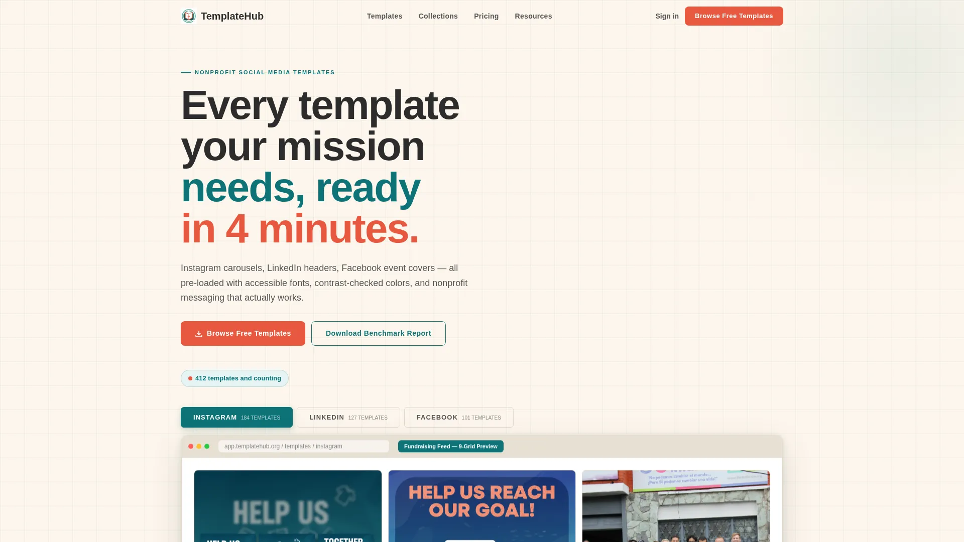
- A Feature Tab Switcher header with live browser mockup and a "412 templates and counting" counter
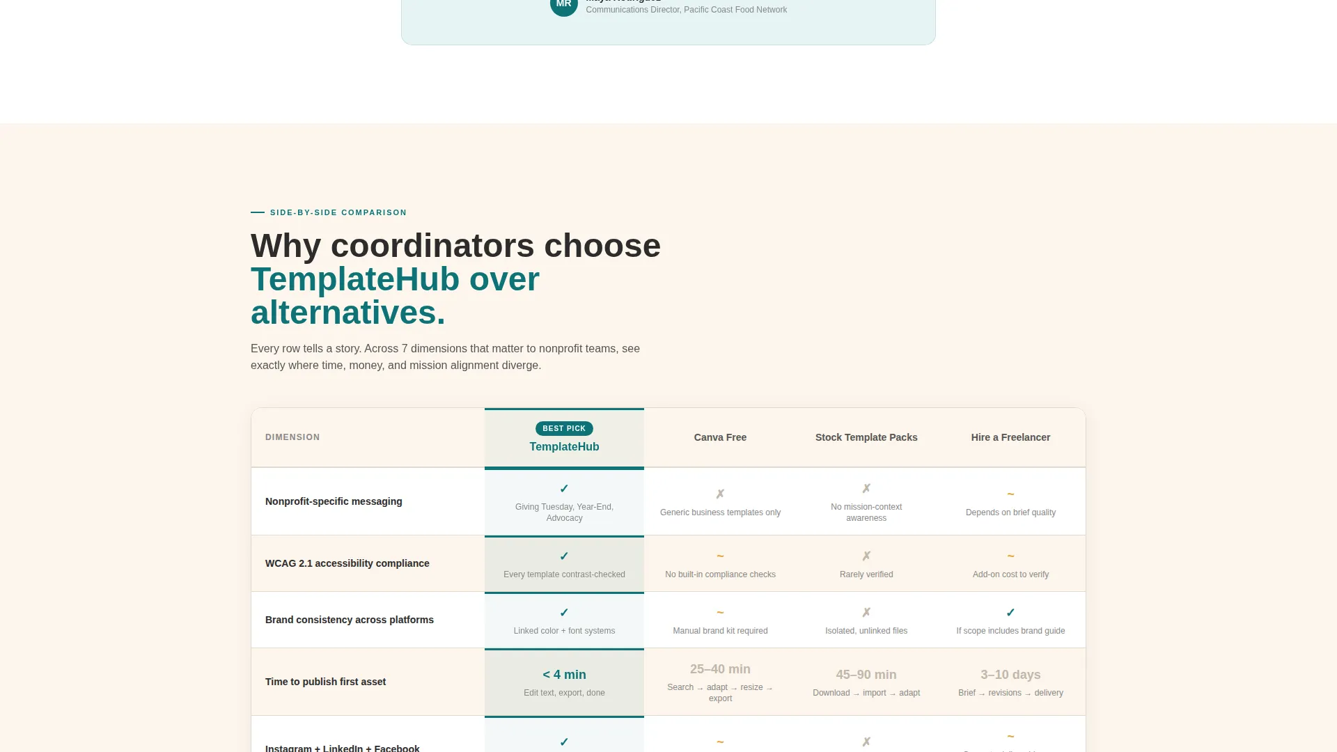
- A full comparison table pitting the library against free tools, stock packs, and freelance designers
- Three curated Template Collections shown as horizontal scroll previews with two conversion paths
Feature list
This template ships with purpose-built sections that do the persuasion work before any button is clicked.
Tab-Switching Header Preview
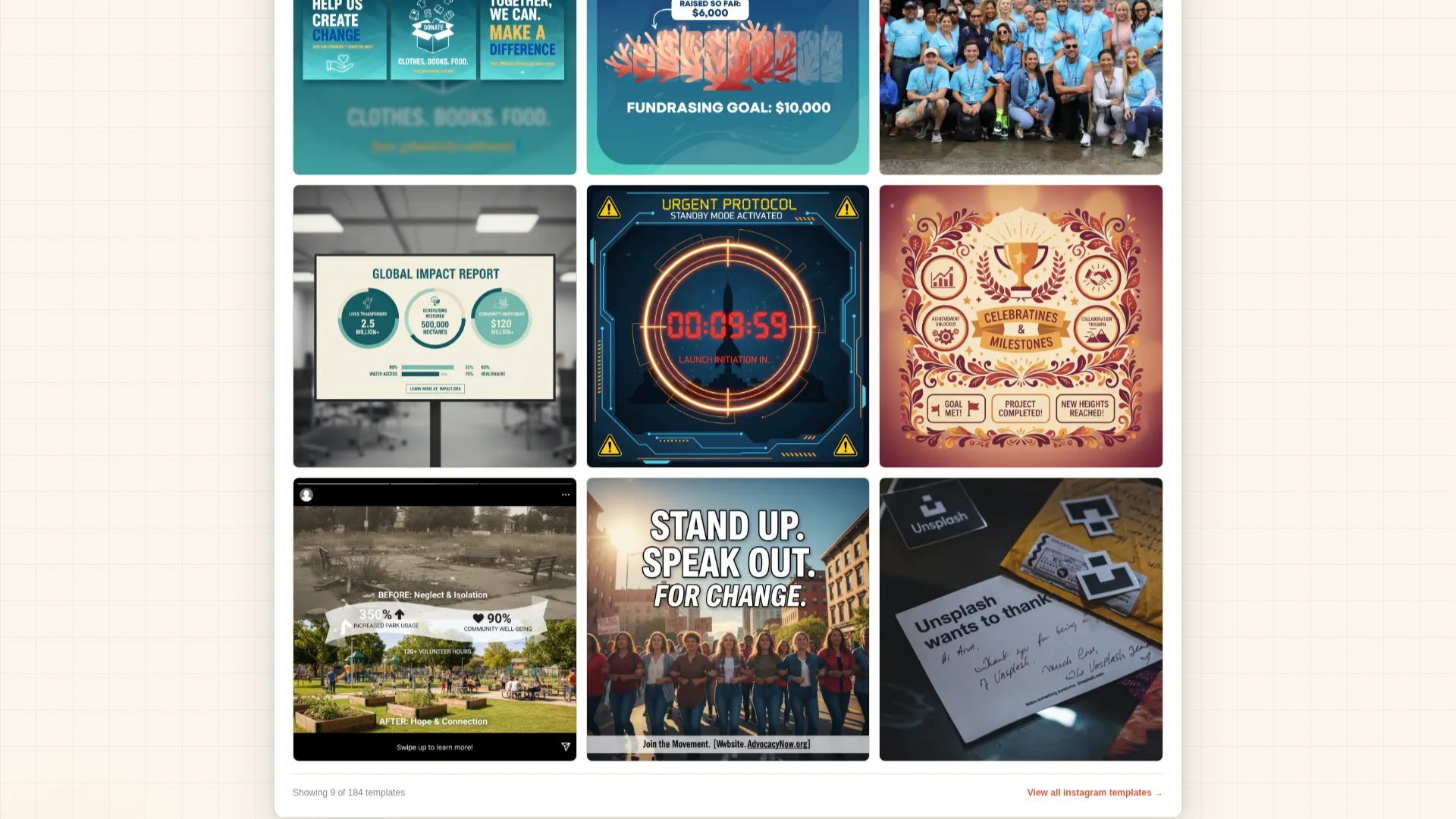
Three clickable tabs labeled Instagram, LinkedIn, and Facebook sit above a browser mockup. Each tab reveals actual template thumbnails instantly, with no loading state. A live counter beneath reads "412 templates and counting," reinforcing library depth at first glance.
Side-by-Side Comparison Table
The core section compares the template library against free tools, generic stock packs, and hiring a freelance designer. Rows cover brand consistency, accessibility compliance, nonprofit-specific messaging, time-to-publish, and annual cost. Teal cell highlights mark the winning column without feeling heavy-handed.
Curated Campaign Collections
Three named collections, Giving Tuesday, Year-End Appeal, and Volunteer Recruitment, are each displayed as a horizontal scroll of thumbnail previews. This format lets visitors preview real use cases before committing to anything.
Dual Conversion Paths
A primary call to action, "Browse Free Templates," is pinned below the comparison table and repeated after the collections. A secondary path offers a downloadable Nonprofit Social Media Benchmark Report in exchange for an email address and organization name, capturing leads who are sold on the data but not yet ready to browse.
Statistics Pull-Quote Cards
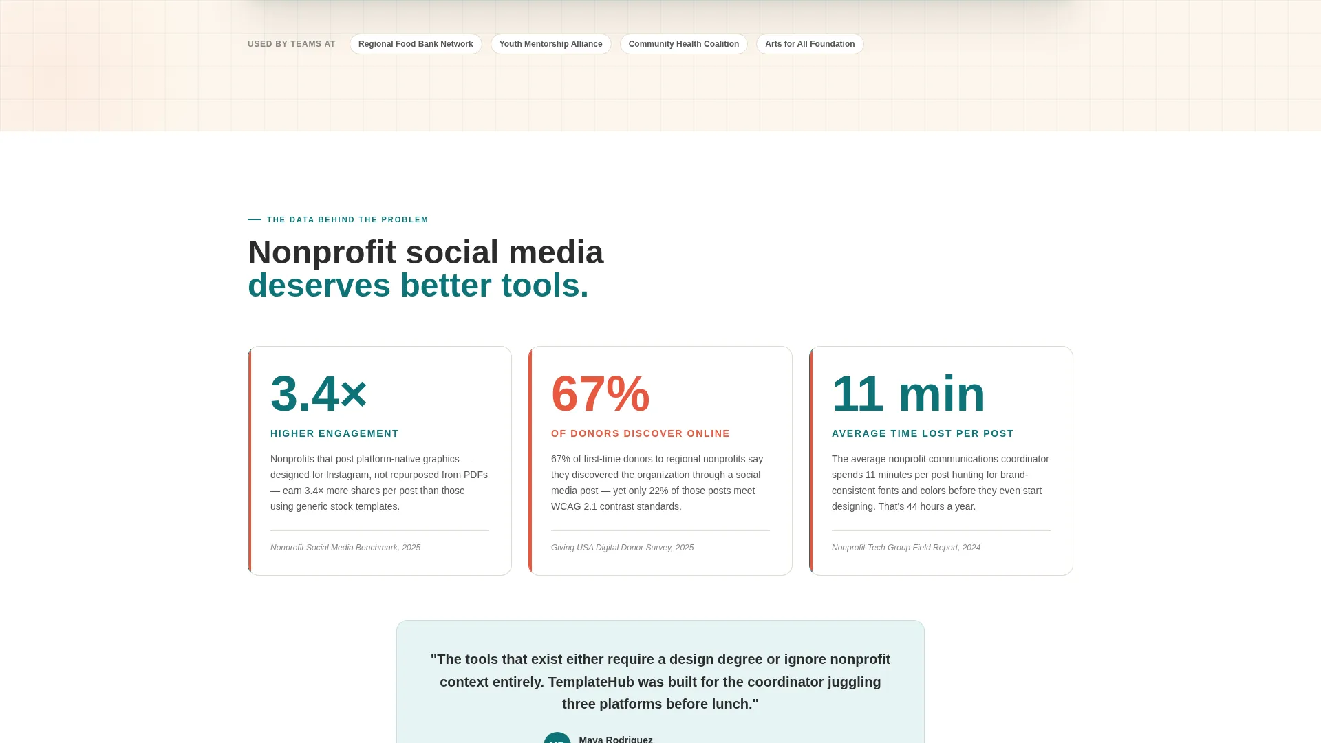
Three statistics about nonprofit social media engagement rates appear as styled pull-quotes on ivory cards. This data-led opening builds the case before any product feature is introduced.
Industry Report Scroll Structure
The full page follows an escalating narrative: statistics, comparison, then collections. Each section builds on the last, so by the time a visitor reaches the call to action, the decision already feels obvious.
Page sections overview
| Section | Purpose |
|---|---|
| Tab Switcher Header | Previews Instagram, LinkedIn, and Facebook template sets instantly |
| Stats Pull-Quotes | Opens with nonprofit social media engagement data to build credibility |
| Comparison Table | Positions the library against free tools, stock packs, and freelancers |
| Template Collections | Shows Giving Tuesday, Year-End Appeal, and Volunteer Recruitment previews |
| Primary call to action Block | Repeats "Browse Free Templates" after the collections section |
| Lead Capture Form | Collects email and organization name for the Benchmark Report download |
Design & branding system
The visual identity follows a Directory and Discovery theme using the Teal Catalyst color system. Every color choice has a clear role, and the overall feel is earnest and organized, like a grant proposal printed on quality stationery with one bold spark of energy.
- Deep mission teal (#0D7377) anchors headers and comparison table column highlights
- Warm ivory (#FDF6EC) serves as the primary background, giving the page a grounded, paper-like warmth
- Action coral (#E8573E) drives every call-to-action button and interactive hover state, while charcoal (#2C2C2C) keeps body text readable at any size
Mobile & speed optimization
The layout is structured for clarity at every screen size. Stacked sections, readable type, and touch-friendly tab controls mean the page works as well on a phone as it does on a desktop monitor.
- Tab switcher and browser mockup scale down gracefully for smaller screens
- Comparison table is formatted to remain scannable on mobile without horizontal overflow
- Horizontal collection scrolls translate naturally to touch-swipe on mobile devices
How this template helps you convert
Every design and layout decision in this template is oriented toward reducing hesitation and making the next step feel natural.
- The comparison table does the persuasion work early, so by the time a visitor reaches the call-to-action button, the alternatives already feel less appealing.
- Two conversion paths, one for immediate browsers and one for data-curious leads, mean the page captures value from visitors at different stages of readiness.
Other information about this template
This template is part of a broader set of tools built for nonprofit digital presence work. It fits naturally into a technology-forward communications strategy where design quality and mission clarity have to coexist.
- The template style is a Comparison Table layout inside a single landing page flow
- The creative direction follows an Industry Report structure, using data and proof before product
- The header concept is a Feature Tab Switcher, a pattern well suited to libraries with multiple content categories
- The landing page conversion direction is Comparison and Versus, making it ideal for audiences who are actively evaluating their options
- Tools like Canva Free are referenced within the comparison table as alternatives, which is consistent with how nonprofit teams typically evaluate design resources
Theme
Directory & Discovery
Creative direction
Industry Report
Color system
Teal Catalyst
Style
Comparison Table
Direction
Comparison/Versus
Page Sections
Tab-switching Header with Live Preview
Side-by-side Comparison Table
Curated Campaign Collections
Dual Conversion Path Design
Statistics Pull-quote Cards
Industry Report Scroll Narrative
Related questions
Can I customize the colors and fonts in this template?
Does this template work for a single nonprofit or a template marketplace?
How does the comparison table section work?
What are the two conversion paths included in this template?
Is this template suitable for Giving Tuesday or seasonal campaign promotion?



