EdTech & Learning Platform Professional Website Template
Notify is a single-column landing page template built for parent communication apps. It walks visitors through a timestamped school day, showing real notification moments from morning to evening. The layout drives freemium signups with a focused three-field form, a secondary demo video path, and a restrained visual identity that earns a busy parent's trust at a glance.
by Rocket studio
Quick summary
Notify is a focused landing page template for a parent communication app. It uses a Timeline Progression layout to walk visitors through a real school day, building genuine urgency from a 6:45 a.m. bus alert to an 8:00 p.m. fundraiser reminder. The design is calm, organized, and built to convert families, teachers, and school administrators into free-trial signups.
Who this template is for
This template is designed for teams building or marketing a school messaging platform. It speaks directly to the people who live inside the communication gap that most schools struggle to close.
- Room parents and classroom volunteers who coordinate school events late at night
- Assistant principals and school administrators pushing reminders to hundreds of families
- Divorced or co-parenting households that need one clear, reliable place for school updates
What problem this template solves
School communication is scattered. Permission slips get buried in email threads. Carpool changes arrive too late. Snow-day alerts land in three different apps at once. Parents feel overwhelmed, and schools feel unheard.
- Families miss critical updates because messages are spread across too many channels
- School staff spend extra time repeating communications that never reached every parent
- Parents in split households struggle to confirm who received which message and when
What you get with this template
You get a complete single-column landing page designed to present a parent communication app with clarity and confidence. Every section has a defined job, and nothing competes for attention unnecessarily.
- A timestamped Timeline Progression that walks visitors through a real school day in sequence
- A three-field freemium signup form with a secondary demo video path for hesitant visitors
- A Slate and Sky color system with a Logo Bar header and pencil-yellow notification accents
Feature list
This template includes six purpose-built sections and a tightly controlled design system. Every component reflects the source brief exactly.
Timestamped Timeline Scroll
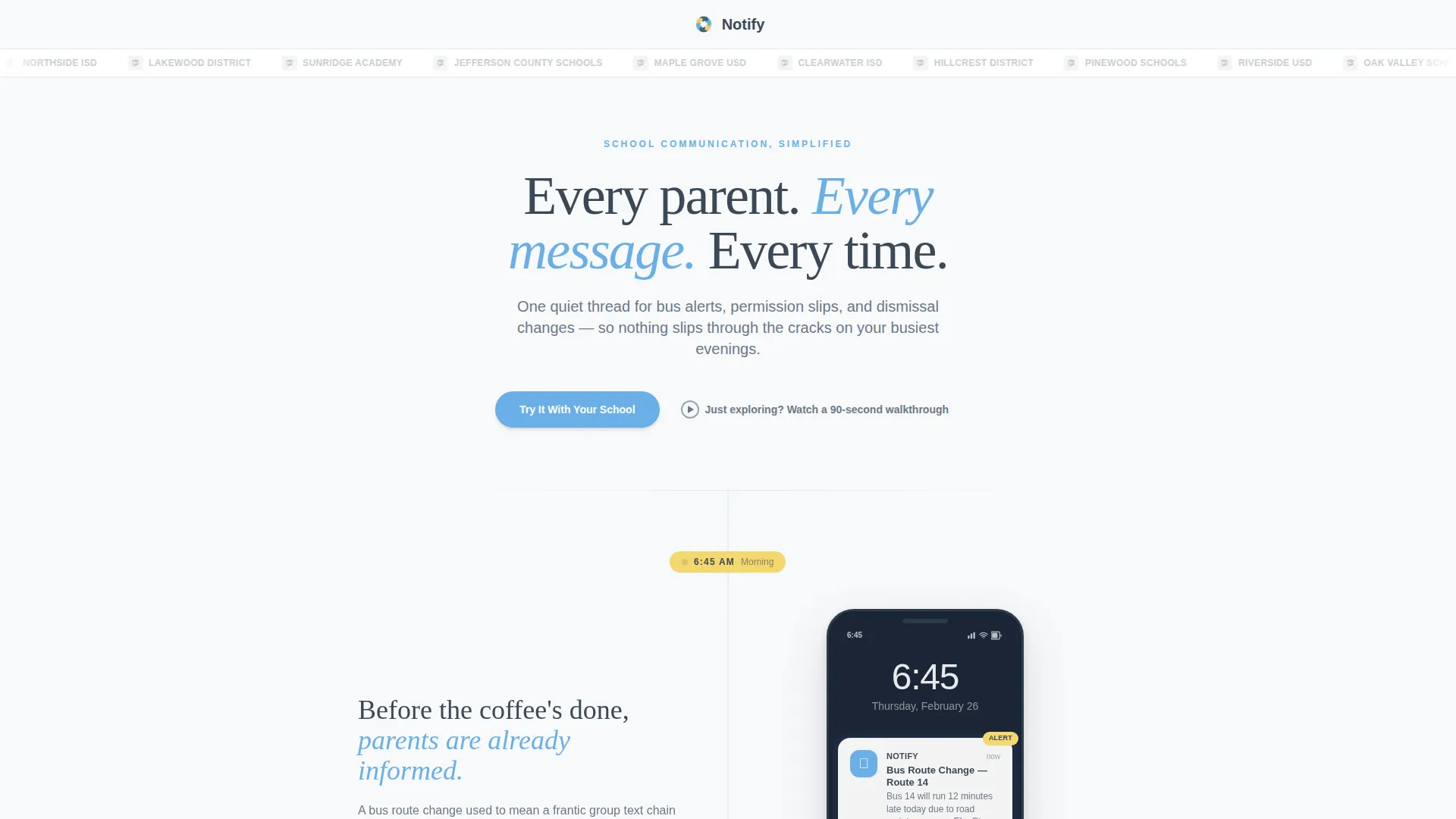
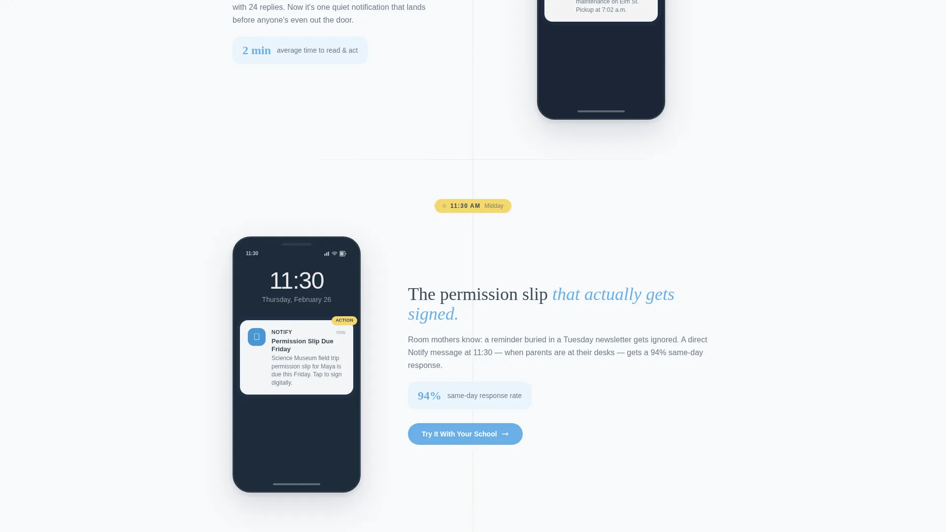
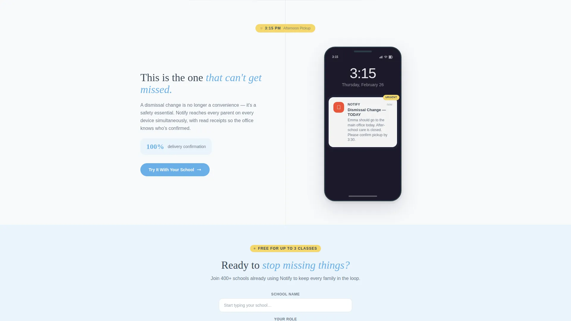
The page is structured around a single school day, from 6:45 a.m. to 8:00 p.m. Each timestamp appears in pencil-yellow, anchoring the visitor to a real moment in a parent's day. Mock phone screens show the actual notification a parent would see at that time.
Micro-Animation Phone Reveals
As each timeline timestamp comes into view during scroll, a phone screen slides in to mimic a live notification pulse. The motion is gentle and purposeful. It reinforces the product's core promise without adding visual noise.
Three-Field Freemium Signup Form
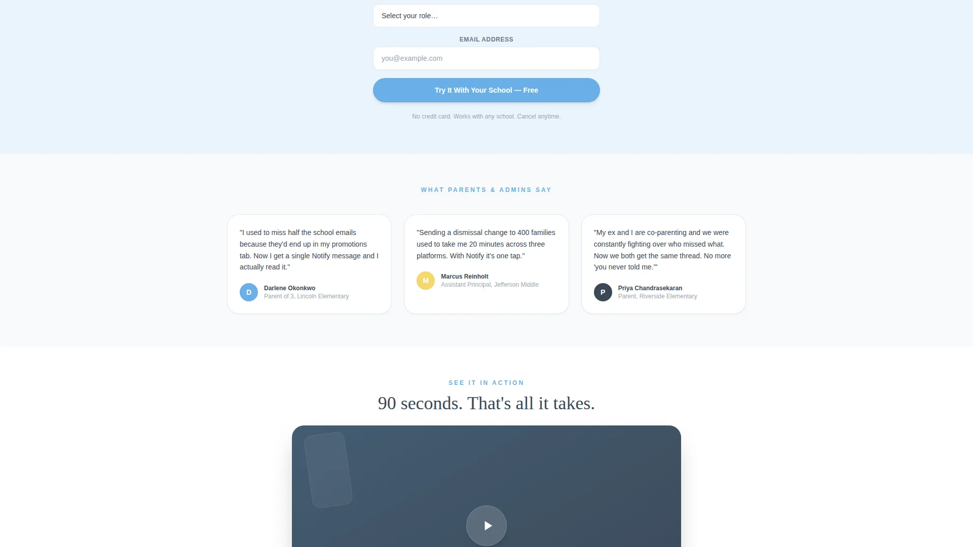
The primary call to action form collects three fields in order: school name with autosuggest, your role as a dropdown (parent, teacher, or admin), and email address. The form is simple enough to complete in under a minute and appears at two key scroll points.
Secondary Demo Video Path
Below the primary form, a secondary prompt reads "Just exploring? Watch a 90-second walkthrough." This path links to an embedded demo video. It gives hesitant visitors a low-commitment way to stay engaged before deciding to sign up.
Logo Bar Header
The header centers the app wordmark on notebook white. A thin row of school and district logos scrolls gently beside it in muted grayscale. No hero image competes for attention, keeping the first impression calm and credible.
Repeating call to action Placement
The primary call to action, "Try It With Your School," repeats at two natural scroll beats: the midday timeline section and the end-of-day section. Repetition at emotionally resonant moments raises the likelihood of a signup without feeling pushy.
Page sections overview
| Section | Purpose |
|---|---|
| Logo Bar Header | Establishes brand trust with app wordmark and school logos |
| Display Headline | Sets the product promise in one focused line of type |
| Morning Timeline Block | Opens the school day with a 6:45 a.m. bus-route alert |
| Midday Timeline Block | Delivers a 3:15 p.m. dismissal change with midday call to action |
| Evening Timeline Block | Closes with an 8:00 p.m. reminder and final signup form |
| Freemium Signup Form | Collects school name, role, and email for free-trial access |
| Demo Video Path | Offers a 90-second walkthrough for undecided visitors |
Design & branding system
The visual identity follows an Educational Guide theme. It is calm and structured, designed to lower a busy parent's stress rather than add to it.
- Chalkboard slate (#3B4856) anchors body text and navigation for stability and legibility
- Morning-sky blue (#6AAFE6) carries all buttons and active states, signaling action without urgency
- Pencil-yellow (#F5D76E) appears only on timestamps and notification badges to draw the eye precisely where it matters
Mobile & speed optimization
The single-column layout is inherently suited for vertical scrolling on a phone screen. Parents checking school updates at pickup or before bed are most often on a mobile device.
- The column flow stacks every section cleanly without requiring a responsive grid adjustment
- Phone screen mock-ups are sized and positioned to read clearly at small viewport widths
- The three-field form is compact enough to complete without horizontal scrolling or zooming
How this template helps you convert
The timeline structure does the persuasive work gradually and honestly. By the time a visitor reaches the evening section, the cost of not having the app feels personal.
- Each timestamped moment mirrors a real parenting scenario, building emotional recognition before any sales claim is made.
- The primary call to action repeats at two high-urgency scroll points, catching visitors at moments when they feel the product's value most directly.
- The free tier removes financial hesitation, and the short form removes friction, so the only remaining decision is whether to sign up now or watch the demo first.
Other information about this template
This template is built specifically for the parent communication app niche within the broader EdTech and learning platform category. It fits naturally inside an education and training product portfolio.
- The theme is Educational Guide, which informs the organized binder aesthetic and calm color choices
- The header concept is a Logo Bar, making it easy to display partner schools or district logos from launch
- The template style is Single Column Flow, which suits both desktop and mobile viewing without layout changes
- The landing page direction is Freemium and Trial, meaning all copy and call to action placement are optimized for low-barrier signup rather than direct purchase
Theme
Educational Guide
Creative direction
Timeline Progression
Color system
Slate & Sky
Style
Single Column Flow
Direction
Freemium/Trial
Page Sections
Timestamped School Day Timeline
Slide-in Phone Screen Animations
Three-field Freemium Signup Form
Secondary Demo Video Embed
Logo Bar with School Logos
Repeating Call to Action at Key Scroll Points
Related questions
Who is this landing page template designed for?
Can I customize the timeline timestamps and notification content?
Does the template include the demo video or just the embed placeholder?
How many times does the primary call to action appear on the page?
Is the signup form connected to a backend or email service?



