Senior Care Digital Presence Reviews Website Template
This senior care digital menu landing page template is built for assisted living food service teams that need to eliminate tray errors, automate dietary flag tracking, and pass compliance reviews without paper trails. It leads with live-style stat cards, a three-column comparison table, and a minimal three-field pilot signup form, all designed to turn skeptical directors into confident trial users.
by Rocket studio
Quick summary
A single-page, evidence-first template for a senior care digital menu platform. It opens with three oversized stat cards, moves through a comparison table and a real facility case study, and closes with a low-friction pilot signup form. The layout is built for food service directors and administrators who need fast answers and clear proof before committing.
Who this template is for
This template is made for operations-focused professionals managing dining in assisted living and senior care facilities. It speaks directly to the people who feel the cost of a wrong tray most acutely.
- Food service directors managing multiple texture levels, allergen flags, and daily compliance documentation
- Activity coordinators who print tomorrow's menu late at night and need a faster, more reliable process
- Facility administrators handling family concerns about residents receiving incorrect meals
What problem this template solves
Paper menus and manual dietary tracking create real risk in senior dining operations. Tray errors are not just an inconvenience, they carry compliance and resident safety implications. This template surfaces that cost clearly and positions the digital platform as the measurable solution.
- Facilities running on paper or basic digital tools struggle to track fourteen or more allergen flags across hundreds of residents
- Manual menu updates create last-minute printing bottlenecks and version-control errors
- Administrators lack a verifiable record when families question whether dietary requirements were followed
What you get with this template
The template delivers a complete, conversion-focused landing page layout with every section pre-structured and styled. No blank pages or guesswork, just a ready-to-customize dashboard-style page.
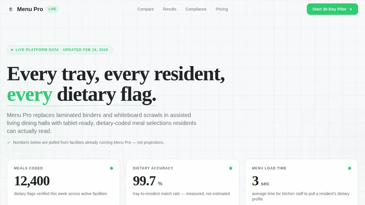
- A hero section with three live-style metric stat cards showing meals coded, dietary accuracy, and menu load time
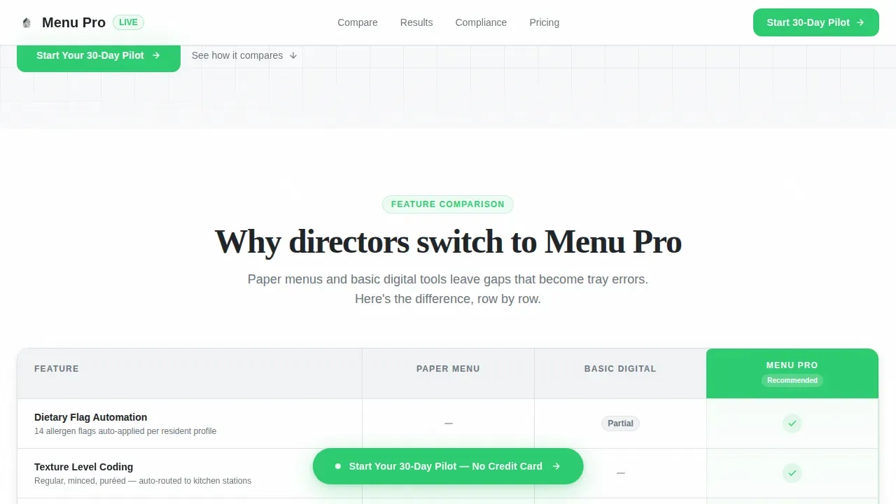
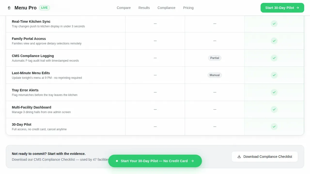
- A three-column comparison table covering Paper Menu, Basic Digital, and Menu Pro feature rows
- A case study section, a gated compliance checklist download, and a three-field pilot signup form
Feature list
This template is built around a specific sequence of persuasion. Each section earns the next click.
Live Metrics Hero Section
Three oversized stat cards open the page with immediate evidence: meals coded per week, dietary accuracy percentage, and average menu load time. The numbers are rendered in Fraunces display numerals against a white card with thin instrument-gray borders, signaling precision before a visitor reads a single word.
Three-Column Comparison Table
The comparison table sets Paper Menu, Basic Digital, and Menu Pro side by side across rows covering dietary flag automation, font scaling for low vision, real-time kitchen sync, family portal access, and compliance logging. Status-green checkmarks and instrument-gray dashes make the gap between options instantly readable.
Single-Facility Case Study
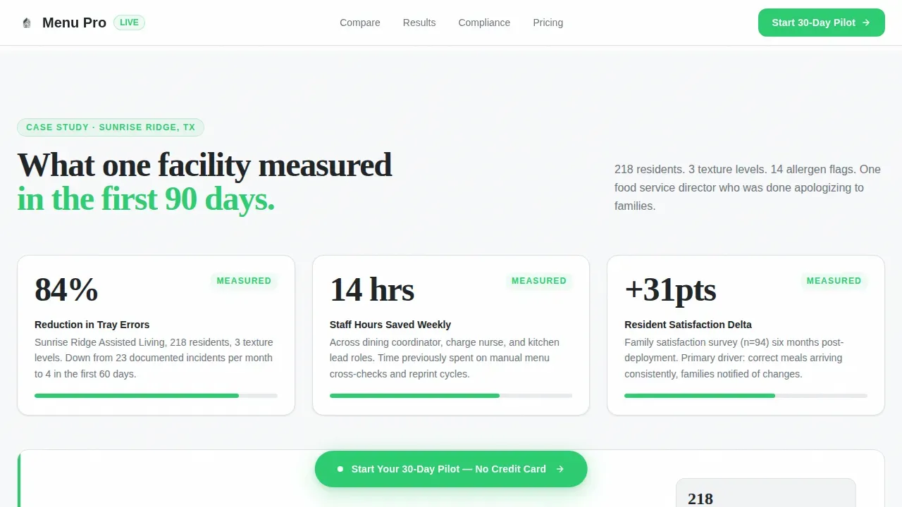
A focused case study section presents three metrics from a real facility: tray error reduction percentage, staff hours saved per week, and resident satisfaction change. The format keeps the narrative tight and the numbers prominent, building cumulative proof as the visitor scrolls.
Gated Compliance Checklist Download
A secondary conversion path sits below the comparison table. Directors not yet ready to start a pilot can download a compliance checklist PDF by submitting their email and role. This captures qualified leads from buyers who are in research mode.
Floating Pilot Signup Form
The primary call to action is a three-field form asking for facility name, number of residents, and a work email. It pins as a floating button labeled "Start Your 30-Day Pilot" after the first scroll, keeping the conversion path visible without interrupting the reading flow.
Scroll-Linked Animation System
Stat counters animate on scroll entry, comparison table rows reveal progressively, and the floating call-to-action button pins at the right moment. The animation level is intentionally moderate, enough to feel responsive, not enough to distract a busy director scanning for facts.
Page sections overview
| Section | Purpose |
|---|---|
| Hero Stat Cards | Open with three concrete performance metrics to establish immediate credibility |
| Comparison Table | Show feature gaps between paper, basic digital, and the platform side by side |
| Facility Case Study | Deliver three real outcome metrics to make the value measurable and specific |
| Compliance PDF Download | Capture research-stage leads with a gated checklist as a secondary conversion |
| Pilot Signup Form | Convert ready buyers with a three-field form and a clear 30-day pilot offer |
| Footer | Close with a minimal single-row linear footer for navigation and legal links |
Design & branding system
The visual identity follows a Dashboard Pro theme built on a Monochrome Steel color palette. Every design decision reinforces the feeling of a medical-grade control panel: authoritative, calm, and free of clutter.
- Color palette uses surgical white (#F8F9FA) for backgrounds, charcoal (#212529) for data text, instrument gray (#6C757D) for secondary labels, and status green (#2ECC71) reserved strictly for active states, toggles, checkmarks, and call-to-action buttons
- Typography pairs DM Sans for body text and interface labels with Fraunces for display numerals, creating a clear visual hierarchy between operational data and supporting copy
- No stock photography appears anywhere on the page; the visual proof comes from numbers, table cells, and structured data layouts
Mobile & speed optimization
The template is built desktop-first to match the tablet-mounted use case in assisted living dining halls, with full mobile support included. Performance choices reflect the operational context, this page may be opened on a facility network during a busy service window.
- Static sections use server components to minimize load overhead, while counters and scroll animations run as client components only where interaction is needed
- The floating call-to-action button and comparison table toggle are optimized for touch interaction on tablets and mobile screens
- The three-field form is intentionally minimal, reducing friction on both desktop and mobile without requiring lengthy input from a time-pressed director
How this template helps you convert
The page is engineered around a single principle: accumulate proof until inaction feels more costly than starting a pilot. Each scroll adds a data point, and each section removes a reason to hesitate.
- The metrics hero front-loads credibility before the visitor reaches any sales language, making the comparison table feel like evidence rather than marketing
- The gated compliance checklist captures email leads from directors in research mode, so the platform stays in front of buyers who are not yet ready to sign up for a pilot
- The floating "Start Your 30-Day Pilot" button keeps the primary call to action visible throughout the scroll without forcing a disruptive popup or interrupting the proof-building sequence
Other information about this template
This template is designed specifically for the senior care digital menu niche and reflects the operational realities of B2B software-as-a-service sales into healthcare food service environments. It is category-aware from the first pixel.
- The template style is a comparison table landing page, making it well-suited for platforms competing against paper-based or entry-level digital alternatives
- Localization is set for English, US date format, and USD pricing references where applicable
- The creative direction is Stats-First Impact, meaning proof comes before persuasion throughout the entire page flow
- The header concept is a live-style metrics dashboard, not a promotional banner or lifestyle photograph
- The conversion path is structured for a freemium or free-trial offer, specifically a 30-day pilot with a three-field signup
Theme
Dashboard Pro
Creative direction
Stats-First Impact
Color system
Monochrome Steel
Style
Comparison Table
Direction
Freemium/Trial
Page Sections
Live Metrics Hero with Stat Cards
Three-column Feature Comparison Table
Real-facility Case Study Section
Gated Compliance Checklist Download
Floating Pilot Signup Form
Scroll-linked Animation System
Related questions
Who is this landing page template designed for?
What sections does this template include?
Can this template capture leads from buyers who are not ready to sign up?
How does the comparison table work in this template?
Is this template suitable for tablet use in a dining hall setting?



