Physics Education Specialist Professional Website Template
Nucleus is a single-column physics study guide landing page built for students who learn better from real notes than textbooks. It opens with an interactive quiz question, introduces contributor profiles with personal note cards and diagrams, and converts visitors through a freemium model that trades one email for a full chapter of study material.
by Rocket studio
Quick summary
Nucleus is a physics study guide landing page template with a chalkboard-inspired visual identity. It leads with an interactive quiz question, builds trust through real contributor profiles, and drives sign-ups with a freemium model. The single-column flow guides visitors from curiosity to commitment without friction or hard sells.
Who this template is for
This template is built for people who create or share physics study content and want a landing page that feels personal and credible. It suits educators, tutors, and peer-learning communities who want their audience to feel they have found their study group.
- Second-year engineering students and AP Physics C learners looking for peer-style notes
- Adult learners preparing for graduate school entrance exams who need accessible, worked examples
- Physics content creators, note-sharing platforms, and study communities building a freemium audience
What problem this template solves
Standard physics resources feel cold and impersonal. Textbooks do not show their working. Generic course pages do not earn trust. Students abandon pages that feel like a sales pitch rather than a study session. Nucleus solves this by leading with human connection and immediate intellectual engagement.
- Visitors arrive skeptical and leave before converting because the page lacks personality or proof
- Students cannot judge whether the content matches their level before committing their email
- Study platforms struggle to communicate the quality and voice of their material at a glance
What you get with this template
You get a complete, ready-to-customize single-column landing page designed specifically for a physics study guide and notes platform. Every section is purposeful and sequenced to move a visitor from first impression to sign-up.
- An interactive Quiz Starter header with illustrated answer choices and contributor avatars
- Scrollable contributor profile sections with sample note cards, diagrams, and personal bios
- A dual-path freemium conversion system with a primary email call to action and a no-form browse option
Feature list
This template ships with purpose-built sections and interaction patterns designed for physics education content. Each component is grounded in the brief and serves a specific role in the visitor journey.
Interactive Quiz Starter Header
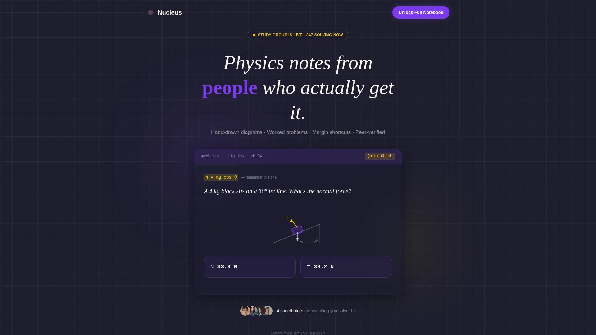
The page opens with a single physics question rendered in handwritten-style type on a deep chalkboard background. Two illustrated answer choices pulse gently in electric violet and serotonin yellow. Small contributor avatars cluster beneath the question, making the header feel like a live study group moment rather than a static hero banner.
Contributor Profile Scroll Sections
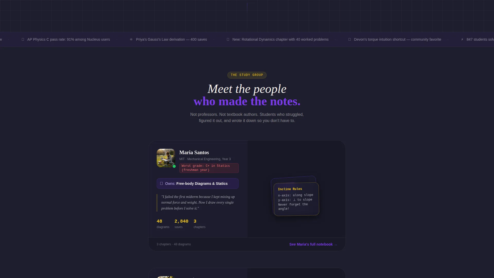
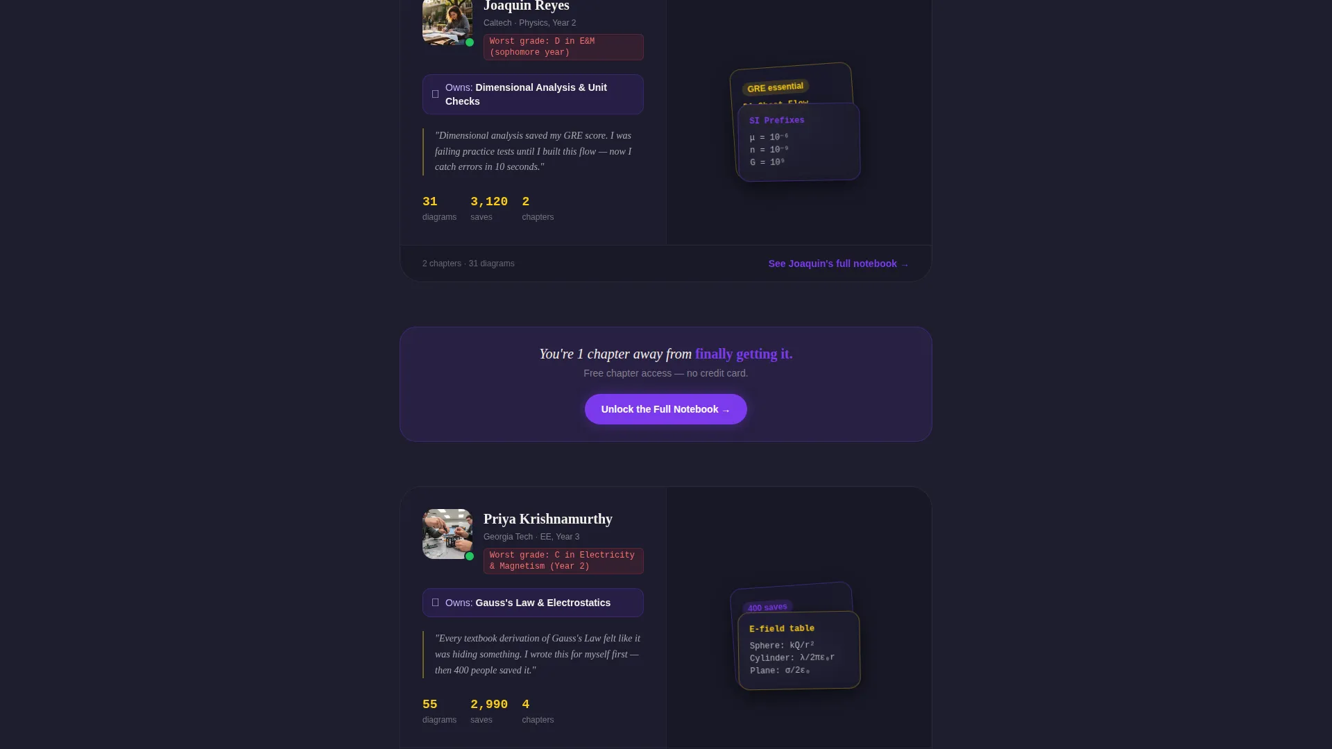
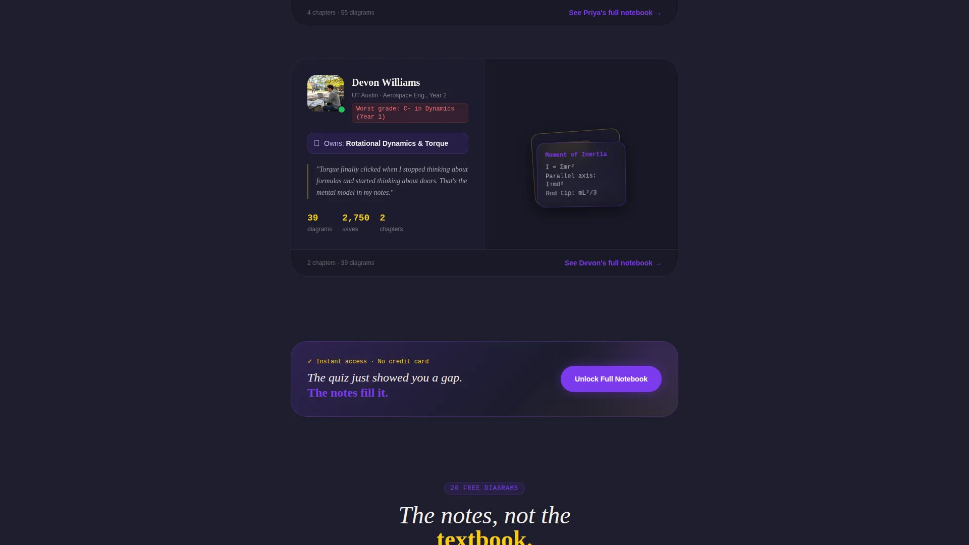
Each scroll section introduces one real content contributor. Their photo, university, self-disclosed worst physics grade, and owned topic sit alongside a fanned-out sample note card or diagram. This structure builds trust through specificity and vulnerability, letting visitors meet the people behind the material before committing.
Annotated Sample Note Cards and Diagrams
Alongside each contributor profile, the template displays a representative study artifact. These include free-body diagram shorthand cards, dimensional-analysis cheat flows, and annotated equation derivations. Visitors see exactly what the full notebook looks like before they sign up.
Freemium Dual-Path Conversion
The primary call to action reads "Unlock the Full Notebook" in electric violet and appears first after the quiz result. It repeats after every third contributor profile. A secondary path lets visitors browse twenty free diagrams without any form, reducing commitment anxiety and keeping low-intent visitors on the page.
Single-Field Email Sign-Up
Clicking the primary call to action opens a minimal single-field email form. Submitting it immediately grants access to one full chapter of notes. The simplicity removes friction at the most critical conversion moment.
Quiz Score Personalization
The quiz result creates a personalized stake in the content. Visitors who answer the opening question see their result, which naturally positions the notes as the logical next step. This micro-engagement loop ties curiosity directly to the sign-up motivation.
Page sections overview
| Section | Purpose |
|---|---|
| Quiz Starter Header | Hook visitors with an interactive physics question and social proof avatars |
| Quiz Result Display | Show the answer and connect the gap in knowledge to the full notebook call to action |
| Primary call to action Block | Present the "Unlock the Full Notebook" email sign-up after the quiz result |
| Contributor Profile 1 | Introduce the first contributor with photo, bio, and sample note card |
| Contributor Profile 2 | Introduce the second contributor with diagram and personal study story |
| Contributor Profile 3 | Introduce the third contributor with annotated derivation sample |
| Repeat call to action Block | Reinforce the primary sign-up after every third contributor profile |
| Free Browse Path | Offer a no-form option to browse twenty free diagrams |
| Footer Section | Close the page with minimal navigation and secondary links |
Design & branding system
The visual identity follows a Community Hearth theme expressed through a Dopamine Pop color system. The palette evokes a blackboard covered in neon chalk and highlighter marks at midnight: cerebral and buzzing at the same time.
- Deep chalkboard charcoal (#1E1E2E) as the primary background, electric violet (#7C3AED) on buttons and highlighted equations, serotonin yellow (#FACC15) for annotations and callout badges, and warm chalk white (#F5F0EB) for body text and diagram lines
- Handwritten-style typography for question prompts and note card text, creating the visual impression of real student notes rather than designed assets
- Illustrated answer choice components and fanned note card layouts reinforce the analog study desk aesthetic throughout the scroll
Mobile & speed optimization
The single-column flow is a natural fit for mobile screens. Every section stacks cleanly without requiring horizontal scrolling or pinch-to-zoom interaction. The layout prioritizes readability for students studying on phones late at night.
- Single-column structure adapts to narrow viewports without layout shifts or overlapping elements
- Large tap targets on the two illustrated answer choices and the primary call-to-action button suit touch navigation
- Minimal decorative overhead keeps the page lightweight, supporting smooth scrolling through the contributor profile sections
How this template helps you convert
Nucleus is designed to reduce friction at every stage of the visitor journey. Conversion happens not through pressure but through earned trust and personalized engagement.
- The interactive quiz creates an immediate personal stake. Visitors who attempt the question feel a genuine curiosity gap, and the note access becomes the obvious resolution rather than a sales offer.
- Contributor profiles build social proof through vulnerability and specificity. Seeing a real person's worst grade and their current expertise tells visitors that the content was made by someone who once struggled the same way they do.
- The dual-path conversion system removes the all-or-nothing commitment. Visitors who are not ready to share their email can still browse twenty free diagrams, staying engaged and warming up to the full sign-up at their own pace.
Other information about this template
Nucleus was designed as a single-column flow landing page, which means all content lives in one continuous vertical scroll. There are no multi-page navigation links or tabbed interfaces. The structure is intentionally linear to guide visitors without distraction.
- The template is built for the Physics Study Guide and Notes niche within the broader Education and Training category
- The freemium model supports two conversion paths: an email-gated full chapter and a no-gate free diagram browse
- The Community Hearth theme and Team and People creative direction were chosen to make a digital product feel like a community, not a course catalog
- The Dopamine Pop color system is designed to sustain attention during late-night study sessions while keeping the aesthetic sharp and intentional
- The header concept draws on a Quiz Starter pattern, which is particularly effective for education niches because it activates the learner's self-assessment reflex immediately on arrival
Theme
Community Hearth
Creative direction
Team & People
Color system
Dopamine Pop
Style
Single Column Flow
Direction
Freemium/Trial
Page Sections
Interactive Quiz Starter Header
Contributor Profile Scroll Sections
Annotated Sample Note Cards
Dual-path Freemium Conversion
Single-field Email Sign-up
Quiz Score Personalization Loop
Related questions
Who is the Nucleus template designed for?
Can I customize the contributor profiles and note card samples?
How does the freemium conversion model work in this template?
Do I need to build multiple pages to use this template?
What makes this template different from a generic education landing page?



