Agriculture Software & SaaS Booking Website Template
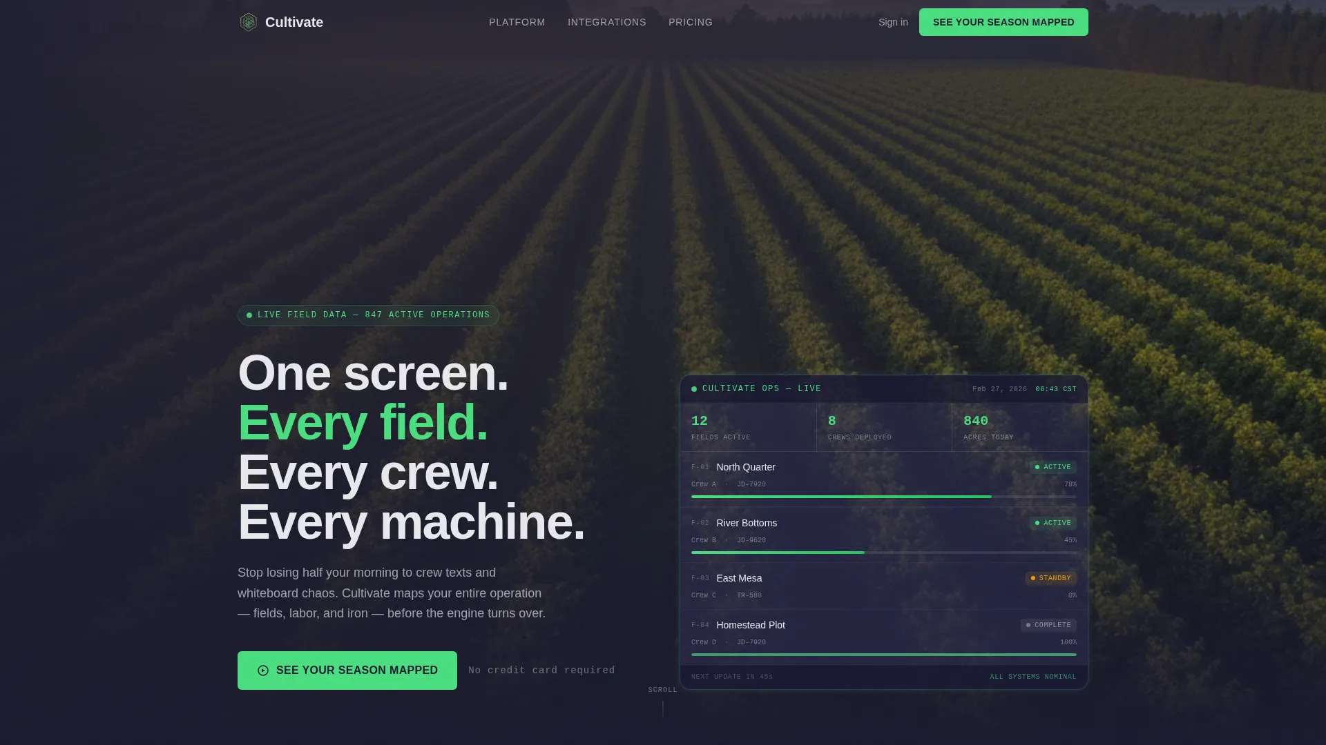
Cultivate is a split-screen landing page template built for agriculture booking and field scheduling software. It uses a dark, instrument-panel aesthetic to guide farm operations managers from a chaotic before-state to a calm, organized solution. The Click-Through layout drives visitors straight into a live demo with zero form friction, making it ideal for ag-tech products that sell on clarity and confidence.
by Rocket studio
Quick summary
Cultivate is a single-page, split-screen landing page template designed for precision agriculture software. It pairs a problem-and-solution scroll rhythm with a dark Data Command visual style to help ag-tech platforms convert farm operations managers, cooperative coordinators, and vineyard owners into demo participants. Every section is built to build trust fast and remove hesitation before the click.
Who this template is for
This template is made for agriculture software teams that need to communicate operational complexity and resolve it visually. If your product handles field scheduling, seasonal labor coordination, or equipment dispatch, this layout speaks directly to your buyer.
- Farm operations managers juggling harvest crews across multiple fields
- Agricultural cooperatives coordinating shared equipment during tight seasonal windows
- Vineyard owners and specialty crop operators who lose time each morning on scheduling logistics
What problem this template solves
Ag-tech products often lose potential customers because the landing page fails to reflect the real weight of the problem. Visitors do not feel understood, so they do not convert. This template solves that gap by mirroring the buyer's operational pain before presenting the software as relief.
- Disconnected scheduling tools make it hard to show the value of a unified platform in a single glance
- Generic SaaS landing pages do not speak the language of field operations or seasonal urgency
- Long sign-up forms and vague calls to action create drop-off before visitors reach the demo
What you get with this template
You get a fully structured, single-page Click-Through landing page built around a Problem-to-Solution Arc. Every section is designed to escalate tension and resolve it, guiding the visitor toward one clear action: entering a live demo environment.
- A split-screen (50/50) layout with alternating problem and solution panels across multiple content sections
- A header Logo Bar anchored to prominent ag-industry brand and integration partner logos rendered in aluminum white monotone
- A friction-free Click-Through flow with three progressive calls to action, each paired with a micro-line that reduces hesitation
Feature list
This section covers the core built-in components and layout decisions that make Cultivate work as a conversion tool for agriculture booking software.
Split-Screen Problem and Solution Panels
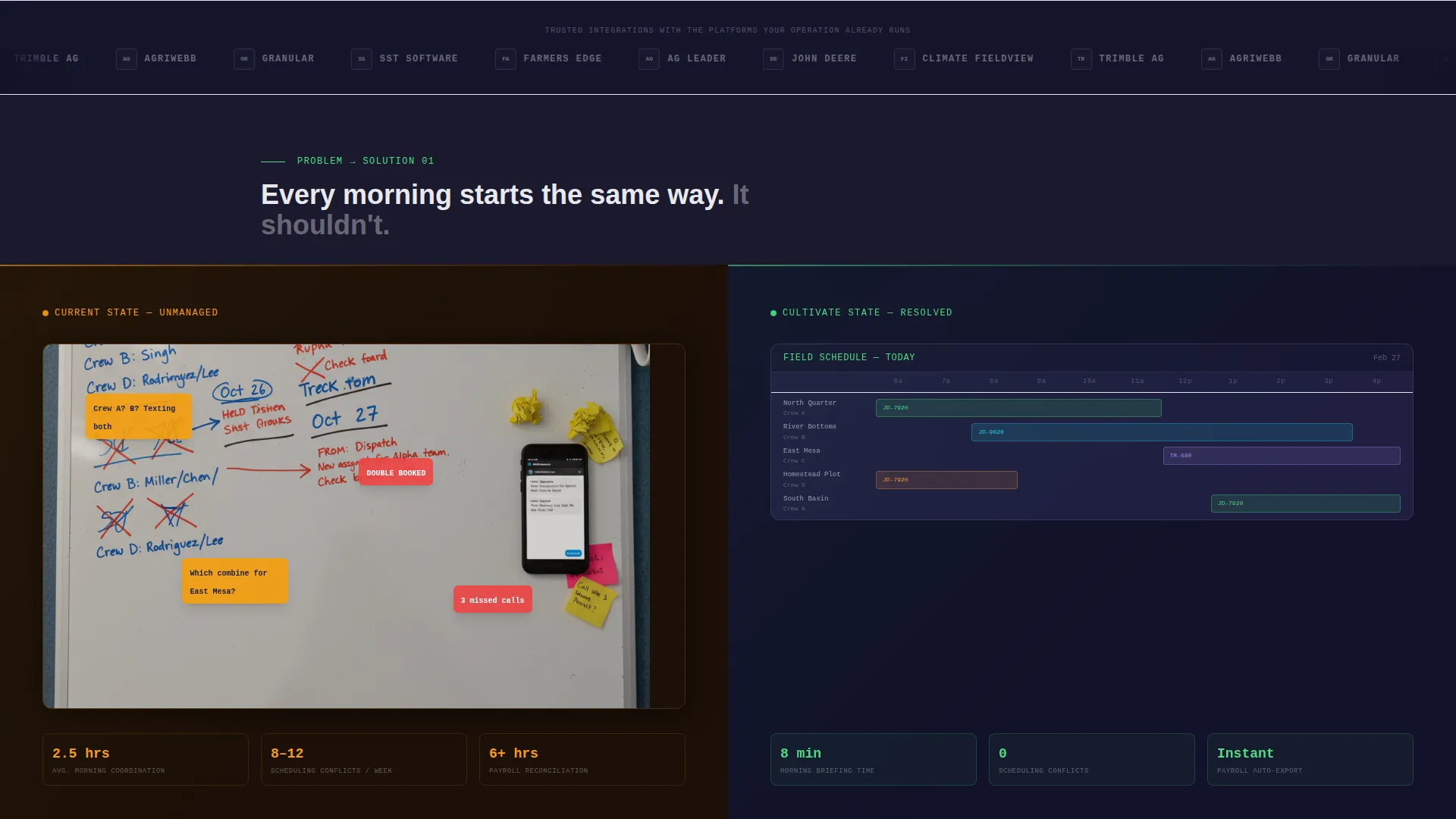
Each content section divides the screen into two equal halves. The left panel shows the messy before-state: a whiteboard with crossed-out crew assignments, a buzzing phone, field names in disarray. The right panel shows the software's scheduling grid, color-coded and composed. The visual contrast does the persuasion work without a single extra word.
Progressive Click-Through Calls to Action
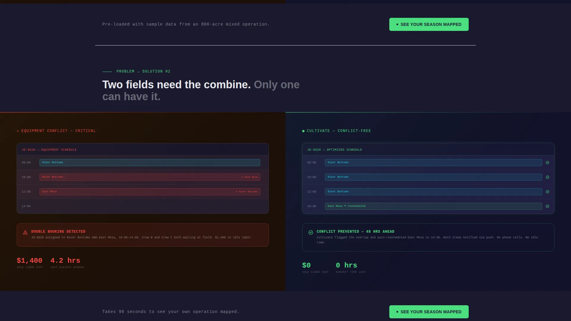
The primary call to action, "See Your Season Mapped," appears beneath the header and repeats after every problem-solution pair. Each instance adds a friction-reducing micro-line: "No credit card," then "Pre-loaded with sample data," then "Takes 90 seconds." This sequence lowers resistance at each decision point in the scroll.
Logo Bar Header with Institutional Trust
The header opens with a clean horizontal strip of recognizable ag-industry logos rendered in aluminum white on a carbon-black background. Below the logo bar, a single wide headline delivers the core value proposition. No imagery competes with the authority the logos establish.
Data Command Color System
The template uses a precise four-color palette built for a technical instrument-panel feel. Sensor-green (#4ADE80) marks live states and confirmation moments. Carbon black (#1A1A2E) and machined graphite (#30305A) anchor the dark background layers. Aluminum white (#E8E8ED) carries all typography and data labels.
Enterprise Footer with Secondary Contact Path
A secondary text link, "Talk to an Ag Ops Specialist," sits in the footer. This gives enterprise cooperatives and larger operations a direct human contact option without cluttering the primary conversion flow. The footer keeps the main call to action clean while serving a distinct buyer segment.
Sandbox Demo Click-Through Destination
The page has no on-page form fields. Every primary call to action click routes the visitor directly into a sandbox demo environment pre-populated with a realistic 800-acre mixed operation. This removes sign-up friction entirely and lets the software prove its value before any commitment is made.
Page sections overview
| Section | Purpose |
|---|---|
| Logo Bar Header | Builds institutional trust with ag-industry partner logos and delivers the core headline |
| Problem Split One | Shows chaotic field scheduling versus the software's organized scheduling grid |
| call to action Block One | Drives the first demo click with "No credit card" friction reducer |
| Problem Split Two | Contrasts double-booked equipment stress against the software's resolved dispatch view |
| call to action Block Two | Repeats demo call to action with "Pre-loaded with sample data" reassurance |
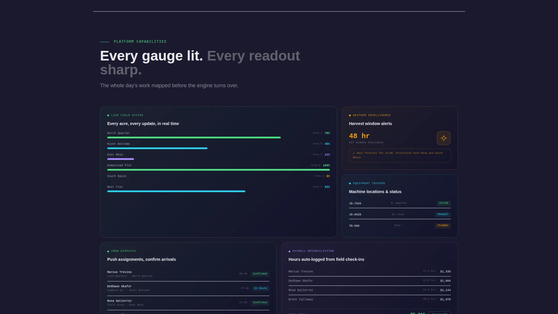
| Problem Split Three | Pairs payroll reconciliation chaos with the software's clean labor tracking state |
| call to action Block Three | Final call to action with "Takes 90 seconds" to close remaining hesitation |
| Footer Contact | Provides enterprise secondary path via "Talk to an Ag Ops Specialist" text link |
Design & branding system
The visual identity follows a Data Command theme. Every design choice reinforces the feeling of climbing into a precision machine where every readout is meaningful and nothing is decorative noise.
- Carbon Fiber palette: deep carbon black (#1A1A2E) backgrounds, machined graphite (#30305A) panel layers, sensor-green (#4ADE80) for active states and confirmation accents, and aluminum white (#E8E8ED) for all text and labels
- Wide, engineered sans-serif typography that reads like instrument-panel data, not editorial copy
- Monotone aluminum white logo rendering in the header strip to keep the visual hierarchy clean and the brand associations immediate
Mobile & speed optimization
The split-screen layout is structured so that each 50/50 panel can reflow cleanly on smaller screens without losing the problem-to-solution narrative sequence. The design avoids decorative overhead that would slow perceived load or clutter mobile viewports.
- Each problem and solution panel is designed as a self-contained visual unit that stacks vertically on mobile without breaking the before-and-after logic
- The no-form-field Click-Through approach means the mobile experience has a single tap destination with no keyboard friction
- Minimal decorative assets and a dark-background palette keep the page visually focused on mobile displays
How this template helps you convert
The Cultivate template is engineered around a single conversion goal: getting the visitor into a live demo environment. Every layout decision reduces the distance between first scroll and first click.
- The Problem-to-Solution Arc builds emotional momentum across the page. Each scroll step makes the visitor feel the cost of their current workflow before presenting the software as relief, so the call to action arrives at exactly the right psychological moment.
- The progressive micro-copy on each call to action block ("No credit card," "Pre-loaded with sample data," "Takes 90 seconds") addresses the three most common reasons a qualified buyer hesitates: cost fear, setup burden, and time investment.
- The zero-form-field Click-Through destination drops visitors directly into a pre-populated 800-acre sandbox demo, removing the single biggest conversion barrier in SaaS: the sign-up wall.
Other information about this template
Cultivate is built specifically for the agriculture booking software niche, where seasonal urgency and operational complexity are the primary emotional drivers. The template's structure reflects that reality at every scroll position.
- The template style is Split Screen (50/50), a layout approach well suited to before-and-after product storytelling in field management and crop scheduling software
- The Data Command theme and Carbon Fiber color system position the product as a precision technology platform, not a generic farm management app
- The header concept is a Logo Bar, which is particularly effective for ag-tech platforms that have established integration partnerships or cooperative-network credibility
- This template is well matched to agriculture booking software products that integrate with platforms such as John Deere Operations Center, Climate FieldView, Trimble Agriculture, and AgriWebb, where name recognition in the header strip accelerates trust
Theme
Data Command
Creative direction
Problem→Solution Arc
Color system
Carbon Fiber
Style
Split Screen (50/50)
Direction
Click-Through
Page Sections
Split-screen Problem and Solution Layout
Progressive Friction-reducing Call to Action Blocks
Logo Bar with Partner Trust Strip
Zero-form Click-through Destination
Data Command Visual Identity
Enterprise Footer Contact Path
Related questions
Who is this landing page template designed for?
Does the template include a sign-up form?
Can I adapt the problem-and-solution panels to match my specific software?
How many calls to action does the template include?



