Data-Driven Preschool & Daycare Landing Page Template
Nurture is a scroll-reveal landing page template built for modern daycare and preschool providers. It leads with a live cost-comparison calculator, delivers statistics before context, and uses a frosted-glass visual system to communicate trust through data. Designed for families who research before they commit, every section earns attention before asking for it.
by Rocket studio
Quick summary
Nurture is a single-page, scroll-reveal landing page template designed for daycare and preschool services. It opens with an interactive cost estimator, builds credibility through a stats-first scroll experience, and closes with a clear comparison module. The visual identity is clean and data-forward, helping analytical parents see value before reading a single paragraph of copy.
Who this template is for
This template is built for early childhood education providers who want to compete with corporate daycare chains and Montessori programs on transparency and data, not just warmth. It works best when your audience researches decisions carefully and responds to evidence.
- Preschool and daycare owners who want to attract dual-income, research-driven families
- Early childhood education centers positioned between boutique Montessori programs and national daycare chains
- Operators who need to convert relocating parents and first-time families quickly, before a competitor does
What problem this template solves
Most daycare and preschool landing pages rely on stock photography and feel-good copy. They do not answer the specific questions that analytical parents are asking at midnight: What is the real cost? What is the teacher-to-child ratio? How does this compare to the alternatives? This template removes that anxiety by leading with numbers.
- Parents comparing multiple providers cannot easily see cost-per-developmental-hour or staff certification rates side by side
- Emotional copy alone rarely converts research-driven families who need proof before they schedule a visit
- Generic layouts waste the first scroll on imagery when the data could already be making the case
What you get with this template
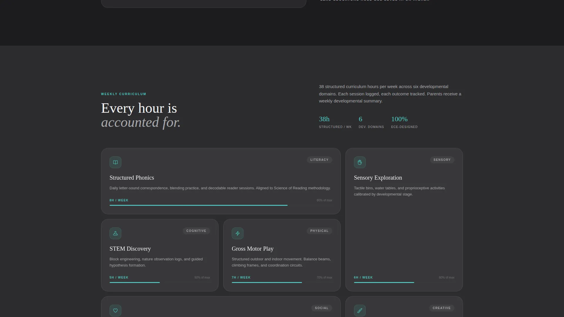
You get a fully structured, section-led landing page that communicates preschool and daycare value through data visualizations, progressive scroll reveals, and a persistent comparison module. Every section is sequenced to move a skeptical parent from curiosity to commitment.
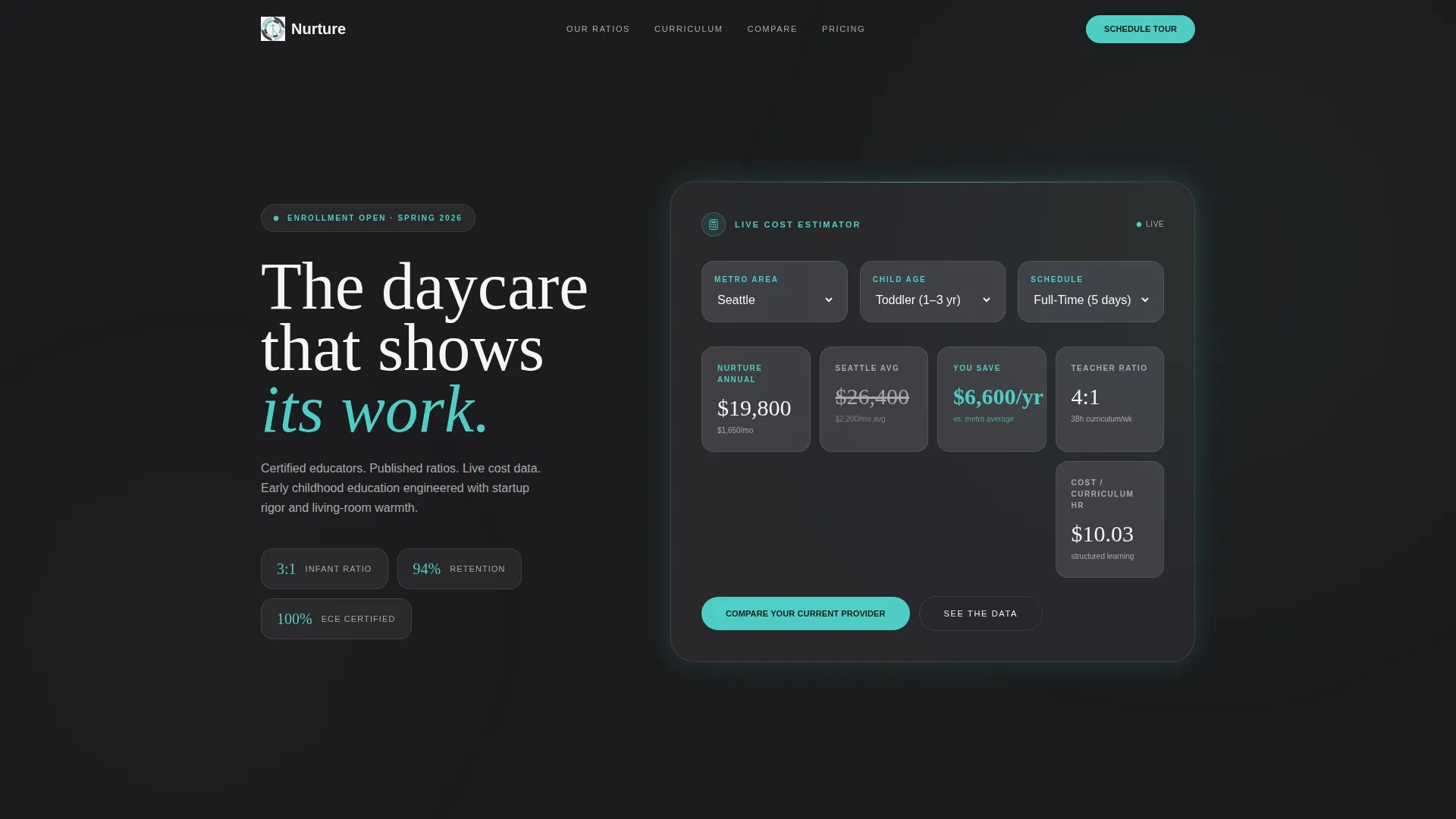
- A live cost-comparison calculator in the header, pre-populated with metro area average daycare rates and animated in real time
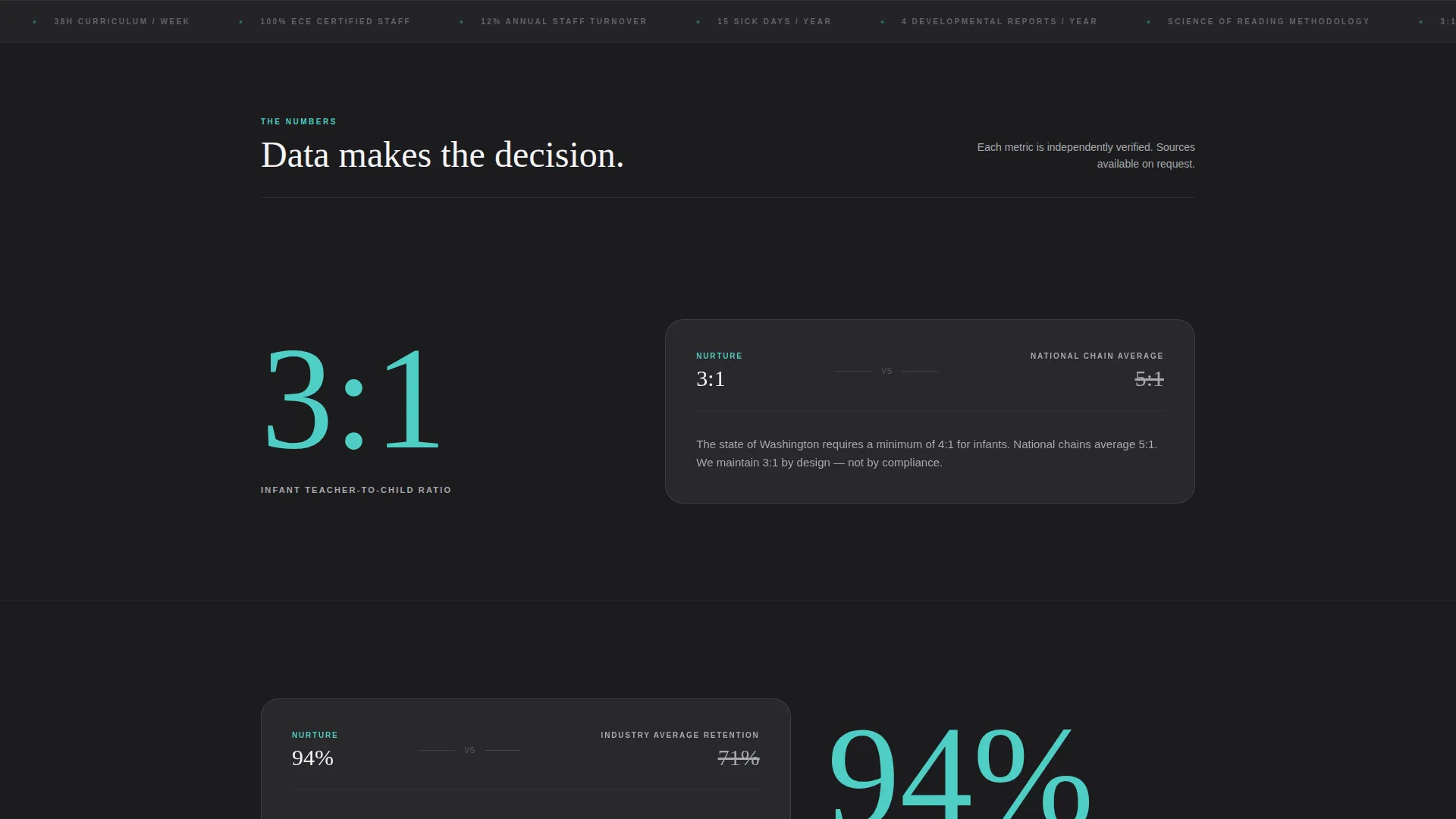
- A stats-first scroll flow where each key metric lands alone before supporting context appears around it
- A split-column comparison module toggling between two competitor types across eight metrics, plus dual call-to-action paths
Feature list
This template includes a focused set of purpose-built components, each one mapped directly to how data-oriented families make childcare decisions.
Live Cost-Comparison Calculator
The header features an interactive estimator that accepts a child's age, schedule needs, and zip code. It animates annual cost, teacher-to-child ratio, and curriculum hours per week in real time on frosted glass panels, giving parents concrete numbers before any copy asks for their trust.
Stats-First Scroll Reveals
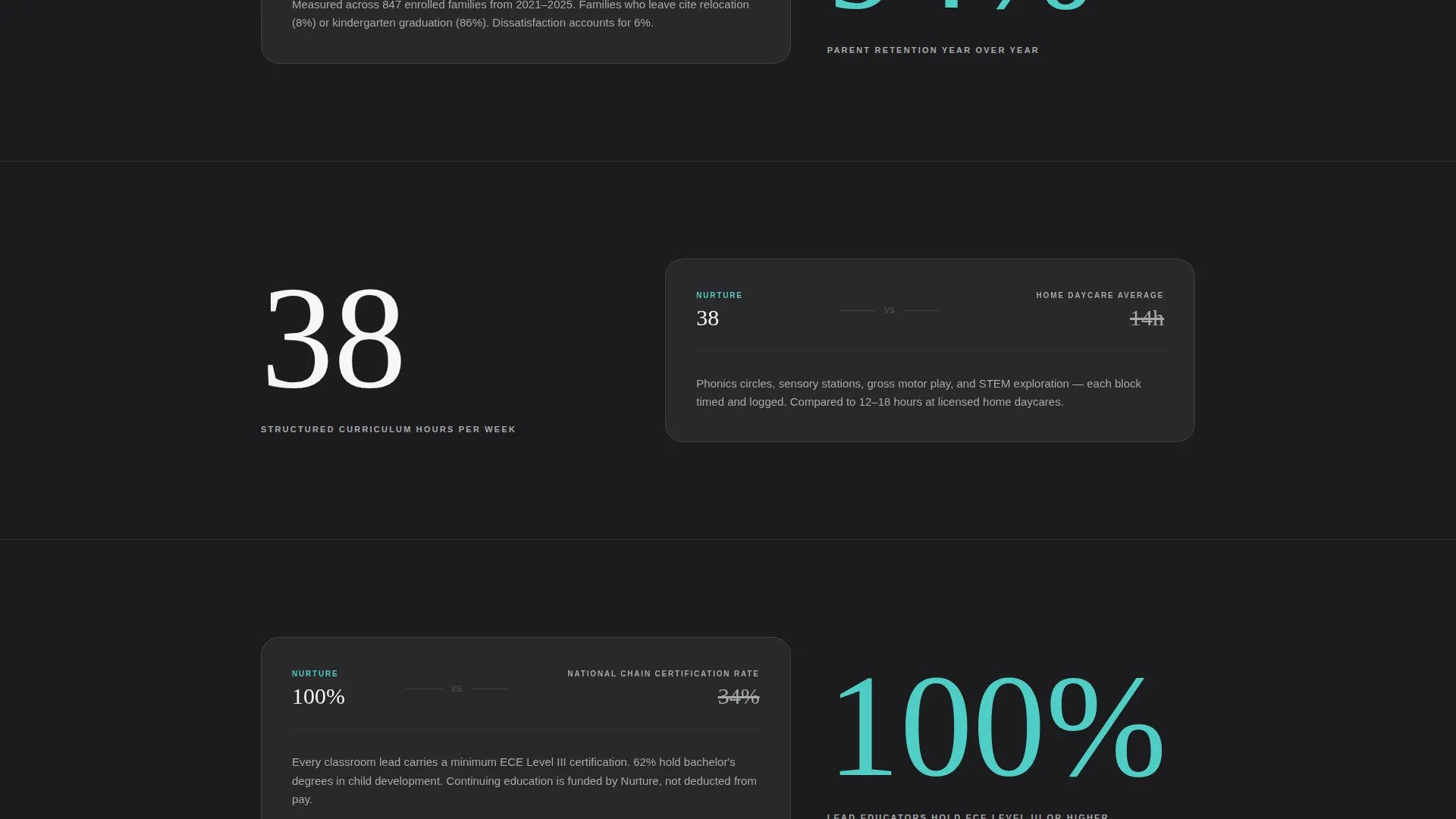
Each section of the page opens with a single statistic displayed alone in the viewport. The surrounding context, ratio explanations, state requirement comparisons, and competitor benchmarks, then builds around it. The scroll feels like a pitch deck dealing one data point at a time, with tension built through accumulation rather than emotion.
Persistent Comparison Module
A split-column module stays accessible as visitors scroll. They can toggle between two comparison modes: "Us versus. National Chains" and "Us versus. Home Daycare." Eight metrics are displayed, including cost-per-developmental-hour, staff certification rates, and sick-day flexibility policies, making side-by-side evaluation effortless.
Personalized Comparison PDF Path
The primary call to action, "Compare Your Current Provider," opens a short qualifier. Visitors select their current provider type, child's age, and biggest frustration from a dropdown. A personalized comparison document is then emailed to them instantly, turning a passive browser into a warm lead.
Transparent Tour Scheduling
A secondary call-to-action path, "Schedule a Transparent Tour," is anchored after the ratio section. By that point in the scroll, the data has already built enough credibility that scheduling a tour feels like a natural next step rather than a pressure moment.
Frosted Glass Panel Layout
All data fields, stat reveals, and comparison modules are presented inside frosted glass panels. This visual treatment reinforces the tech-glass theme and keeps the focus on content rather than decoration, making numbers feel precise and trustworthy rather than clinical.
Page sections overview
| Section | Purpose |
|---|---|
| Header Calculator | Interactive cost estimator with real-time animated metrics |
| Ratio Stat Reveal | "3:1" ratio lands first, then context and benchmarks build around it |
| Retention Stat Reveal | "94%" parent retention arrives alone before methodology is explained |
| Comparison Module | Toggle between national chains and home daycare across eight metrics |
| Primary call to action Block | "Compare Your Current Provider" qualifier and PDF delivery path |
| Tour call to action Anchor | "Schedule a Transparent Tour" placed after the ratio section |
Design & branding system
The visual identity follows a Tech Glass theme built on a Monochrome Steel color system. The palette was chosen to feel like a polished tablet displaying a child's developmental dashboard: cool, trustworthy, and unexpectedly calming.
- Core colors: deep charcoal (#1C1C1E), brushed aluminum (#A8A9AD), and clinical white (#F5F5F7) form the structural palette
- Accent color: soft teal (#4ECDC4) is reserved exclusively for interactive elements and data highlights, keeping the visual hierarchy clear
- All data fields and stat panels use frosted glass styling, reinforcing the theme without adding visual noise
Mobile & speed optimization
The scroll-reveal structure and frosted glass panels are designed to translate cleanly across screen sizes. Progressive disclosure, where content builds section by section, keeps the mobile experience focused and prevents information overload on smaller viewports.
- Each stat-reveal section is designed as a full-viewport moment, which works naturally on both desktop and mobile displays
- The comparison module uses a toggle interaction that adapts to touch-based navigation without requiring horizontal scrolling
- The calculator header is structured with clear, discrete input fields that are easy to use on a mobile keyboard
How this template helps you convert
Every design and layout decision in this template serves one goal: moving a research-driven parent from skeptical visitor to scheduled tour or requested comparison document.
- The calculator in the header produces personalized numbers immediately, replacing the visitor's anxiety with data that is specific to their situation and metro area, making the first impression a useful one rather than a sales pitch.
- The stats-first scroll sequence builds an evidence stack section by section, so that by the time any call to action appears, the parent has already been given enough data to form a strong opinion in favor of the provider.
- The dual call-to-action structure, a personalized PDF path and a tour scheduling anchor, captures both the ready-to-act parent and the still-comparing parent without forcing either into the wrong funnel.
Other information about this template
This template sits at the intersection of the technology category and the daycare and preschool services niche. It was designed with an intersection match score of 13, reflecting a deliberate pairing of data-forward design language with an emotionally significant service category. The result is a landing page that feels categorically different from typical childcare websites.
- The template style is Scroll Reveal (Progressive), meaning content is sequenced to appear as the visitor scrolls rather than presented all at once on load
- The creative direction is Stats-First Impact, a layout philosophy where data leads and context follows, borrowed from investor pitch deck structure
- The header concept is a Calculator and Estimator, one of the highest-engagement entry points for cost-sensitive, research-driven audiences
- The landing page direction is Comparison and Versus, meaning the page is architecturally built around helping visitors evaluate options rather than simply describing a single product
Theme
Tech Glass
Creative direction
Stats-First Impact
Color system
Monochrome Steel
Style
Scroll Reveal (Progressive)
Direction
Comparison/Versus
Page Sections
Live Cost-comparison Calculator
Stats-first Scroll Reveal Flow
Persistent Comparison Module
Personalized Comparison PDF Path
Frosted Glass Panel Design
Dual Call-to-action Structure
Related questions
Can I edit the calculator inputs to match my own pricing and ratio data?
Does the template include the PDF generation and email delivery functionality?
How many comparison metrics are included in the split-column module?
Is this template suitable for a preschool that serves multiple age groups?
Can I adapt this template if my preschool has a warmer, less data-focused brand?



