Agriculture Software Specialist Directory Website Template
Cultivar is a comparison table landing page template built for agriculture project management platforms. It guides large-scale farm operators, agribusiness consultants, and cooperative directors through a structured Problem to Solution narrative, showing exactly how a unified dashboard outperforms spreadsheets and generic tools across every critical field operation.
by Rocket studio
Quick summary
Cultivar is a single-page, comparison-driven template designed for agriculture software platforms. It opens with a Feature Tab Switcher, walks visitors through escalating pain-point comparison tables, and closes every section with a conversion prompt. The layout speaks directly to operations-minded buyers who evaluate software on capability, not aesthetics.
Who this template is for
This template is built for software teams and platform founders serving serious agricultural operators. It resonates with buyers who need evidence, not inspiration.
- Farm operations managers running large-scale row crop operations who need to justify a new platform investment
- Agribusiness consultants managing multiple client portfolios who need a clear, side-by-side capability comparison
- Cooperative directors preparing yield forecasts and compliance documentation before board-level meetings
What problem this template solves
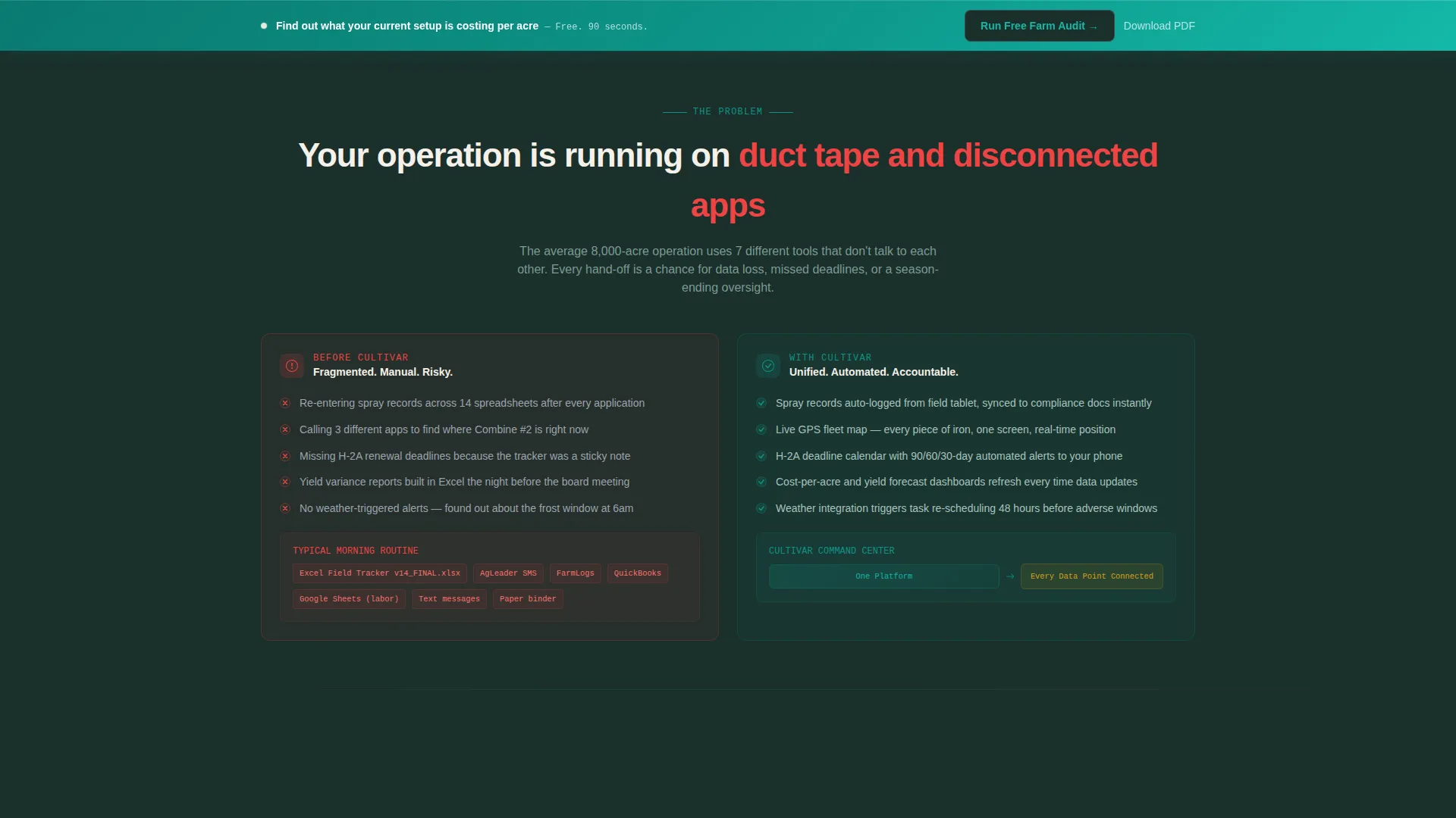
Large agricultural operations run on fragmented tools. Schedules live in spreadsheets, equipment status sits in a separate app, and compliance deadlines get tracked on sticky notes. That fragmentation costs time and, in peak season, costs yield.
- Buyers arrive already evaluating options; they need a structured comparison, not a generic features list
- Generic project management templates cannot show field-level specifics like spray window alerts or H-2A visa deadline tracking
- Without a comparison format, visitors leave without understanding what they would lose by staying with their current tools
What you get with this template
Cultivar delivers a fully structured, section-led landing page ready for agriculture software positioning. Every component is intentional and grounded in how operations-focused buyers actually evaluate platforms.
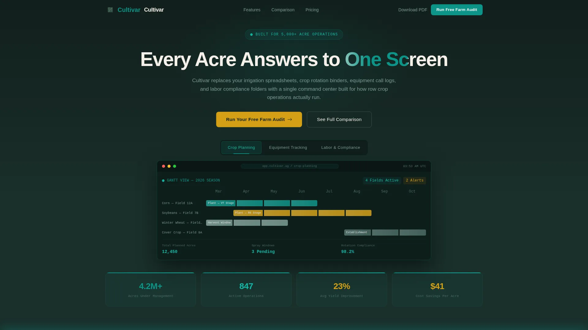
- A Feature Tab Switcher header with three labeled tabs: Crop Planning, Equipment Tracking, and Labor and Compliance, each revealing a distinct product screenshot
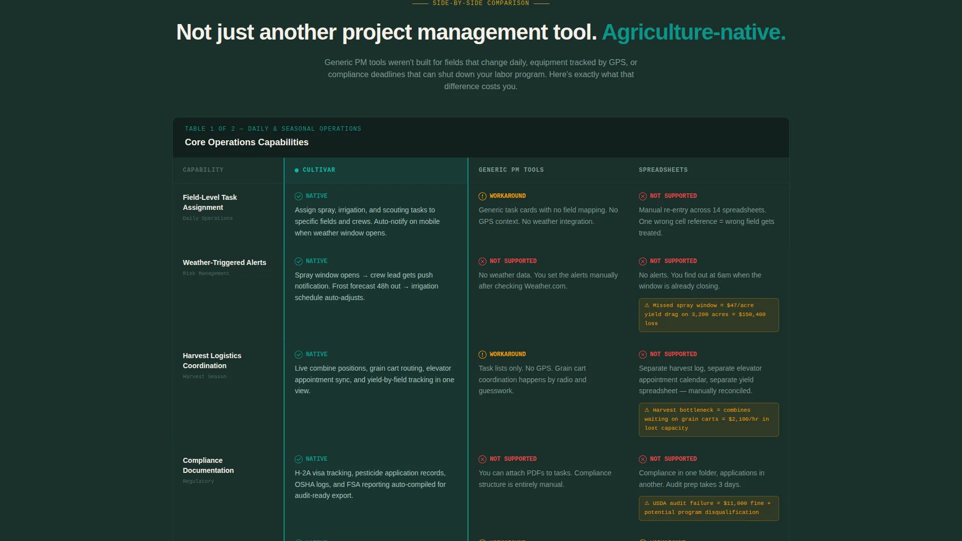
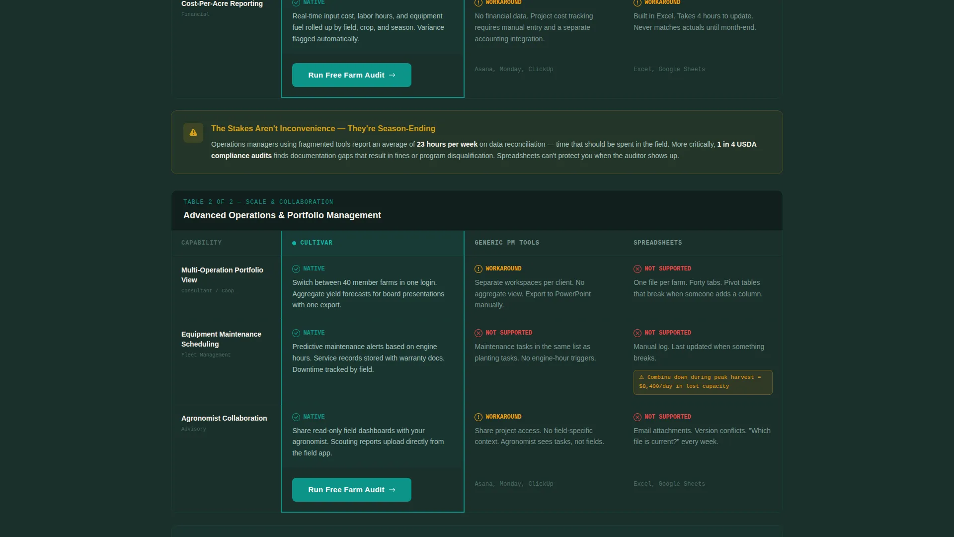
- Multiple comparison tables contrasting the platform against generic project management tools and spreadsheets, with failure scenarios written into the losing columns
- Two conversion paths: a primary "Run Your Free Farm Audit" sticky bar with a guided intake form, and a secondary "Download the Comparison PDF" email capture for later-stage visitors
Feature list
A single paragraph introduces the feature set: every element below was purpose-built for the agriculture software buying context, where trust is earned through specificity and operational detail.
Feature Tab Switcher Header
Three clickable tabs sit inside a deep earth-toned navigation bar. Each tab, Crop Planning, Equipment Tracking, and Labor and Compliance, reveals a different product screenshot with real interface density. Active tabs glow in teal, signaling focus without distracting from the content below.
Escalating Comparison Tables
Each table section compares the platform against generic project management tools and spreadsheets. Losing columns show specific failure scenarios, such as manual re-entry across multiple spreadsheets or missed spray windows. Stakes escalate row by row from daily inconvenience to season-ending risk.
Problem and Solution Visual Arc
The page opens with a side-by-side contrast: a chaotic view of disconnected tools versus a unified dashboard. This visual anchor sets the Problem to Solution narrative that carries through every subsequent section, keeping the reader oriented and moving forward.
Sticky Audit call to action Bar
A "Run Your Free Farm Audit" call-to-action bar activates after the second comparison table section. It stays visible as the visitor scrolls, creating a persistent, low-friction entry point. The bar also anchors to the bottom of every comparison table for immediate response.
Farm Audit Intake Form
The audit form begins with a total managed acreage slider ranging from 500 to 50,000 or more acres. It then asks for operation type and current tools in use, including multi-select checkboxes that name competitor platforms directly. This structure qualifies leads while reducing form abandonment.
Secondary PDF Lead Capture
A "Download the Comparison PDF" path targets visitors who are deep in evaluation mode but not ready to commit. It captures an email address in exchange for the comparison data in offline-ready format, extending the conversion window beyond the first visit.
Page sections overview
| Section | Purpose |
|---|---|
| Feature Tab Switcher | Introduce platform modules with screenshot previews |
| Pain Point Contrast | Show fragmented tools versus unified dashboard visually |
| Comparison Table One | Compare field-level task assignment across tool types |
| Comparison Table Two | Contrast weather alerts and harvest logistics handling |
| Sticky Audit Bar | Persistent primary call to action activated mid-scroll |
| Compliance Table | Highlight documentation and audit failure risks |
| Cost Reporting Table | Compare cost-per-acre reporting capabilities |
| Audit Intake Form | Qualify leads by acreage, type, and current tools |
| PDF Lead Capture | Secondary email capture for offline evaluation path |
| Page Footer | Anchor call to action and final conversion prompt |
Design & branding system
The visual identity uses a Teal Catalyst color system rooted in land, function, and clarity. Every color choice maps directly to a role in the interface, keeping the page readable and purposeful under the weight of dense comparison data.
- Deep tillable earth (#1A2F2B) anchors the navigation bar and section backgrounds, grounding the layout in an agricultural context
- Active teal (#0D9488) highlights selected tabs, active states, and primary interactive elements, providing clear visual focus
- Sun-bleached parchment (#F5F0E8) fills table backgrounds for comfortable reading, while harvest gold (#D4A017) marks the winning comparison column and all call-to-action states
Mobile & speed optimization
The template is structured to remain legible and functional on smaller screens, where many field-side buyers will first encounter it. Comparison tables are the most layout-intensive element and are handled with that reality in mind.
- Comparison tables adapt for narrow viewports so buyers can still read column-by-column breakdowns without horizontal scrolling disruption
- The sticky audit bar scales to mobile touch targets, keeping the primary conversion path accessible throughout the scroll
- Screenshot-heavy tab sections are sized and positioned to remain informative on tablet and mobile screen sizes without overwhelming load context
How this template helps you convert
Cultivar is built around a Comparison and Versus conversion model, meaning every design and copy decision is calibrated to move an evaluating buyer toward a decision.
- The escalating table structure raises the stakes gradually, moving from daily friction to season-ending risk, so visitors feel the cost of inaction before they reach the audit form
- The sticky call to action bar and per-table anchor placement ensure the primary conversion prompt is always within reach, regardless of where the visitor pauses in their evaluation
- The secondary PDF capture extends the conversion window for deep-evaluation visitors, turning a non-committing session into a qualified email lead
Other information about this template
This template is designed for the agriculture project management software category, where buyers are experienced operators who recognize vague claims immediately. Every structural choice reflects how this audience actually evaluates tools.
- The Directory and Discovery theme shapes the overall layout logic, presenting the platform as a findable, structured reference rather than a promotional brochure
- The no-lifestyle-photography directive keeps the template focused on software interface density, reinforcing credibility with technical evaluators
- This template supports positioning against competing platforms by naming them directly inside the audit form's multi-select checkboxes, a deliberate tactic for the Comparison and Versus page type
- The Teal Catalyst palette, with its topographic survey map aesthetic, is distinctive within the agriculture software space and avoids the generic green-and-brown commodity look
Theme
Directory & Discovery
Creative direction
Problem→Solution Arc
Color system
Teal Catalyst
Style
Comparison Table
Direction
Comparison/Versus
Page Sections
Feature Tab Switcher Header
Escalating Comparison Tables
Problem and Solution Visual Arc
Sticky Audit Call to Action Bar
Farm Audit Intake Form
Secondary PDF Lead Capture
Related questions
Who is this landing page template designed for?
Can I adapt the comparison tables for a different number of competitors?
Does this template include the actual audit form logic?
How does the Feature Tab Switcher work in the template?
Is this template suitable for a shorter agriculture software pitch?



