Daycare Landing Page Template with Split-Screen Design
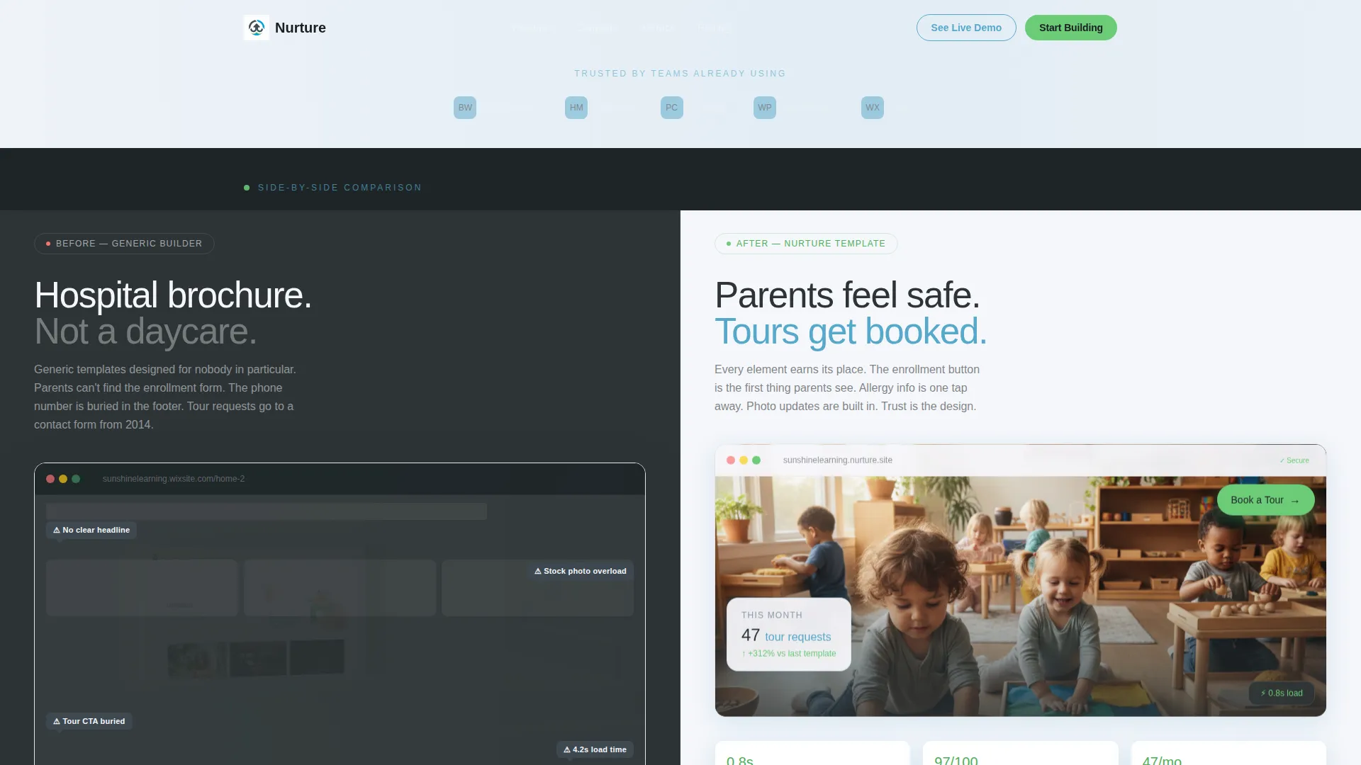
Nurture is a split-screen daycare landing page template built for daycare owners who need a site that earns parent trust fast. The design uses a Slate & Sky color system with a Data Command theme, structured as a side-by-side Comparison/Versus experience. Every section shows the problem and the solution at once, with clear calls to action that move parents toward booking a tour.
by Rocket studio
Quick summary
Nurture is a single-page, split-screen daycare landing page template designed for daycare directors who are done with generic, clinical-looking website builders. The layout uses a 50/50 Comparison/Versus structure to show parents exactly why this template stands apart. Every section is built to build trust and move visitors toward one clear action: booking a tour.
Who this template is for
This template is made for daycare owners and directors who need a professional web presence without the frustration of starting from scratch. If you have tried multiple builders and ended up with something that looks like a hospital brochure, this template was built with you in mind.
- Daycare owners launching or refreshing their digital presence
- Directors who want parents to feel safe and confident before ever visiting
- Childcare professionals who need a polished, conversion-ready page without a developer
What problem this template solves
Most daycare websites fall into the same trap: cluttered layouts, buried contact forms, and nothing that makes a parent feel welcome. The Nurture template solves this by replacing visual noise with a structured, warm, side-by-side experience that shows parents what good looks like.
- Generic designs that fail to communicate trust or warmth to prospective families
- Hard-to-find contact options that reduce tour bookings and parent inquiries
- A slow, frustrating build process that wastes weekends on the wrong tool
What you get with this template
You get a complete, ready-to-customize landing page built around the Comparison/Versus experience. The template is structured so that every section makes an argument for itself, visually and functionally, without requiring any copywriting expertise from you.
- A full split-screen (50/50) single-page layout with left-panel versus right-panel sections
- A sticky "Book a Tour" call-to-action bar and a secondary ghost-button demo link on every versus section
- A Logo Bar header, annotated pain-point screenshots, and dashboard gauge visuals that fill on scroll
Feature list
This template is built with a focused set of components that serve one goal: helping parents trust the daycare and take action quickly.
Split-Screen Comparison Layout
Every section is divided into a left panel and a right panel. The left shows a common problem (a cluttered, generic daycare site) and the right shows the same content rebuilt cleanly. The contrast does the selling for you.
Sticky "Book a Tour" Call to Action
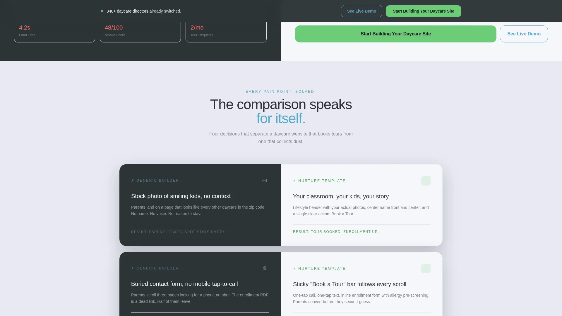
A persistent call-to-action bar travels with the visitor as they scroll. It is styled in signal green so it is always visible and always clear about the next step.
Scroll-Triggered Dashboard Gauges
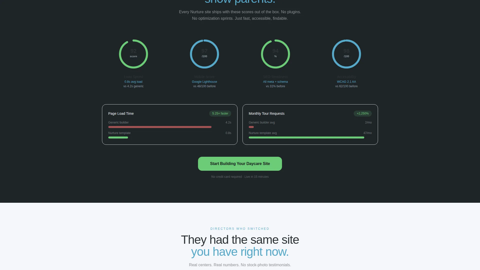
Load-speed benchmarks, mobile responsiveness scores, and readiness meters are rendered as visual dashboard gauges. They fill with color as the visitor scrolls into each section, making metrics feel dynamic and credible.
Logo Bar Header
The page opens with a horizontal strip of recognizable childcare platform logos, anchoring credibility before the visitor even reads the first headline.
Annotation Callout Bubbles
Slate-gray callout bubbles overlay the "before" screenshot panels to highlight specific pain points. Visitors immediately understand the problem without needing a paragraph of explanation.
Ghost-Button Demo Path
A secondary "See the Live Demo" ghost-button in sky blue appears alongside every primary call to action. There is no email gate on the demo, so the template sells itself through proof.
Page sections overview
| Section | Purpose |
|---|---|
| Logo Bar Header | Establishes credibility with childcare platform logos |
| Split Viewport Hero | Contrasts a cluttered site with the clean template side by side |
| Pain Point Panels | Annotated callouts highlight problems on the left panel |
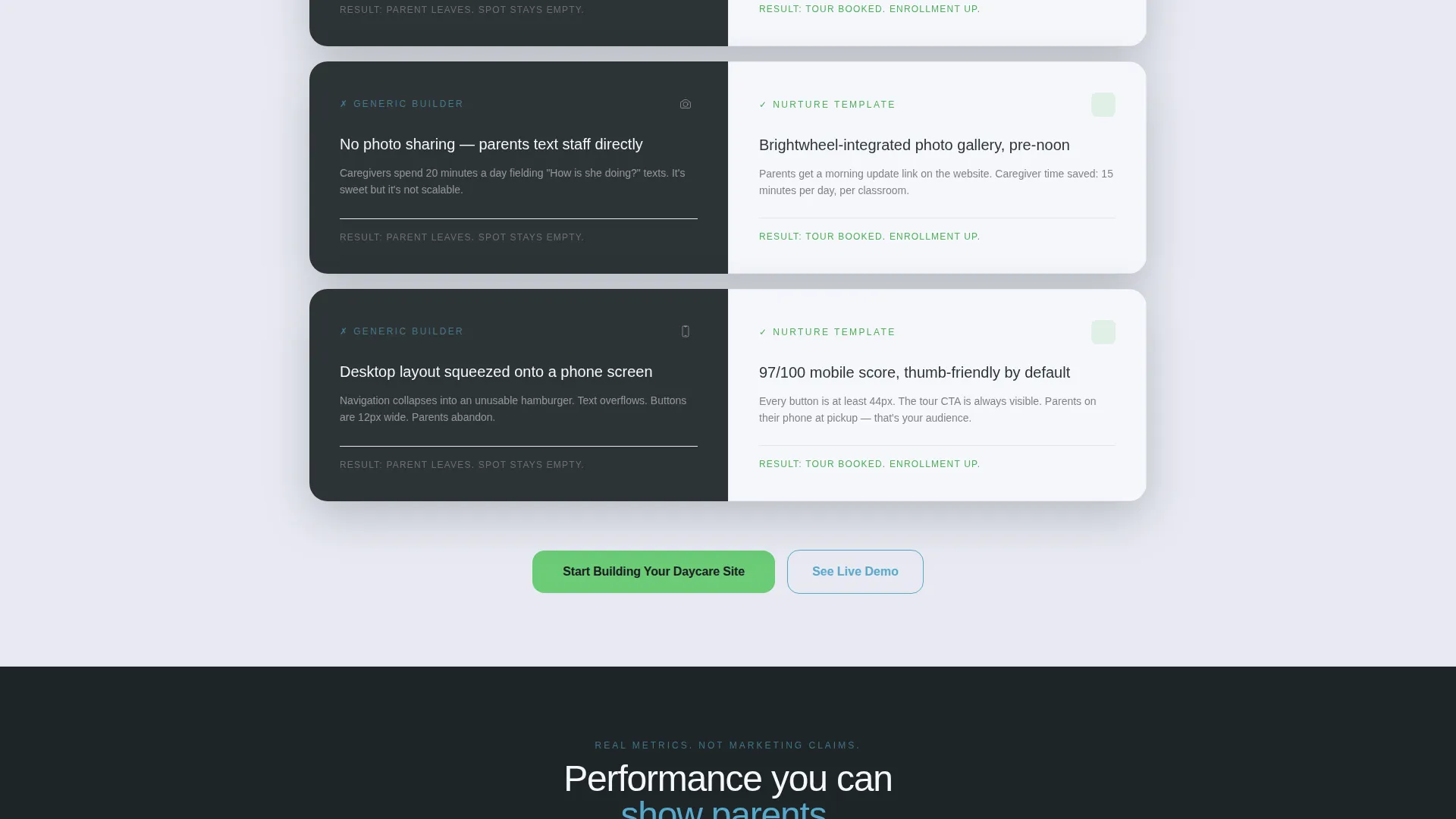
| Versus Section Cards | Each card compares a generic feature to the template version |
| Dashboard Gauge Strip | Scrollable metrics fill to show readiness benchmarks visually |
| Sticky Tour Bar | Persistent call to action keeps conversion path always visible |
| Demo Ghost Button | Frictionless path to the live template preview |
| Bottom call to action Section | Final conversion prompt with primary and secondary actions |
Design & branding system
The visual identity follows a Data Command theme using the Slate & Sky color system. The palette feels organized and purposeful, clinical enough to signal competence and warm enough to communicate care.
- Deep operations slate (#2D3436) dominates left-panel backgrounds for structure and authority
- Soft cloud white (#F5F6FA) and open-sky blue (#56A8CB) bring lightness and openness to right-panel highlights
- Signal green (#6BCB77) is reserved exclusively for calls to action and checkmarks, so every decision point is visually unmistakable
Mobile & speed optimization
The template is designed to present cleanly across screen sizes. The split-screen layout adapts so that the versus experience remains readable and engaging on smaller devices.
- Split panels reflow for mobile without losing the side-by-side comparison intent
- Scroll-triggered gauge animations are built into the section structure for smooth visual engagement
- Sticky call-to-action bar remains accessible on mobile so the tour booking path is never buried
How this template helps you convert
The entire page is structured as a conversion sequence, not just a brochure. Every design decision moves the visitor from curiosity to confidence to action.
- The Logo Bar and annotated pain-point panels build immediate trust and recognition in the first scroll, so visitors understand the value before they read a single feature claim.
- Scroll-triggered dashboard gauges introduce real metrics visually, replacing skepticism with evidence as the visitor moves down the page.
- Signal green primary calls to action and no-friction ghost-button demo access appear at the bottom of every versus section, so the visitor can convert the moment conviction hits.
Other information about this template
This template is designed to complement the tools that daycare professionals already use day to day. While the template itself does not include backend integrations, it can support linking to external booking and communication platforms your team relies on.
- Template style: Split Screen (50/50) single landing page
- Theme: Data Command with Slate & Sky color system
- Creative direction: Launch Energy, driving scroll momentum with kinetic section transitions
- Header concept: Logo Bar for immediate third-party credibility
- Landing page direction: Comparison/Versus, structured so each section is a side-by-side argument
- Compatible context: Designed for daycare owners building on platforms like WordPress or Wix, or any builder that supports custom HTML and CSS layouts
- The childcare platform logos featured in the Logo Bar (Brightwheel, HiMama, Procare) are used as visual credibility anchors in the header strip
Theme
Data Command
Creative direction
Launch Energy
Color system
Slate & Sky
Style
Split Screen (50/50)
Direction
Comparison/Versus
Page Sections
Split-screen Comparison Layout
Sticky Book a Tour Bar
Scroll-triggered Dashboard Gauges
Logo Bar Header Strip
Annotation Callout Bubbles
No-gate Ghost Button Demo
Related questions
Is this template suitable for a small, single-location daycare?
Can I replace the logo bar with my own credentials or certifications?
Does the live demo require an email address or sign-up?
How does the Comparison/Versus layout work in practice?
What happens to the split-screen layout on a mobile screen?



