Hydroponics Booking System Landing Page Template
Nurture is a single-page comparison landing page template built for a hydroponics booking platform. It helps urban micro-farmers, co-op managers, and commercial indoor farm operators see exactly why a dedicated booking system beats spreadsheets and whiteboards. The page flows from a dashboard screenshot hero through animated stats, detailed comparison tables, and a freemium signup form.
by Rocket studio
Quick summary
Nurture is a high-converting comparison landing page template for a hydroponics booking platform. It opens with a live-look dashboard screenshot, rolls into animated utilization counters, and builds its case through side-by-side comparison tables. The design uses a controlled-environment color palette and ends with a low-friction freemium signup flow targeting indoor farm operators.
Who this template is for
This template is built for teams selling or promoting a hydroponics booking system to operational decision-makers in indoor farming. It speaks directly to people who manage real rack space, real grow cycles, and real deadlines.
- Urban micro-farmers running multiple concurrent grows across more than one facility
- Co-op managers allocating shared rack space among many members
- Commercial indoor farm operators who need every bay producing on rotation without downtime
What problem this template solves
Scheduling grow slots across shared indoor farms is messy without a dedicated tool. Double-booked bays, missed nutrient changeovers, and untracked harvest dates cost operators time and yield. This template makes the cost of staying on spreadsheets and whiteboards feel immediate and real.
- No single view of rack availability across multiple facilities or shared co-op spaces
- Manual scheduling tools cannot enforce nutrient cycle timing or flag harvest-window conflicts
- Operators waste hours each month rebuilding schedules that a booking platform could handle automatically
What you get with this template
You get a fully structured, single-page landing page template designed around the hydroponics booking use case. Every section is purpose-built to guide a skeptical farm operator from curiosity to signup.
- A product screenshot hero section with a headline, device mockup frame, and dashboard visual showing rack calendar and utilization badge
- Three animated stat counters, multi-column comparison tables with checkmark and empty-cell formatting, and a pinned freemium call-to-action bar
- A three-field signup form collecting email, facility count, and total rack slots, plus a secondary path to a guided demo
Feature list
This template covers every layout decision a hydroponics booking platform needs to make its case on a single page.
Product Screenshot Hero Section
The header drops a high-fidelity dashboard screenshot directly into the viewport. It shows a seven-day rack calendar with color-coded grow phases, three facilities in a left sidebar, and a 94.2% utilization badge. A single headline sits above the device mockup: "Every Bay. Every Cycle. Booked."
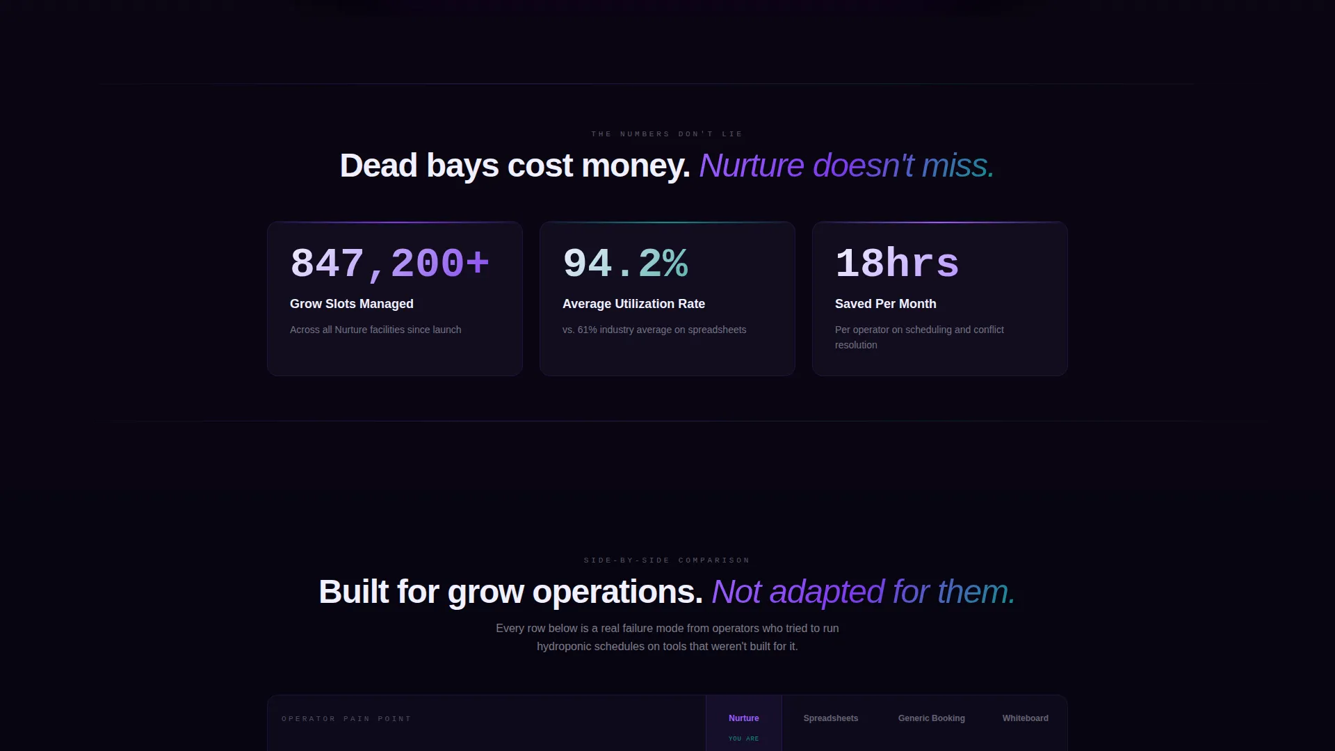
Animated Stats Block
Three large counters animate on scroll entry, showing total grow slots managed, average utilization rate, and hours saved per month on scheduling. This section creates immediate credibility before the visitor reaches any comparison content.
Comparison Tables with Pain-Point Rows
The core of the page is a set of comparison tables pitting the booking system against spreadsheets, generic booking tools, and pen-and-whiteboard methods. Each row targets a real operator pain point. Checkmarks appear in phosphor violet and empty cells in muted gray, making gaps between tools instantly visible.
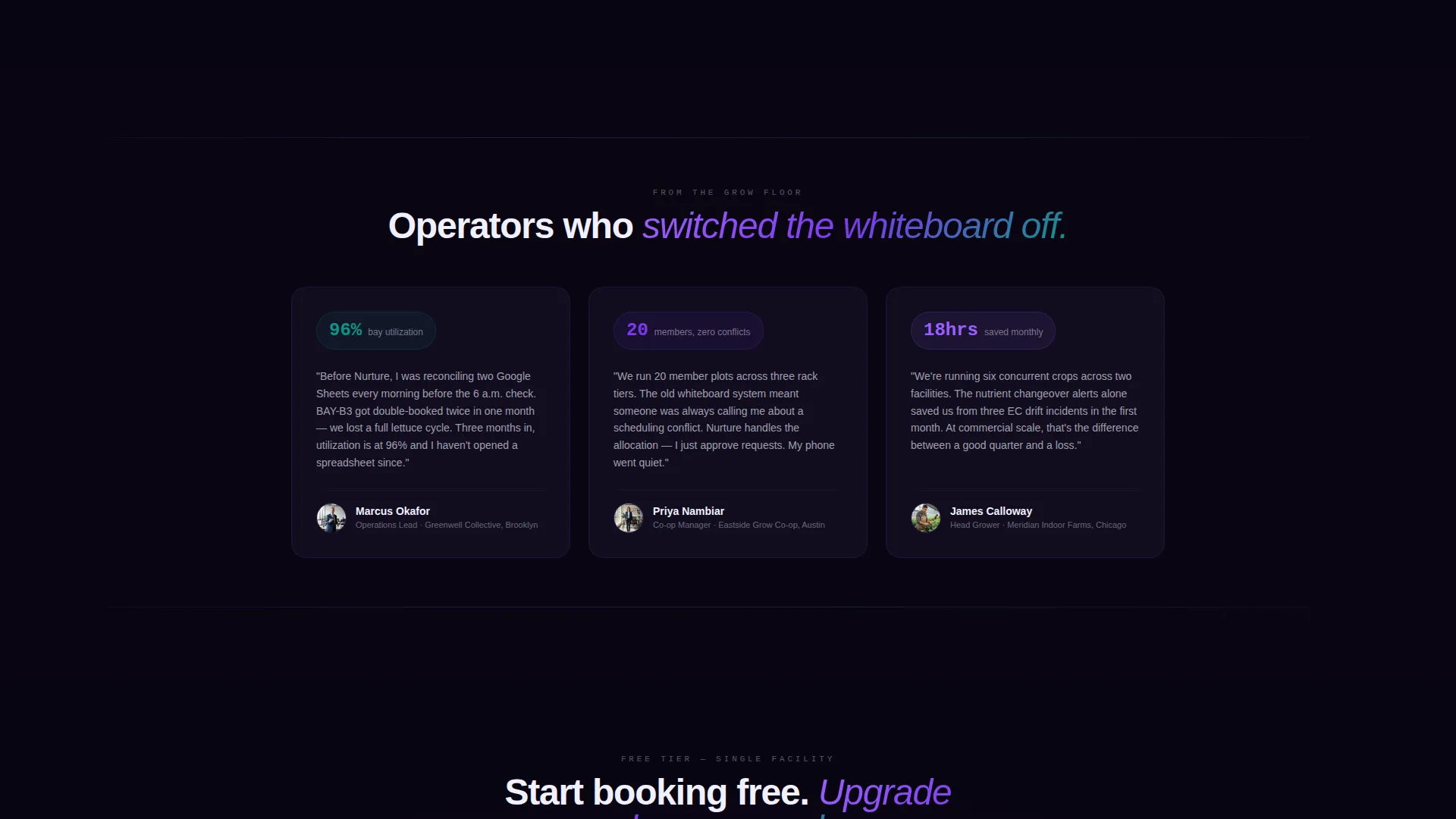
Freemium Signup Form
The primary call-to-action reads "Start Booking Free" and appears both below the comparison tables and as a floating bar after the visitor scrolls past fifty percent of the page. The form asks for only three fields: email address, facility count, and total rack slots.
Guided Demo Secondary Path
A secondary conversion path labeled "See It With Your Farm's Data" links operators to a guided demo experience. This path captures visitors who want proof before committing, reducing drop-off among high-intent but cautious buyers.
Electric Indigo Color System
The entire template uses a four-color palette built around deep grow-light indigo, phosphor violet, nutrient-solution teal, and propagation white. Color-coded grow phases in the hero screenshot align with this palette, creating visual consistency from hero to form.
Page sections overview
| Section | Purpose |
|---|---|
| Hero Screenshot Header | Introduce the dashboard and anchor the headline |
| Animated Stats Block | Establish credibility with live-look counters |
| Comparison Table: Spreadsheets | Show gaps between manual tracking and the platform |
| Comparison Table: Generic Tools | Highlight missing hydroponics-specific features |
| Comparison Table: Whiteboard | Make analog scheduling feel costly and fragile |
| Primary call to action Section | Drive freemium signups with a three-field form |
| Floating call to action Bar | Capture mid-scroll intent with a persistent prompt |
| Guided Demo Path | Offer a low-risk secondary conversion for cautious visitors |
Design & branding system
The visual identity follows a Directory and Discovery theme built around an Electric Indigo color system. Every color choice references the physical environment of a controlled indoor farm at night.
- Deep grow-light indigo (#4B0082) and phosphor violet (#7C3AED) carry primary user interface elements and checkmark indicators
- Nutrient-solution teal (#0D9488) marks germination phase labels and supporting accents throughout the page
- Propagation white (#F0F0FF) is used for card backgrounds and comparison table cells, keeping data easy to scan
Mobile & speed optimization
The template is structured so that its most data-dense sections, the comparison tables and stat counters, remain readable and functional at smaller screen widths. Layout decisions prioritize clarity over decoration on every viewport.
- Comparison tables are designed to scroll horizontally on narrow screens without breaking the column structure
- The floating call-to-action bar is sized and positioned to avoid obscuring content on mobile displays
- The three-field signup form stacks cleanly in a single column on phones, keeping friction low for mobile visitors
How this template helps you convert
Every section of this landing page is arranged to build the case for switching before asking for a commitment. The sequence is deliberate and grounded in how operators actually evaluate new tools.
- The dashboard screenshot and utilization badge establish that the platform is already in active use, giving first-time visitors immediate social proof before they read a single feature claim.
- The animated stats counters quantify value in terms operators already care about: slots managed, utilization rates, and hours saved, making the benefit concrete rather than abstract.
- The comparison tables stack evidence row by row until switching feels more expensive than staying put, then the freemium form removes the final barrier by offering a no-cost starting point.
Other information about this template
This template is part of the Nurture template family, designed specifically for vertical SaaS products in the hydroponics and controlled-environment agriculture space. It fits naturally within a broader technology marketplace context for niche booking and scheduling platforms.
- The template style is Comparison Table, making it well-suited for any hydroponics booking system that needs to differentiate itself from general-purpose scheduling tools
- The freemium and trial landing page direction means the page is optimized for low-commitment entry points, with upgrade paths built into the copy structure
- The guided demo path supports sales-assisted conversion alongside self-serve signup, giving operators two distinct ways to get started


Theme
Directory & Discovery
Creative direction
Stats-First Impact
Color system
Electric Indigo
Style
Comparison Table
Direction
Freemium/Trial
Page Sections
Product Screenshot Hero with Dashboard View
Animated Stats Counters on Scroll
Multi-tool Comparison Tables
Freemium Signup Form with Floating Call to Action
Guided Demo Secondary Conversion Path
Electric Indigo Visual Identity System
Related questions
Who is this landing page template designed for?
What sections are included in this template?
Can I use this template for a free trial or freemium offer?
How does the comparison table section work?
What fields does the signup form collect?


