Self-Storage Vertical SaaS Cost Calculator Website Template
Occupancy is a hub-and-spoke self-storage analytics landing page built for operators who need real revenue clarity fast. It opens with a live revenue calculator, moves through anchored dashboard modules, and closes every section with a free trial call to action. The dark glass visual system makes dense data feel urgent and authoritative from the first scroll.
by Rocket studio
Quick summary
Occupancy is a single-page self-storage analytics dashboard template designed around a calculator-first experience. Visitors immediately see projected revenue impact before reading a word of sales copy. Five anchored spoke sections walk through each dashboard module in sequence, building from individual facility views to full portfolio intelligence.
Who this template is for
This template is built for self-storage professionals who manage real portfolios and need to communicate performance clearly. It speaks directly to operators who still spend hours in spreadsheets before every reporting cycle.
- Regional self-storage operators managing fifteen to forty facilities across a portfolio
- Real estate investment trusts running acquisition due diligence on self-storage assets
- Third-party management firms that build monthly performance decks for absentee property owners
What problem this template solves
Most self-storage operators lose time and credibility to slow, manual reporting. Performance data lives in disconnected exports, and the story it tells is always a day late. This template is designed to show visitors exactly how a connected analytics dashboard eliminates that gap.
- Reconciling occupancy and rate data still happens in spreadsheets, creating delays and errors
- Monthly owner reports take days to build and are outdated before they reach the inbox
- No single view connects unit mix, occupancy waves, and rate optimization across a full portfolio
What you get with this template
You get a fully structured hub-and-spoke landing page built around five named dashboard modules. Every section is anchored to a persistent navigation bar so visitors can jump directly to the feature most relevant to their role.
- A live revenue calculator embedded directly below the header, projecting dollar impact before any signup ask
- Five spoke sections, each pairing a specific operator pain point with an interactive dashboard preview
- A progressive signup form and a secondary gated PDF lead capture path for research-mode visitors
Feature list
This template ships with a focused set of interactive and structural components grounded in the source brief.
Revenue Impact Calculator
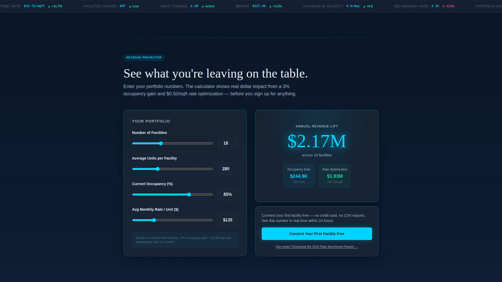
The calculator sits immediately below the header. Visitors enter their facility count, average unit count, and current occupancy rate. It instantly projects the revenue lift from a three-percent occupancy gain and a fifty-cent rate optimization, displaying the result in oversized signal cyan. The output is the trust mechanism: real dollar impact before any commitment.
Anchor Navigation Bar
A thin navigation bar pins to the top of the page throughout the entire scroll. It carries five spoke labels: Occupancy Engine, Rate Optimizer, Portfolio View, Comp Intel, and Reporting. Visitors can jump to any module without losing context, keeping the experience focused for operators with specific questions.
Dark Glass Panel Header
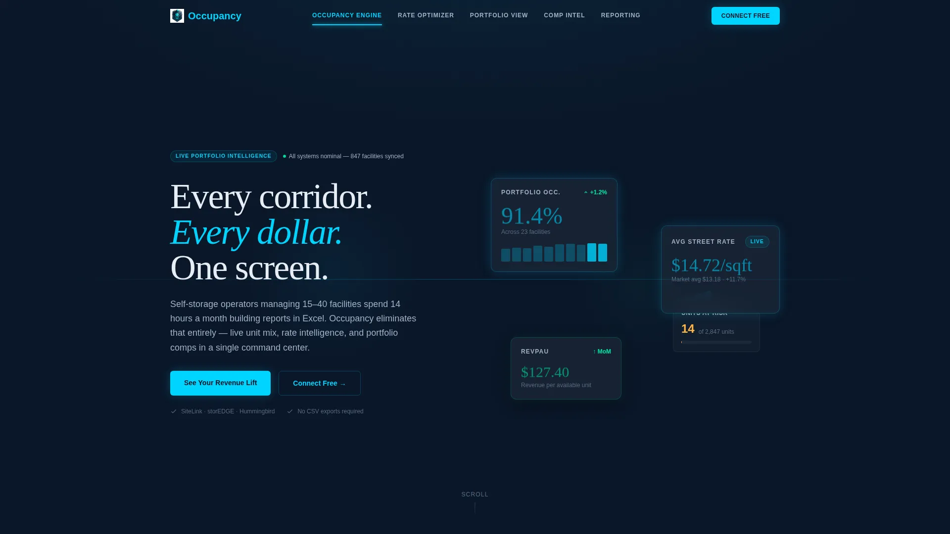
The header fills the viewport with translucent frosted-glass cards floating against a deep navy background. Each panel displays a live-style metric: portfolio occupancy at 91.4%, average street rate at $14.72 per square foot, and a revenue-per-available-unit sparkline. There is no hero image and no stock photography. The product interface is the visual.
Pain-Point-to-Preview Spoke Sections
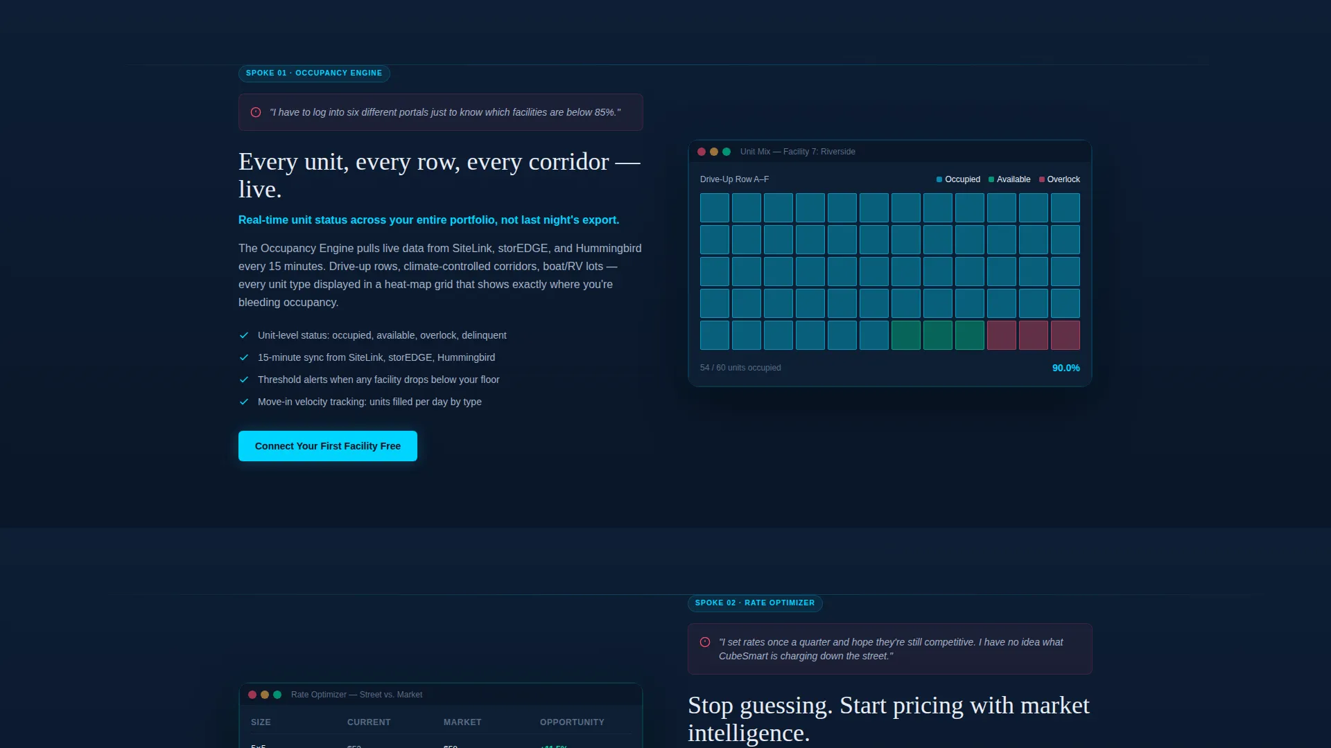
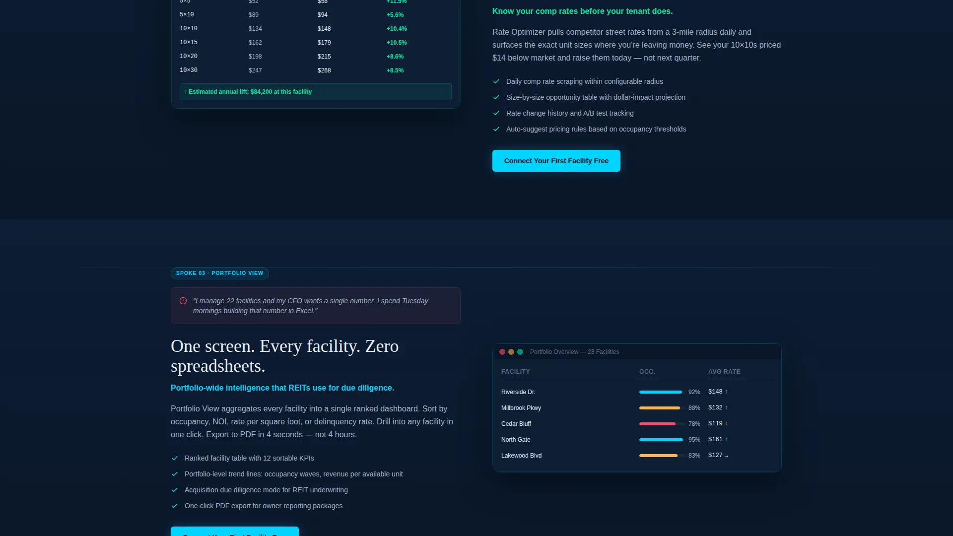
Each of the five spoke sections follows a consistent rhythm. A specific operator pain point is stated plainly, then an interactive dark-user interface dashboard preview is revealed directly below it. Screenshots are data-dense and annotated, with numbers ticking and charts drawing in. The visual language escalates from single-facility detail to full portfolio and competitive market intelligence.
Progressive Signup Form
The primary conversion path uses a two-step form. The first screen asks only for email address and facility count. After the visitor clicks through, the second screen asks for management software integration preference and portfolio size tier. This reduces friction at the entry point while qualifying leads for the next step.
Gated Benchmark Report Lead Capture
A secondary conversion path offers a downloadable rate benchmark report for visitors not yet ready to start a trial. This captures research-mode leads who are still evaluating options, keeping them inside the funnel without requiring a platform commitment.
Page sections overview
| Section | Purpose |
|---|---|
| Dark Glass Header | Display live portfolio metrics in frosted-glass panels |
| Revenue Calculator | Project dollar impact before any signup ask |
| Occupancy Engine | Show unit mix and occupancy wave tracking |
| Rate Optimizer | Demonstrate rate optimization across drive-up and climate-controlled units |
| Portfolio View | Reveal cross-facility performance in a single view |
| Comp Intel | Surface competitive market comparisons by geography |
| Reporting Module | Preview automated owner report generation |
| Primary call to action Band | Prompt trial signup after each spoke section |
| Benchmark Report Capture | Convert research-mode visitors with gated PDF offer |
Design & branding system
The visual identity follows a Directory and Discovery theme executed entirely in a Midnight Blue color system. Every color choice is functional, not decorative. The palette is built to make numbers feel urgent and data feel trustworthy.
- Background and surface: deep terminal navy (#0A1628) as the page base, steel-panel charcoal (#1B2838) for card and module surfaces
- Accent and interaction: signal cyan (#00D4FF) for live data highlights, calculator output figures, and hover states on interactive elements
- Typography and labels: muted silver (#A3B1C6) for secondary text, axis labels, and supporting copy throughout the dashboard previews
Mobile & speed optimization
The template is structured to keep the data-dense layout functional and readable across viewport sizes. The anchor navigation and calculator are core interactive elements that the layout preserves at smaller breakpoints.
- The hub-and-spoke layout uses section anchoring that remains navigable on tablet and mobile screen widths
- Dark glass panel cards and dashboard previews are sized to reflow without losing the layered depth effect on smaller displays
How this template helps you convert
The conversion architecture puts demonstrated value ahead of every ask. Visitors earn trust from the calculator result before they see a form field.
- The revenue calculator produces a personalized dollar figure in signal cyan immediately after the visitor inputs their portfolio details, making the value case concrete before any copy explains it.
- The primary call to action, "Connect Your First Facility Free," appears directly after the calculator result and repeats at the close of every spoke section, maintaining consistent conversion pressure without being intrusive.
- The gated benchmark report provides a lower-commitment path for visitors in research mode, capturing qualified leads who are not yet ready to start a trial but remain inside the funnel.
Other information about this template
This template is designed specifically for the self-storage vertical and reflects the operational vocabulary operators and managers use every day. It is built as a single landing page with a hub-and-spoke structure, not a multi-page site.
- The progressive form references management software integrations by category, supporting platforms in the SiteLink, storEDGE, and Hummingbird ecosystem families
- The template rhythm moves from individual facility detail to portfolio-wide intelligence to competitive market comparisons, widening the aperture spoke by spoke
- The calculator interaction is the primary trust-building mechanism and is intended to function before any visitor encounters a signup prompt
- The visual system is intentionally free of stock photography; the dashboard interface itself serves as the product demonstration throughout the page
Theme
Directory & Discovery
Creative direction
Calculator/Tool First
Color system
Midnight Blue
Style
Hub & Spoke (Anchor Nav)
Direction
Freemium/Trial
Page Sections
Live Revenue Impact Calculator
Pinned Anchor Navigation Bar
Dark Glass Panel Header
Pain-point-led Spoke Sections
Progressive Two-step Signup Form
Gated Benchmark Report Capture
Related questions
Who is this landing page template designed for?
What does the revenue calculator actually do?
Does this template include more than one conversion path?
What makes the visual design different from a typical SaaS landing page?
Can the template support a smaller self-storage portfolio?



