Onboard - Highconverting SaaS Landing Page Template
Onboard is a dashboard-style SaaS landing page template built for welcome email platforms. It opens with a live metrics wall, drops visitors into a revenue-loss calculator, and guides them through interactive sequence previews and annotated email teardowns. The design runs on a cold Monochrome Steel palette with a single signal-green accent that fires only when something is winning.
by Rocket studio
Quick summary
Onboard is a single-page, data-first landing page template for SaaS welcome email platforms. It leads with eight animated metric tiles, pulls visitors into an interactive revenue diagnostic, and unfolds like an analytics suite. Every section earns attention the way a sharp dashboard does: clear numbers, zero decoration, and a conversion path that feels like a natural next step.
Who this template is for
This template is built for teams who know their onboarding emails are underperforming and need a landing page that speaks the same language their buyers do.
- Growth leads at Series A startups tracking activation rate drops across new trial cohorts
- Product marketers managing multiple onboarding flows across different user segments
- Founder-operators whose welcome email has not changed since the early days of their product
What problem this template solves
Most SaaS landing pages for email tools look like brochures. They describe features in paragraphs when buyers need to see proof in numbers. This template closes that gap.
- Visitors arrive skeptical and leave before a generic hero section earns their trust
- Revenue lost to weak onboarding emails is invisible until someone quantifies it on the screen
- Founders and growth leads need a lead capture path that works even before a buyer is ready to commit
What you get with this template
You get a fully structured landing page that leads with data, earns trust through diagnostic interaction, and captures leads through two distinct paths.
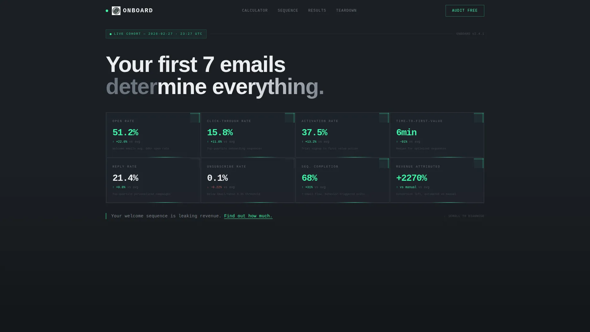
- A live-animated metrics wall with eight real-time tiles covering open rate, click-through rate (CTR), activation rate, time-to-first-value, reply rate, unsubscribe rate, sequence completion, and revenue attributed
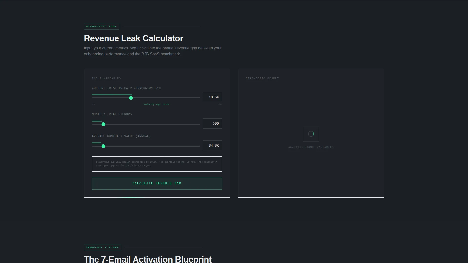
- An interactive revenue-loss calculator where visitors input their trial-to-paid conversion rate, monthly signups, and average contract value to see their annual revenue gap in signal green
- A progressive two-step lead capture form, a secondary email teardown input, and a persistent bottom-bar call to action
Feature list
This template is built around functional sections that do real work for the visitor before asking anything in return.
Animated Metrics Wall Header
Eight counting-up metric tiles open the page. They simulate a live cohort converting in real time. There is no hero illustration. The data is the visual.
Interactive Revenue Diagnostic
Visitors type in three numbers and see their annual revenue loss from poor onboarding emails. The result renders in signal green, large and impossible to ignore.
Sequence Builder Timeline Preview
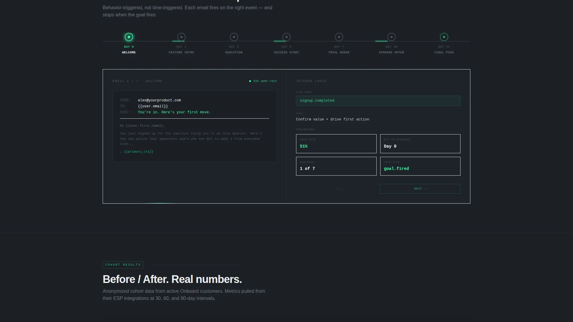
A horizontal timeline shows email timing across a seven-day onboarding flow. Visitors can see how a well-structured sequence is spaced before they ever sign up.
Dropout Heatmap Section
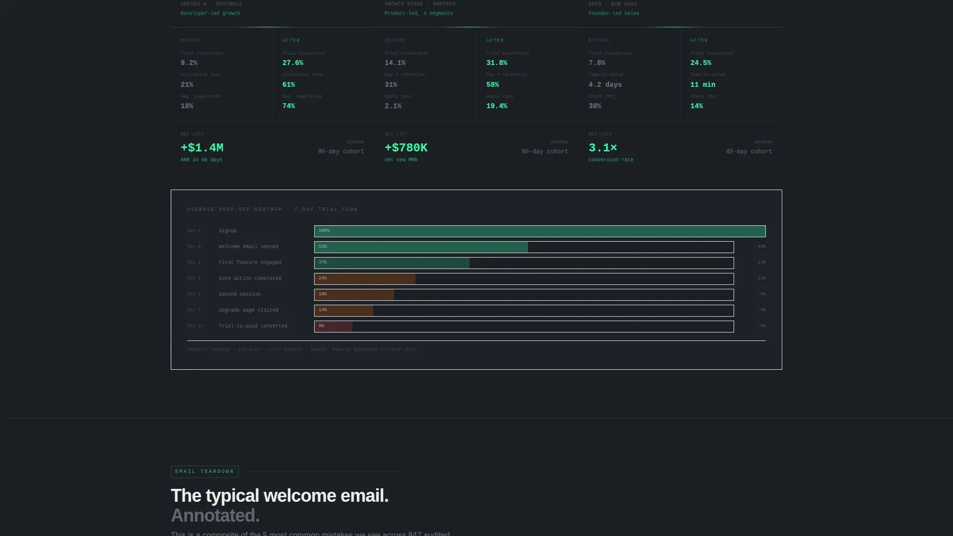
A visual heatmap shows where users typically fall off during a seven-day trial flow. It makes the cost of bad sequencing visible at a glance.
Before and After Metric Cards
Real customer data is displayed as before-and-after comparison cards. Each card shows a specific metric improvement so claims stay concrete and scannable.
Annotated Email Teardown
One anonymized welcome email is shown with inline annotations flagging what to fix. Visitors see the diagnostic thinking before they commit to a full audit.
Page sections overview
| Section | Purpose |
|---|---|
| Metrics Wall Header | Opens with eight animated real-time tiles |
| Diagnostic Subheadline | Sets the revenue-leak framing immediately |
| Revenue Loss Calculator | Quantifies the cost of weak onboarding emails |
| Primary call to action Block | First "Audit My Welcome Sequence Free" prompt |
| Sequence Timeline Preview | Shows email cadence across seven days |
| Dropout Heatmap | Visualizes where trial users disengage |
| Before / After Cards | Displays real customer metric improvements |
| Email Teardown Section | Annotated breakdown of a sample welcome email |
| Secondary call to action Bar | Persistent bottom-bar audit prompt |
| Progressive Lead Form | Two-step email capture with ESP and volume fields |
| Paste-and-Score Input | Secondary lead path via AI-scored email teardown |
Design & branding system
The visual identity follows a Data Command theme. Everything on the page is built to feel like a server-side dashboard at peak focus, not a polished marketing site.
- Color system is Monochrome Steel: deep gunmetal (#1B1F24) backgrounds, brushed aluminum (#A8B0BA) and terminal white (#EDEEF0) for text, and signal green (#3DF5A7) reserved exclusively for positive metrics and primary action elements
- Typography uses monospaced type for data labels and subheadlines, keeping the terminal aesthetic consistent throughout the page
- Green appears only when something is winning: an open rate climbing, a revenue figure landing, or a button ready to press
Mobile & speed optimization
The template is structured to keep the data-grid layout readable and functional at smaller screen sizes without sacrificing the dashboard aesthetic.
- Metric tiles reflow into a tighter grid on mobile so all eight stats stay visible above the fold
- The calculator input and result block stack vertically on narrow screens, keeping the revenue figure prominent
- Section transitions are designed to feel like tab navigation, which translates cleanly to a swipe-friendly mobile experience
How this template helps you convert
The conversion architecture is built around reducing friction at every decision point while keeping the revenue-loss framing active throughout the scroll.
- The calculator creates a personalized, quantified reason to act before any feature list appears, so visitors are primed to convert by the time they reach the first call-to-action button.
- Two parallel lead capture paths mean visitors who are not ready for a full trial can still enter the funnel by pasting their existing welcome email for an instant scored teardown delivered to their inbox.
Other information about this template
This template sits at the intersection of SaaS email tooling and high-intent performance landing pages. A few additional details are worth knowing before you customize it.
- The template is categorized under Technology, specifically the SaaS Email Templates subcategory, with a niche focus on SaaS welcome email use cases
- The "Audit My Welcome Sequence Free" call to action is designed for a freemium or free-trial conversion model, not a direct purchase flow
- The secondary paste-and-score path captures leads from visitors who want value before commitment, extending the funnel without adding a separate page
- The page structure follows a Calculator-First creative direction, meaning interactive diagnostic value comes before any feature explanation
- Each section is designed to feel like a deeper tab in an analytics suite, reinforcing the platform's core promise through the layout itself
Theme
Data Command
Creative direction
Calculator/Tool First
Color system
Monochrome Steel
Style
Dashboard/Data Grid
Direction
Freemium/Trial
Page Sections
Animated Metrics Wall Header
Interactive Revenue Loss Calculator
Seven-day Sequence Timeline
Trial Dropout Heatmap
Annotated Email Teardown
Dual-path Lead Capture
Related questions
Who is this landing page template designed for?
Can I use this template if I do not have real metric data yet?
How does the two-step lead form work?
Is the revenue calculator functional out of the box?
What makes this template different from a standard SaaS landing page?



