Onboard — Learner Platform Landing Page Template
Enroll is a split-screen education welcome email landing page template built for institutions that need to turn post-signup chaos into a clear, guided onboarding experience. It combines an interactive ROI calculator, a problem-to-solution scroll arc, and a freemium sign-up flow, helping admissions teams, course creators, and district IT leads convert new enrollees into engaged participants from day one.
by Rocket studio
Quick summary
Enroll is a single-page, split-screen (50/50) landing page template designed for education welcome email platforms. It opens with a live ROI calculator, walks visitors through a problem-to-solution narrative, and closes with a no-credit-card freemium trial offer. The template targets admissions coordinators, online course creators, and K-12 district IT leads who need smarter post-signup onboarding.
Who this template is for
This template is built for education professionals who manage the critical window between signup and first engagement. If onboarding confusion is costing you students, this is the page that makes the case for fixing it.
- Admissions coordinators handling high volumes of "I never got my login" support tickets each enrollment cycle
- Online course creators who see engagement drop off sharply after day one of a new cohort
- K-12 district IT leads onboarding thousands of families at the start of each school year
What problem this template solves
Most institutions send a single generic "Welcome!" email and hope for the best. New students, parents, and educators are left to navigate unfamiliar systems with no clear next step. The result is confusion, support overload, and quiet churn.
- Cluttered, non-personalized welcome emails that fail to guide different audiences (students, parents, educators) to the right starting point
- Admin teams buried in repetitive first-week support requests that a well-structured email sequence could have prevented
- No clear way to demonstrate the ROI of investing in a better onboarding email system before committing to a paid plan
What you get with this template
You get a fully structured, visually polished landing page layout ready to present your education welcome email platform. Every section is purpose-built for the education onboarding use case, from the interactive header tool down to the footer demo offer.
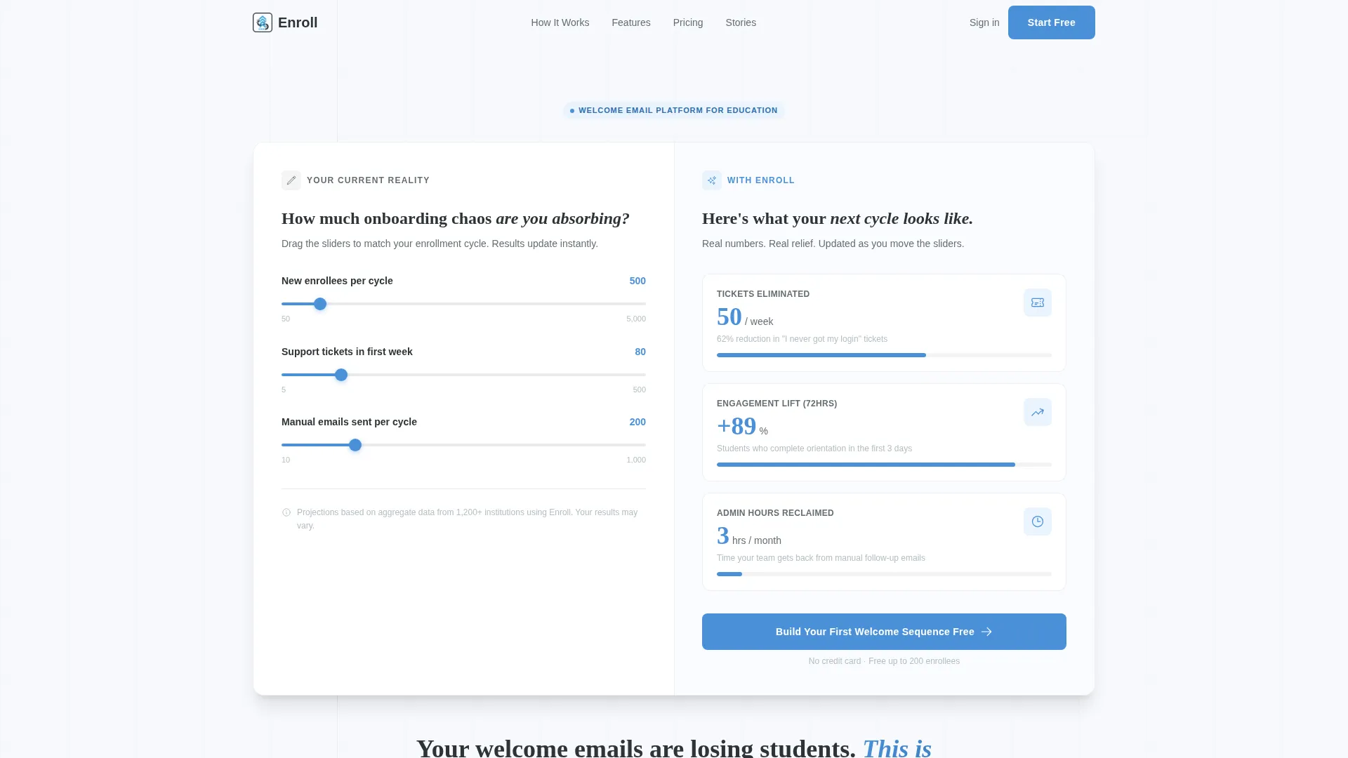
- A live, interactive ROI calculator split across both screen halves, letting visitors input their own enrollment data and see projected impact in real time
- A scroll-driven problem-to-solution narrative with alternating left-right panels that escalate the stakes and resolve them with specific product features
- A two-step freemium sign-up form and a footer-based one-click demo path, giving visitors two distinct ways to convert
Feature list
This template's layout and interaction patterns are purpose-matched to the education welcome email use case. Each section earns its place by moving a skeptical visitor closer to action.
Live ROI Calculator Header
The header occupies the full viewport as a split-screen calculator. Visitors enter their number of new enrollees per cycle, average first-week support tickets, and manual emails sent per month. The right half instantly renders projected outcomes, tickets reduced, engagement lift in the first 72 hours, and hours reclaimed per admin per month. Numbers animate in sky blue, building immediate personal relevance before a single word of marketing copy appears.
Problem-to-Solution Scroll Arc
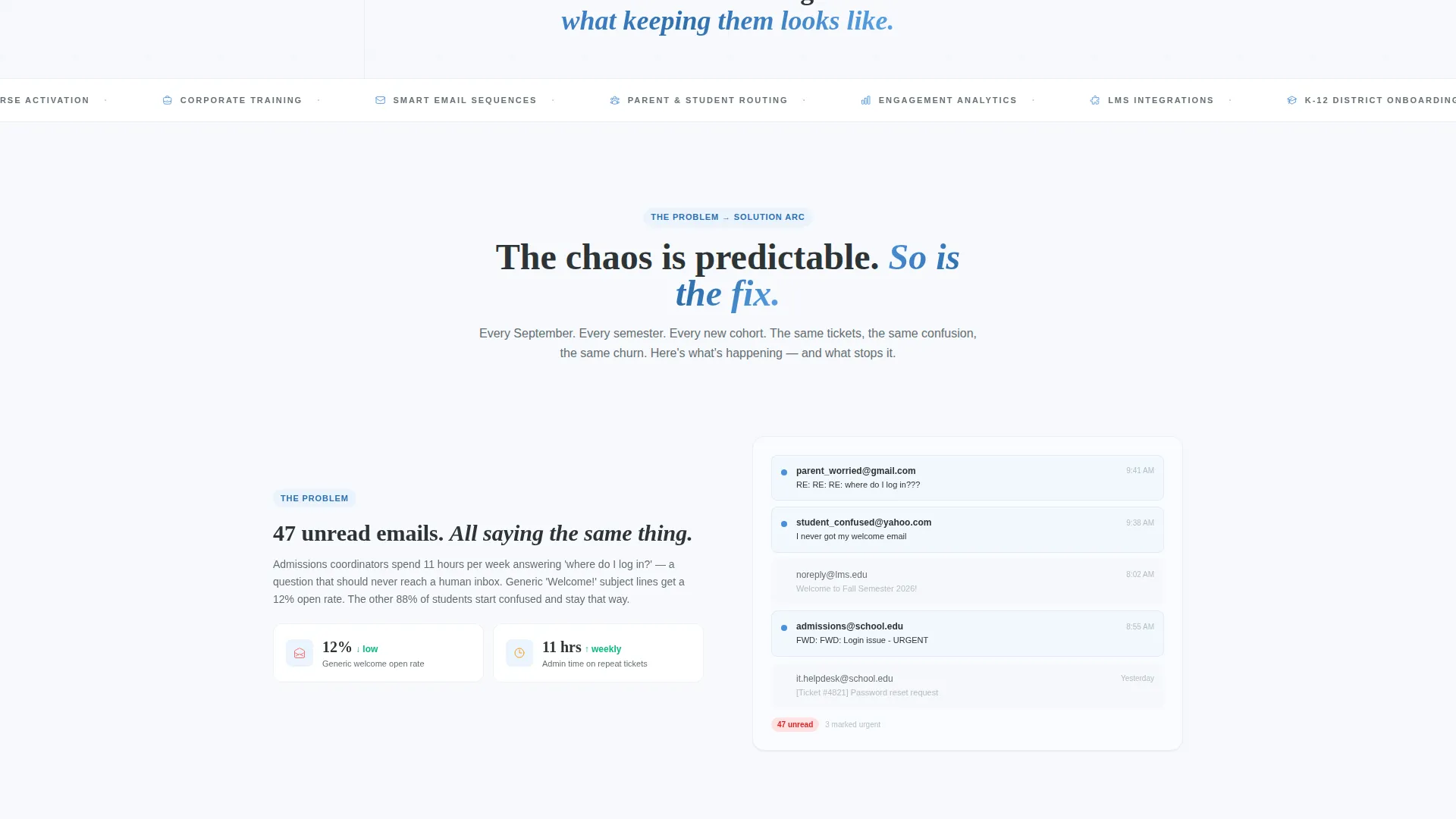
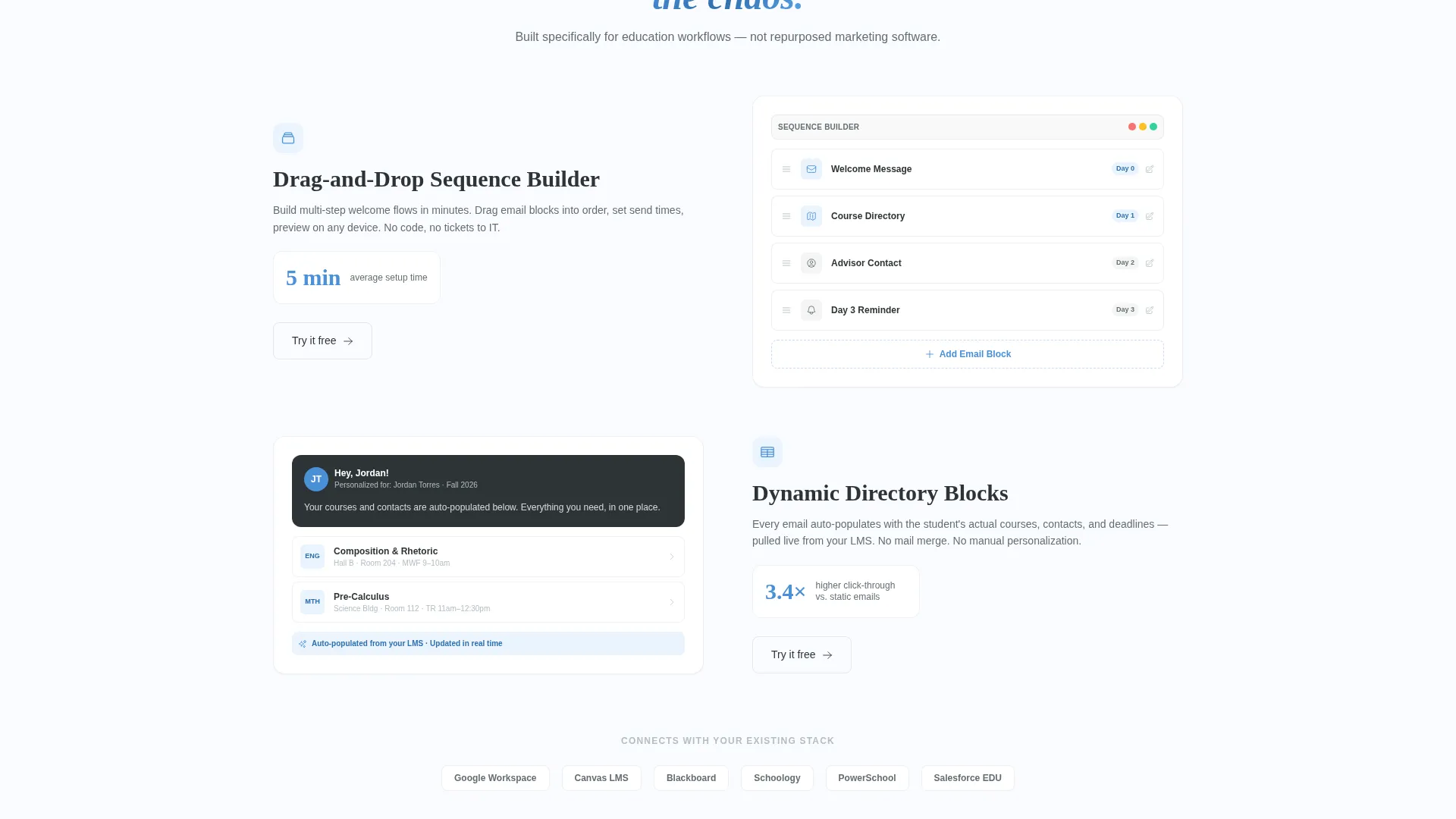
Each scroll section pairs a left-panel problem (cluttered inboxes, confused reply-all threads, a parent asking "where do I even start?") with a right-panel solution (drag-and-drop sequence builder, dynamic directory block, conditional logic tree). The rhythm is tension then release, repeated and escalating, so visitors mentally redesign their own welcome flow as they scroll.
Conditional Audience Routing Display
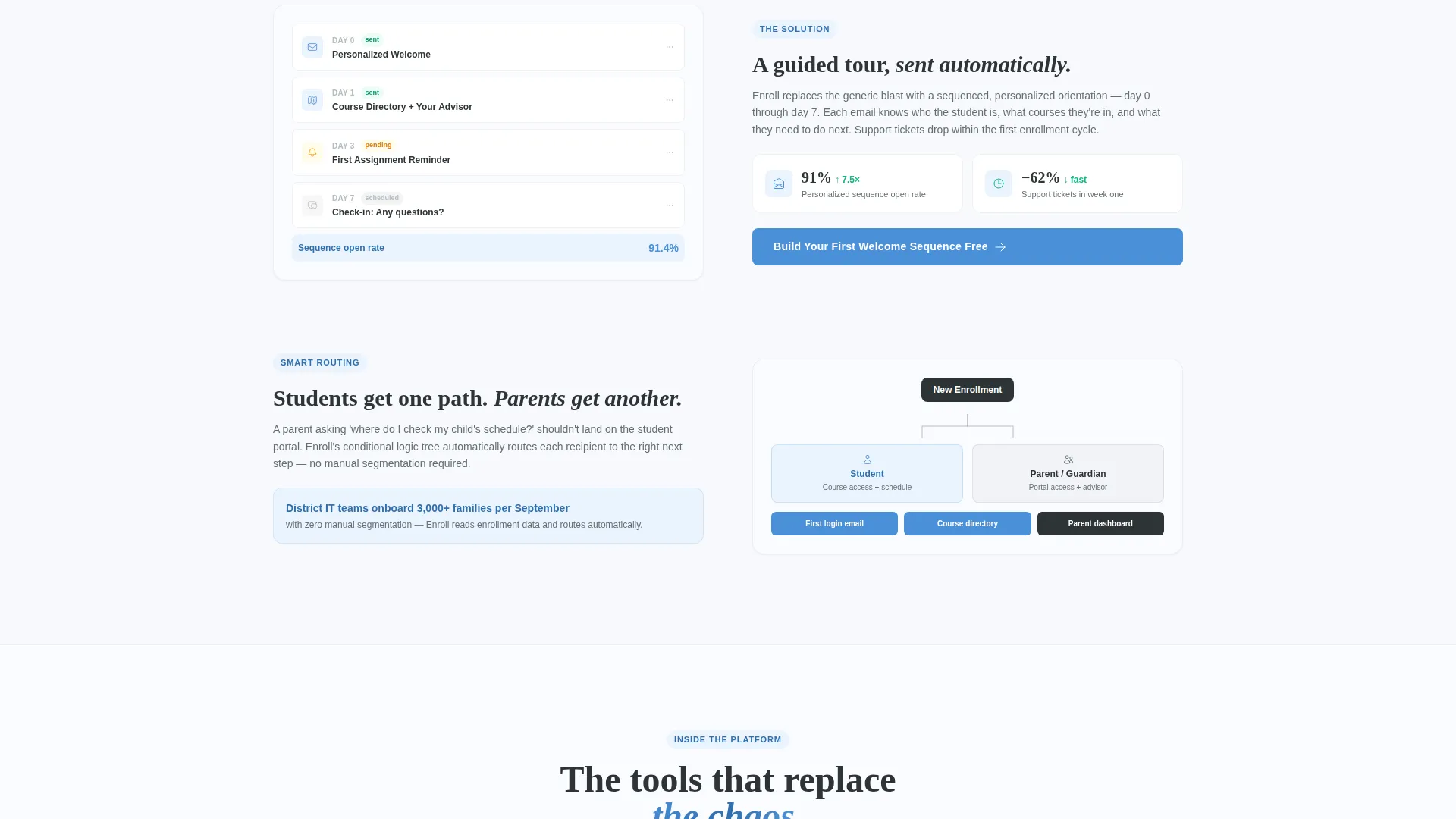
A visual conditional logic tree shows how the platform routes parents to one email path and students to another. This section demonstrates the "personalized directory" concept clearly, without requiring the visitor to imagine it themselves.
Two-Step Freemium Sign-Up Form
The primary conversion point is a two-step form. Step one captures institution type and enrollment size. Step two captures a work email and preferred platform integration choice. No credit card is required. The free tier supports one active welcome sequence for up to 200 enrollees.
Repeated In-Page Call to Action
The primary call to action, "Build Your First Welcome Sequence Free," appears immediately after the calculator and repeats after every solution panel. This keeps the conversion offer visible throughout the scroll without feeling intrusive.
Footer Demo Delivery Path
A secondary conversion path sits in the footer. Visitors can request a sample welcome sequence matched to their institution type, delivered directly to their inbox. The product demonstrates its own value inside the channel it is designed to improve.
Page sections overview
| Section | Purpose |
|---|---|
| Calculator Header | Personalizes the pitch with live ROI data inputs |
| Animated Headline | Anchors the core problem after calculator engagement |
| Problem Panel One | Shows inbox chaos and generic welcome email failure |
| Solution Panel One | Introduces drag-and-drop email sequence builder |
| Problem Panel Two | Highlights confusion from unsegmented onboarding |
| Solution Panel Two | Shows dynamic directory block with auto-populated content |
| Problem Panel Three | Escalates stakes to enrollment churn and revenue loss |
| Solution Panel Three | Presents conditional logic routing for parents and students |
| Primary call to action Block | Repeats freemium offer after each solution panel |
| Two-Step Sign-Up Form | Captures institution type, size, email, and integration preference |
| Footer Demo Path | Offers one-click sample sequence delivered to inbox |
Design & branding system
The visual identity follows a Directory and Discovery theme built on a Slate and Sky color system. The palette feels like a freshly organized classroom on the first morning of school, structured, calm, and easy to navigate.
- Deep chalkboard slate (#2D3436) anchors headers, navigation, and section frames; classroom whiteboard (#F7F9FC) serves as the primary background; and pencil-graphite gray (#636E72) carries all body text
- Clear-morning sky blue (#4A90D9) covers every interactive element, link, animated number, and call-to-action button, creating a consistent visual signal for anything clickable
- White space is used generously throughout, mimicking the wide margins of a well-designed syllabus to reduce cognitive load and keep the page easy to scan
Mobile & speed optimization
The 50/50 split-screen layout is designed to reflow cleanly for smaller viewports. On mobile, the dual-panel sections stack vertically so the problem and solution pairing remains readable without horizontal scrolling.
- The calculator inputs and animated result panels are structured to remain interactive and legible on touch screens
- The two-step form is kept intentionally short, with only two fields per step, to reduce friction on mobile entry
How this template helps you convert
The page is engineered around a single insight: people act when they see their own numbers, not someone else's case study. Every layout decision reinforces this.
- The ROI calculator makes the value proposition personal before any marketing copy loads, so visitors arrive at the headline already invested in the outcome
- The problem-to-solution scroll arc builds urgency gradually, escalating from minor frustration to enrollment churn and revenue loss, then releasing each tension point with a specific, visual solution
- Two conversion paths (the freemium form and the footer demo) give different buyer types a way to act at their own pace, without either path requiring a credit card commitment
Other information about this template
This template is part of a broader set of education-focused landing page layouts designed for platforms that serve the K-12, higher education, online course, and corporate training markets. It is built to support a freemium or free-trial acquisition model where the product needs to prove value before an upgrade is needed.
- The free tier framing (one active welcome sequence, up to 200 enrollees, no credit card) is built directly into the page copy and form structure, making the offer self-explanatory
- The integration preference field in step two of the sign-up form references Google Workspace, Canvas, Blackboard, and an open "other" option, covering the most common education platform environments
- The footer demo path is a low-commitment entry point designed for visitors who are not yet ready to sign up but are open to experiencing the product firsthand inside their own inbox
Theme
Directory & Discovery
Creative direction
Problem→Solution Arc
Color system
Slate & Sky
Style
Split Screen (50/50)
Direction
Freemium/Trial
Page Sections
Live Split-screen ROI Calculator
Problem-to-solution Scroll Narrative
Conditional Audience Routing Display
Two-step Freemium Conversion Form
Repeated In-page Call to Action
Footer One-click Demo Path
Related questions
Who is this landing page template designed for?
Does the template include the actual email sequence builder?
What does the free tier offer described in the template include?
Can the two-step sign-up form be adapted for different institution types?
How does the footer demo path work?



