Open-Source ERP Comparison Table Landing Page
Openerp is a bold brutalist landing page template built for open-source enterprise resource planning platforms. It features a live terminal header, a head-to-head comparison table, and a lead generation form designed to convert cost-conscious operations directors, CTOs, and finance leads who are ready to leave closed, expensive ERP contracts behind.
by Rocket studio
Quick summary
Openerp is a single-page, comparison-table landing page template built for open-source enterprise resource planning (ERP) platforms. It uses a bold brutalist visual identity, a terminal-style header, and a problem-to-solution scroll arc to turn frustrated enterprise software buyers into qualified demo leads.
Who this template is for
This template is built for teams marketing open-source ERP software to buyers who are tired of opaque licensing and vendor lock-in. The target audience is technical and cost-aware, and they need to see proof before they trust a pitch.
- Operations directors at mid-market manufacturers stuck managing business processes through spreadsheets
- CTOs at scaling startups who need infrastructure they own outright, not an annual renewal negotiation
- Finance leads at nonprofits requiring full audit trails without six-figure software contracts
What problem this template solves
Enterprise buyers have seen too many polished software landing pages that hide pricing, bury limitations, and route every question through a sales representative. This template flips that dynamic entirely. It leads with raw transparency and lets the product speak in its own language.
- Most ERP landing pages avoid direct comparisons, leaving buyers to do painful research on their own
- Closed-source platforms use licensing complexity to prevent buyers from understanding true total cost
- Developers and technical evaluators distrust marketing copy but will trust a real terminal session they can read line by line
What you get with this template
You get a complete single-page layout designed to guide a skeptical technical buyer from initial pain to confident conversion. Every section has a defined job, and the visual system reinforces the core message: this platform has nothing to hide.
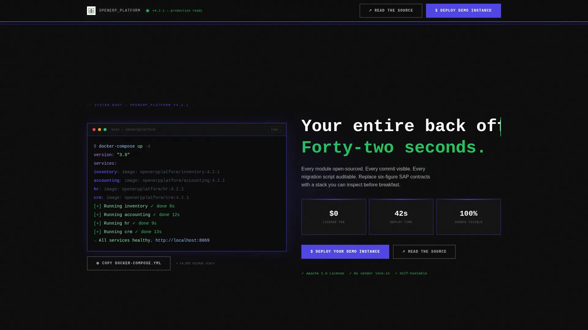
- A full-viewport terminal header displaying a syntax-highlighted docker-compose session spinning up ERP modules in twelve lines of YAML
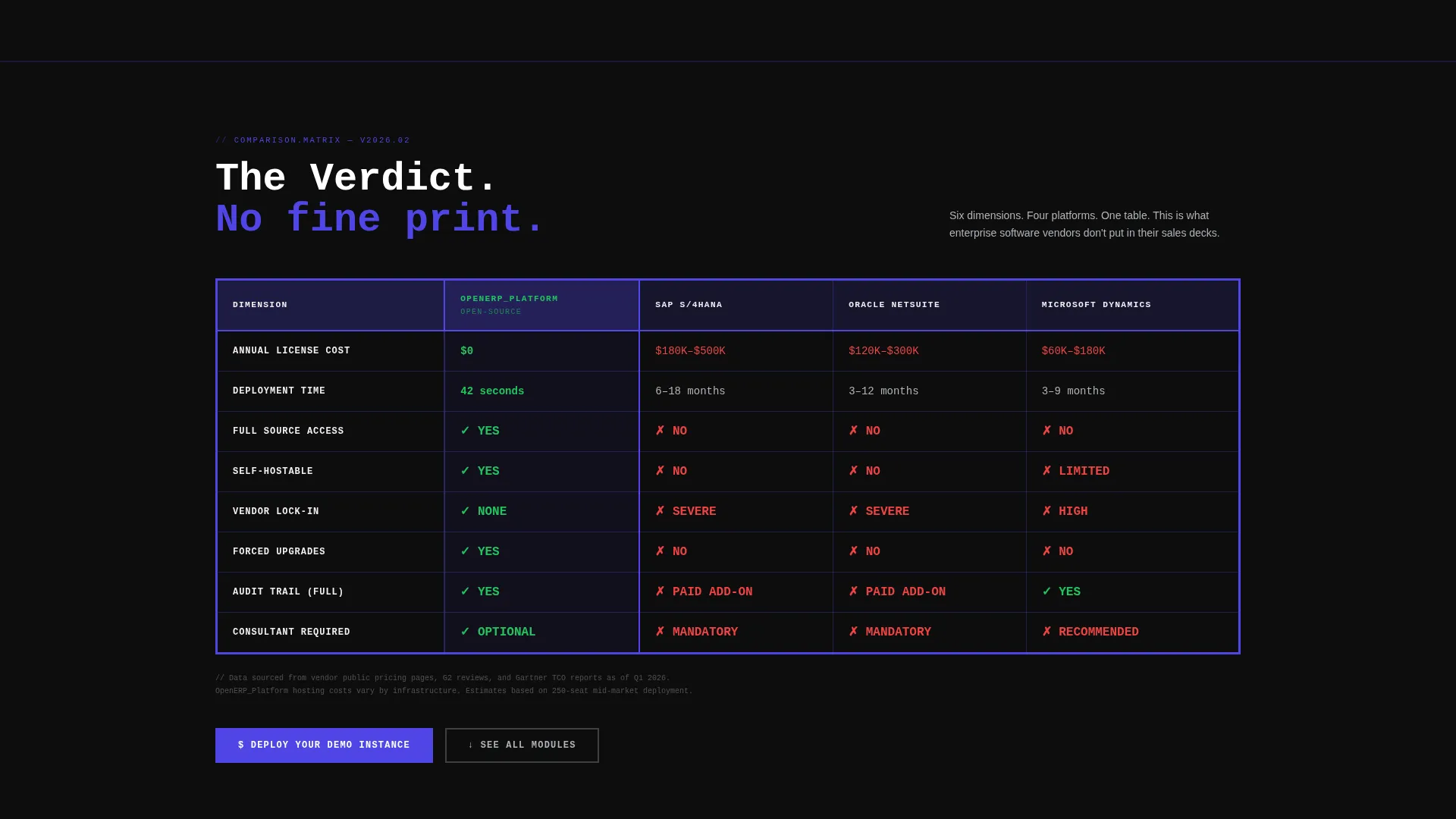
- A brutalist head-to-head comparison table with thick indigo borders, checkmarks, and verdict-style indicators across cost, deployment time, source access, and vendor lock-in
- A fixed top-bar lead generation form that captures company size, current ERP, and work email after the first scroll, with a secondary "Read the Source" path to the public repository
Feature list
This template includes purpose-built components that serve a technically literate, conversion-ready audience. Each one is grounded in the source brief and designed to earn trust before asking for a click.
Live Terminal Header Block
A full-viewport black field displays a real, syntax-highlighted terminal session. The sequence shows a docker-compose command spinning up inventory, accounting, HR, and CRM modules. A monospaced headline types itself into frame: "Your entire back office. Forty-two seconds."
Brutalist Comparison Table
A thick-bordered, Electric Indigo comparison table places the platform side by side with competing closed-source ERP systems. Rows cover cost, deployment time, source access, and vendor lock-in. Checkmarks and X marks render as verdicts, not suggestions.
Problem-to-Solution Scroll Arc
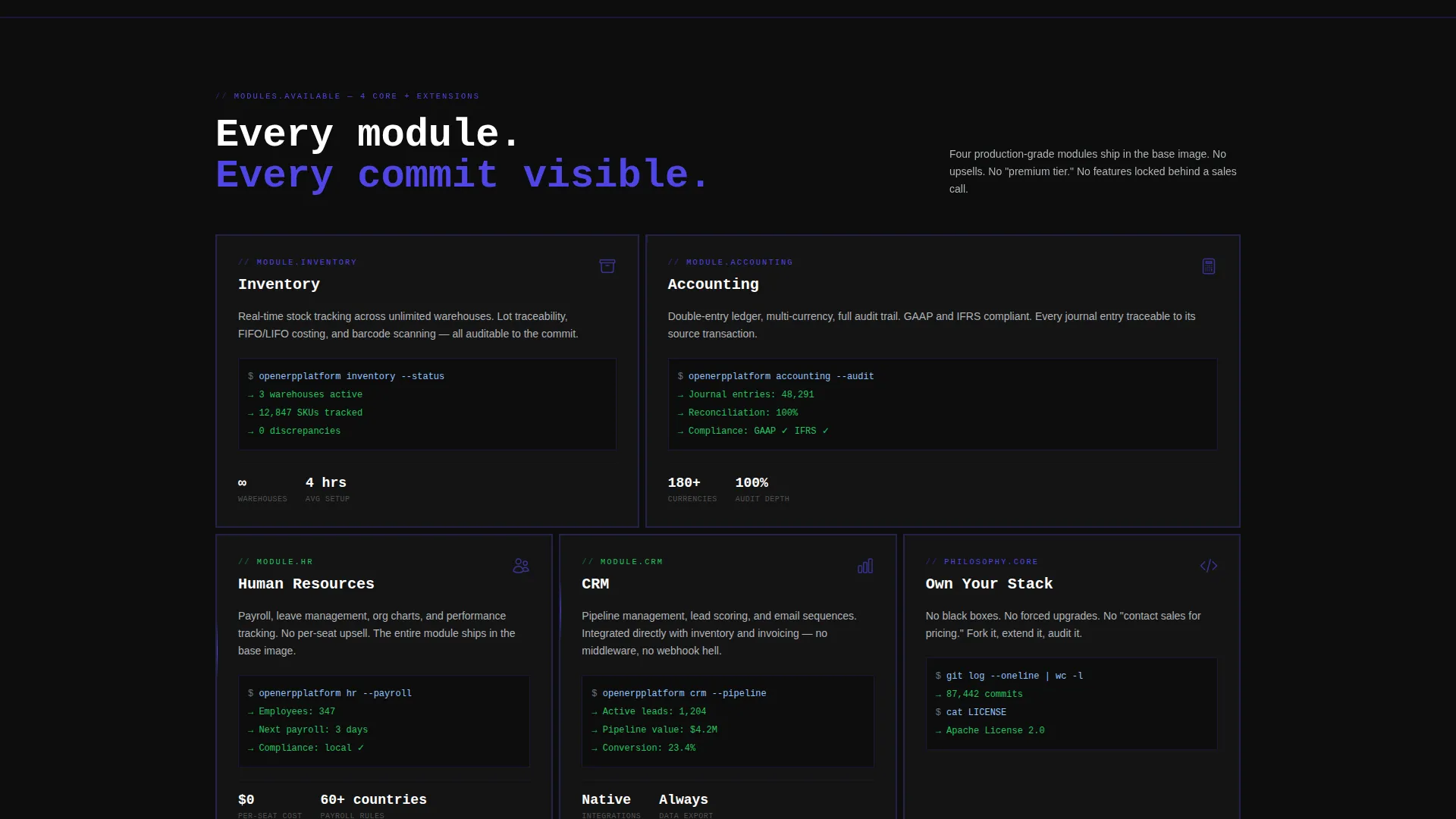
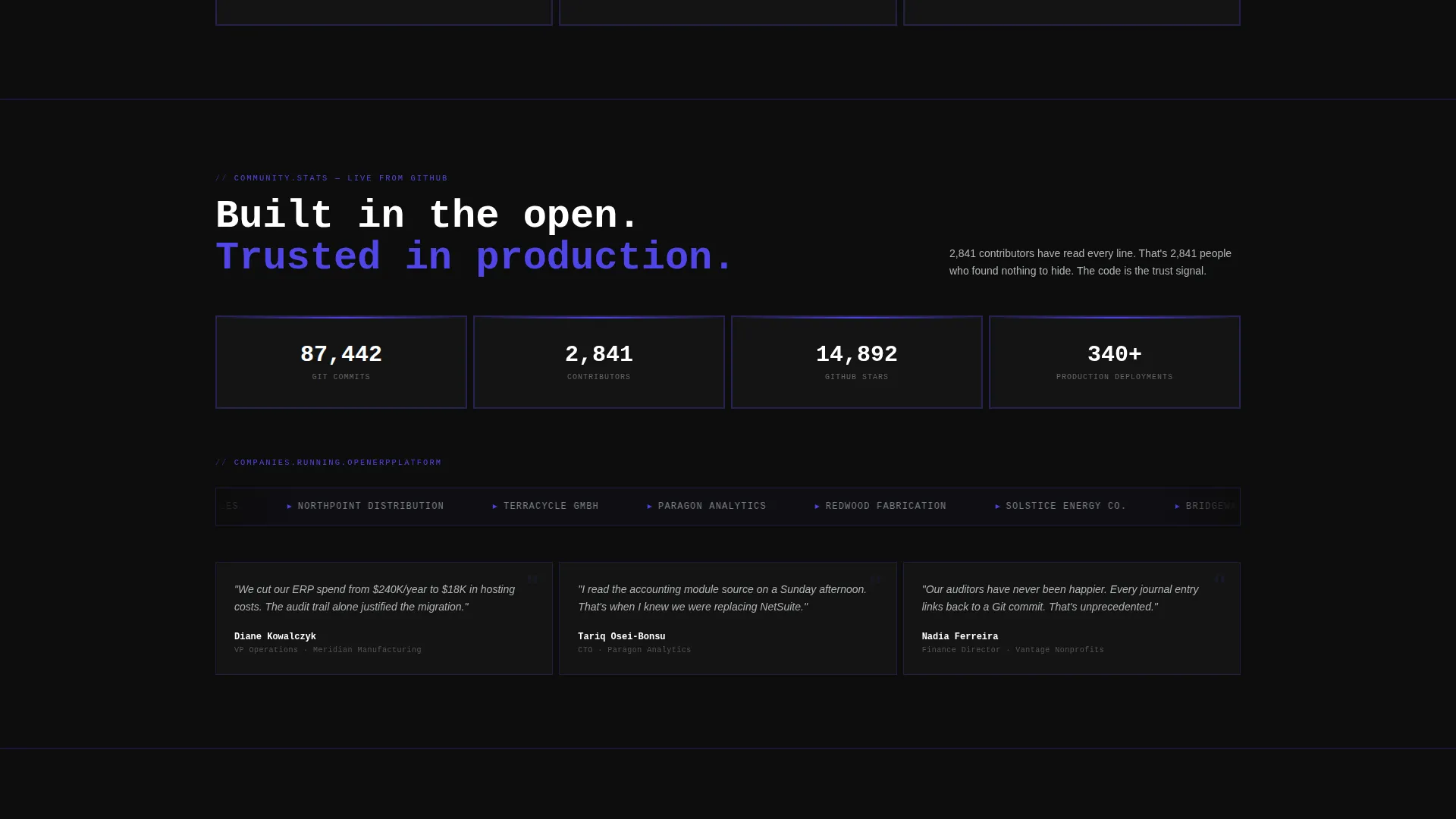
Each scroll section targets one specific enterprise pain point: opaque licensing, forced upgrades, and consultant dependencies. Each pain is answered immediately with a concrete module screenshot, a GitHub commit count, and a community contributor number.
Fixed Lead Generation Bar
After the first scroll, a brutalist top bar locks into position and stays visible throughout the page. The form collects company size via dropdown, current ERP via autocomplete text field, and work email, ordered from easiest to highest commitment.
Dual Conversion Paths
The primary call to action reads "Deploy Your Demo Instance" for buyers ready to act. A secondary path, "Read the Source," links to the public repository. For this audience, access to the codebase is itself a conversion signal.
Bold Brutalist Visual System
The design uses deep terminal black as the primary background, electric indigo as the dominant accent, raw aluminum gray for body text, and phosphor green reserved exclusively for positive indicators. No rounded corners, no stock photography, no apologies.
Page sections overview
| Section | Purpose |
|---|---|
| Terminal Header Block | Opens with live docker-compose session and typed headline |
| Fixed Lead Bar | Captures company size, current ERP, and work email after first scroll |
| Comparison Table | Pits platform against closed-source competitors across four key criteria |
| Licensing Pain Section | Dismantles opaque licensing with module screenshot and commit data |
| Forced Upgrades Section | Addresses forced upgrade cycle with community contributor proof |
| Consultant Dependency Section | Answers dependency lock-in with source transparency evidence |
| Secondary call to action Path | Offers "Read the Source" link as an alternative conversion route |
Design & branding system
The visual identity is rooted in a bold brutalist philosophy. The palette reads like a mainframe terminal designed by a brutalist architect: high contrast, monospaced confidence, and zero decorative softness.
- Background is deep terminal black (#0D0D0D); electric indigo (#4F46E5) drives borders, table highlights, and interactive states; raw aluminum gray (#B0B3B8) carries body text and secondary elements
- Phosphor green (#22C55E) appears only on checkmarks and positive indicators, making every "yes" land with visual weight
- No rounded corners, no illustration, no stock photography; the product running live in a code block is the only hero image this page needs
Mobile & speed optimization
The template is structured for a clean reading experience across screen sizes. The brutalist grid and monospaced type system translate naturally to narrower viewports without losing the core aesthetic.
- Fixed top-bar lead form is designed to stay accessible and usable as the layout reflows on smaller screens
- The comparison table uses a horizontally scrollable layout on mobile so no data is hidden or collapsed
- The terminal header block scales to viewport height, keeping the typed headline visible and legible on all devices
How this template helps you convert
This template is engineered around a single insight: for technical buyers, proof of transparency is more persuasive than any marketing headline. Every layout decision serves that conversion logic.
- The terminal header establishes credibility in the first three seconds by showing real infrastructure code, not a product illustration, making technical visitors immediately more receptive to the rest of the page
- The comparison table removes the buyer's need to do independent research by presenting verdict-level answers to the four questions every ERP evaluator is already asking
- The dual call to action structure meets buyers at two levels of readiness: those ready to deploy a demo instance and those who need to read the source code first, reducing drop-off from hesitant but qualified visitors
Other information about this template
This template is part of the open-source enterprise software category and is designed specifically for the open-source ERP niche. It sits at the intersection of developer-focused marketing and enterprise sales, making it useful for any platform that competes on transparency and cost against closed-source alternatives.
- The template style is a comparison table landing page, matched to buyers actively evaluating competing ERP solutions
- The creative direction follows a problem-to-solution arc, a proven structure for high-consideration B2B software decisions
- The header concept is a live code snippet, a format that resonates with technical evaluators who distrust polished product renders
- The lead generation direction prioritizes progressive commitment in the form flow, starting with the lowest-friction field first
Theme
Bold Brutalist
Creative direction
Problem→Solution Arc
Color system
Electric Indigo
Style
Comparison Table
Direction
Lead Generation
Page Sections
Live Terminal Header Block
Brutalist Comparison Table
Problem-to-solution Scroll Arc
Fixed Lead Generation Top Bar
Dual Conversion Path Design
Related questions
Who is the Openerp template designed for?
Can I customize the comparison table rows and competitors?
Does the terminal header require a live backend to display the code animation?
What does the lead generation form collect?
Is this template suitable for a SaaS product that is not fully open source?



