Dental ERP Landing Page Template | Tech Glass Design
Operatory is a dental ERP landing page template built for enterprise dental platforms. It uses a Hub and Spoke anchor navigation layout to present six practice modules as spec-sheet deep-dives. The Tech Glass visual identity pairs void black with iridescent violet-to-cyan gradients, creating a cockpit-grade interface that earns buyer trust before the primary call to action lands.
by Rocket studio
Quick summary
Operatory is a single-page, anchor-navigated landing page template designed for dental ERP platforms. It presents scheduling, clinical charting, imaging, billing, inventory, and analytics as discrete technical modules. The aesthetic is Tech Glass with an AI Iridescent color system. Every section builds specification-level proof before driving visitors toward an app download or enterprise license request.
Who this template is for
This template was built for teams selling or showcasing complex, multi-function dental practice management software. It speaks to buyers who evaluate on evidence, not emotion.
- Multi-location dental service organization (DSO) operations directors tracking chair utilization across dozens of offices
- Solo-practice owner-dentists who manage both clinical and administrative workflows from a single dashboard
- Office managers currently juggling multiple browser tabs and paper-based scheduling systems
What problem this template solves
Most dental software landing pages bury capabilities in marketing language. Analytical buyers, especially those evaluating enterprise dental ERP platforms, need quantified proof before they commit to a demo or a volume license conversation.
- There is no structured way to present six or more platform modules without the page feeling overwhelming or cluttered
- Single-scroll pages rarely give enterprise buyers the depth they need to justify a purchase recommendation internally
- Generic SaaS templates do not reflect the clinical and operational gravity that dental practice management software carries
What you get with this template
You get a fully structured, spec-sheet-style landing page with anchor navigation that links directly to each platform module. The layout rewards careful readers while staying skimmable for decision-makers in a hurry.
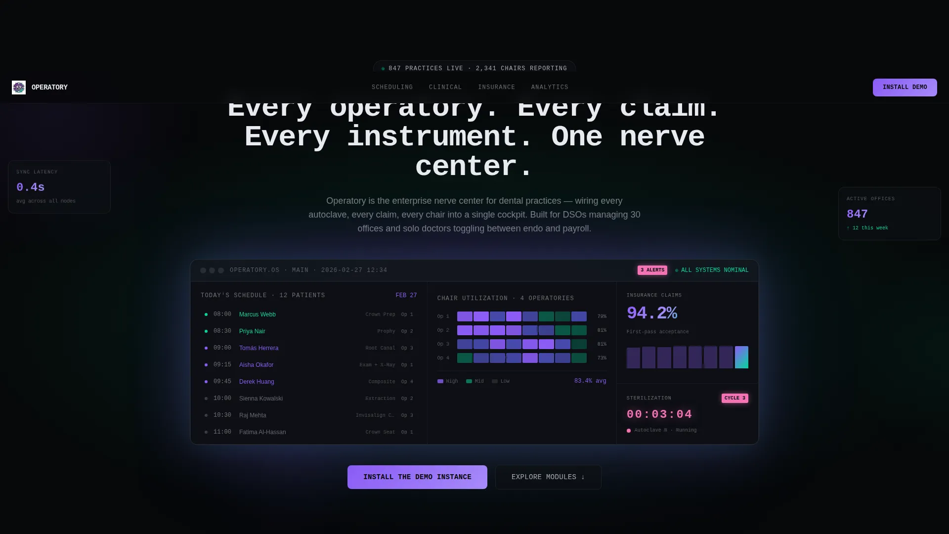
- A dark full-bleed header with a glowing dashboard interface displaying real operational data: a live schedule, a chair utilization heatmap, a claims acceptance rate, and a sterilization cycle countdown
- Six spoke sections covering Scheduling, Clinical Charting, Imaging Integration, Insurance and Billing, Inventory, and Analytics, each presented as a technical deep-dive card
- A dual conversion path: a primary "Install the Demo Instance" call to action with a device-detecting modal, and a secondary "Request a DSO Volume License" form targeting enterprise buyers
Feature list
This template is built around six core capabilities. Each one is laid out as a standalone module section with space for KPI callouts, sub-feature lists, a frosted glass screenshot frame, and a compatibility matrix.
Anchor Navigation Hub and Spoke Layout
A sticky anchor navigation bar connects the header to each of the six module spokes below. Visitors can jump directly to the section most relevant to their role, whether that is billing, scheduling, or analytics, without losing context.
Device-Detecting Download Modal
The primary call to action triggers a frosted glass modal that adapts to the visitor's device. Desktop visitors see a QR code for a mobile companion app plus a server demo installer selector. Mobile visitors see direct App Store and Google Play buttons.
Spec Sheet Module Cards
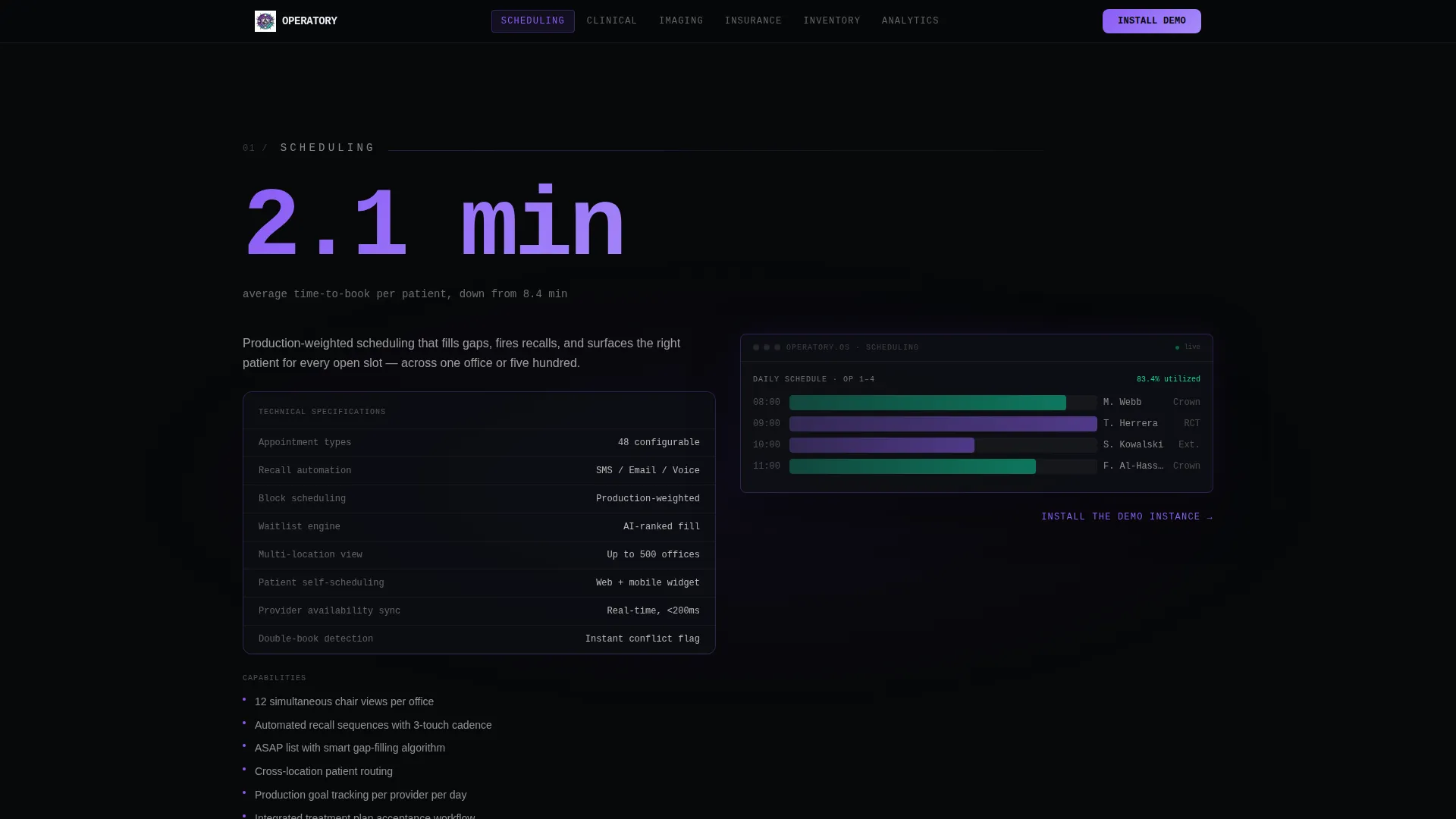
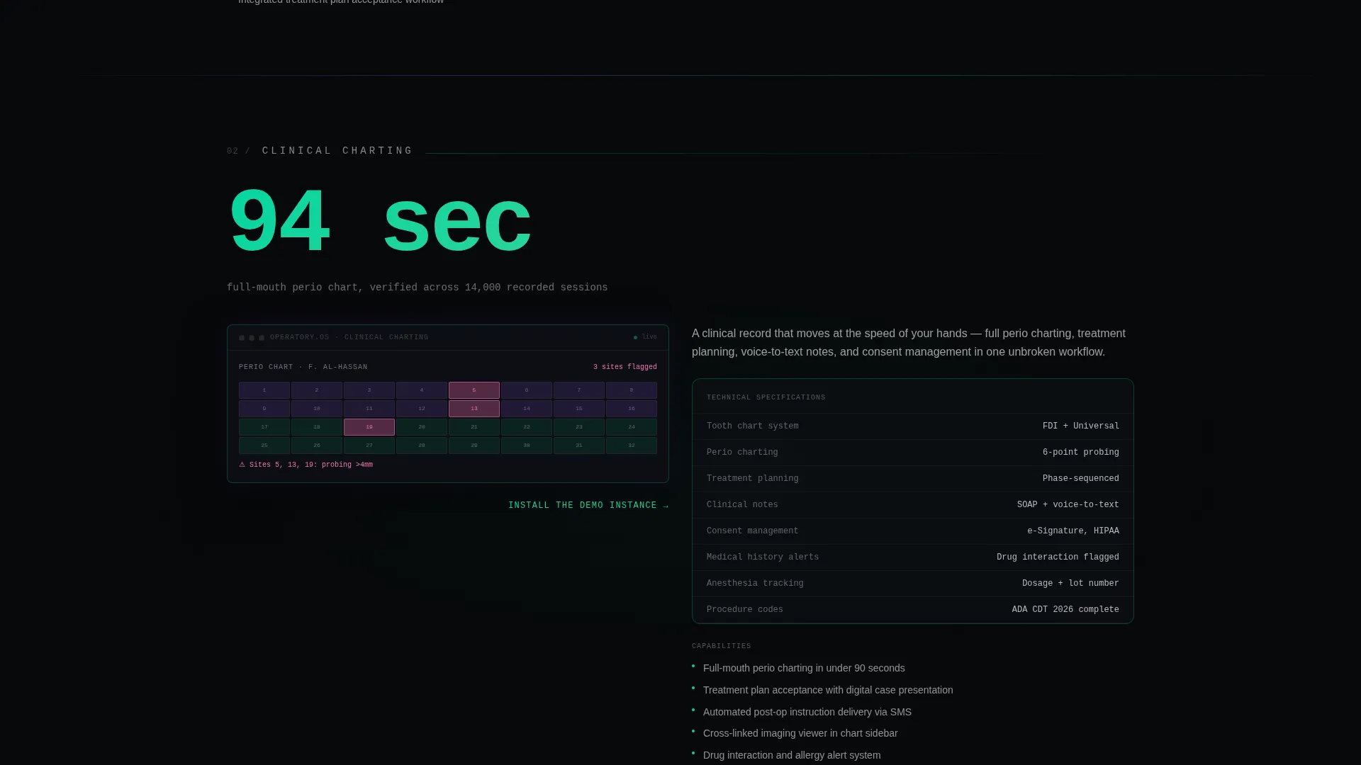
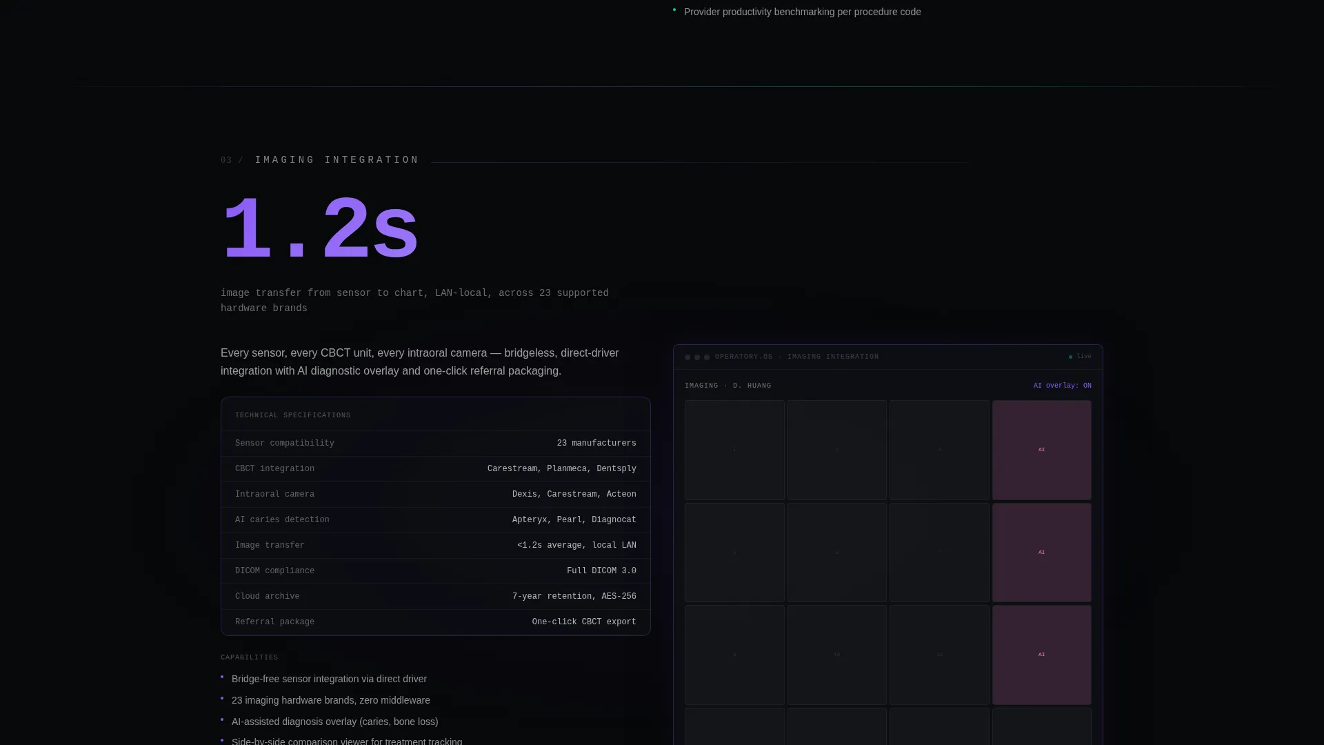
Each module section opens with a single oversized KPI figure in iridescent type, then unfolds into sub-features, a mini-screenshot, and a compatibility matrix. The format mirrors an aerospace datasheet: dense with real specifications but organized with enough glass-panel whitespace to stay readable.
Enterprise License Conversion Path
A secondary call to action, "Request a DSO Volume License," appears below the primary download prompt. It opens a short qualification form asking for number of locations, current practice management software vendor, and preferred onboarding quarter.
Iridescent Interactive Color System
Color is used functionally, not decoratively. Interactive elements carry the iridescent violet-to-cyan gradient. Static elements stay in frosted glass white on void black. This trains the visitor's eye: color means something you can act on.
Monospace Hero Headline Animation
The header headline types itself in monospace font, reading: "Every operatory. Every claim. Every instrument. One nerve center." The animation creates a sense of the product being live and responsive before the visitor has scrolled at all.
Page sections overview
| Section | Purpose |
|---|---|
| Dark Hero Header | Display the glowing dashboard interface and animated headline |
| Sticky Anchor Nav | Link directly to each of the six module spokes |
| Scheduling Module | Present scheduling capabilities with KPI, sub-features, and compatibility |
| Clinical Charting Module | Detail charting tools with screenshot and specification breakdown |
| Imaging Integration Module | Show imaging hardware support and integration list |
| Insurance and Billing Module | Highlight claims waterfall data and billing workflow specs |
| Inventory Module | Cover sterilization tracking and supply chain capabilities |
| Analytics Module | Display utilization metrics and reporting depth |
| Download call to action Modal | Convert visitors with device-aware demo install prompt |
| DSO License Form | Qualify enterprise buyers with a short multi-location form |
Design & branding system
The visual identity is built on a Tech Glass theme with an AI Iridescent color system. Every design decision reinforces the idea that the software is intelligent, precise, and in control.
- Void black (#07080A) forms the full-bleed canvas; frosted glass white (#E8EAF0) handles primary text; iridescent violet (#8B5CF6) bleeds into cyan (#06D6A0) on interactive elements; clinical accent pink (#F472B6) marks notification badges and alert indicators
- Translucent glass panels with frosted blur float above the dark background, giving the interface a layered depth that feels like a cockpit at night
- No stock photography appears anywhere on the page; the hero section shows only the product dashboard, radiating ambient violet-to-cyan light into the surrounding darkness
Mobile & speed optimization
The template's layout is built to translate the cockpit aesthetic cleanly across screen sizes. The device-detecting modal ensures the download call to action is always relevant to the visitor's current device.
- The frosted glass module cards reflow for smaller viewports without losing the specification density that makes each section persuasive
- The device-detecting call to action modal automatically surfaces App Store and Google Play buttons on mobile, removing friction from the download path
- The sticky anchor navigation remains accessible on mobile, letting visitors jump between the six module spokes without scrolling back to the top
How this template helps you convert
The entire page is structured as a trust-building sequence. Visitors encounter hard evidence first and the ask second, so the call to action feels earned rather than premature.
- The spec-sheet module cards front-load latency benchmarks, integration names, and compliance badges. By the time a visitor reaches the download prompt, they have already processed the proof.
- The dual conversion path captures two distinct buyer types in one pass: the individual practitioner who wants to install a demo instance now, and the DSO operations director who needs to start an enterprise license conversation.
Other information about this template
This template is designed specifically for the dental ERP category, where buyers typically conduct longer evaluation cycles and require technical depth before committing to a trial or a sales conversation.
- The creative direction follows a Spec Sheet approach, meaning every module section is built to hold exact capability counts, supported hardware lists, and named integrations
- The template style is Hub and Spoke with Anchor Navigation, a structure well-suited to platforms that need to present multiple discrete modules without flattening them into a single undifferentiated feature list
- The header concept is Dark Full-Bleed with Glow, using a single dashboard interface as the hero visual rather than lifestyle photography
- The primary landing page direction is App Download, with the secondary path oriented toward DSO volume licensing for group practice buyers
Theme
Tech Glass
Creative direction
Spec Sheet
Color system
AI Iridescent
Style
Hub & Spoke (Anchor Nav)
Direction
App Download
Page Sections
Anchor Navigation Hub and Spoke Layout
Device-detecting Download Modal
Spec Sheet Module Cards
Enterprise DSO License Form
Iridescent Interactive Color System
Monospace Hero Headline Animation
Related questions
Who is this landing page template designed for?
What are the six module sections included in this template?
How does the download call to action work?
Can this template support enterprise sales conversations, not just downloads?
Does the template use any stock photography?



