AIOps Technology Reviews Website Template
This AIOps landing page template is built for teams that need to show their platform working before they ask for anything. A modular card grid assembles on scroll like mission control powering up, moving from detection through reasoning to automated action. The dark, iridescent visual system and animated dashboard preview communicate speed, precision, and reliability from the first second.
by Rocket studio
Quick summary
This template is a single-page, card grid layout for an artificial intelligence operations (AIOps) tool. It opens with a living dashboard preview, then builds a full capability map across three scrolling card rows. Every section earns trust before asking for a conversion. The design runs on a void black canvas with holographic violet, signal cyan, and pearl white accents.
Who this template is for
This template was purpose-built for technical B2B products that need to earn credibility with engineers before pitching a sign-up. If your audience reads alert logs at 2 AM, this visual language speaks directly to them.
- Platform engineers and site reliability engineers (SREs) who deal with high alert volumes and need proof that automation works
- SRE leads and engineering managers who must justify headcount budgets through demonstrated automation return on investment
- Series B startup chief technology officers (CTOs) who need enterprise-grade reliability without the cost of a large operations team
What problem this template solves
Most AIOps product pages describe features in plain text. Engineers don't trust plain text. They trust systems they can watch run. This template solves the credibility gap by showing the product in motion before a single form field appears.
- Alert fatigue is real: the page addresses it visually by showing a triage sequence that resolves in eleven seconds instead of forty minutes
- Traditional landing pages bury the proof below the fold; this layout puts the animated dashboard in the hero so the value is immediate
- Progressive lead capture replaces single long forms, reducing friction for engineers who distrust aggressive sign-up flows
What you get with this template
You get a fully structured, animation-ready single-page layout that communicates detection, reasoning, and automated action in a single scroll. Every section is built to move.
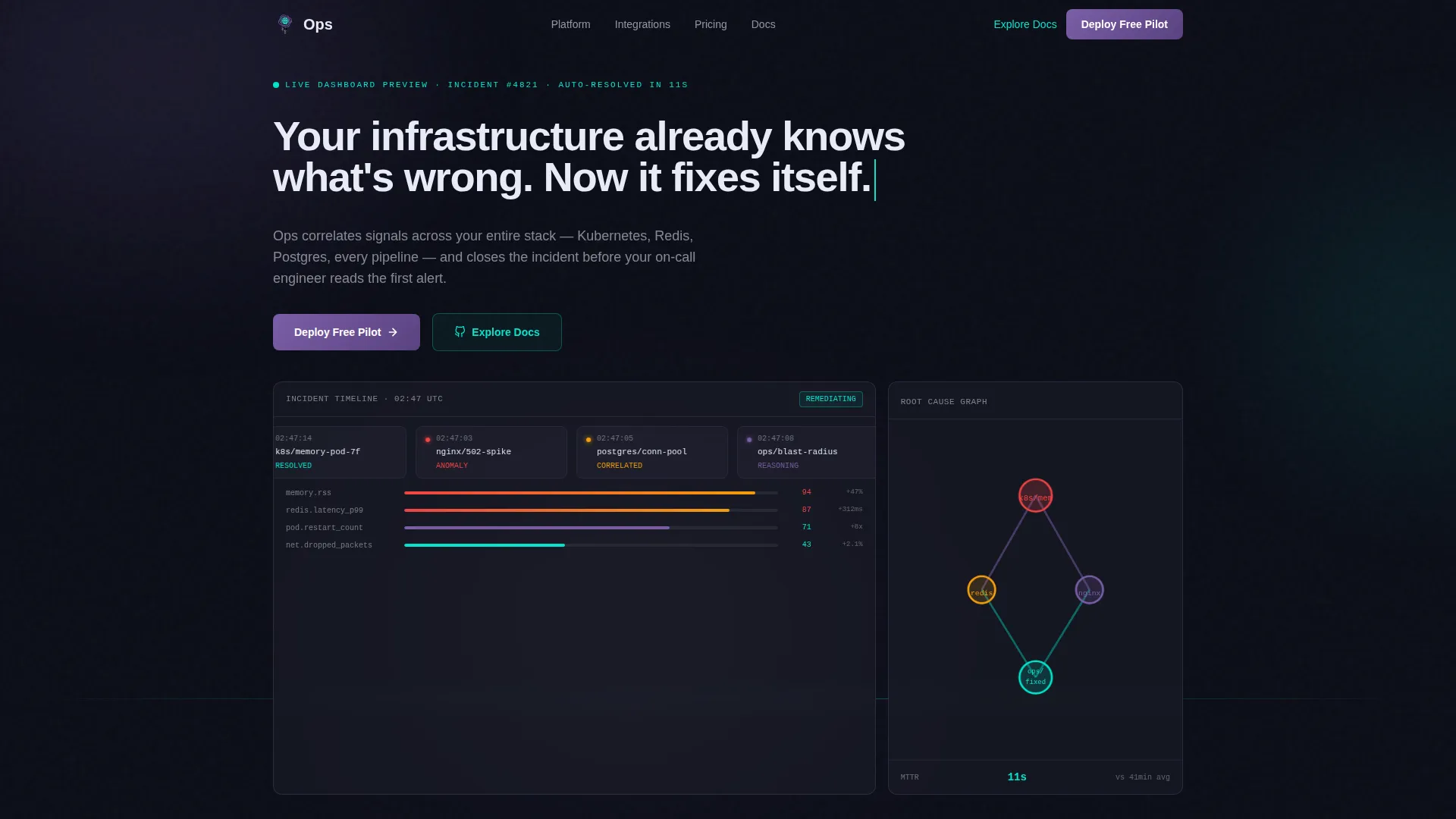
- A hero section with a pixel-accurate animated dashboard preview, typewriter headline, and scrolling incident timeline
- Three modular card grid rows covering detection, reasoning, and action capabilities, each card carrying its own micro-animation
- A three-step progressive lead generation form, a social proof and return on investment stats section, and a streamlined single-row footer
Feature list
This section covers the core built-in components and interaction patterns included in the template.
Animated Dashboard Hero
The hero fills the viewport with a realistic product interface preview. An incident timeline scrolls left, anomaly scores update in real time, and a root-cause graph draws its node connections one by one as the visitor watches. A typewriter effect writes the headline across the top rail letter by letter.
Modular Card Grid Layout
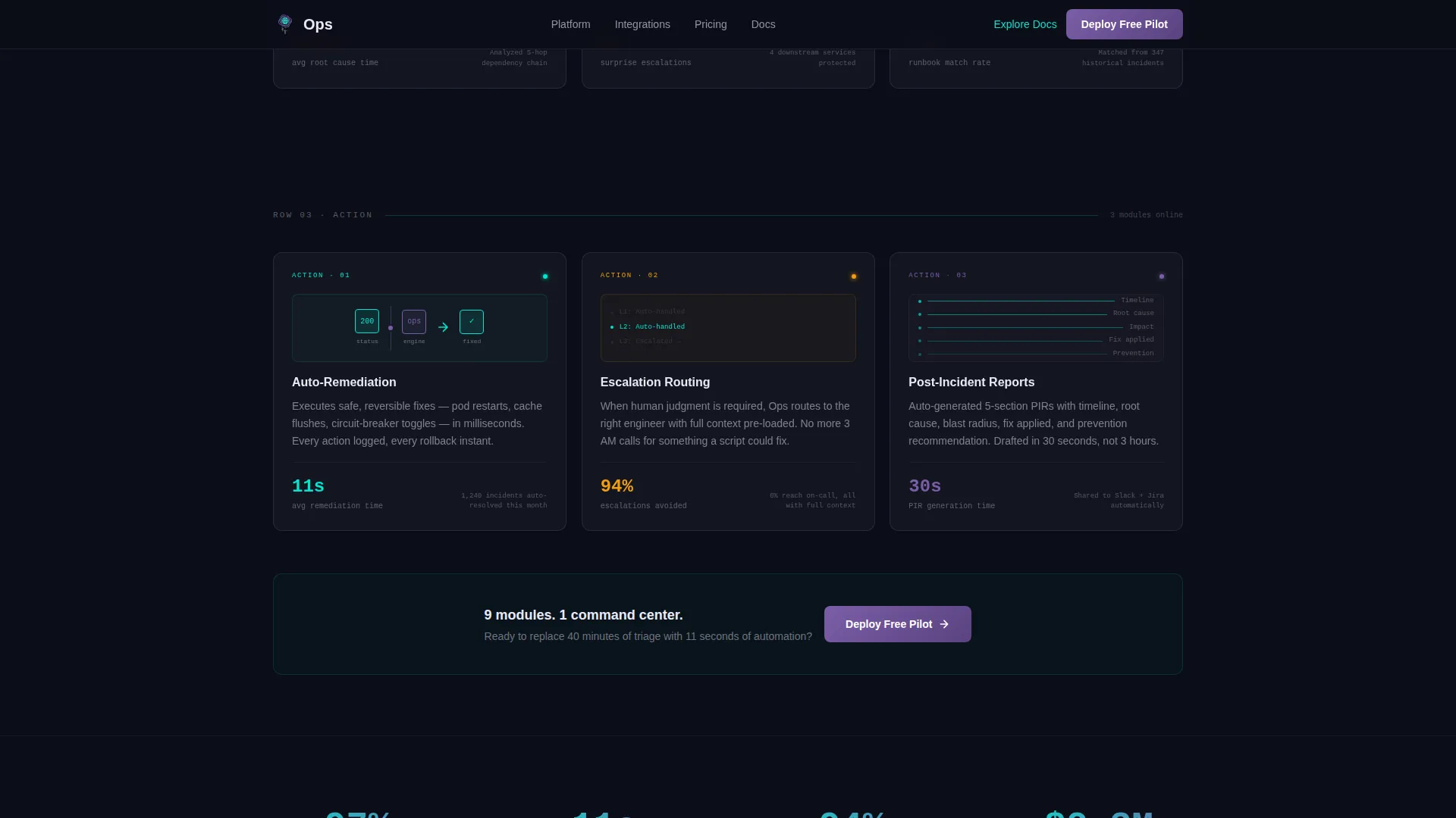
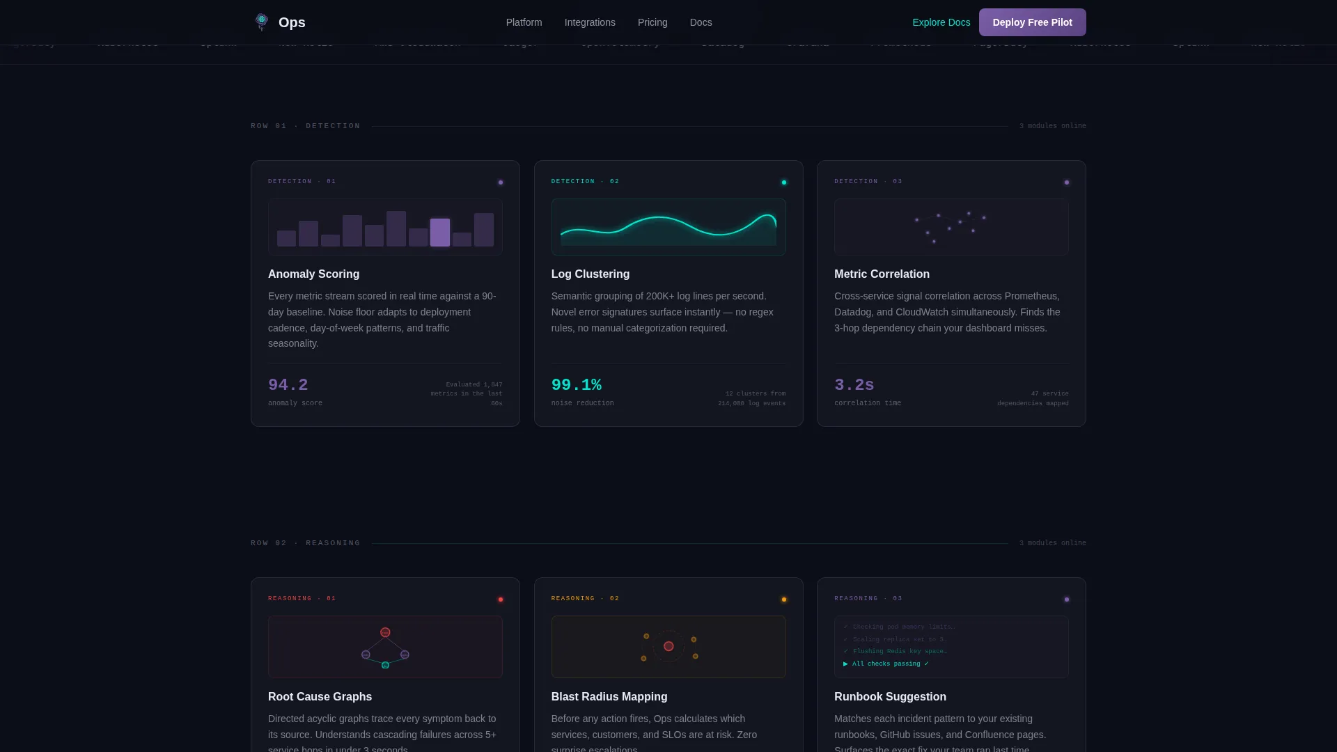
Nine cards are organized into three scroll-triggered rows. The first row covers detection: anomaly scoring, log clustering, and metric correlation. The second row covers reasoning: root-cause graphs, blast-radius mapping, and runbook suggestion. The third row covers action: auto-remediation, escalation routing, and post-incident reports. Each card snaps into the grid as the visitor scrolls down.
Per-Card Micro-Animations
Every card in the grid carries a dedicated micro-animation. Examples include a graph drawing itself, a node connecting to another node, and a status indicator flipping from red to green. These animations make the grid feel like a live system booting up rather than a static feature list.
Three-Step Progressive Form
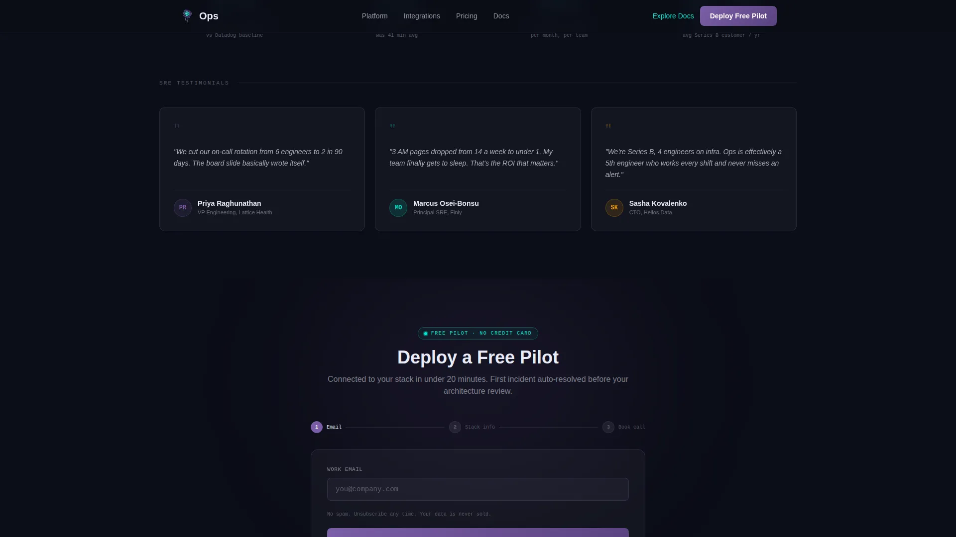
The lead capture form is split into three screens. The first asks only for a work email. The second reveals company size and primary observability stack selection. The third offers a calendar embed for booking a 20-minute architecture review. This flow reduces friction and collects richer qualification data incrementally.
Secondary Self-Serve Path
An "Explore the Docs" call to action runs alongside the primary form. It routes engineers who prefer self-service toward the framework's open-source layer. This path captures softer engagement signals without requiring a form submission.
Social Proof and Return on Investment Section
A dedicated stats section presents concrete metrics such as mean time to resolution (MTTR) reduction percentages and alert noise reduction figures. Named SRE testimonials and company logos sit alongside the numbers to build credibility with a technical audience.
Page sections overview
| Section | Purpose |
|---|---|
| Hero Dashboard Preview | Animated incident resolution demo with typewriter headline and live data pulses |
| Detection Card Row | Three cards covering anomaly scoring, log clustering, and metric correlation |
| Reasoning Card Row | Three cards covering root-cause graphs, blast-radius mapping, and runbook suggestion |
| Action Card Row | Three cards covering auto-remediation, escalation routing, and post-incident reports |
| Primary call to action Block | "Deploy a Free Pilot" repeated after the third card row with progressive form |
| Social Proof Stats | Concrete MTTR and alert noise metrics with SRE testimonials and logos |
| Footer | Linear single-row pattern with navigation and secondary links |
Design & branding system
The visual language blends a dark terminal aesthetic with a GPU-rendered iridescent quality. Cards appear to float above the background, catching violet and cyan light at their edges like glass refracting a prism.
- Color palette: void black (#0B0D17) as the canvas, holographic violet (#7B5EA7) for primary actions and graph accents, signal cyan (#00E5CC) for success states and live-data pulses, pearl white (#E8EAF6) for card surfaces
- Typography: JetBrains Mono for data displays and code-style labels, DM Sans for body copy and interface text
- The overall theme is Startup Velocity expressed through the AI Iridescent color system, where every visual element feels synthetic, luminous, and precise
Mobile & speed optimization
The template is designed desktop-first, matching how platform engineers actually work. A mobile fallback layout is included for secondary device coverage.
- Animations use CSS where possible, with Intersection Observer controlling scroll-triggered card reveals so they fire only when elements enter the viewport
- The progressive form and animated dashboard preview are structured to function on both desktop and mobile screen sizes
How this template helps you convert
The page earns the click before it asks for one. By the time the primary call to action appears, the visitor has already watched the product catch, diagnose, and resolve a simulated incident.
- The animated hero demonstrates an eleven-second automated resolution sequence immediately on load, creating a concrete proof point before any feature text
- The modular card grid builds the capability picture incrementally on scroll, so visitors absorb detection, reasoning, and action as a logical sequence rather than a feature dump
- The three-step progressive form and the parallel self-serve documentation path give two different engineer personas a comfortable way to engage on their own terms
Other information about this template
This template sits at the intersection of AIOps technology and platform engineering tooling. It is particularly well-suited for teams positioning an AI-powered observability platform or incident management product in the B2B SaaS space.
- The template style is Card Grid (Modular), built on the Launch Energy creative direction with the Dashboard Preview header concept
- The design theme is Startup Velocity paired with the AI Iridescent color system, making it distinct in a market where most ops tooling pages default to plain dark themes
- Localization defaults are English, United States dollar (USD), and MM/DD/YYYY date format, reflecting a USA-centric go-to-market context
- The footer follows Pattern 1, a linear single-row layout that keeps the page feeling clean and fast to the very end
Theme
Startup Velocity
Creative direction
Launch Energy
Color system
AI Iridescent
Style
Card Grid (Modular)
Direction
Lead Generation
Page Sections
Animated Dashboard Hero Preview
Scroll-triggered Card Grid
Per-card Micro-animations
Three-step Progressive Lead Form
Self-serve Documentation Path
Social Proof and ROI Stats Section
Related questions
Who is the primary audience for this template?
Can the card grid be customized for my product's specific features?
How does the progressive form reduce sign-up friction?
Is this template suitable for a developer-led or open-source product?
Does the template include the social proof section with metrics and testimonials?



