Optometry Software Portfolio & Case Study Website Template
Optic is a Bold Brutalist bento grid landing page template built for optometry workflow automation platforms. It combines Dark Glass Panels, an Acid Digital color system, and an Interactive Explorer layout to showcase how disconnected eye care practice steps connect automatically. The design is purpose-built to earn trial signups from independent optometrists and multi-location practice owners.
by Rocket studio
Quick summary
Optic is a single-page bento grid template designed for optometry workflow automation platforms. It uses a Bold Brutalist visual language, Dark Glass Panels, and an Interactive Explorer approach to show exactly how a fragmented eye care practice becomes a connected, automated system. The layout drives freemium trial conversions with minimal friction.
Who this template is for
This template is built for teams launching or marketing an eye care practice automation platform. It speaks directly to the people who feel the daily weight of manual clinical and administrative work.
- Independent optometrists who manually transfer data between instruments and patient record systems
- Office managers confirming insurance eligibility across multiple browser tabs
- Multi-location group owners who cannot see unified practice metrics without exporting files
What problem this template solves
Eye care practices run on dozens of disconnected steps per patient visit. This template gives a platform the visual language to make that complexity feel instantly solvable.
- Manual chart transfers between autorefractors and electronic medical record systems slow every exam
- Recall campaigns require staff time to build and send, even when prescription expiry data already exists
- Practice owners lack a single view of performance across locations without manual data exports
What you get with this template
The template delivers a fully structured bento grid landing page with a clear conversion path built in. Every visual and structural decision is tied to a specific workflow automation message.
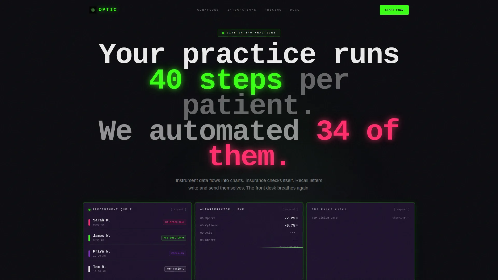
- A Dark Glass Panels header grid with four live workflow fragment tiles: appointment queue, real-time refraction result, insurance verification, and a recall campaign counter
- A bold monospaced center-panel headline: "Your practice runs 40 steps per patient. We automated 34 of them."
- A freemium signup tile with three fields (practice name, number of locations, and work email) and a secondary lead-capture quiz path labeled "See Your Workflow Map"
Feature list
This template ships with purpose-built components that map directly to the automation platform's core value proposition.
Clickable Bento Grid Panels
Each panel in the grid is clickable and expandable. Tapping a card zooms it to full width and reveals a micro-demo of that specific workflow, with animated data flowing between nodes.
Workflow Category Grid Reconfiguration
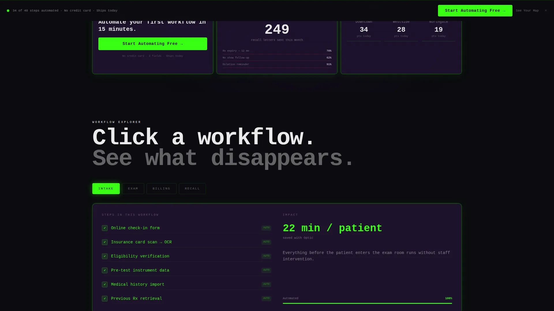
As the visitor scrolls deeper, the grid reconfigures automatically. Panels cluster first by workflow category (intake, exam, billing, recall), teaching the visitor how the system connects across a real practice day.
Dark Glass Panel Header
The header is built as a wall of translucent, smoke-black cards with frosted-glass depth. Each panel shows a different live workflow fragment with a faint terminal green border glow, floating over a pure black void.
Freemium Conversion Tile
A dedicated bento tile inside the header grid carries the primary call to action: "Start Automating Free." The same call to action reappears as a sticky bottom bar after the third scroll depth, keeping the conversion path always visible.
Interactive Workflow Map Quiz
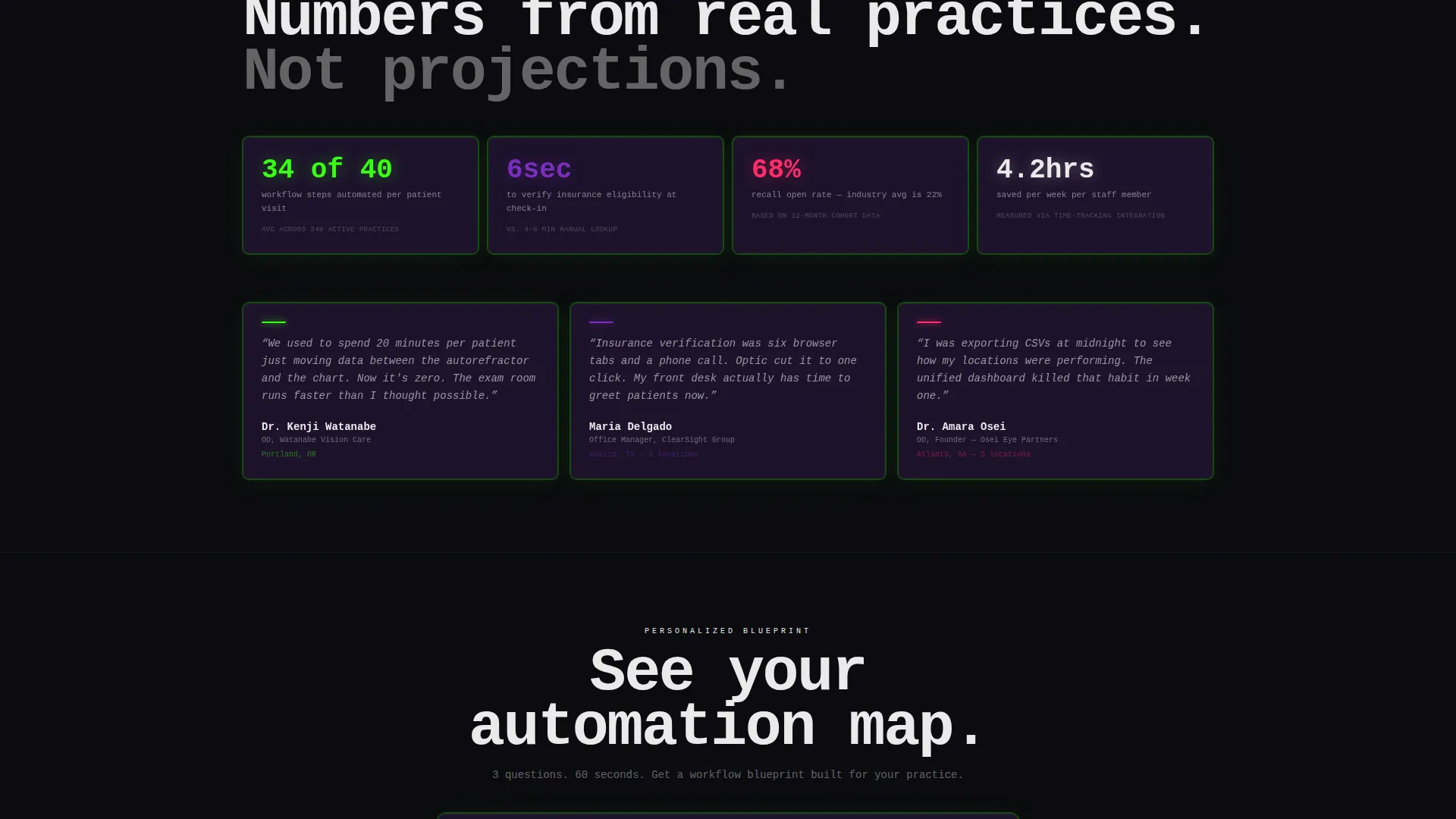
A secondary conversion path offers "See Your Workflow Map." Visitors answer a short quiz about their practice management system, top time-wasting tasks, and daily patient volume. The result is a personalized automation blueprint they can download.
Sticky Secondary Conversion Bar
After three scroll depths, a sticky bottom bar appears with the primary call to action. This keeps the signup option in view without interrupting the exploratory grid experience above it.
Page sections overview
| Section | Purpose |
|---|---|
| Dark Glass Header | Introduce platform value with live workflow fragment panels and primary conversion tile |
| Monospaced Headline Panel | Deliver the core automation claim in a single, punchy center-panel statement |
| Intake Workflow Cluster | Show how patient intake steps connect and automate from first contact |
| Exam Workflow Cluster | Demonstrate real-time data flow from pre-test instruments into exam records |
| Billing Workflow Cluster | Illustrate insurance eligibility verification and billing automation |
| Recall Workflow Cluster | Explain how recall letters fire automatically based on prescription expiry |
| Workflow Map Quiz | Capture leads with a personalized automation blueprint quiz |
| Freemium Signup Block | Convert ready visitors with a three-field, no-credit-card signup form |
| Sticky Conversion Bar | Maintain call to action visibility across the full scroll depth of the page |
Design & branding system
The visual identity uses a Bold Brutalist theme with the Acid Digital color system. Every design decision is functional and stripped of decorative softness.
- Color palette: void black (#0B0B0F) as the base, terminal green (#39FF14) for borders and primary calls to action, ultraviolet (#7B2FBE) as a backlit wash beneath cards, hot signal white (#EAEAEA) for body text, and danger-pulse magenta (#FF2D6B) reserved for alerts and key interactive states
- Typography: monospaced headline type punches through the center panel; all grid borders are single-pixel terminal green lines against near-black backgrounds
Mobile & speed optimization
The bento grid layout is structured to translate from wide desktop grids to focused mobile card stacks without losing the interactive explorer logic.
- Each expandable panel is designed to zoom to full width on both desktop and mobile tap interactions
- The sticky conversion bar is built to remain anchored at the bottom of the viewport across all screen sizes
How this template helps you convert
The template earns the click by letting visitors touch the product before committing. Every design choice supports a low-friction path from curiosity to signup.
- The header grid puts live workflow fragments in front of the visitor immediately, making the platform's value concrete before any scroll
- The three-field freemium tile removes credit card friction and reduces signup hesitation for practice owners evaluating the platform
- The "See Your Workflow Map" quiz captures leads who are not yet ready to trial by delivering a personalized, downloadable automation blueprint in exchange for practice details
Other information about this template
This template was designed specifically for the optometry software niche within the broader health care technology market. It is well suited for platforms in the optometry workflow automation space that need to communicate complex, multi-step process value to a non-technical clinical audience.
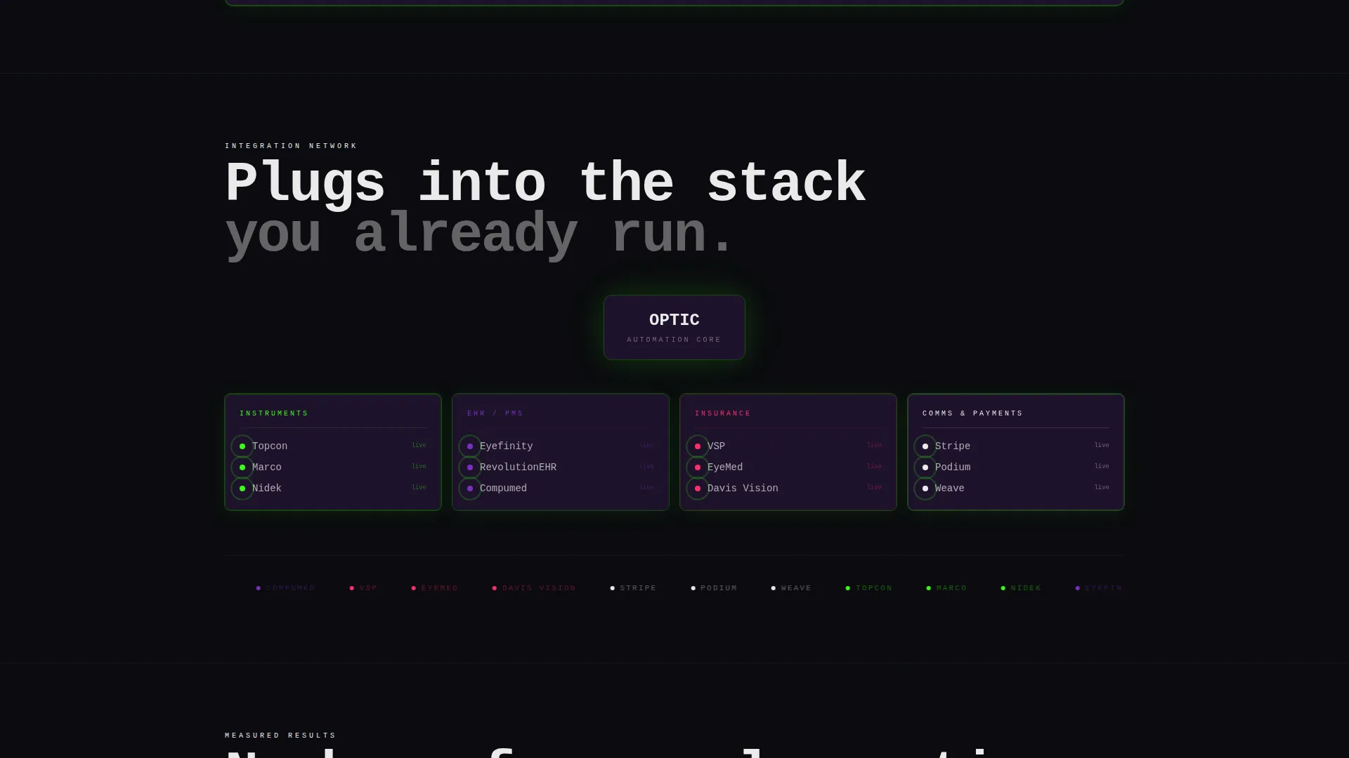
- The bento grid style supports a modular build approach, meaning individual panels can be updated to reflect new workflow categories or integration partners over time
- The Interactive Explorer creative direction means the page teaches the visitor progressively, with each panel expansion acting as a proof point rather than a marketing claim
- The Freemium/Trial landing page direction keeps the page focused on a single conversion goal while the secondary quiz path ensures the page captures value from visitors at every stage of the buying decision
Theme
Bold Brutalist
Creative direction
Interactive Explorer
Color system
Acid Digital
Style
Bento Grid
Direction
Freemium/Trial
Page Sections
Clickable Expandable Bento Panels
Dark Glass Panel Header
Freemium Signup Conversion Tile
Interactive Workflow Map Quiz
Progressive Grid Reconfiguration
Sticky Bottom Conversion Bar
Related questions
Who is this template designed for?
Do I need design experience to use this template?
What conversion paths does this template include?
Can the bento grid panels be updated for different workflow categories?
What makes this template different from a standard software landing page?



