Expert Optometry Software Professional Website Template
Optic is a bold brutalist landing page template built for optometry learning management platforms. It opens with a live-feel dashboard preview packed with cohort performance data, then drives scroll through oversized statistics and a click-through funnel. The design uses a dense Slate and Sky color system engineered for zero distraction and maximum credibility.
by Rocket studio
Quick summary
Optic is a single-page brutalist landing page template designed for optometry learning management systems. It leads with a full-viewport data grid dashboard, delivers evidence through giant statistics, and funnels visitors toward a guided product tour. The Slate and Sky color system keeps every element sharp, clinical, and conversion-ready.
Who this template is for
This template is built for teams selling or presenting an optometry learning management system to institutional buyers. It speaks directly to the people who evaluate, purchase, and run clinical education platforms.
- Optometry program directors building and managing curricula for student cohorts
- Third-year optometry students preparing for the National Board of Examiners in Optometry (NBEO) examination
- Continuing education coordinators tracking license renewal credits across multi-location practices
What problem this template solves
Optometry education platforms often struggle to communicate value quickly to skeptical institutional buyers. A generic software landing page does not build the trust that program directors and coordinators need before committing to a procurement process.
- Visitors leave before understanding the platform's clinical depth or measurable outcomes
- Program directors need institutional return-on-investment proof, not feature lists
- Students and coordinators need to feel the tool works before they sign up
What you get with this template
You get a fully structured brutalist landing page that argues its case through data rather than marketing language. Every section is purpose-built to move a specific audience segment from curiosity to action.
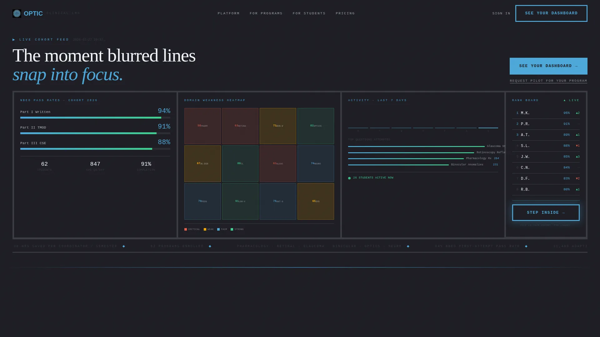
- A full-viewport dashboard header rendered in monospaced type and thick brutalist borders, showing cohort pass rates, a clinical domain heatmap, and an anonymized leaderboard
- Stats-first scroll panels that each open with a single oversized statistic in 120-pixel brutalist type before revealing supporting methodology and context
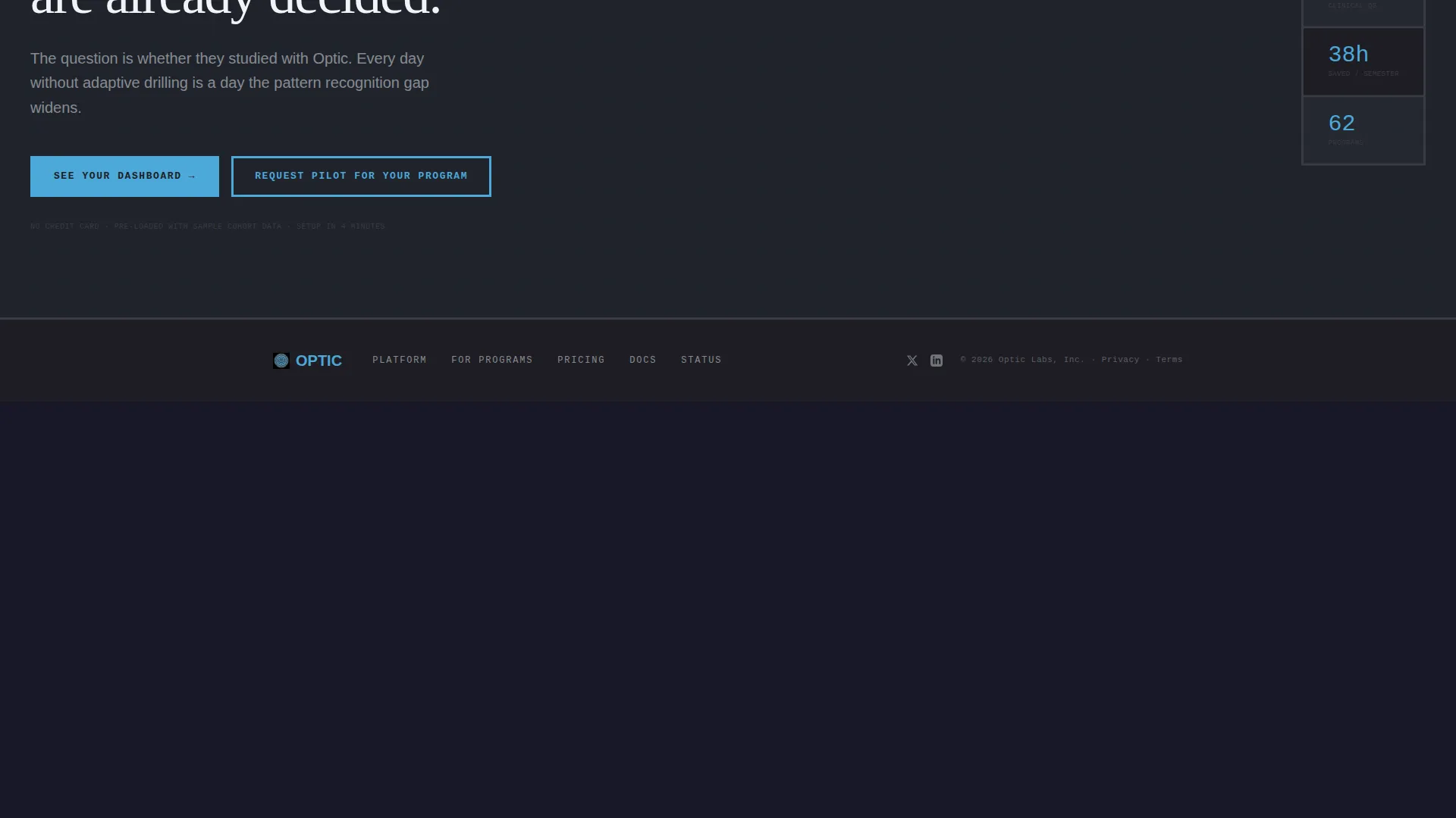
- A two-tier call-to-action system with a primary "See Your Dashboard" button and a secondary "Request Pilot for Your Program" text link
Feature list
This template includes six core design and layout features, each grounded in the source brief.
Living Dashboard Header
The header fills the full viewport with a brutalist data grid. It displays student cohort pass-rate percentages in oversized numerals, a color-coded heatmap of weakest clinical domains, and a ranked leaderboard column with anonymized initials. The dashboard does not look like a screenshot; it reads as an active, working interface.
Stats-First Scroll Panels
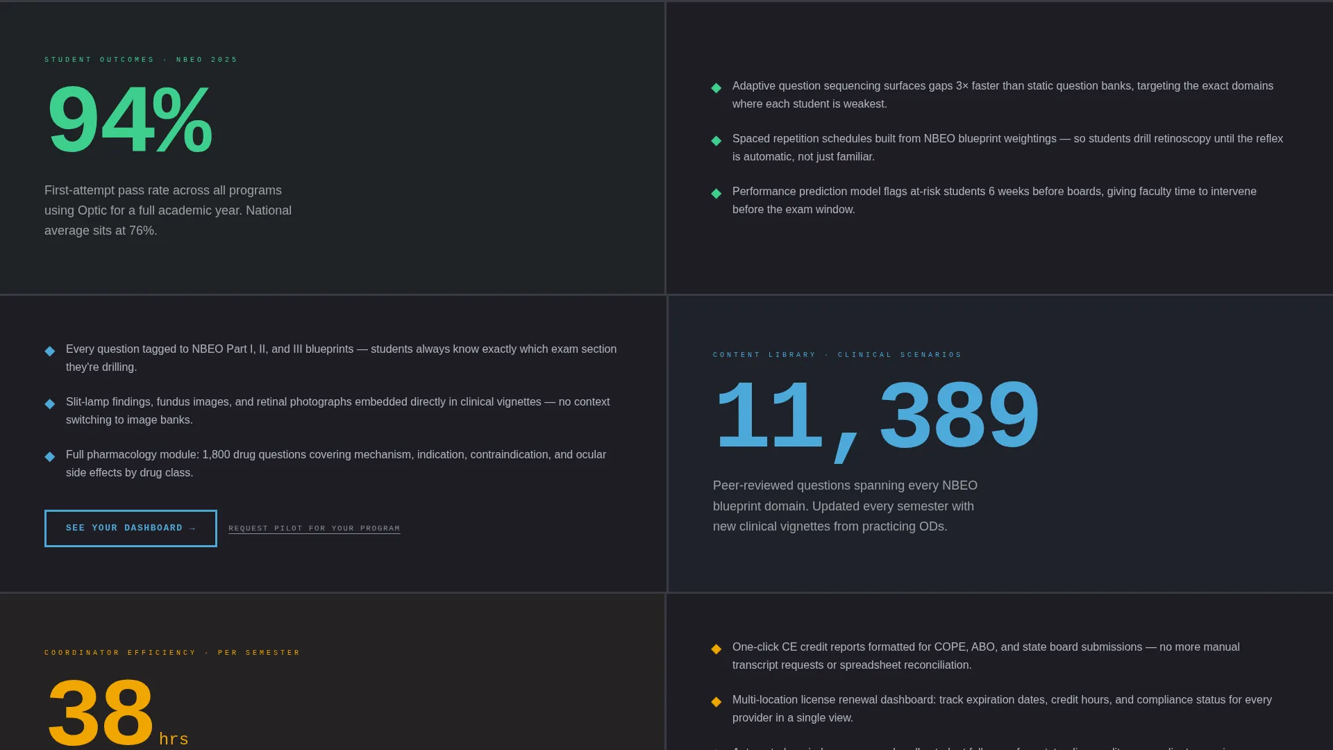
Each panel below the fold opens with a single enormous statistic rendered in 120-pixel brutalist type. The number appears first, then the supporting context unfolds beneath it. This mirrors the structure of a research paper's results section, letting evidence build from student outcomes to institutional return on investment.
Two-Tier Call-to-Action System
The primary call to action, "See Your Dashboard," appears first inside the header as a brutalist button that breaks the fourth wall. It then repeats after every second stats panel. A secondary text link, "Request Pilot for Your Program," targets program directors who need procurement justification.
Slate and Sky Color System
The palette uses dense charcoal slab, exposed concrete gray, clinical sky blue for active states and data highlights, and a sharp white that cuts across dark surfaces. Every color decision reinforces the windowless exam-room atmosphere where the only light comes from instrument screens.
Monospaced Brutalist Typography
All data labels, statistics, and interface elements use monospaced type paired with thick structural borders. The typographic system makes raw numbers feel authoritative and clinical rather than decorative.
Heatmap Domain Highlight Panel
Weak clinical domains glow in warm red tones while stronger areas cool to blue. This embedded heatmap inside the dashboard header gives visitors an immediate visual argument for the platform's diagnostic depth without requiring a single line of explanatory copy.
Page sections overview
| Section | Purpose |
|---|---|
| Dashboard Header | Displays live-feel cohort data grid as the full-viewport hero |
| Pass Rate Panel | Opens with 94% NBEO first-attempt stat and supporting methodology |
| Question Library Panel | Reveals 11,400 adaptive clinical questions as the content proof |
| Coordinator ROI Panel | Shows 38 hours saved per coordinator per semester as workflow evidence |
| Primary call to action Repeat | Reinforces "See Your Dashboard" after every second stats panel |
| Pilot Request Link | Provides secondary path for program directors needing procurement support |
Design & branding system
The visual identity is built on a Bold Brutalist theme that treats exposed structure as the aesthetic, not a limitation. Every design choice prioritizes legibility and data density over decoration.
- Color palette: dense charcoal slab (#1E1E24), exposed concrete gray (#3A3A44), clinical sky blue (#4DA8DA) for active states, and sharp white (#F0F4F8) for contrast elements
- Typography: monospaced slab type used at multiple scales, with 120-pixel headline numerals for stats panels and compact body type for data grid labels
- Layout: thick borders, rigid grid structures, and zero use of stock photography or illustration
Mobile & speed optimization
The brutalist grid structure is designed to translate cleanly to smaller screens without losing its data-dense character. The layout relies on structured content blocks rather than complex imagery, keeping the page lean.
- No stock photography or illustration assets means fewer heavy image requests on load
- Monospaced type and border-based layouts scale predictably across viewport widths
- Stats panels reflow vertically on mobile, preserving the single-statistic-first reveal sequence
How this template helps you convert
The entire page is engineered as a click-through funnel. Visitors are never asked to trust a pitch; they are shown evidence and then invited to step inside the product.
- The dashboard header makes visitors feel they are already looking at their own cohort data, lowering the psychological barrier to clicking "See Your Dashboard" before a single scroll
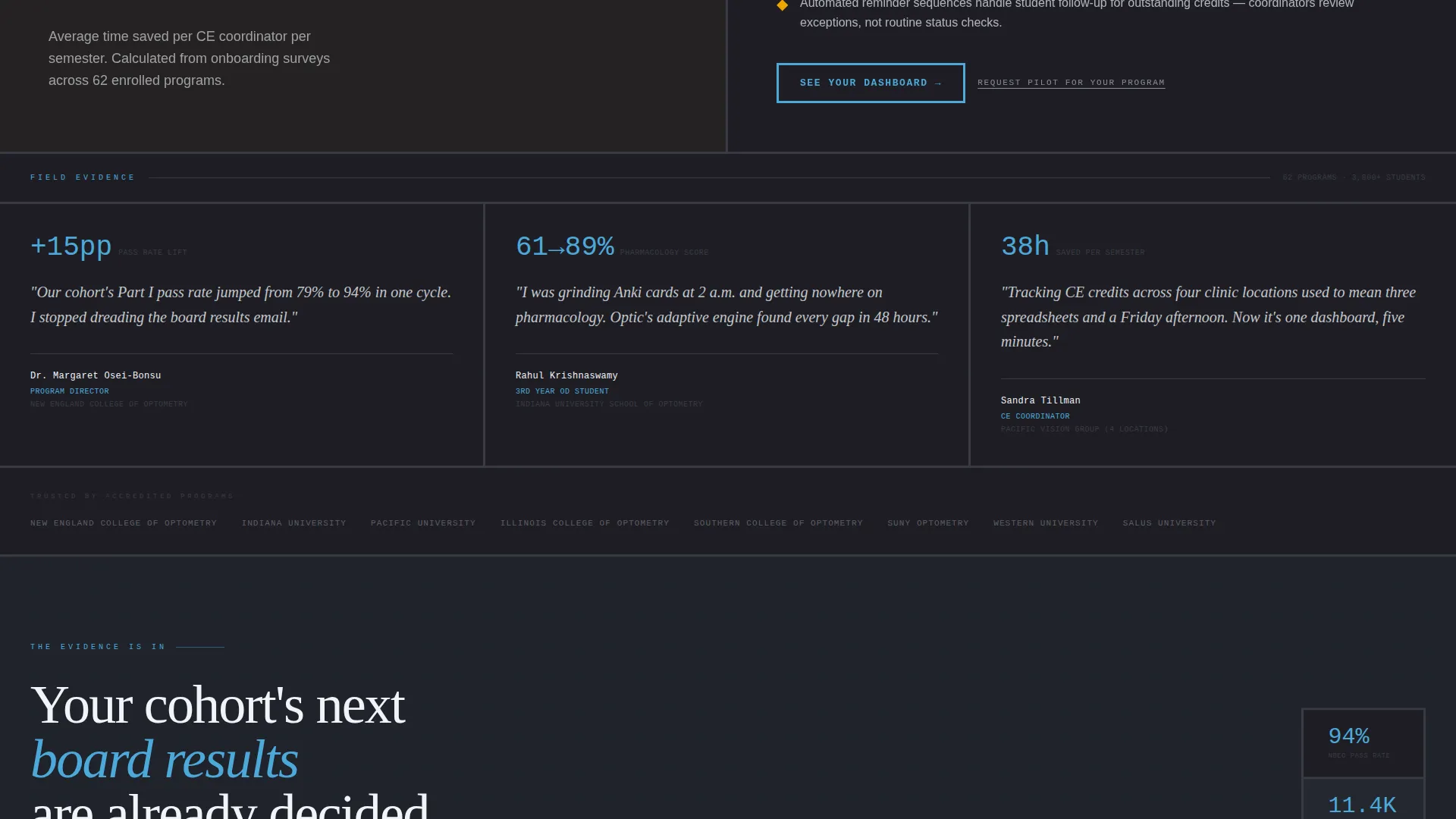
- Each stats panel escalates the institutional case from student pass rates to coordinator time savings, so the call to action arrives after the argument is already won
Other information about this template
This template is categorized under Technology, with a subcategory focus on optometry software and a niche alignment with optometry learning management systems. It is a strong fit for any team that needs to present a clinical education platform to institutional decision-makers.
- Template style: Dashboard and data grid layout, single-page structure
- Theme: Bold Brutalist with a Stats-First Impact creative direction
- Header concept: Full-viewport Dashboard Preview with live-feel cohort metrics
- Page direction: Click-Through funnel routing visitors to a guided product tour with pre-loaded sample cohort data
- Suitable for showcasing platforms that cover clinical scenarios ranging from retinoscopy reflex interpretation to glaucoma staging
Theme
Bold Brutalist
Creative direction
Stats-First Impact
Color system
Slate & Sky
Style
Dashboard/Data Grid
Direction
Click-Through
Page Sections
Living Dashboard Header
Stats-first Scroll Panels
Two-tier Call-to-action System
Slate and Sky Color System
Monospaced Brutalist Typography
Clinical Domain Heatmap Panel
Related questions
Who is this landing page template designed for?
Can I edit the statistics shown in the dashboard header?
Does this template use photographs or illustrations?
What makes the call-to-action system different from a standard template?
Is this template suitable for a platform covering multiple clinical areas?



