Optometry Software Comparison Website Template
Optic is a comparison-focused landing page template built for eye bank platforms that replace spreadsheet-driven donor coordination with a unified dashboard. It guides eye bank directors, transplant coordinators, and development officers from chaos to clarity using a Problem-to-Solution scroll arc, a side-by-side comparison table, and two targeted conversion paths.
by Rocket studio
Quick summary
Optic is a single-page landing page template designed for optometry donor management platforms. It presents a stark comparison between legacy workflows and a purpose-built dashboard, walking visitors through real coordination pain points before revealing a clear solution. The page earns trust through specificity and converts through a focused, low-friction call to action.
Who this template is for
This template speaks directly to the people who feel the cost of broken eye bank workflows every single day. It is built for teams who need to show stakeholders why a dedicated platform matters.
- Eye bank directors managing Eye Bank Association of America (EBAA) compliance audits and donor tissue lifecycles
- Transplant coordinators who field urgent surgeon requests outside of business hours
- Development officers who need to report donor impact to foundation boards in a credible, visual way
What problem this template solves
Eye bank coordination still runs on spreadsheets, disconnected text threads, and software built for unrelated industries. That means tissue expiration goes untracked, audit trails disappear, and donor families never hear back. This template helps a platform make that cost impossible to ignore.
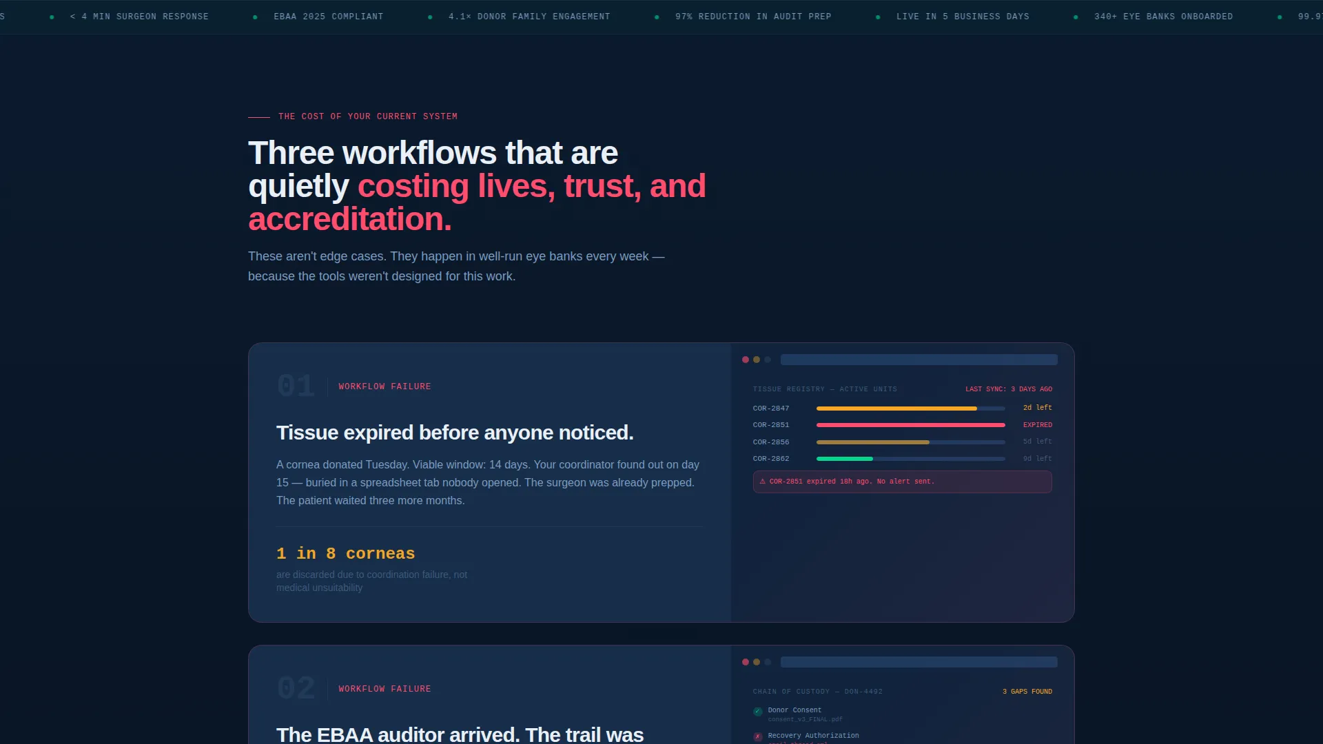
- Missed tissue expiration windows caused by fragmented tracking tools
- Lost EBAA compliance audit trails spread across email chains and manual logs
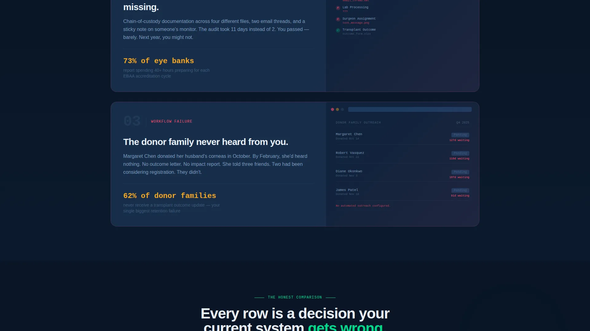
- Donor family engagement that falls through the cracks after the initial consent stage
What you get with this template
You get a structured, scroll-driven landing page that takes a skeptical visitor through a deliberate persuasion arc. Every section builds on the last, and nothing is decorative.
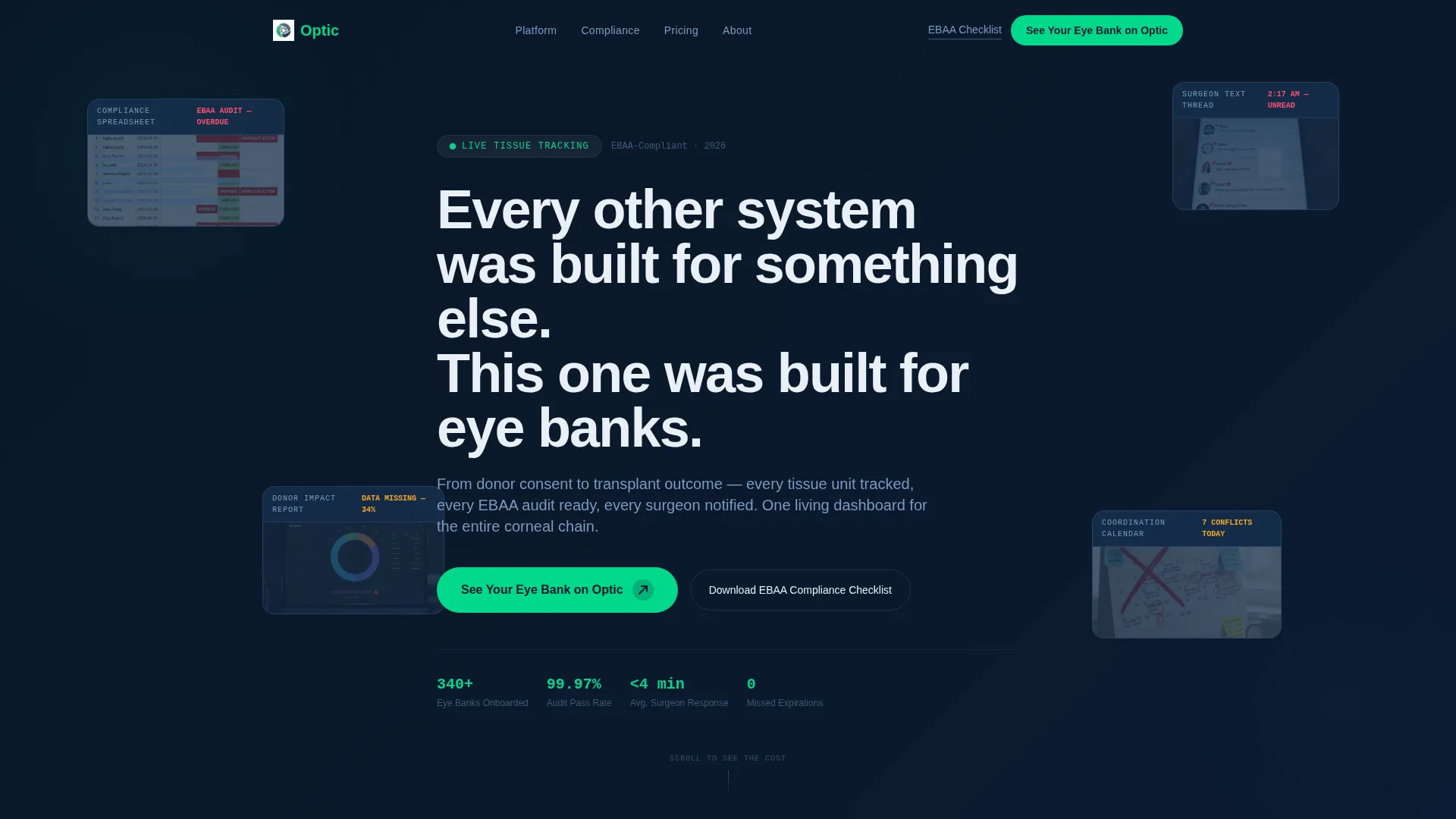
- A chaotic header that visually resolves into order on scroll, setting the emotional tone immediately
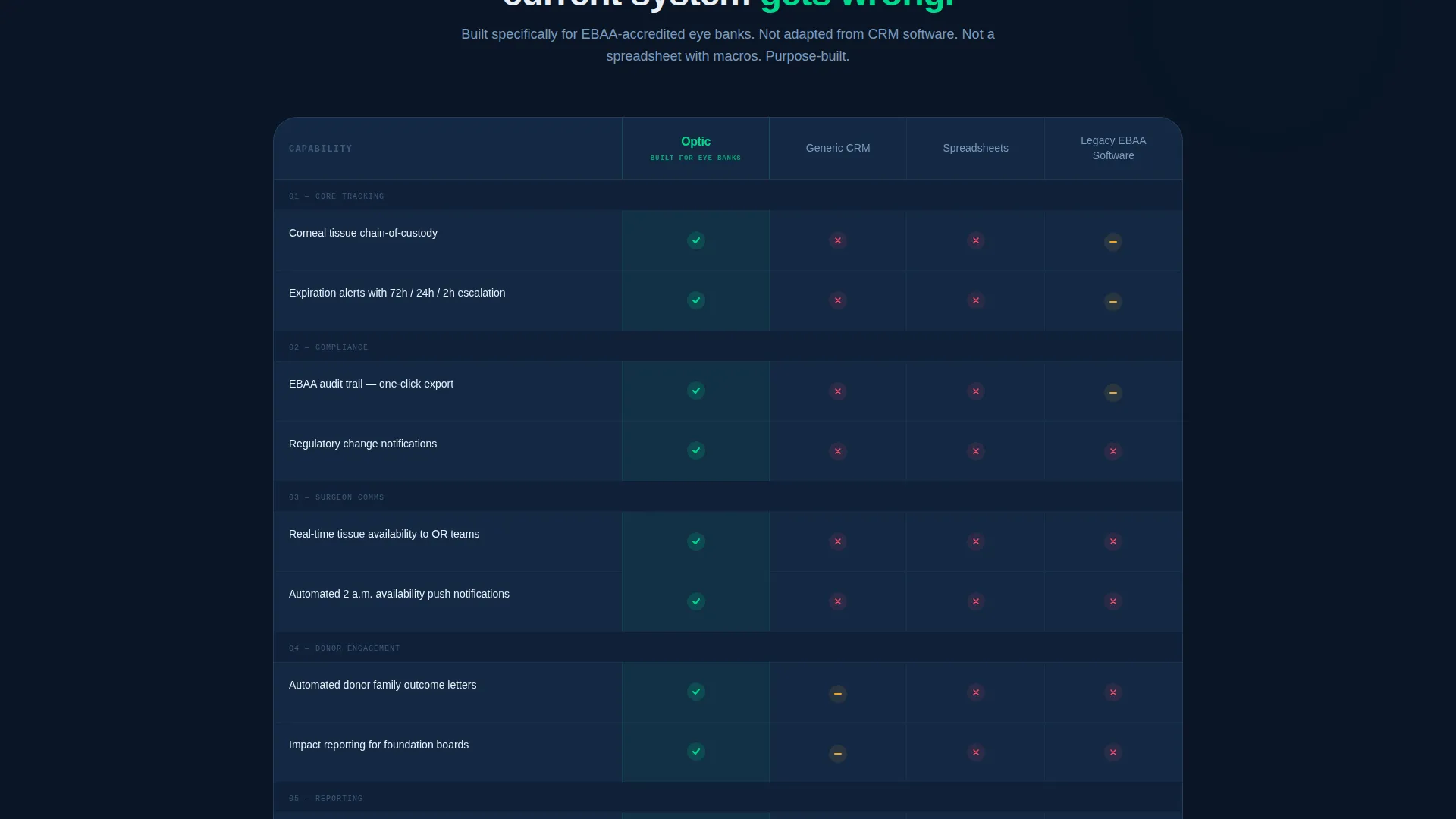
- A side-by-side comparison table pitting the platform against generic customer relationship management (CRM) tools, spreadsheets, and legacy EBAA software
- Two conversion paths: a demo request form and a secondary email capture tied to a compliance checklist download
Feature list
This section describes the core built-in components that make the Optic template work as a conversion tool for optometry donor management platforms.
Animated Dark Glass Header
The header opens with a grid of translucent, frosted-glass cards floating against a deep navy background. Each panel shows a fragment of donor management pain: a redacted compliance spreadsheet, an unanswered surgeon text thread, a pie chart with missing segments, a calendar full of conflicts. On scroll, the panels realign and snap into a clean unified dashboard as the headline types itself in.
Problem Arc with Broken-user interface Cards
The first content section presents three real workflow failures rendered as dim, broken-interface cards. Each card names a specific nightmare: missed tissue expiration, a lost EBAA audit trail, and a donor family never thanked. This section sets up the emotional weight before the comparison table arrives.
Centerpiece Comparison Table
The comparison table is the persuasive core of the page. It places the platform in the anchor column against three competitor types across five criteria: tissue tracking, compliance automation, surgeon communication, donor family engagement, and reporting. Green checkmarks pulse subtly in the platform column on each winning row.
Micro-Demo Zoom Sections
After the comparison table, the page zooms into each winning row with a dedicated micro-demo panel. Each panel shows what the platform actually does in that category. The sequence escalates from operational loss to trust loss, then closes with the resolution.
Dual Conversion Path Design
The primary call to action, "See Your Eye Bank on Optic," is pinned at the base of the comparison table and repeated after the final micro-demo. It opens a two-field form collecting organization name and monthly donor volume. A secondary path captures email through a compliance checklist download for visitors not yet ready to request a demo.
Startup Velocity Visual Theme
The page uses a Midnight Blue color system built around deep orbital navy, clinical slate card surfaces, sterile white text, and a sharp donor-green accent on calls to action and positive metric indicators. The overall palette feels like a mission control room at night, purposeful and data-forward with nothing wasted on decoration.
Page sections overview
| Section | Purpose |
|---|---|
| Dark Glass Header | Visualizes coordination chaos, resolves on scroll into a unified dashboard interface |
| Problem Cards Row | Names three specific workflow failures using dim broken-user interface card visuals |
| Comparison Table | Side-by-side platform versus competitor breakdown across five workflow criteria |
| Micro-Demo Panels | Zooms into each winning table row with a focused capability demonstration |
| Primary call to action Block | Pins the demo request form at the table base and after the final micro-demo |
| Secondary call to action Strip | Captures email with a compliance checklist download for early-stage visitors |
Design & branding system
The visual identity follows a Startup Velocity theme and a Midnight Blue color system. Every design choice reinforces a mission-critical, data-driven atmosphere with no unnecessary ornamentation.
- Color palette: deep orbital navy (#0B1A2E) as the primary background, clinical slate (#1E3A5F) for card surfaces and table rows, sterile white (#EAF0F7) for all text and data labels, and donor-green (#00D98B) on calls to action and positive indicators
- Typography and motion: the headline types itself in on scroll, frosted-glass panels shift from chaotic overlap to clean alignment, and comparison table checkmarks pulse subtly to draw the eye
Mobile & speed optimization
The Optic template is structured so that its most persuasive elements remain clear and readable across screen sizes. The scroll-triggered animations and table layout are designed to function on smaller viewports without losing the comparison logic.
- The comparison table maintains its column structure on mobile so visitors can still read the platform versus competitor breakdown clearly
- The dual conversion paths remain accessible at both the mid-page and end-page positions regardless of device size
How this template helps you convert
The page is built around a Comparison/Versus conversion strategy. Every section is ordered to increase the visitor's sense of urgency before presenting a low-friction way to act.
- The header creates immediate emotional recognition by showing real coordination pain in fragmented visual form, then resolves it, making the platform feel like the obvious answer before a single feature is listed.
- The comparison table removes abstract claims and replaces them with a structured, row-by-row contrast that makes the cost of staying with legacy tools concrete and visible.
- The dual conversion paths match visitors at different stages of readiness, capturing both high-intent demo requests and early-stage leads through the compliance checklist download.
Other information about this template
This template is part of a broader set of Startup Velocity theme designs built for niche software platforms where the buyer already knows their problem but needs help seeing the solution clearly.
- The template style is a Comparison Table landing page, making it well-suited for optometry software platforms competing against generic tools
- The creative direction follows a Problem-to-Solution Arc, a format that works especially well for regulated industries where the stakes of the wrong tool are tangible
- The header concept, Dark Glass Panels, is a distinctive visual device that differentiates this template from standard software landing pages using static hero imagery
- The lp direction, Comparison/Versus, is intentionally paired with the two-field demo form to keep qualification simple without adding friction
Theme
Startup Velocity
Creative direction
Problem→Solution Arc
Color system
Midnight Blue
Style
Comparison Table
Direction
Comparison/Versus
Page Sections
Animated Dark Glass Header
Problem Arc with Broken-ui Cards
Centerpiece Comparison Table
Micro-demo Zoom Panels
Dual Conversion Path Design
Related questions
Can I customize the comparison table columns and rows?
What does the two-field demo form collect?
Is the secondary email capture separate from the demo form?
Who is this landing page template best suited for?
Can the scroll animations be adjusted?



