Advanced Optometry Software Cost Estimator Website Template
Optic is a bold, brutalist-styled optometry case management landing page built for independent practitioners and multi-location practice owners. It opens with a live case-load calculator that surfaces recovered revenue before a visitor scrolls. A split-screen layout pairs problem with solution in blunt, data-driven sections, and drives action toward an app download.
by Rocket studio
Quick summary
Optic is a single-page, split-screen landing page template for an optometry case management platform. The page opens with a live calculator that shows practice owners their unbilled exams and hours wasted. Each section below it pairs a real workflow problem with a direct visual answer. The primary goal is one clear action: download the app and run the first audit.
Who this template is for
This template was designed for optometry practices that are losing revenue to disorganized workflows. It speaks directly to the people carrying that daily weight.
- Independent optometrists managing sixty or more patients a day across multiple exam lanes
- Office managers tracking prior-authorization follow-ups across a packed weekly schedule
- Multi-location practice owners who need a clear view of unbilled exams across every clinic
What problem this template solves
Optometry practices often run on scattered systems. Patient charts, insurance codes, and referral chains live in separate places, and revenue slips through the cracks before anyone notices.
- Staff spend hours chasing prior-authorization approvals instead of supporting patient care
- Unbilled exams accumulate silently until a quarterly review reveals the loss
- Practice owners cannot easily compare clinic performance without pulling reports manually
What you get with this template
This template gives you a fully structured, single-page layout with interactive components built in. Every section is designed to earn trust through demonstration, not description.
- A live case-load calculator in the header that returns personalized revenue and time-recovery estimates
- A split-screen layout that pairs brutalist data blocks with corresponding app screenshots
- Two primary call-to-action placements and a device-detect modal routing to the App Store or Google Play
- A secondary "Text Me the Link" capture field for desktop visitors
Feature list
This template delivers a tightly engineered set of interactive and visual components. Each one earns its place on the page by doing real work.
Live Case-Load Calculator
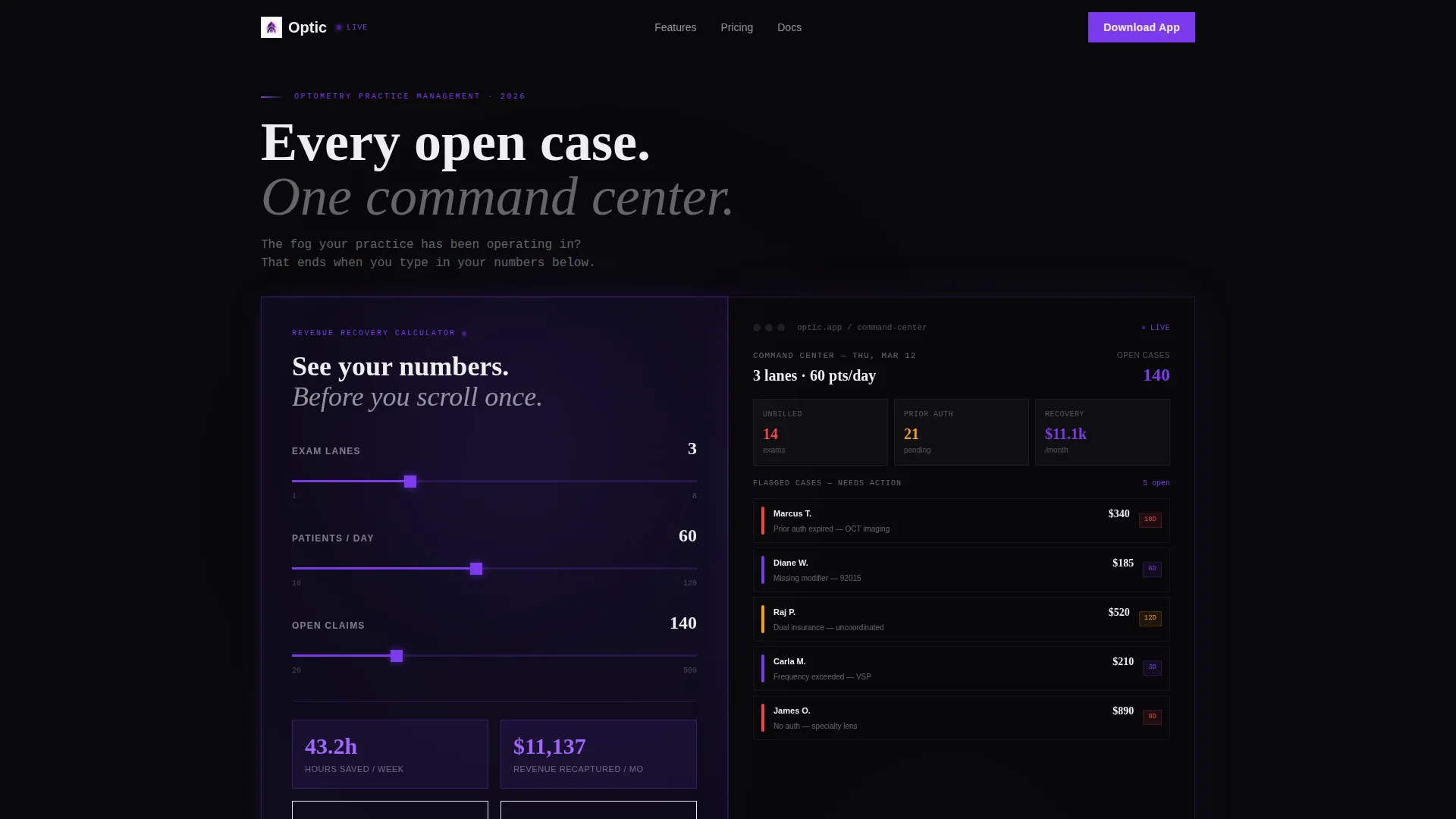
Visitors enter their practice size, average daily patient count, and number of open insurance claims. The tool instantly returns hours saved per week, unbilled-exam recovery rate, and projected revenue recaptured. The calculator is the hero, no stock imagery, no placeholder statistics.
Real-Time App Interface Panel
The right side of the header responds live to calculator inputs. It populates a dashboard with matching numbers, surfaces flagged cases, and color-codes overdue authorizations. The visitor sees their own practice reflected in the product before scrolling.
Alternating Split-Screen Sections
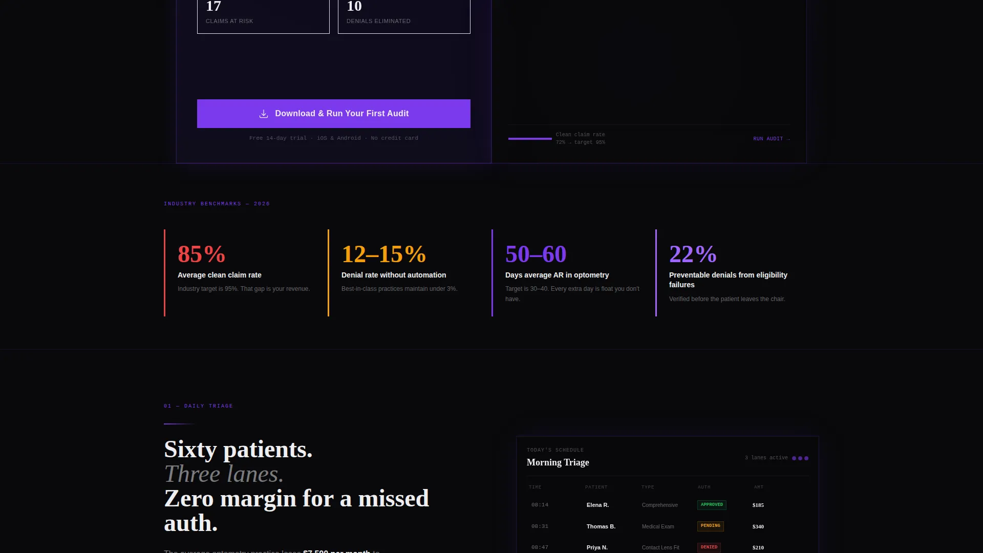
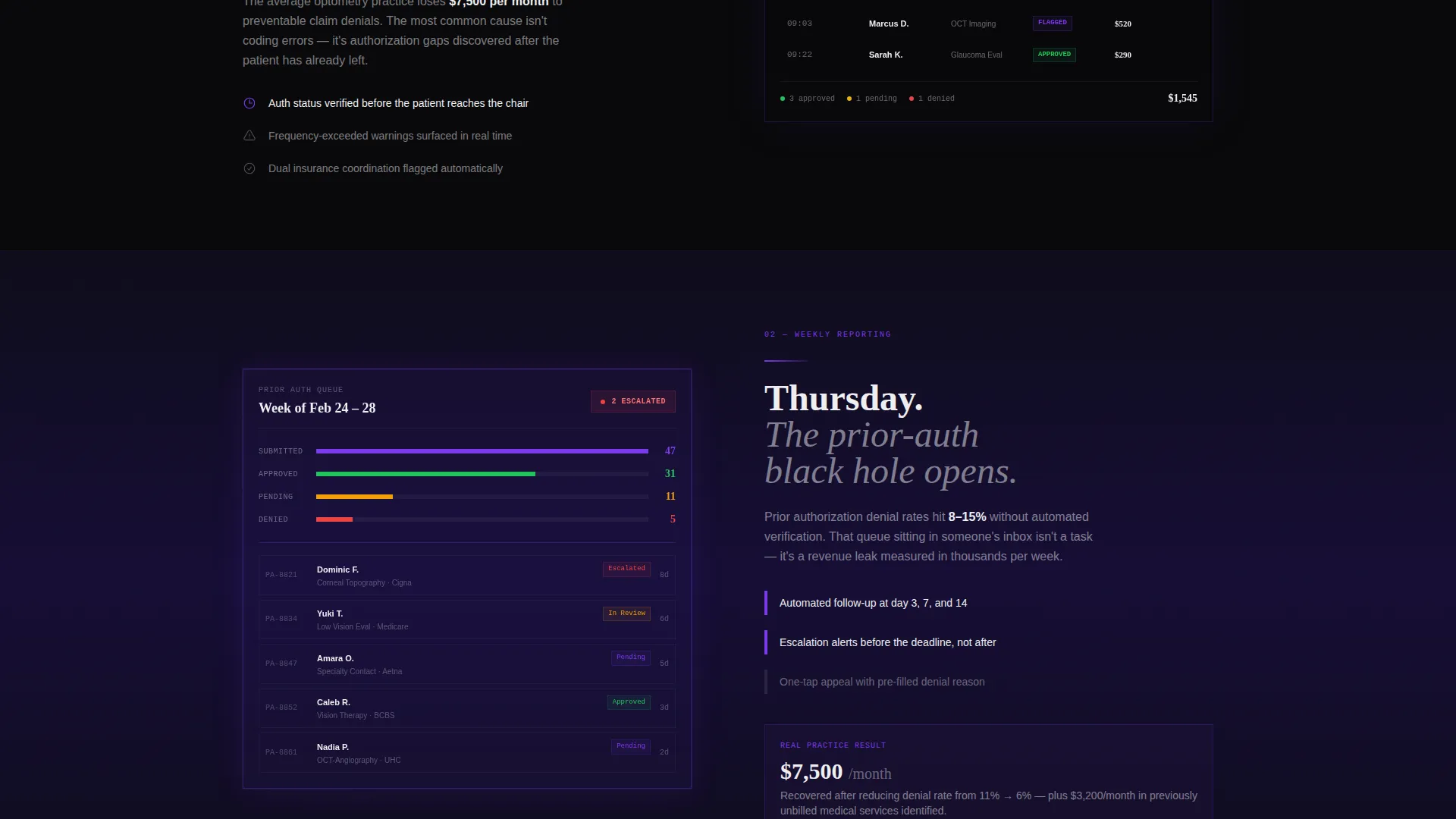
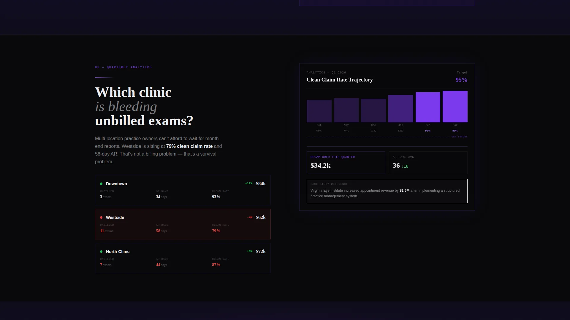
Each content row divides into a left-side problem block and a right-side solution block. Bold stats and single-sentence callouts sit beside app screenshots that match the described workflow. The rhythm escalates from daily triage to weekly reporting to quarterly analytics.
Dual Call-to-Action Placement
The primary call to action, "Download and Run Your First Audit," appears twice: once anchored beside the calculator results and once at the bottom of the page after the final proof section. This placement captures both early-intent and fully-convinced visitors.
Device-Detect Download Modal
Tapping the primary call to action triggers a modal that detects the visitor's device and routes them to the correct app store. Desktop visitors see a phone-number field to receive a direct download link by text message.
Dark Glass Panel Header
Two translucent, frosted-glass cards sit side by side against a void-black background. Faint violet light traces their edges. The left card holds the calculator; the right card holds the live app response. Together they form a single, immersive opening section.
Page sections overview
| Section | Purpose |
|---|---|
| Dark Glass Header | Opens with live calculator and real-time app panel |
| Daily Triage Block | Shows how individual patient queues are managed |
| Weekly Reporting Row | Demonstrates prior-auth tracking and follow-up visibility |
| Quarterly Analytics View | Connects billing gaps to long-term practice profitability |
| Bottom call to action Section | Anchors the final download prompt after proof sections |
Design & branding system
The visual identity is Bold Brutalist, built on a Void and Violet color system. Every design decision serves focus and clarity, like a diagnostic room with the lights dimmed and the slit lamp on.
- Color palette: absolute void black (#09090B), deep ultraviolet (#2D1B69), electric violet (#7C3AED) for interactive surfaces, and clinical white (#EEEEF0) for all typography
- Backgrounds alternate between void black and ultraviolet; violet pulses on buttons, progress bars, and active-state indicators
- No stock photography; the user interface and calculator data are the only visual content
Mobile & speed optimization
The template is structured to work across screen sizes without losing its core interactive experience. The split-screen layout adapts for smaller viewports.
- The device-detect modal ensures mobile visitors land on the correct app store without extra steps
- The "Text Me the Link" field on desktop provides a seamless bridge for visitors who discover the page on a larger screen
- Section stacking on mobile preserves the problem-solution pairing that drives the page's argument
How this template helps you convert
Every layout decision on this page removes friction from the path to download. The calculator does the selling; the rest of the page provides proof.
- The live calculator delivers a personalized result before the visitor scrolls, creating an immediate emotional stake in the product
- Each split-screen section deepens the calculator's claim by showing the exact feature that solves the problem just named
- The dual call-to-action placement captures visitors at two different stages of confidence, and the device-detect modal removes the final step between decision and download
Other information about this template
This template is part of a category focused on optometry software and practice management tools. It is built for the intersection of technology and clinical operations.
- Template style: Split Screen (50/50) with alternating left-right content rows
- Theme: Bold Brutalist with a Void and Violet color system
- Creative direction: Calculator and tool-first, where the interactive component leads the page
- Header concept: Dark Glass Panels with frosted translucency and violet edge lighting
- Landing-page direction: App Download, with dual primary call-to-action anchors and a text-link capture field
- Suitable for optometry case management platforms targeting independent practices and multi-site clinic groups
Theme
Bold Brutalist
Creative direction
Calculator/Tool First
Color system
Void & Violet
Style
Split Screen (50/50)
Direction
App Download
Page Sections
Live Case-load Calculator
Real-time App Interface Panel
Alternating Split-screen Layout
Device-detect Download Modal
Dual Call to Action Anchor Points
Dark Glass Panel Header
Related questions
What kind of practice is this template designed for?
How does the calculator in the header work?
What is the primary call to action on this page?
Can desktop visitors still get the download link?
Does this template use stock photography?



