Optometry Software Cost Calculator Website Template
Optic is a hub-and-spoke subscription landing page template built for optometry subscription management platforms. It combines a live ROI estimator, scroll-triggered data storytelling, and a device-aware app download flow into one purposefully uncluttered, Dashboard Pro layout. Visitors understand the value proposition within seconds and move naturally toward signing up for a free pilot.
by Rocket studio
Quick summary
Optic is a single-page subscription landing page template designed for optometry practice management software. It opens with a working calculator that makes the revenue cost of inaction personal and immediate. Five hub-and-spoke sections then walk visitors from problem data to product feature to outcome proof, landing on a device-aware download call to action that drives installs and lead capture simultaneously.
Who this template is for
This landing page is built for SaaS teams targeting independent optometry practices and optical chains. It suits anyone who needs to turn cold visitors into active subscribers quickly and credibly.
- Independent OD practice owners managing 800 or more patients with a small front-desk team
- Multi-location optical chain operators whose stores track renewals differently
- Practice managers spending many hours per week recovering lapsed annual supply patients
What problem this template solves
Managing recurring lens orders, exam reminders, and insurance eligibility checks across spreadsheets wastes time and loses revenue. A focused subscription landing page removes that friction by making the platform's value proposition obvious the moment visitors arrive.
- Practices lose patients to lapse because no automated outreach exists
- Front-desk staff spend hours on tasks that subscription management tools can automate
- Visitors leave landing pages that fail to communicate pricing, proof, or a clear next step
What you get with this template
This template delivers a complete, ready-to-customize subscription landing page structured around a clinical narrative arc: diagnosis, prescription, and outcome. Every section is designed to build trust and move visitors toward a download or lead-capture action.
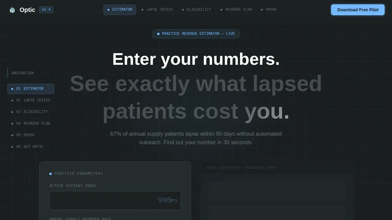
- A live revenue estimator hero with animated dashboard mockup and personalized headline
- Five anchor-nav hub sections each pairing a data finding with a product feature and case study metric
- A device-detect download modal, a sticky cost micro-bar, and a secondary email-capture path
Feature list
This landing page template includes carefully considered features drawn directly from the project brief. Each one serves a specific conversion purpose.
Revenue Estimator Hero
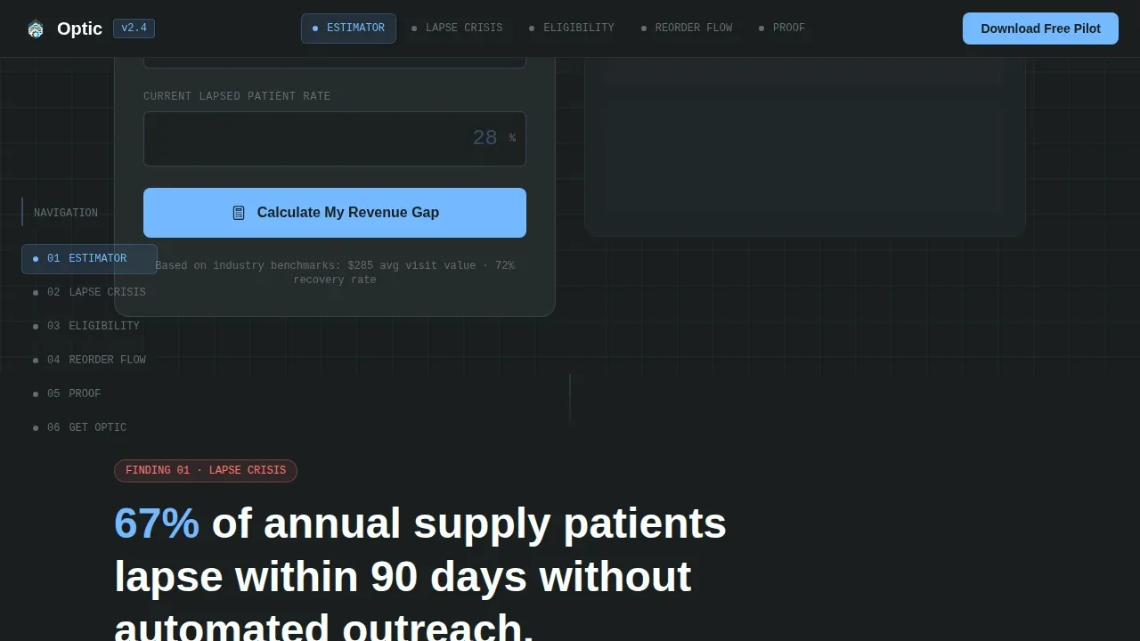
The header is a working calculator with three input fields styled as instrument readouts. Visitors enter patient count, reorder rate, and lapse percentage. On submit, a live dashboard mockup animates with their numbers, counting up projected monthly recurring revenue, hours saved, and annual retention lift in sky blue. The headline personalizes to their figure, making the subscription value immediate.
Hub-and-Spoke Anchor Navigation
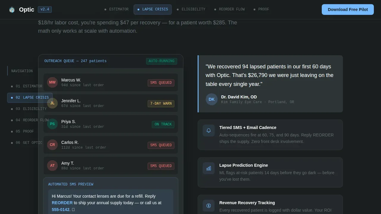
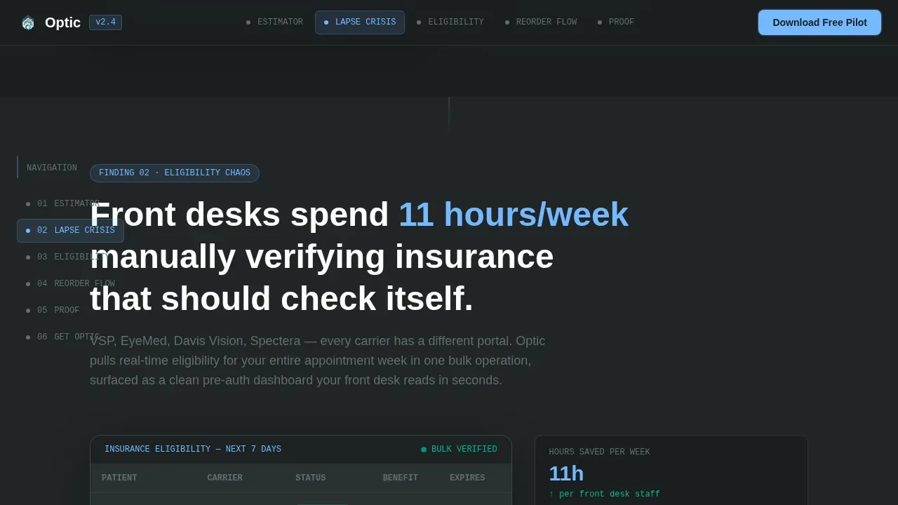
A left-rail anchor nav lets visitors jump between five spoke sections without losing context. Each spoke opens with a data finding about subscription lapse or operational waste, then expands into the product feature that solves it, demonstrated through a scroll-triggered embedded dashboard animation. The rhythm builds an evidence-based case for switching services.
Scroll-Triggered Case Study Metrics
Micro-charts animate on scroll entry throughout the page. Pull-quote cards from practicing optometrists sit in slate card containers. These case studies include metrics that quantify retained subscribers and recovered revenue, giving visitors the social proof they need before they sign up or plan a next step.
Device-Aware Download Modal
The primary call-to-action triggers a device-detect modal. iOS routes to the App Store, Android to Google Play, and desktop surfaces a QR code with a front-desk prompt. This single interaction serves all users without redirecting them away from the landing page.
Sticky ROI Cost Bar
A persistent micro-bar carries the visitor's personalized estimator figure as they scroll. It reinforces the monthly cost of inaction without requiring them to return to the hero. This detail keeps the subscription revenue story active across every section of the page.
Secondary Lead Capture Path
Visitors not ready to install can select "Email Me the ROI Report." The form asks only for name, practice name, and email, keeping drop-off low. They receive the calculator results as a branded PDF, and the practice becomes a warm lead stored for follow-up.
Page sections overview
| Section | Purpose |
|---|---|
| Hero Estimator | Personalize revenue impact instantly |
| Anchor Nav Rail | Jump between five spokes |
| Spoke 1: Lapse Crisis | Show 67% lapse stat, present automated outreach feature |
| Spoke 2: Insurance Chaos | Surface eligibility problem, demo real-time eligibility engine |
| Spoke 3: Reorder Friction | Highlight manual reorder pain, show one-tap reorder flow |
| Spoke 4: Testimonials | Marquee OD pull-quotes with subscriber metrics |
| call to action Download Band | Full-width download with device modal |
| Sticky Cost Bar | Persistent personalized revenue figure |
| Secondary Lead Form | Email capture for ROI report PDF |
| Footer | Linear single-row pattern with sign and log in links |
Design & branding system
The visual identity follows a Dashboard Pro theme built on a Slate and Sky color system. The palette evokes a high-end diagnostic instrument: matte charcoal housing, cool blue alignment targets, and a sterile white reading surface.
- Charcoal slate (#2D3436) dominates nav and card containers; clinical mid-gray (#636E72) fills secondary panels; open-sky blue (#74B9FF) pulses on active states, data highlights, and live metrics; crisp white (#FAFFFE) holds reading surfaces
- Signal green (#00B894) fires only on positive-delta indicators such as retained subscribers and recovered revenue, keeping its visual weight focused and meaningful
- Friendly typography uses Manrope for headings, JetBrains Mono for data and metrics, and DM Sans for body copy, creating a nuanced use of type that feels clinical yet readable
Mobile & speed optimization
The template is designed desktop-first to match front-desk iPad usage, but carries full mobile support so the subscription landing page stays useful for ODs reviewing data from any device.
- Thumb-friendly buttons and readable type scales ensure the landing page works on smaller screens without layout compromise
- Server Components handle static sections while Client Components power the calculator, sticky bar, animations, and modal, keeping interactive pages fast and focused
How this template helps you convert
A strong subscription landing page converts visitors because it removes every reason to hesitate. This template is built with that goal at every layer.
- The estimator hero makes the value proposition personal before the visitor scrolls, giving the landing page an immediately pleasing impression that generic pages cannot match
- The hub-and-spoke structure pairs each problem with proof and a feature, so by the final spoke the case for the subscription feels as evidence-based as a clinical study
- The device-aware call to action and low-field lead form let every visitor act on their preferences immediately, whether they are ready to install or just want to save the ROI report
Other information about this template
This template is a corporate Webflow template that can suit young startups and established businesses alike who are building a subscription-focused company website. The layouts range from the hero estimator to inner pages including pricing, contact pages, and legal pages, making it useful beyond the initial landing.
- Optic includes a simple, repeatable framework of reusable user interface elements that let teams build pages quickly without starting from scratch each time
- Optic makes it easy to create new sections using an intuitive framework, and the color scheme can be adjusted globally using Webflow's Global Color Swatch feature
- Optic's Webflow CMS powers a blog so the site can publish content that attracts more subscribers over time, and the template is structured to support SEO best practices at the page level
- The purposefully uncluttered design gives the brand story colorfully through contrasting graphical elements and thoughtfully embellished graphical elements that keep the appearance lively without overwhelming users
- The color combine of slate, sky, and signal green creates a magnetic allure and appealing magnetism that signals professional-grade software to a skeptical target audience
- The big picture goal is a bold web presence: a landing page that is fluorescence round in its focus, perfect layout in its structure, and only the start of what a team can build on top of these reusable ui elements
- The optic smart subscription management landing page template is designed so visitors can sign up, log in, or access the ROI report from a single, purposefully uncluttered page that never loses the subscription narrative
- Pricing tiers can be displayed using a horizontal layout that clearly marks the best-value plan, helping visitors compare options and make a purchase decision without leaving the page
Theme
Dashboard Pro
Creative direction
Industry Report
Color system
Slate & Sky
Direction
App Download
Page Sections
Revenue Estimator Hero with Live Dashboard
Hub-and-spoke Anchor Navigation
Scroll-triggered Case Studies and Pull-quotes
Device-aware App Download Modal
Sticky ROI Micro-bar
Low-field Secondary Lead Capture
Related questions
Can I adjust the color scheme without rebuilding the layout?
Does the template include inner pages beyond the main landing page?
How does the lead capture form keep drop-off low?
Can the frequently asked question section address common concerns about subscription management?
Is this template suitable for a smaller team or early-stage product?



