Intelligent Procurement Platform Landing Page Template
The Calibrate landing page template is built for K-12 AI procurement platforms that need to convert budget-conscious district leaders fast. It combines a dark, Bloomberg-terminal visual style with a data-dense comparison table layout, a savings calculator with lead qualification form fields, and a direct app-download call to action. Every section earns the next click by showing hard numbers before asking for anything.
by Rocket studio
Quick summary
This is a single-page, desktop-first landing page template designed for an AI-powered K-12 procurement optimization platform. The page opens with a glowing live-dashboard hero, moves into a column-by-column comparison table, surfaces a savings calculator with a short lead qualification form, and closes with a phosphor-green app-download call to action. The entire layout is built to move procurement directors from scroll to install.
Who this template is for
This template is purpose-built for EdTech companies and B2B SaaS teams launching or relaunching an AI procurement tool aimed at public-school district leadership. It works well for teams that need high converting landing pages without starting from scratch, and for product marketers who want data-dense, credibility-first layouts that reflect real procurement workflows.
Users who will get the most from this template include:
- Procurement platform founders and product marketing leads targeting K-12 district buyers
- EdTech marketing teams positioning an AI-powered spend analysis or contract optimization tool
- Growth teams that need lead generation pages ready to drive app downloads from budget-deadline-driven decision makers
What problem this template solves
District procurement leaders are hard to convince. They are risk-averse, budget-constrained, and deeply skeptical of vendor promises. A generic SaaS landing page does not work for this audience. The pain points are specific: manual Request for Proposal cycles, missed rebate windows, stale vendor quotes, and no visibility into when to lock a price before a budget line expires.
This template solves the structural problem of communicating complex AI capabilities to non-technical buyers. Most AI procurement landing pages fail because they lead with features instead of evidence. This layout leads with dollar figures, then backs them up row by row in a comparison table before ever asking for a download.
Key problems this template addresses:
- Landing pages that bury the value proposition below the fold and lose decision makers before they reach the call to action
- Comparison pages that use vague language instead of hard procurement metrics that build trust signals fast
- Lead capture flows with too many form fields, too much friction, and no immediate value exchange to justify the ask
What you get with this template
You get a complete, single-page template built around five core content sections, each designed with its own visual treatment and interaction logic. The page structure moves visitors through a clear progression from problem awareness to confident action. Every section is editable and built to reflect the Acid Digital color system and Dashboard Pro theme described in the brief.
Included components and sections:
- Full-bleed dark hero with a typewriter-effect headline, a glowing live-style procurement dashboard visual, and a soft violet ambient glow behind the primary interface element
- Full-width comparison table with expandable row panels showing AI confidence scores and historical price curve indicators organized by procurement category
- Three-field lead qualification row with district name autocomplete, annual procurement budget dropdown, and work email input, paired with App Store and Google Play download badges
- Secondary savings calculator path that delivers an instant PDF savings estimate and nudges the user toward the primary app download on the results screen
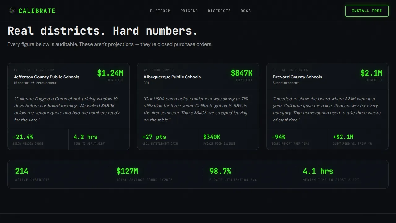
- District proof section anchored by hard savings numbers and procurement category wins
- Linear single-row footer following Pattern 1 layout
Feature list
This template ships with a set of built-in design and structural features drawn directly from the project brief. Each one serves a specific role in moving procurement-focused users from scroll to action.
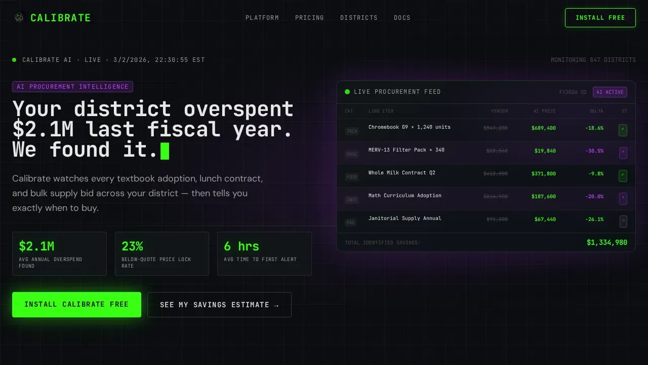
Live-Dashboard Hero with Typewriter Headline
The hero opens on a full-bleed void-black canvas. A live-style procurement grid fades into view showing real district line items with AI-optimized prices pulsing in phosphor green beside muted original vendor quotes. The headline types itself in JetBrains Mono monospace. There is no stock photography. The product interface is the visual, which makes landing page performance immediate and visceral for first time visitors who need to understand the tool in under five seconds.
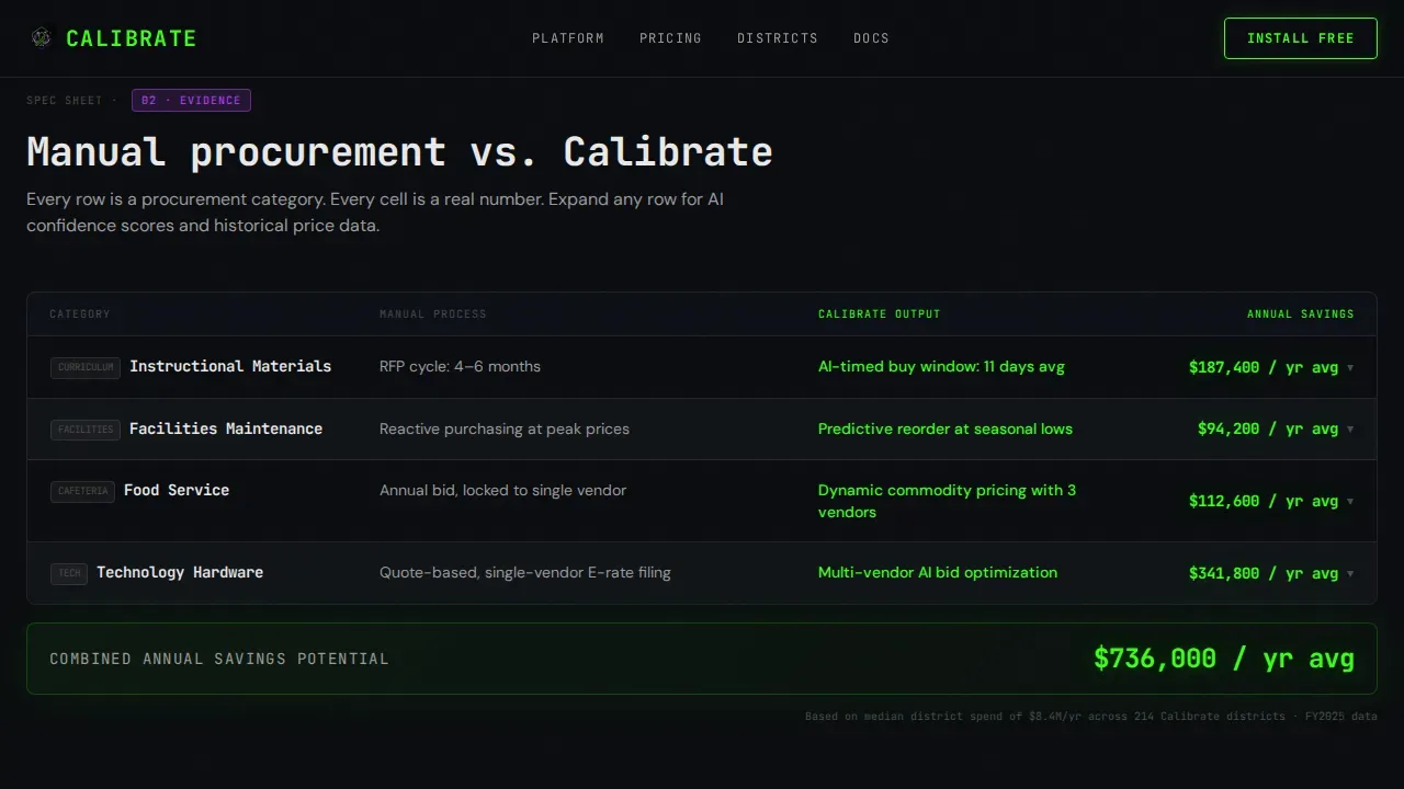
Spec-Sheet Comparison Table
Below the hero, a full-width comparison table lays out the manual procurement process against the platform's automated output. Rows are organized by procurement category including instructional materials, facilities maintenance, food service, and technology hardware. Each row uses phosphor-green checkmarks and hard dollar figures instead of vague language. Expandable detail panels show AI confidence scores and historical price curves, rewarding scroll depth with increasingly granular data.
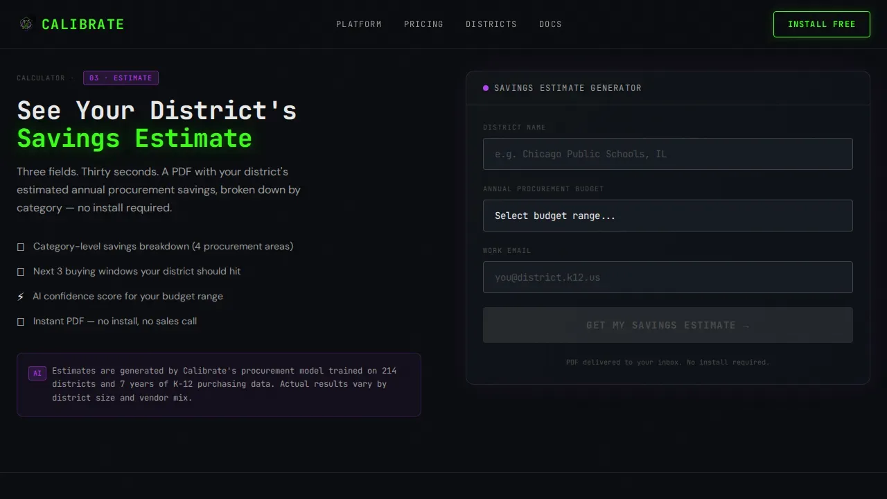
Savings Calculator with Lead Qualification
Before the primary call to action, the page presents a three-field quick-qualification row. Users enter their district name via NCES database autocomplete, select an annual procurement budget range from a dropdown, and provide a work email. A secondary path offers an instant district savings estimate delivered as a PDF. This dual-path approach serves different funnel stages and protects lead quality by qualifying district size before an install.
App Download Call to Action Block
The primary call to action reads "Install Calibrate Free" in a phosphor-green button that pulses once on scroll-into-view. Compact App Store and Google Play badges sit beside the button. The secondary savings calculator path captures the same lead data and nudges the user toward download on the results screen. Every proof point up the page earns this final ask, so the download feels like a logical next step rather than a cold pitch.
Acid Digital Color System and Typography
The design system uses void black (#0B0D10) as the dominant background, phosphor green (#39FF14) for positive deltas and primary interactive states, electric violet (#BF40FF) for AI-generated recommendations and predictive alerts, and interface white (#E8E8E8) for body text and table borders. Headlines and data labels use JetBrains Mono. Body copy uses DM Sans. The combined effect reads like a Bloomberg terminal reimagined with a high-contrast, cyberpunk visual identity.
Scroll-Triggered Animation System
The template includes high-complexity animation: typewriter effect on the hero headline, pulsing green numbers in the dashboard grid, scroll-triggered counter animations in the proof section, and glow pulses on the primary call to action button. These animations are implemented with a performance split between Server Components for static content and Client Components for interactive and animated elements, keeping the page load lean while keeping the visual energy high.
Page sections overview
| Section | Purpose |
|---|---|
| Dark Hero Dashboard | Opens with a glowing live procurement grid and typewriter headline to establish instant platform credibility |
| Comparison Table | Delivers a column-by-column, row-by-row spec dump contrasting manual RFP cycles against AI-automated output |
| Savings Calculator Row | Captures lead qualification data through three short form fields while delivering immediate estimated savings value |
| District Proof Block | Anchors trust signals with specific dollar savings figures and named procurement category wins |
| App Download call to action | Closes the page with a pulsing phosphor-green install button and App Store plus Google Play badges |
| Linear Footer | Presents a single-row Pattern 1 footer with essential navigation and contact links |
Design & branding system
The visual identity follows the Acid Digital color system applied to a Dashboard Pro theme. The result feels like a Bloomberg terminal rebuilt by a cyberpunk interface team. It is dark enough for a procurement director to stare at for hours during a budget-deadline session, with accent glows that make every savings figure feel like a small confirmation lighting up a circuit board.
Core design elements include:
- Four-color palette: void black (#0B0D10) for all backgrounds, phosphor green (#39FF14) for positive states and savings figures, electric violet (#BF40FF) for AI-generated signals and predictive alerts, and interface white (#E8E8E8) for all body text and table borders
- Two-typeface system: JetBrains Mono for all headlines and data labels to reinforce the terminal aesthetic, DM Sans for body paragraphs to maintain readability at density
- Visual hierarchy built around the comparison table as the dominant content block, with the hero and call to action framing either end of the scroll path
Mobile & speed optimization
The template is desktop-first by design. Procurement directors working on budget deadlines operate primarily on large screens, and the comparison table layout is optimized for that context. The performance architecture separates static content into Server Components and animated or interactive elements into Client Components.
Optimization highlights include:
- Server Component and Client Component split to keep initial page load fast while supporting high-complexity animations including typewriter effects, pulsing counters, and glow pulses
- Comparison table and expandable row panels designed for desktop viewport widths, with a responsive fallback that keeps the core data readable on smaller screens
- Short, essential form fields in the lead capture row reduce friction and lower bounce rates by keeping the qualification process fast for returning visitors and first time visitors alike
How this template helps you convert
This template is structured to increase conversions at every stage of the scroll, not just at the call to action block. The page earns the download by building a cumulative case across every section before making the ask.
- The hero establishes the core messaging and quantified benefit within the first viewport. Users see the problem stated in dollar terms before they scroll a single pixel. This directly reduces bounce rates from traffic that lands and immediately questions whether the product is relevant.
- The comparison table is the conversion engine. It systematically eliminates skepticism by replacing vague platform promises with row-level procurement metrics. AI-driven data shown in expandable panels gives decision makers the detailed information they need to feel confident before committing to a download. This approach improves lead quality because only genuinely interested district contacts reach the qualification form.
- The savings calculator secondary path captures leads who are not yet ready to install. It delivers immediate, data driven insights in the form of a personalized PDF, then nudges toward the primary download on the results screen. This dual-path structure means the page serves multiple funnel stages from the same URL without splitting traffic source attribution.
Other information about this template
This template supports a specific intersection of creative direction, theme, and layout style that makes it distinct from general-purpose SaaS landing page templates. Understanding this context helps teams adapt it effectively to their own approach and business goals.
The calibrate ai procurement optimization platform landing page template represents a Spec Sheet creative direction applied to a Dashboard Pro theme. This intersection is engineered for high-stakes B2B buyers where specification density and proof points matter more than narrative. The comparison table structure is the defining feature of this creative direction. It enables teams to prioritize content that decision makers want to verify rather than content that simply persuades.
The template is designed to stay ahead of common B2B landing page problems by addressing them structurally. High converting landing pages for procurement audiences share a consistent set of traits: a clear, quantified headline above the fold; trust signals and trust badges visible without scrolling; simple, short form fields for lead capture; and a final call to action that reiterates the value proposition for users who scroll down to the bottom. This template builds all of those traits into the page structure by default.
From a lead generation standpoint, the template supports workflow automation through the savings calculator path. When a user completes the calculator, the same lead data captured across the form fields also feeds the qualification row, so teams do not need to manage two separate data collection processes. This saves time for marketing teams and improves the feedback loop between page performance and sales follow-up.
The template also reflects best practices for ai landing pages aimed at skeptical, budget-constrained buyers. Procurement professionals are risk-averse. They rely on trusted vendor choices to protect their reputations and need to make informed decisions in front of boards and superintendents. The comparison table structure, paired with district-level proof figures, gives those users the evidence they need. The layout supports social proof through a dedicated district proof section that can display quantifiable wins by procurement category.
Additional notes for teams evaluating this template:
- The template supports lead quality filtering through the budget-range dropdown, which helps allocate resources to the most qualified inbound contacts by company size and district budget band
- Data security considerations around the work email and district name fields are the responsibility of the implementing team and their hosting environment
- The ai generated savings estimate in the calculator path is a template feature placeholder. Actual calculation logic requires custom implementation on the platform side
- The template uses content types suited to B2B procurement audiences: data tables, expandable detail panels, a savings calculator, and a download-focused call to action, rather than long-form narrative or video-heavy layouts
- Small businesses and individual school administrators outside of district-level procurement structures may find the qualification flow less relevant to their context, as the template is scoped to district-level buyers
- The referral source and traffic source attribution structure is not baked into the template itself. Teams should implement their own UTM tracking and analytics layer on top of the existing page structure
- Leverage ai system capabilities to automatically apply layout adjustments and personalize content elements for returning visitors versus first time visitors through your own integration layer added post-deployment
Theme
Dashboard Pro
Creative direction
Spec Sheet
Color system
Acid Digital
Style
Comparison Table
Direction
App Download
Page Sections
Live Procurement Dashboard Hero
Spec-sheet Comparison Table
Dual-path Lead Capture Flow
Scroll-triggered Animation System
Acid Digital Color and Type System
District Proof and Social Proof Section
Related questions
Who is this landing page template designed for?
What sections are included in this template?
How does the comparison table work in this template?
Do I need a developer to launch this template?
Can I adapt the lead capture form fields for my own qualification criteria?


