FinOps Technology Cost Calculator Website Template
Optimize is a Bold Brutalist bento grid landing page built for FinOps consulting services. It leads with a live Cloud Cost Calculator hero, then guides visitors through a Problem-to-Solution scroll arc. The dark glassmorphic design uses electric magenta for waste signals and teal for savings wins. The primary call to action drives app downloads, with a secondary path for enterprise audits.
by Rocket studio
Quick summary
Optimize is a single-page bento grid landing page for a FinOps consulting service. It opens with a live Cloud Cost Calculator that renders personalized savings estimates in real time. The scroll arc moves visitors from billing chaos to governed clarity. Bold Brutalist typography and a dark glassmorphic palette make every number feel urgent and every solution feel earned.
Who this template is for
This template is built for FinOps consultancies and cloud cost optimization services that need to turn skeptical engineering and finance leaders into booked clients. It speaks directly to the people holding the budget conversation.
- VP Engineering leads fielding CFO questions about runaway infrastructure spend
- Platform team leads who know their reserved instance coverage needs work
- Series B startups where cloud costs are quietly becoming the second-largest line item after payroll
What problem this template solves
Most consulting landing pages describe services in abstract terms. This template skips the pitch and opens with proof. Visitors input their own numbers and immediately see the gap between what they spend and what they should.
- Generic hero sections fail to create urgency for technical buyers who distrust marketing language
- Scattered service descriptions leave VP-level visitors without a clear reason to act now
- No single visual thread connects the pain of cloud waste to the relief of a concrete savings number
What you get with this template
You get a fully designed, single-page bento grid layout ready to represent a cloud cost optimization service. Every section is purpose-built to move a skeptical technical buyer from curiosity to conversion.
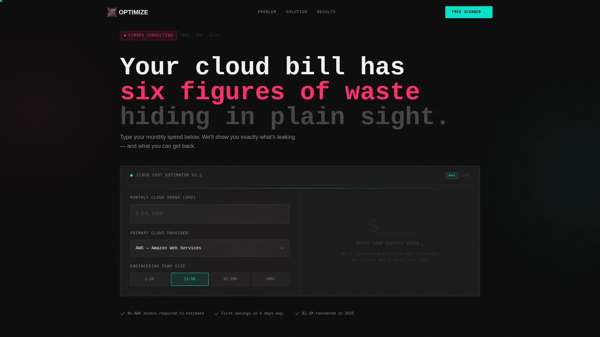
- A live Cloud Cost Calculator hero with three brutalist input fields and real-time teal savings output
- A Problem-to-Solution scroll arc built from magenta-bordered problem tiles resolving into teal-bordered solution panels
- A sticky bottom bar and inline calculator call to action driving downloads of the Free Savings Scanner
- A secondary ghost button path for enterprise visitors who want a hands-on FinOps audit booking
Feature list
This template delivers a tightly scoped set of components, each designed around the FinOps consulting use case and the Bold Brutalist visual language.
Live Cloud Cost Calculator Hero
Visitors enter their monthly cloud spend, select their primary provider, and specify team size. The calculator instantly renders projected annual savings in oversized monospace teal digits, with a magenta strikethrough on the current waste estimate. The tool replaces a traditional hero image entirely.
Bento Grid Layout System
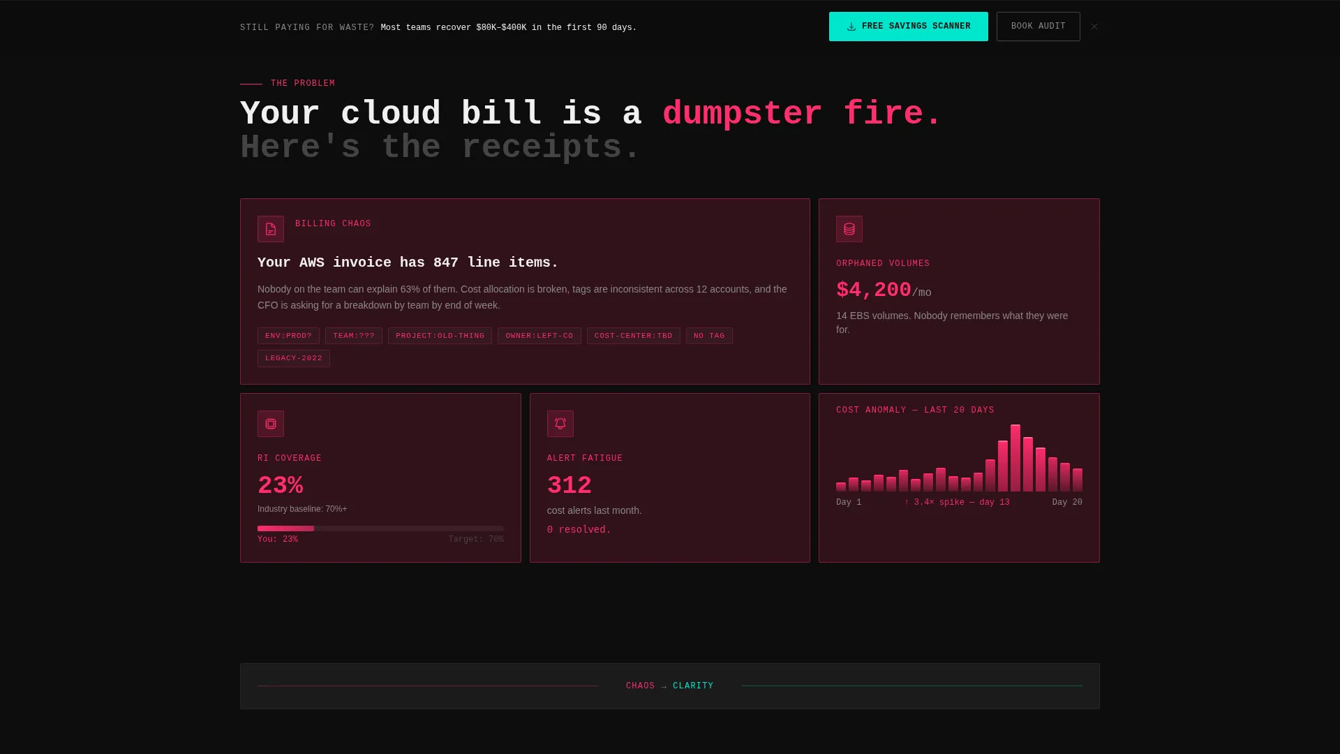
The page is structured as a responsive bento grid of frosted glass tiles. Early rows show fragmented billing dashboards and cost-anomaly graphs. Later rows consolidate into wide, confident panels as the problem-to-solution arc resolves. The grid itself communicates the transformation from chaos to clarity.
Problem-to-Solution Scroll Arc
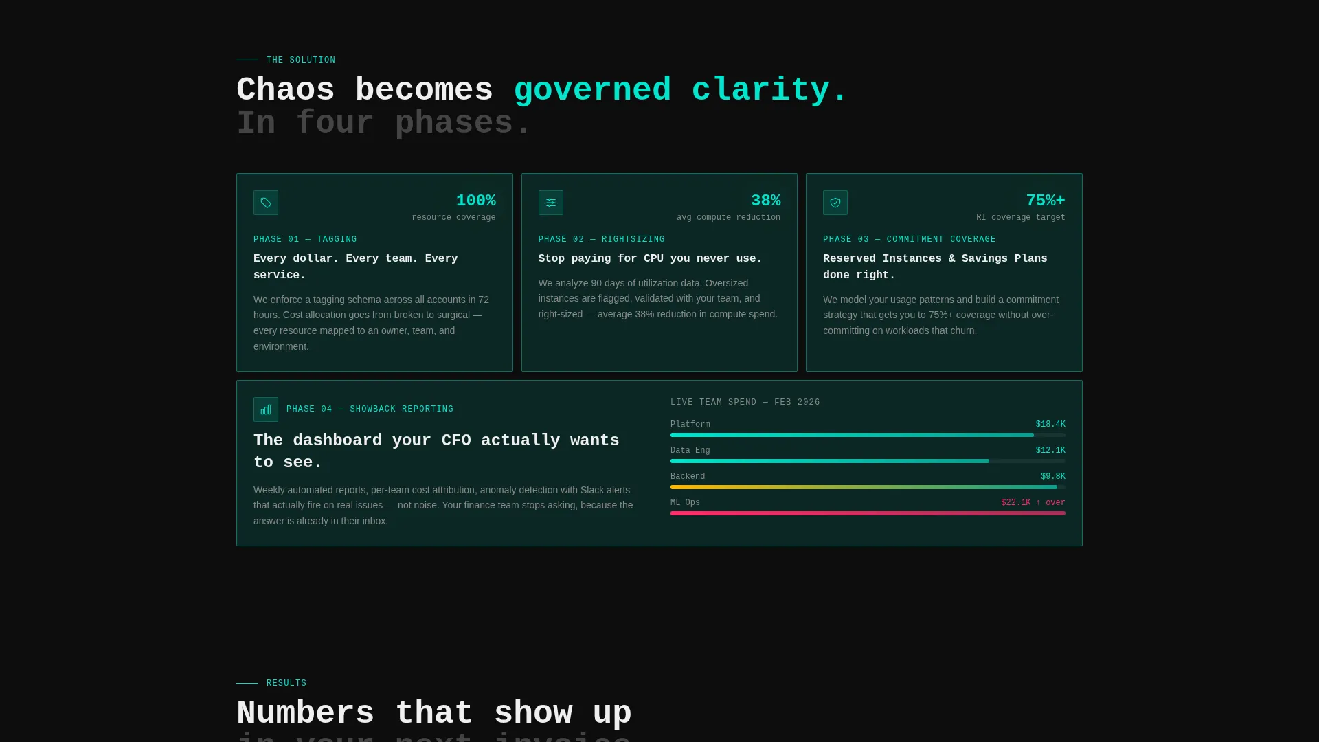
Each scroll section peels back one layer of cloud waste: tagging strategy, rightsizing, commitment coverage, and showback reporting. Magenta borders signal unresolved problems. Teal borders confirm solutions. The visual language does the explaining before the visitor reads a single word.
Dual call to action Conversion Path
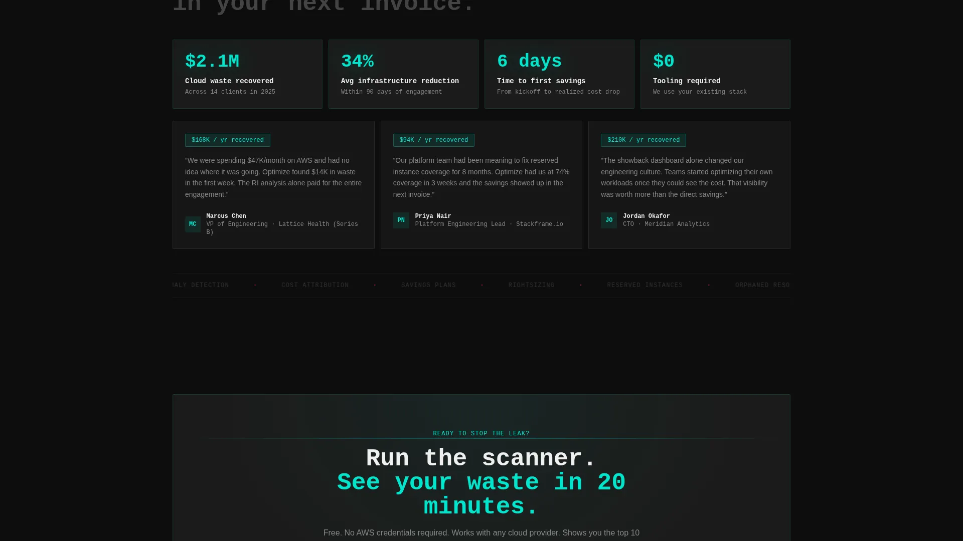
The primary call to action, "Download the Free Savings Scanner," appears inside the calculator result card and again in a sticky bottom bar after the second scroll. A muted ghost button for "Book a FinOps Audit" sits beside it, earning the click only after the calculator has already proven the savings gap.
App Download Flow with Email Gate
The download flow is a staged sequence: work email first, then company name, then a platform-detection step for iOS or desktop routing. The gate is intentionally lightweight to reduce drop-off while still qualifying leads by role.
Glassmorphic Dark Panel System
Every tile is a frosted translucent panel with a heavy 1px border floating over deep terminal black. The design feels like a mission-control dashboard. Magenta signals waste. Teal confirms savings. No stock imagery or illustration appears anywhere on the page.
Page sections overview
| Section | Purpose |
|---|---|
| Cloud Cost Calculator | Hero input tool rendering personalized annual savings in real time |
| Fragmented Billing Row | First problem bento row showing billing dashboard chaos and alert fatigue |
| Cost Anomaly Graph | Anonymized real spike graph visualizing untracked cloud waste |
| Tagging Strategy Panel | First solution layer resolving cost attribution problems |
| Rightsizing Module | Tile addressing over-provisioned compute and memory waste |
| Commitment Coverage Row | Panel showing reserved instance and savings plan coverage gaps and fixes |
| Showback Reporting Panel | Final solution layer delivering team-level cost visibility |
| Primary Download call to action | Inline calculator result card with Free Savings Scanner download action |
| Sticky Bottom Bar | Persistent conversion bar appearing after second scroll with dual call to action |
| Enterprise Audit Path | Ghost button routing enterprise visitors to FinOps audit booking |
Design & branding system
The template uses a Bold Brutalist theme layered over a glassmorphic color system. The result looks like a mission-control dashboard running at 2 AM: dark, backlit, precise, and high-stakes.
- Color palette: deep terminal black (#0D0D0D) as the base, frosted glass panel white at 12% opacity (#FFFFFF1F) for tiles, electric cost-alert magenta (#FF2D6B) for waste signals, and cool optimization teal (#00E5CC) for savings outputs
- Typography: heavy brutalist monospace fonts punch through the frosted glass blur, keeping every number and label crisp and authoritative
- Visual language: no stock imagery, no illustration; bento tiles float as translucent panels with 1px borders, and every accent color earns its presence by signaling something urgent or resolved
Mobile & speed optimization
The bento grid layout is structured to reflow cleanly across screen sizes. The calculator and sticky call to action bar are core conversion surfaces, so they are prioritized in the layout hierarchy at every breakpoint.
- Bento tiles stack and resize responsively, preserving the problem-to-solution arc on smaller screens
- The sticky bottom bar remains visible and actionable after the second scroll on mobile viewports
- Monospace type and high-contrast colors maintain readability on dark screens without requiring image assets to load
How this template helps you convert
The template is engineered around a single insight: technical buyers trust numbers more than narratives. Every layout decision points toward that truth.
- The calculator hero makes the value personal before any sales copy appears, so visitors arrive at the call to action already holding their own projected savings number.
- The scroll arc builds progressive trust by resolving each layer of cloud waste visually, reducing the cognitive gap between "I have this problem" and "this service fixes it."
- The staged download gate and secondary audit path serve two distinct buyer intents simultaneously, capturing both self-serve and enterprise leads without splitting the page.
Other information about this template
This template is a strong fit for FinOps technology providers, cloud cost management consultancies, and infrastructure optimization agencies. It is designed to support pitches to engineering-finance stakeholders who evaluate tools before they evaluate vendors.
- The template style is Bento Grid, ideal for presenting multiple data points and service layers in a single scrollable view
- The creative direction follows a Problem-to-Solution Arc, a pattern that works well for services where the buyer already knows they have a problem but has not yet quantified it
- The header concept is a Calculator or Estimator, which replaces passive hero imagery with an interactive proof-of-value moment
- The landing page direction is optimized for App Download, supporting a lead-generation funnel that starts with a free tool and progresses to a paid engagement
Theme
Bold Brutalist
Creative direction
Problem→Solution Arc
Color system
Glassmorphic
Style
Bento Grid
Direction
App Download
Page Sections
Live Cloud Cost Calculator Hero
Bento Grid Layout System
Problem-to-solution Scroll Arc
Dual Call to Action Conversion Path
Staged App Download Flow
Glassmorphic Dark Panel System
Related questions
Can I customize the calculator fields for a different pricing model?
Does the template include the actual savings calculation logic?
Who is the download flow designed to capture?
Can the primary call to action be changed from an app download?
Is this template suitable for a solo FinOps consultant?



