AI for Fitness Pricing Website Template
Optimize is a bold brutalist fitness AI landing page template built for gym pricing platforms. It features a 50/50 split-screen layout, a live dashboard header, an interactive revenue calculator, and a comparison-driven scroll flow. The design uses electric indigo, void black, and chartreuse to make data feel urgent and actionable for boutique studio owners, franchise operators, and independent gym owners.
by Rocket studio
Quick summary
Optimize is a single-page landing page template for fitness AI price optimization platforms. It opens with a dramatic split-screen dashboard header, drops visitors straight into an interactive pricing calculator, and guides them through a side-by-side comparison narrative. Every section is built to show visible math, not just marketing copy.
Who this template is for
This template is built for founders and operators in the fitness technology space who need to communicate a complex AI product quickly and credibly. It works best when the product itself is the most persuasive thing on the page.
- Boutique studio owners running multiple daily class slots who need a sharper way to present dynamic pricing to potential buyers
- Multi-location franchise operators and independent gym owners evaluating or demoing a membership price optimization platform
- Fitness technology product teams launching or repositioning an AI-driven revenue tool for gym and studio operators
What problem this template solves
Most fitness software landing pages rely on stock photography and feature lists. They bury the product behind adjectives. Operators who set prices based on gut feel or competitor rates need to see a better approach instantly, not after three paragraphs of copy.
- Static pricing pages fail to communicate the live, responsive nature of an AI pricing engine to skeptical gym operators
- Visitors leave before understanding the revenue impact because nothing on the page makes the value personal or specific
- Traditional layouts ask for a demo before giving anything back, which kills trust early in the decision process
What you get with this template
You get a fully structured landing page layout with every section, component, and visual system defined and ready to build from. The template covers the full visitor journey from first impression to form submission.
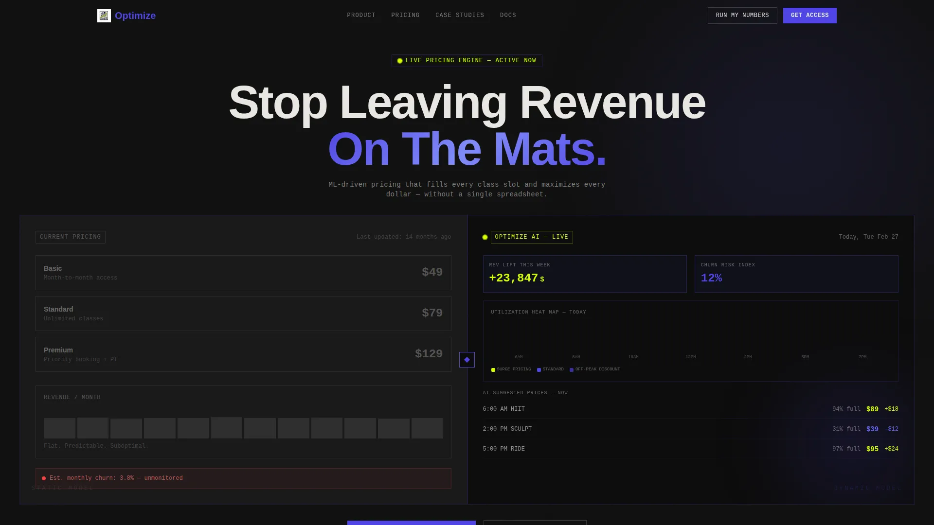
- A 50/50 split-screen header showing static versus AI-optimized pricing side by side, with live-data visual elements including heat maps, revenue counters, and a churn-risk gauge
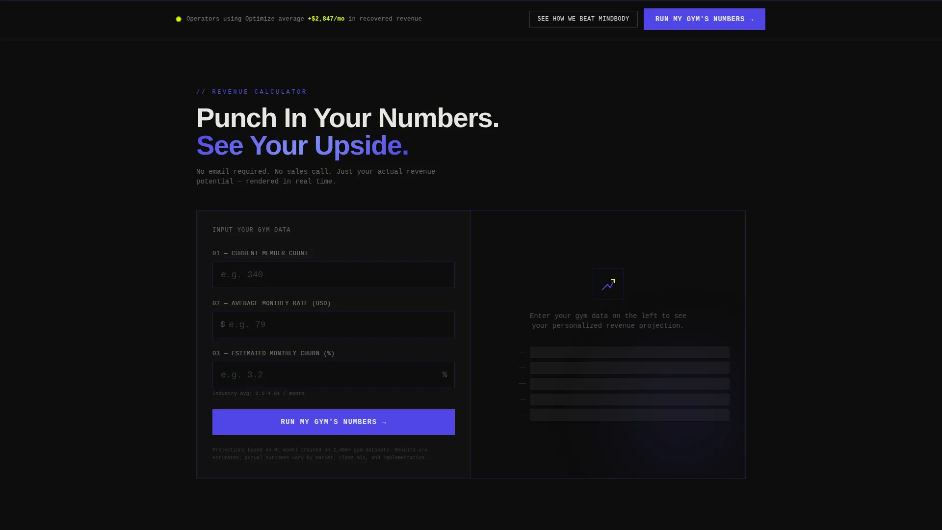
- An interactive pricing calculator placed directly below the header, capturing three operator inputs and animating a personalized revenue lift projection before any scroll begins
- A progressive three-step lead capture form and a sticky bottom call-to-action bar that appears after the visitor scrolls past the first comparison section
Feature list
This template is built around one idea: show the math, then earn the click. Every feature serves that goal.
Split-Screen Dashboard Header
The header divides the viewport exactly in half. The left side shows a familiar flat pricing table. The right side displays the AI-optimized alternative with demand curves, a peak-hour heat map, revenue delta counters, and a churn-risk gauge needle. Data is presented at the class-slot level, specific enough to feel like a real operator's Tuesday morning.
Interactive Revenue Calculator
Placed directly below the header, the calculator asks for three inputs: current membership count, average monthly rate, and estimated monthly churn percentage. On submit, the right panel animates a projected revenue lift, a churn reduction band, and an optimized price range. The output is ungated and specific enough that operators share it before they scroll further.
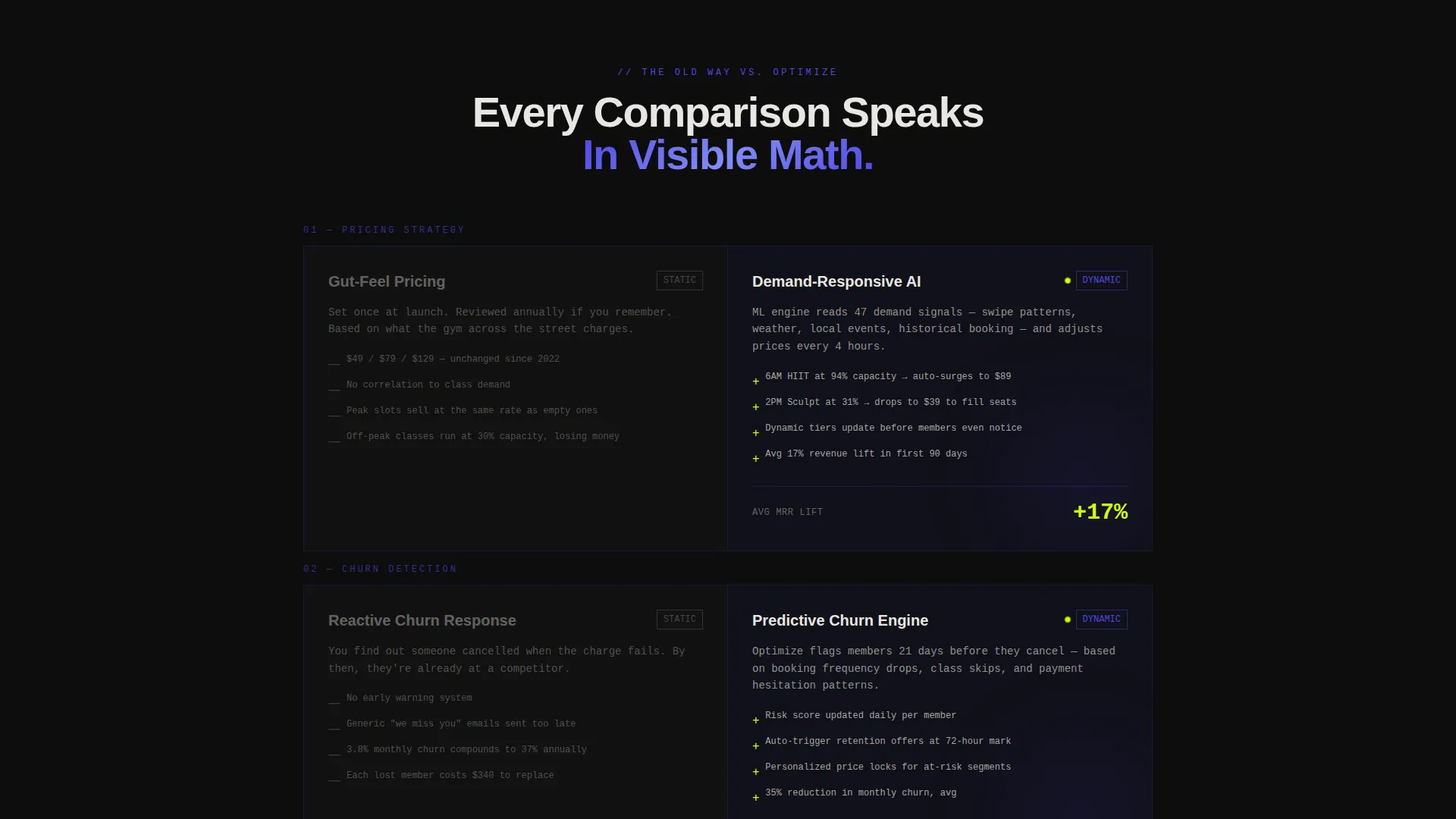
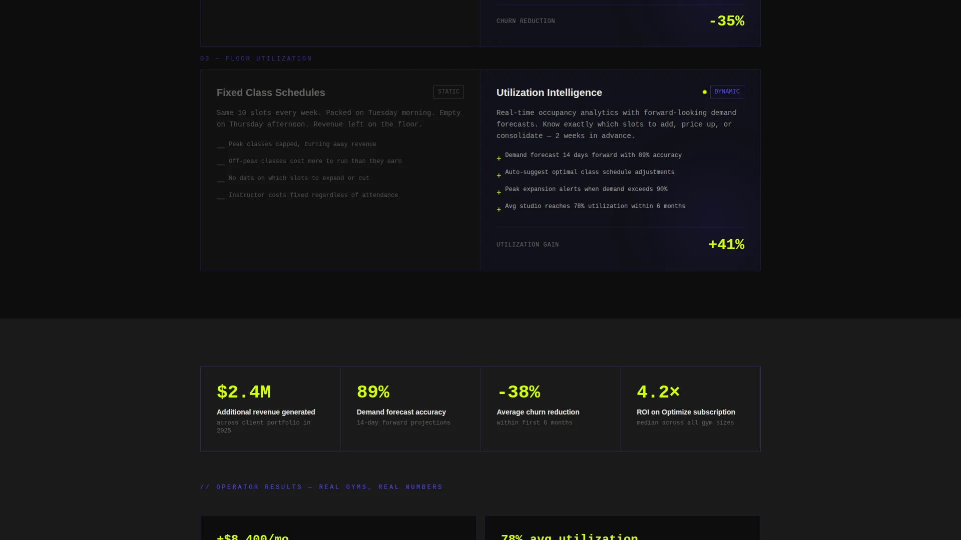
Comparison Section Architecture
Every section below the calculator follows the same split-screen structure. The left side renders the old approach in muted concrete tones. The right side comes alive with indigo graphs and chartreuse data sparks. Comparisons cover static versus dynamic pricing, gut-feel discounting versus data-driven promotions, and flat-rate class packs versus demand-responsive booking.
Sticky call to action Bar
After the visitor scrolls past the first comparison section, a sticky bottom bar locks the primary call to action in view. The bar holds the "Run My Gym's Numbers" prompt and keeps conversion momentum active throughout the rest of the scroll without interrupting the reading flow.
Progressive Lead Capture Form
The form collects information across three steps. Step one captures gym name and email. Step two asks for location count and primary revenue model. Step three offers an optional calendar embed to book a live pricing audit. The structure reduces friction by spacing out commitment across small, logical stages.
Bold Brutalist Visual System
Typography is set in oversized mono or heavy grotesque typefaces, slammed edge-to-edge with intentional disregard for conventional breathing room. Electric indigo owns headlines and graph lines. Chartreuse fires only on interactive states, hover effects, and live data ticks. Off-white text on void black backgrounds creates maximum contrast with zero softening.
Page sections overview
| Section | Purpose |
|---|---|
| Split-Screen Header | Show static versus. AI pricing side by side at first glance |
| Revenue Calculator | Let operators input their numbers and see personalized results |
| First Comparison Block | Contrast static pricing with dynamic pricing using visible math |
| Second Comparison Block | Contrast gut-feel discounts with data-driven promotional logic |
| Third Comparison Block | Contrast flat class packs with demand-responsive booking models |
| Progressive Lead Form | Capture gym details across three low-friction steps |
| Sticky call to action Bar | Keep primary action visible throughout the scroll |
Design & branding system
The visual identity is Bold Brutalist with an Electric Indigo color system. The palette is tight, intentional, and disciplined. Every color has one job, and none of them overlap.
- Four-color palette: deep void black (#0D0D0D) for all backgrounds, raw concrete off-white (#E8E6E1) for body text, electric indigo (#4F46E5) for headlines, graph lines, and active interface elements, and reactive chartreuse (#D4FF00) reserved exclusively for hover states, interactive pulses, and live data ticks
- Typography uses oversized mono numerals and heavy grotesque display type, set edge-to-edge in brutalist style with no decorative padding or soft layout margins
- No stock photography appears anywhere; the product interface and live data visuals carry the entire visual weight of the page
Mobile & speed optimization
The split-screen layout is designed with a responsive reflow in mind. On smaller screens, the two-panel structure stacks cleanly so the comparison narrative remains legible and the calculator stays fully usable.
- The calculator and comparison sections reflow to single-column layouts on mobile, preserving the left-versus-right contrast story through sequential stacking
- Heavy mono type and high-contrast color ratios maintain readability without additional styling adjustments across screen sizes
- No background images or photography means the layout loads without large asset overhead, keeping the visual experience fast by design
How this template helps you convert
The conversion strategy is built into the layout sequence. Value is delivered before commitment is requested, and every scroll step adds evidence rather than pressure.
- The interactive calculator produces a personalized, ungated revenue projection before the visitor has read a single paragraph of copy, giving operators a concrete reason to keep scrolling and a result specific enough to share with a business partner.
- The comparison section architecture replaces persuasive adjectives with side-by-side data visuals, letting the math argue the case so the visitor arrives at the call to action already convinced.
- The progressive form and sticky call to action bar reduce drop-off by spacing out commitment and keeping the primary action visible without forcing a hard interrupt at any point in the scroll.
Other information about this template
This template is categorized under Technology, specifically within the AI for fitness subcategory. It is built for the fitness AI price optimization niche and carries a strong intersection match across theme, creative direction, color system, template style, and landing page direction.
- Template style is Split Screen (50/50), theme is Bold Brutalist, and the header concept is Dashboard Preview
- Creative direction is Calculator and Tool First; the landing page direction is Comparison and Versus
- The color system is Electric Indigo, combining void black, off-white, electric indigo, and chartreuse in a strict role-based palette
- This template is well suited for fitness technology teams building awareness and lead generation pages around machine-learning pricing tools for gym and studio operators
Theme
Bold Brutalist
Creative direction
Calculator/Tool First
Color system
Electric Indigo
Style
Split Screen (50/50)
Direction
Comparison/Versus
Page Sections
Split-screen Dashboard Header
Interactive Revenue Calculator
Comparison Section Architecture
Progressive Three-step Lead Form
Sticky Bottom Call to Action Bar
Bold Brutalist Visual System
Related questions
What type of business is this template designed for?
Can I customize the calculator inputs and output metrics?
Does the template include the sticky call to action bar and progressive lead form?
What makes this different from a standard SaaS landing page template?
Is the design system easy to follow without a dedicated designer?



