Smart Clinic Inventory Landing Page Template
The Forecast AI-powered healthcare inventory forecasting comparison landing page template is built for supply chain directors, pharmacy managers, and CFOs who need to replace manual guesswork with machine-learning precision. It showcases a 72-hour demand forecasting engine through a dark ICU dashboard aesthetic, a three-column comparison table, a cost-of-failure ticker, and a direct call to action that pushes visitors into a live demo sandbox.
by Rocket studio
Quick summary
This is a single-page, click-through landing page designed to convert healthcare supply chain professionals into demo-qualified leads. The page uses a dark ICU dashboard visual identity, a cost-of-failure counter, and a head-to-head comparison table to make the case for AI-powered demand forecasting before the visitor scrolls past the fold. Every section raises the stakes, and every call to action points directly to a guided demo environment.
Who this template is for
This template is built for healthcare AI software companies and B2B SaaS teams selling supply chain intelligence platforms to hospital operations buyers. It speaks the language of operational pain, not feature lists.
- Supply chain directors and pharmacy managers who deal daily with backorders, expiration clocks, and fluctuating customer demand across departments.
- CFOs and VP Finance leaders tracking millions lost to emergency freight surcharges and excess goods sold off at a loss.
- Healthcare technology marketers who need a landing page that converts cold traffic into demo-qualified pipeline without using a traditional lead form.
What problem this template solves
Traditional inventory management relies on manual, periodic checks. This leads to high rates of expired items, stockouts, and costly emergency orders. Common challenges in supply chain management include $25 billion lost annually to expired or excess stock and manual ordering errors. Traditional forecasting methods simply fall short when hospital demand patterns shift overnight.
- Invisible demand signals: Without AI forecasting, supply teams cannot identify patterns across departments or respond quickly to seasonal trends, disease outbreaks, or sudden procedure volumes.
- Poor decision making at the requisition stage: By the time a manual order is placed, the stockout has already started. Precise forecasts delivered 72 hours in advance change that dynamic entirely.
- No clear benchmark for buyers: Healthcare buyers evaluating forecast models struggle to compare AI-powered tools against legacy systems without a clear side-by-side view of forecasting accuracy, lead time, and total cost of ownership.
What you get with this template
This template delivers a fully structured, single-page layout optimized for click-through conversion. It includes every section needed to make the cost of inaction visible, prove AI superiority through data, and move the visitor toward a demo without friction.
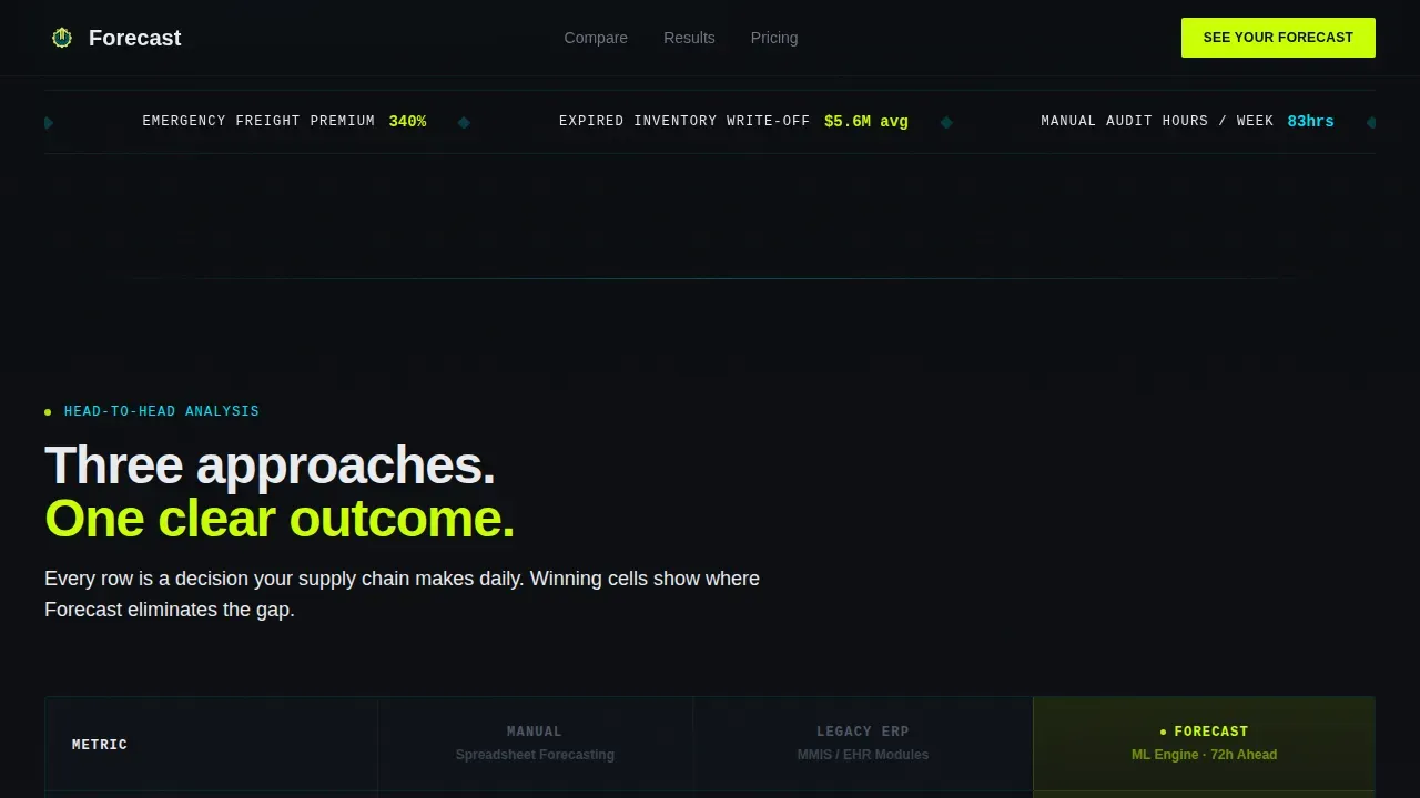
- Four dark glass metric panels in the header, each displaying a real-time performance stat in chartreuse type, including stockout events prevented, emergency orders eliminated, dollars recovered, and forecast accuracy percentage.
- A cost-of-failure ticker that scrolls a live counter showing what manual demand forecasting costs per hospital bed per year, making operating expenses feel immediate and personal.
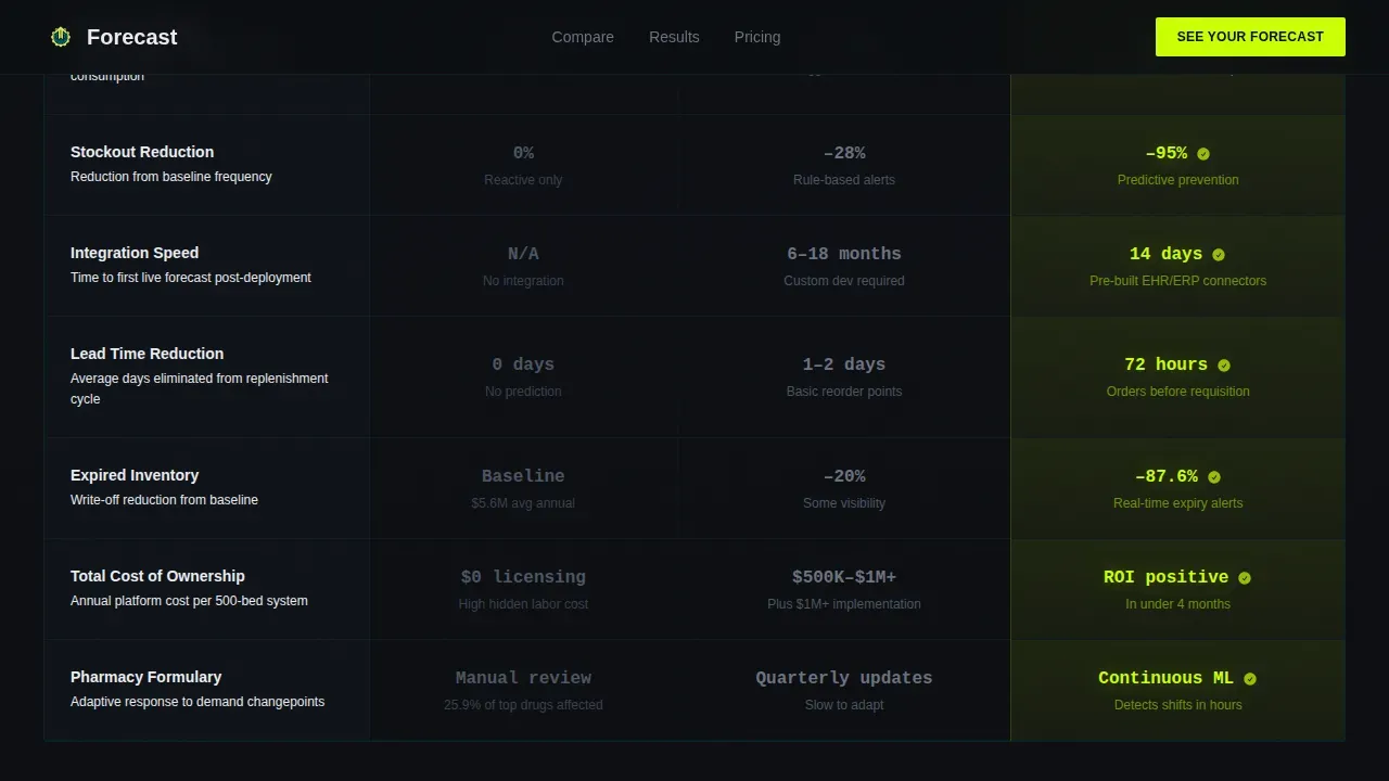
- A three-column comparison table benchmarking manual spreadsheet forecasting, legacy Enterprise Resource Planning (ERP) modules, and this platform across rows for accuracy rate, lead time, integration speed, stockout reduction, and total cost of ownership.
Feature list
This template packages six purpose-built components that work together to build urgency, establish credibility, and drive the click.
Dark Glass Header with Live Metric Panels
Four translucent panels float over a void-black field, each lit by chartreuse data rendered in JetBrains Mono. The panels use a frosted-glass depth effect with phosphor-blue edge lighting. No hero image, no stock photography. Just demand forecasting outcomes glowing in the dark, large enough to read across a room. This header makes precise forecasts feel real before the visitor reads a single word of body copy.
Cost-of-Failure Ticker
A scroll-triggered counter shows what manual forecasting costs per bed per year. This component turns abstract operating expenses into a live, accumulating number. Visitors feel the cost of inaction before they reach the comparison table. The ticker draws on the same emotional logic that makes demand planning feel urgent, not optional.
AI versus. Legacy Comparison Table
Three columns place manual spreadsheet forecasting, legacy ERP modules, and the AI-powered platform side by side. Rows cover forecasting accuracy, lead time, integration speed, stockout reduction, and total cost of ownership. Winning cells glow chartreuse. Losing cells stay muted gray. The table delivers the actionable insights buyers need to justify a switch, grounded in data driven decisions rather than marketing claims.
Auto-Advancing Case Study Carousel
Below the comparison table, a news-ticker-style carousel auto-advances through hospital-level wins: health system name, metric improved, and percentage gained. The carousel builds social proof momentum, allowing users to absorb multiple proof points without clicking. It also supports scenario planning conversations by showing results across different hospital sizes and specialties.
Triple-Placement Call to Action
The primary call to action, "See Your Forecast Now," appears three times: anchored to the header panels, below the comparison table, and after the case-study ticker. Each placement is a chartreuse button that clicks through directly to a guided demo sandbox pre-loaded with anonymized hospital data. No form, no friction. A secondary text link, "Download the ROI Model," captures higher-funnel visitors willing to share an email for a spreadsheet.
Scroll-Linked Reveal Animations
The page uses high-intensity animation throughout: flickering panel reveals, ticker counters, scroll-linked sequences, and staggered card reveals. Each scroll event advances the narrative like a countdown. The animation system is built on client-side components for interactivity, while the static shell remains server-rendered for stability.
Page sections overview
| Section | Purpose |
|---|---|
| Header metric panels | Display four live KPIs in glowing chartreuse type |
| Cost-of-failure ticker | Show manual forecasting cost per bed annually |
| Comparison table | Benchmark three forecasting approaches side by side |
| Case study carousel | Auto-advance hospital win metrics for social proof |
| Final call to action | Push visitor to live demo or ROI model download |
| Footer linear row | Close the page with a dark single-row footer |
Design & branding system
The visual identity follows an Acid Digital color system built to feel like a vital-signs monitor in a darkened ICU. Every color choice is deliberate, and every interactive element has a consistent role in the hierarchy.
- Color palette: Void black (#0B0D10) for all backgrounds, electric chartreuse (#CAFF04) for every interactive element and call to action, clinical phosphor blue (#00E5FF) for chart lines and winning column highlights, and antiseptic white (#EAECF0) for body text and table cell backgrounds.
- Typography: Manrope handles all body copy and user interface labels. JetBrains Mono renders every data point, metric, and number, reinforcing the dashboard feel and making forecast models and inventory data visually distinct from prose.
- Interaction style: Toggle switches, hover states on comparison cells, and call to action buttons all use chartreuse as the interaction color, creating a consistent visual language across the entire page.
Mobile & speed optimization
The template is designed desktop-first, reflecting that supply chain directors and pharmacy managers primarily work at workstations. It is also built to remain readable and functional on tablets, which are common in hospital supply rooms and logistics settings.
- Desktop-first layout: All components, including the four-panel header, the comparison table, and the carousel, are sized and spaced for workstation screens where demand planning decisions actually happen.
- Responsive tablet support: Layouts adapt cleanly to tablet viewports, so supply chain staff reviewing data at the point of use can still engage with the comparison table and call to action without loss of context.
How this template helps you convert
The page is structured as a psychological countdown. Each section adds pressure before the call to action appears. This is deliberate: healthcare buyers make large, high-stakes decisions, and they need to feel the cost of inaction before they feel the pull of a solution.
- The ticker creates urgency: Visitors see what manual forecasting costs per bed before they see the product. This primes them to view the comparison table as a rescue, not a pitch.
- The table delivers proof: Side-by-side rows showing forecasting accuracy, stockout reduction, and total cost of ownership give supply chain buyers the data driven decisions framework they need to build an internal business case.
- The demo button removes risk: "See Your Forecast Now" leads to a sandbox pre-loaded with real anonymized hospital data. There is no form to fill. The word "now" signals instant, low-commitment access, which lowers the barrier and raises the click rate.
Other information about this template
This template is purpose-built for the healthcare AI vertical, but its structure reflects principles that apply broadly across demand forecasting use cases in industries handling complex, time-sensitive inventory strategies. The forecast AI powered healthcare inventory forecasting comparison landing page template is ideal for teams that need to convert informed, skeptical buyers through data rather than through brand imagery.
- AI-powered inventory forecasting tools, including platforms similar to Anaplan PlanIQ, can analyze historical sales data and current market trends to generate precise forecasts that adapt as market conditions shift.
- The technology behind platforms like this reduces medical supply waste by 30 to 40 percent while maintaining 99 percent product availability, a benchmark that resonates strongly with CFOs tracking cost of goods sold and operating expenses.
- Beyond healthcare, the same machine learning and predictive analytics logic applies in industries with equally volatile demand patterns. A fashion retailer navigating seasonal fluctuations, an automotive industry supplier managing component lead times, and an e-commerce operator handling fluctuating customer demand all benefit from the same AI forecasting core capability.
- AI tools built on predictive models can identify patterns across historical data, including past sales data, seasonal patterns, and external factors like disease outbreaks or product launches, to generate precise forecasts at the department level.
- Forecast models that use exponential smoothing alongside machine learning can adapt faster to sudden shifts than any traditional methods relying on static spreadsheets or manual sales data review.
- Businesses that stay ahead of demand use AI powered platforms to optimize resources across the entire supply chain, reduce ad spend on emergency freight, and improve customer satisfaction by maintaining optimal inventory levels.
- The template supports scenario planning conversations: visitors can imagine different scenarios and see how their own supply chain might perform with AI powered demand forecasting in place.
- Data-driven teams in retail, logistics, and manufacturing use AI forecasting to unlock sales opportunities, improve customer experience, and build a genuine competitive advantage in markets where product availability is a differentiator.
- Market knowledge and current market trends data feed into AI models that continuously refine forecast demand accuracy, making the platform more valuable over time and supporting long term success for any health system that adopts it.
- The template's comparison table structure is a game changer for teams that have previously struggled to quantify why AI outperforms legacy ERP in supply chain management contexts, giving them unique perspectives to bring to procurement conversations.


Theme
Directory & Discovery
Creative direction
Launch Energy
Color system
Acid Digital
Style
Comparison Table
Direction
Click-Through
Page Sections
Dark Glass Header with Live Metric Panels
Cost-of-failure Ticker
AI Versus. Legacy Comparison Table
Auto-advancing Case Study Carousel
Triple-placement Call to Action with Demo Sandbox Link
Scroll-linked Reveal Animation System
Related questions
What makes this template different from a standard product landing page?
Who is the primary audience for this landing page?
Does this template include a lead capture form?
How does the comparison table work visually?
Can this template structure apply outside of healthcare?


