Complete Government Software Comparison Website Template
Route is a government fleet optimization landing page template built for municipal and public-sector transportation teams. It opens with a striking animated city-grid header, moves through a side-by-side metrics comparison table, and closes with a lead-capture modal. The design is command-center dark with electric cyan reserved for every optimized result and active call-to-action element.
by Rocket studio
Quick summary
Route is a single-page landing page template designed for government route optimization platforms. It follows a Problem to Solution Arc, opening in operational pain and scrolling toward hard evidence. The color system pairs deep charcoal with electric cyan, and every section earns its place by tying directly to measurable fleet savings.
Who this template is for
This template is built for public-sector transportation software vendors and municipal fleet management solution providers who need to speak directly to government decision-makers. The content hierarchy and visual tone are calibrated for procurement-minded audiences who read data before they read anything else.
- City public works directors reviewing fuel and overtime costs
- County transit planners defending annual transportation budgets
- State department of transportation logistics managers overseeing large vehicle fleets
What problem this template solves
Most government software landing pages either oversell or underwhelm. They lead with features before acknowledging the operational crisis sitting on a planner's desk. This template solves that structural problem by leading with the pain first.
- Garbage trucks retracing the same blocks, school buses running redundant loops, and snowplows missing priority corridors cost municipalities millions every year
- Decision-makers need proof before they engage, and a generic hero section does not provide it
- The comparison table format converts audit findings into visual evidence before the visitor has scrolled past the fold
What you get with this template
You get a fully structured landing page layout built around a core comparison table mechanic. Every section is designed to increase credibility and reduce friction for a government procurement audience.
- Animated header with a city road network glow that transforms from congested amber routes to optimized cyan geometries over four seconds
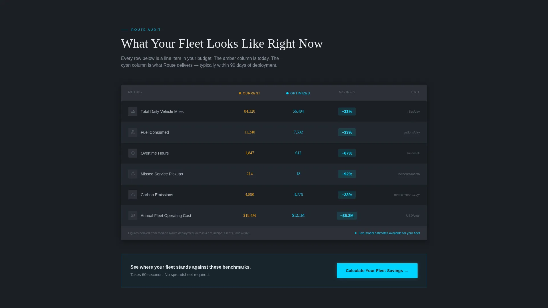
- A side-by-side comparison table contrasting current routing metrics against optimized routing metrics across daily miles, fuel consumption, overtime hours, missed pickups, and carbon tonnage
- A lead-generation modal with three progressive fields: fleet size, primary service type, and work email, plus a secondary gated PDF download path
Feature list
This template packages a purpose-built set of layout components and visual mechanics. Each one is tied directly to the fleet optimization use case and government buyer psychology.
Animated City-Grid Header
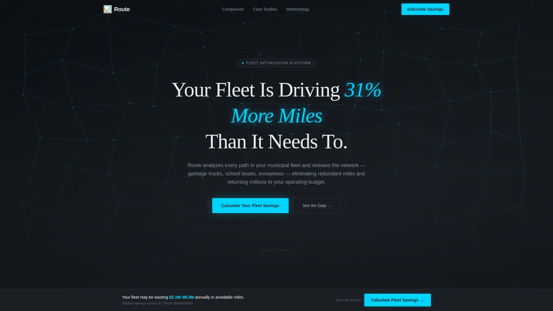
The header is a dark full-bleed aerial view rendered as a data visualization. Amber-lit congested routes pulse across a black map. Over four seconds, cyan light redraws each path into clean optimized geometry. A headline fades in over the animation reading: "Your Fleet Is Driving 31% More Miles Than It Needs To."
Current versus. Optimized Comparison Table
The core section of the landing page is a structured comparison table. The current routing column is styled in dull amber. The optimized routing column is rendered in electric cyan. A delta column between them pulses with percentage savings figures. Each metric row reads like an audit finding.
Municipality Case Study Tables
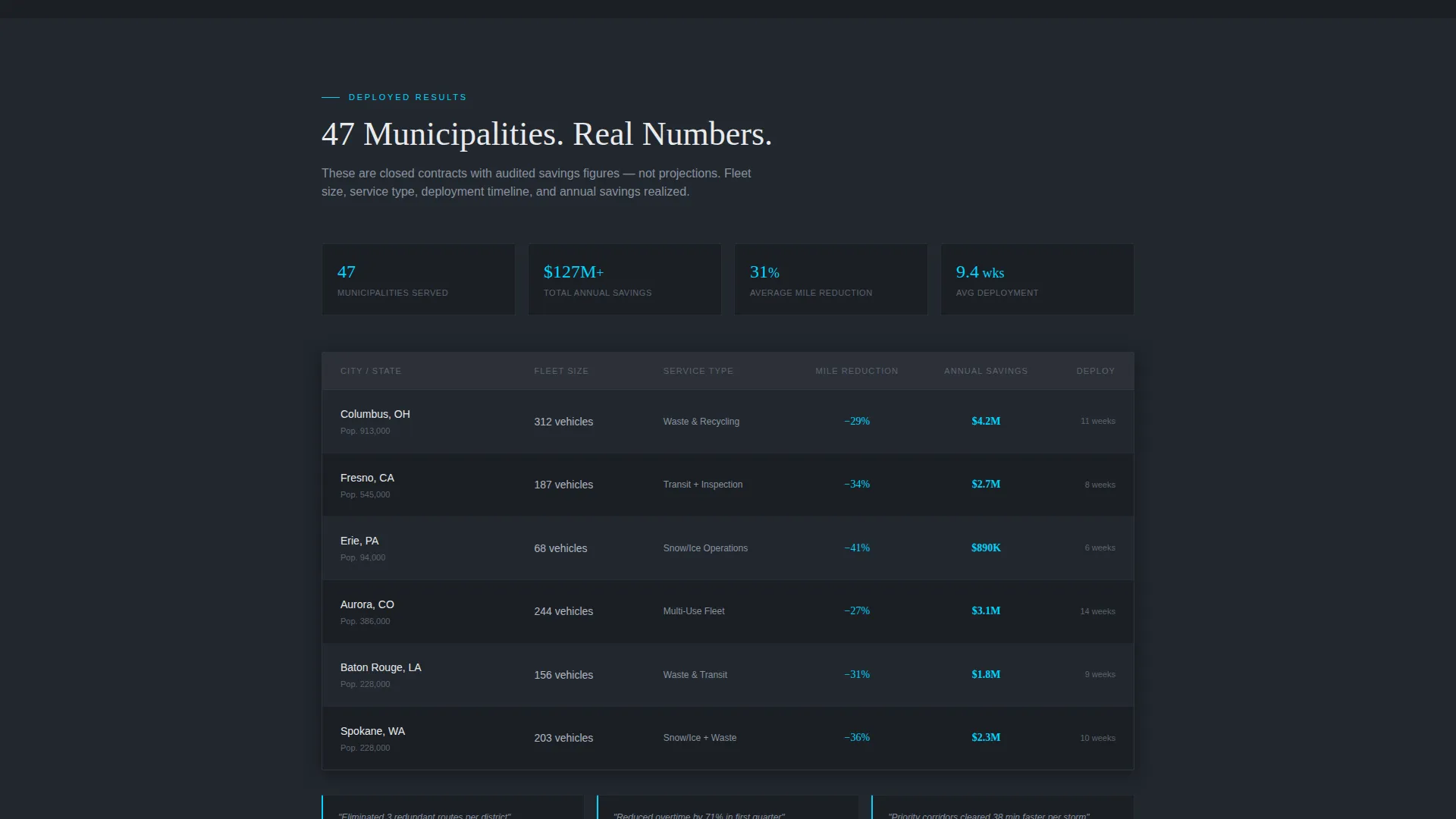
Below the primary comparison, a set of case study tables presents results from actual municipalities. Each row covers city size, fleet type, and annual savings realized. The format shifts from exposure to evidence as the visitor scrolls, increasing the weight of the argument with each row.
Methodology Walk-Through Section
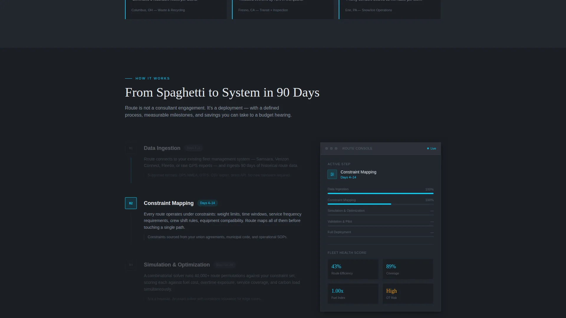
A dedicated section explains data ingestion, constraint mapping, and route simulation in plain language. It is written to feel like a briefing, not a whitepaper. It gives technically minded planners the process transparency they need to trust the platform.
Lead-Generation Modal with Progressive Fields
The primary call-to-action, "Calculate Your Fleet Savings," opens a focused modal. Three progressive fields collect fleet size, primary service type, and work email. No phone number and no budget question. The form is designed around government procurement sensibility.
Sticky call to action Bar and Gated PDF Path
A sticky bottom bar repeats the primary call-to-action after the case study section. A secondary path offers a downloadable PDF titled "Route Optimization ROI for Municipal Fleets," gated behind email only. This catches researchers building an internal business case who are not yet ready for a direct conversation.
Page sections overview
| Section | Purpose |
|---|---|
| Animated Header | Establish the pain with a four-second route transformation |
| Headline Overlay | Lock in the specific 31% miles statistic immediately |
| Comparison Table | Show current versus. optimized metrics side by side |
| Primary call to action Block | Drive "Calculate Your Fleet Savings" engagement |
| Case Study Tables | Build credibility with municipal results data |
| Methodology Section | Explain data ingestion and simulation process |
| Sticky call to action Bar | Repeat the primary call-to-action after case studies |
| PDF Download Path | Capture researchers via gated ROI report |
Design & branding system
The visual identity follows a Dashboard Pro theme using a Monochrome Steel color system. The palette is calibrated to feel like a military operations center at 2 AM: no decoration, no warmth, only information rendered with precision against darkness.
- Core palette: deep command-center charcoal (#1B1F24), brushed steel mid-tone (#5C6370), fog-white data surface (#E8EAED), and electric cyan accent (#00D4FF) reserved for optimized routes, active calls to action, and savings figures
- Backgrounds run charcoal-to-steel gradients; comparison table rows alternate between #1B1F24 and #22272E
- Primary text is fog-white; secondary text is steel; cyan appears only where something has been fixed or where action is required
Mobile & speed optimization
The layout is built with government field users in mind. Public works directors and transit planners review materials on tablets and mobile devices, not just desktop workstations. The template structure supports that usage pattern.
- The comparison table is designed to remain scannable on smaller screens without collapsing critical metric columns
- The sticky call to action bar stays anchored at the bottom of the viewport across device sizes, keeping the primary action reachable at all times
- Section spacing and font sizing follow a hierarchy that remains readable at mobile breakpoints without requiring pinch-to-zoom
How this template helps you convert
Every structural decision in this template is made to move a skeptical government buyer from awareness to action. The scroll arc is intentional and the friction is minimal.
- The comparison table appears immediately after the header, delivering hard metric contrast before the visitor has formed a reason to leave; the specificity of the delta column makes inaction feel costly
- The case study tables reinforce credibility mid-scroll, replacing feature claims with documented municipal results that procurement officers and budget-defense meetings can cite
- The three-field modal and the parallel PDF download path offer two distinct entry points for buyers at different stages of readiness, capturing both the decision-maker and the researcher in a single page visit
Other information about this template
This template is built within the Dashboard Pro theme family and is categorized under Government Software within the Technology vertical. It is purpose-designed for the government route optimization niche, where buyer cycles are long and internal justification documents are part of every procurement process.
- The template style is a Comparison Table layout, making it well suited for platforms that need to demonstrate before-and-after value rather than explain abstract capabilities
- The creative direction follows a Problem to Solution Arc, a structure proven effective for operations software where buyers arrive already aware of the problem but uncertain about the solution
- The header concept uses a Dark Full-Bleed with Glow treatment that sets the visual and emotional tone before a single line of body copy is read
- The landing page direction is Lead Generation, with two capture paths built in: a modal form and a gated PDF download
Theme
Dashboard Pro
Creative direction
Problem→Solution Arc
Color system
Monochrome Steel
Style
Comparison Table
Direction
Lead Generation
Page Sections
Animated City-grid Header
Current Versus. Optimized Comparison Table
Municipality Case Study Tables
Methodology Walk-through Section
Lead-generation Modal with Progressive Fields
Sticky Call to Action Bar and Gated PDF Path
Related questions
Can I edit the comparison table metrics to match my platform's data?
Is the animated header required, or can I swap it for a static image?
Does the modal form connect to a specific email or CRM system?
Who is the gated PDF section intended for?
Can this template be used for a private fleet operator, or is it strictly for government clients?



