Course Landing Page Template, Refract
Refract is a comparison table landing page built for optometry course and training platforms. It combines an interactive diagnostic simulator header, data-rich industry report sections, and a Free versus Pro feature comparison to move visitors from curiosity to sign-up. The design follows a Data Command theme in deep midnight blue, keeping every element focused and clinical.
by Rocket studio
Quick summary
Refract is a single-page template designed for optometry training platforms. It opens with a hands-on diagnostic simulator, flows through an industry data section, and anchors conversion on a structured Free versus Pro comparison table. The layout guides newly qualified optometrists, experienced practitioners, and practice managers toward a free trial with minimal friction.
Who this template is for
This template is built for digital training platforms serving the optometry profession. It suits course creators and continuing education providers who need to demonstrate platform value quickly and convert visitors on a freemium model.
- Newly qualified optometrists studying for board review exams
- Experienced practitioners pursuing Continuing Education and Training (CET) credits before renewal deadlines
- Practice managers looking to upskill associates who need more clinical confidence
What problem this template solves
Most optometry course pages describe their content without ever demonstrating it. Visitors leave without understanding the gap between where they are and where they need to be. This template solves that by surfacing the problem live, before the visitor scrolls past the header.
- Visitors experience their own knowledge gap through the interactive simulator, making the upgrade feel necessary rather than optional
- The comparison table removes price objection friction by showing exactly what Free and Pro tiers include, side by side
- The secondary lead-capture path catches visitors who want the data before committing to a trial
What you get with this template
You get a fully structured, single-page layout built around three conversion moments: the interactive header, the data briefing section, and the comparison table. Every section is purpose-built to build trust and move the visitor toward sign-up.
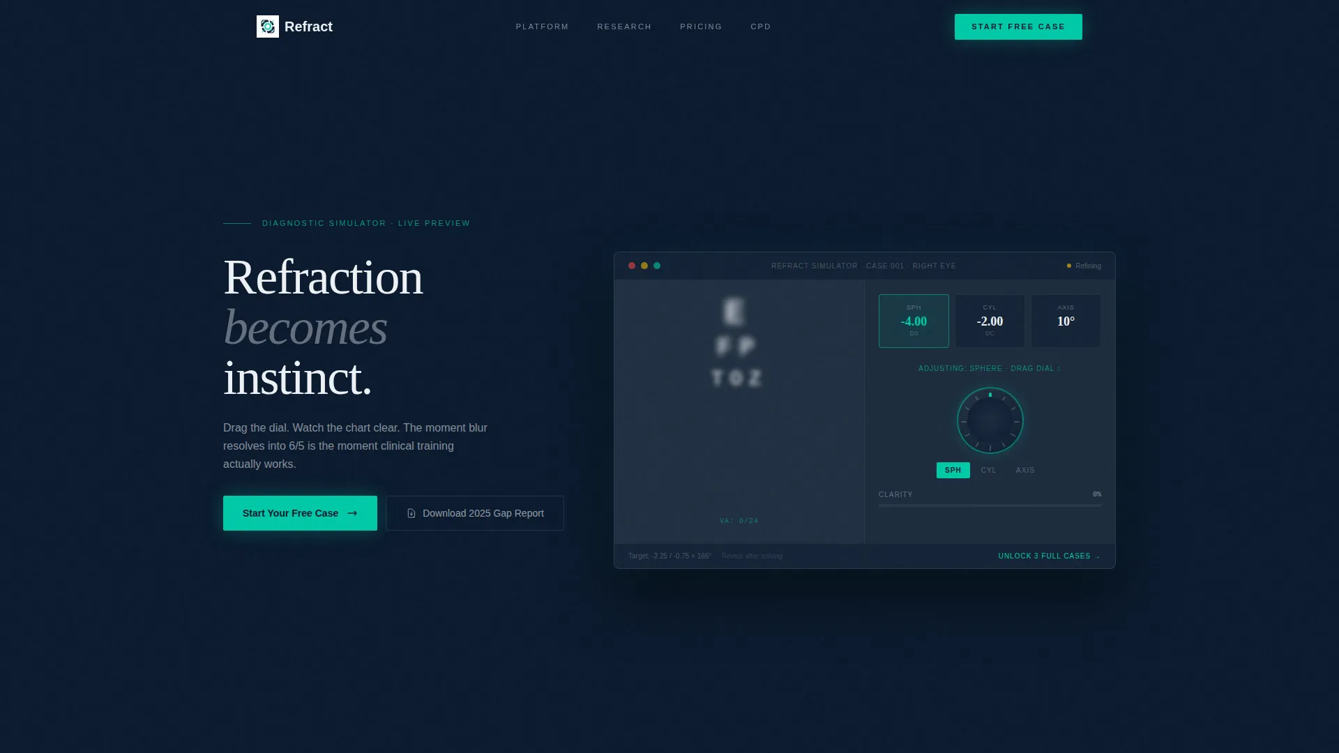
- An interactive Snellen chart simulator in the header where visitors dial in a virtual prescription in real time
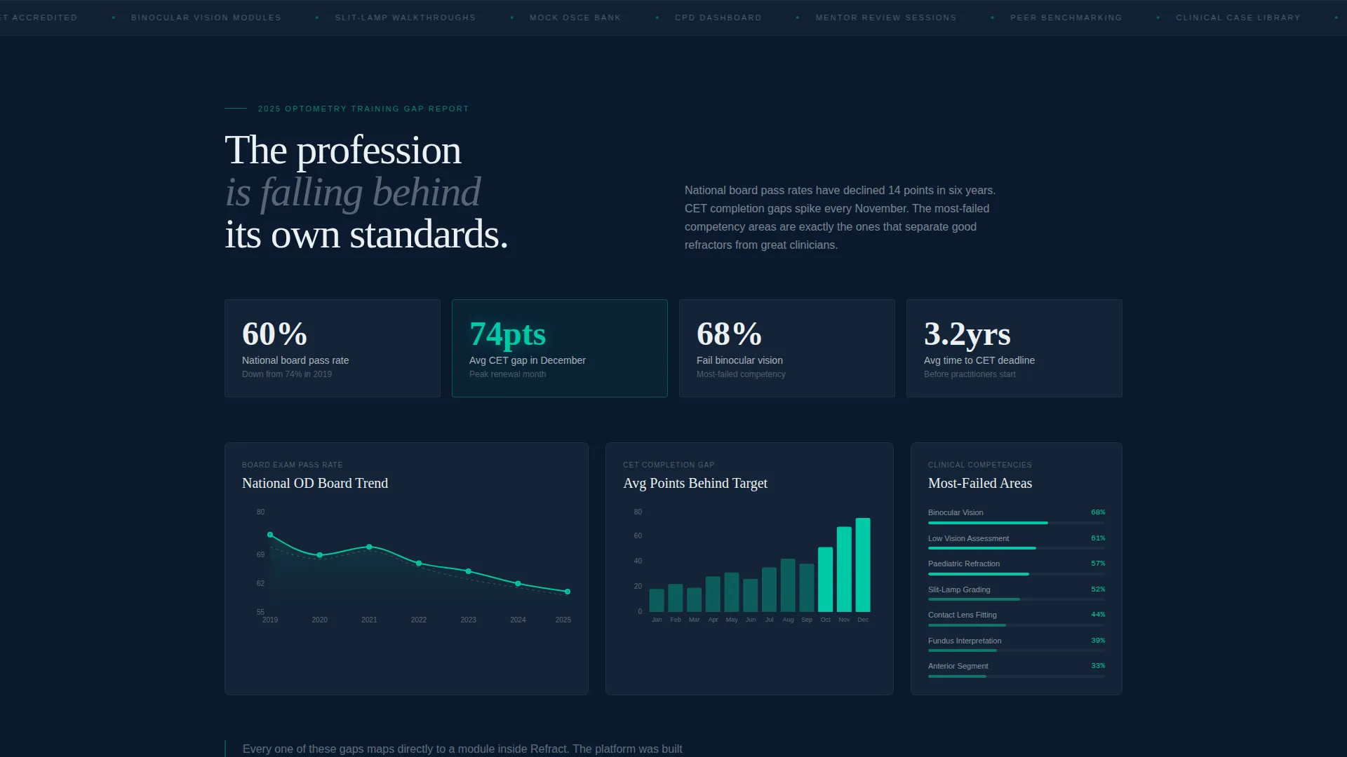
- A data-rich industry report section with pass-rate trends, CET completion gaps, and most-failed competency areas
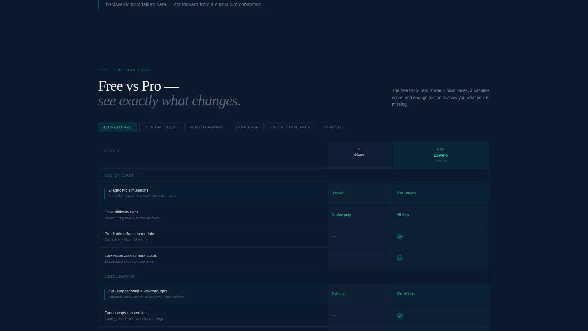
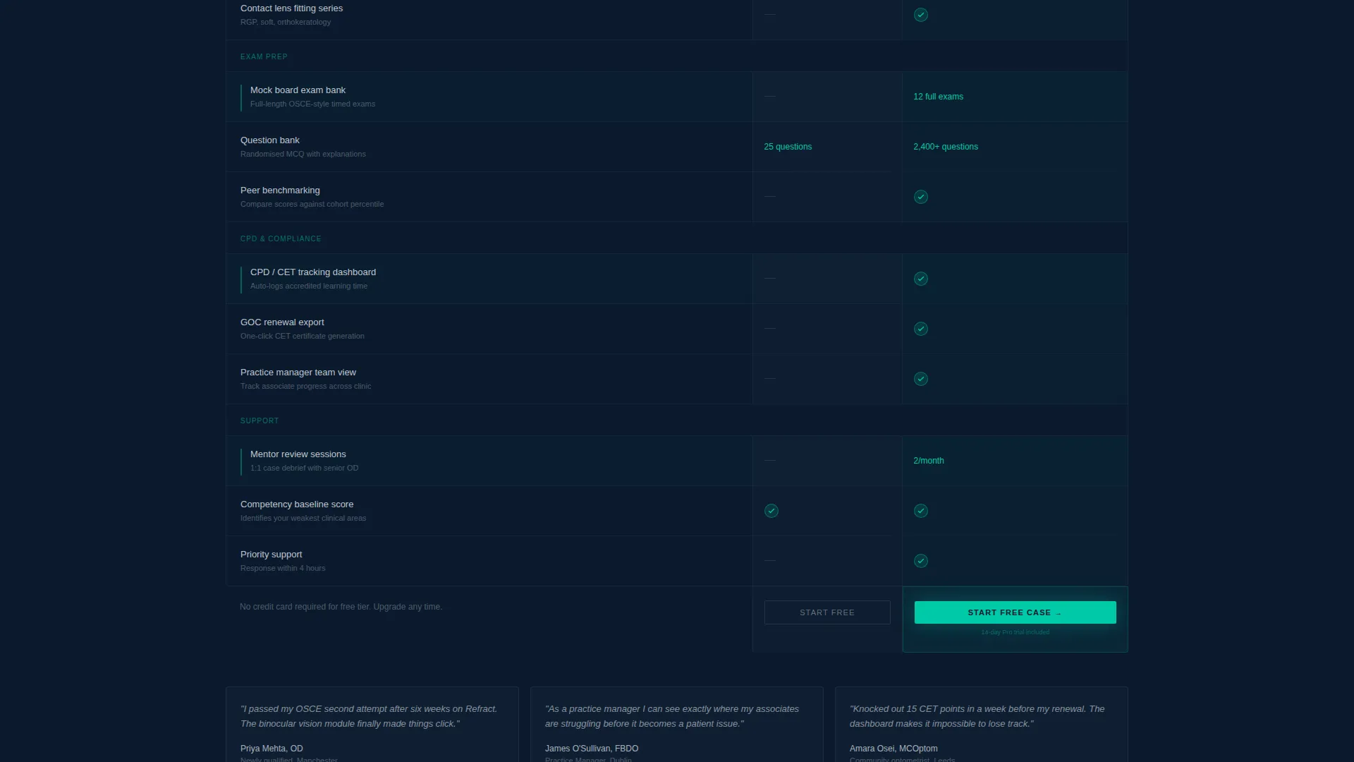
- A Free versus Pro comparison table covering clinical cases, video modules, mock exam banks, CPD tracking, and mentor sessions
- Two distinct call-to-action paths: a free trial trigger and a gated report download for softer leads
Feature list
This template includes purpose-built components that work together to demonstrate platform value and earn the conversion.
Interactive Diagnostic Simulator Header
Visitors drag a virtual lens dial to correct a blurred Snellen chart in real time. Sphere, cylinder, and axis values update live as they adjust, so the product proves itself within seconds of arriving on the page.
Industry Report Data Section
A scroll-driven section presents pass-rate trends for national board exams, average CET completion gaps, and the most-failed clinical competency areas. Each data point is rendered as a clean visualization against the midnight background, building credibility before the comparison table appears.
Free versus. Pro Comparison Table
A structured table lays out tier differences across clinical case count, video-guided slit-lamp module access, mock exam banks, CPD tracking dashboards, and mentor review sessions. Each row ends with a repeat of the primary call-to-action button, keeping conversion always within reach.
Dual Call-to-Action Architecture
The primary path, "Start Your Free Case," opens a single-field email signup that immediately unlocks three diagnostic simulations and a baseline competency score. The secondary path, "Download the 2025 Optometry Training Gap Report," captures leads who prefer data before committing to a trial.
Data Command Visual Theme
The layout uses a midnight blue color system with instrument-panel charcoal card surfaces, clinical white body text, and optic teal reserved for active states, progress indicators, and call-to-action buttons. The visual language mirrors the precision of a consulting room environment.
Page sections overview
| Section | Purpose |
|---|---|
| Interactive Simulator Header | Let visitors dial in a virtual prescription and experience the platform immediately |
| Industry Data Briefing | Display pass-rate trends and CET gap statistics to establish professional relevance |
| Free versus. Pro Table | Compare tier features side by side with inline call-to-action buttons on each row |
| Report Download Banner | Capture softer leads with a gated industry report as a secondary conversion path |
| Bottom call to action Anchor | Reinforce the free trial offer at the end of the page for visitors who scrolled through |
Design & branding system
The template follows a Data Command theme built entirely around a midnight blue color system. Every color choice references the focused, low-distraction atmosphere of a clinical consulting room.
- Deep scleral navy (#0B1A2E) for primary backgrounds, instrument-panel charcoal (#1C2B3D) for card surfaces, and clinical white (#EDF1F5) for body text and table rows
- Optic teal (#00C9A7) is reserved for active states, progress indicators, and all call-to-action buttons, making conversion points immediately visible
- No stock photography and no testimonial carousel; the interactive header element carries all visual and emotional weight
Mobile & speed optimization
The template is structured to remain clean and functional across screen sizes. The comparison table, simulator header, and data visualizations are each designed to reflow gracefully on smaller viewports.
- The comparison table layout is built to stack or scroll horizontally on mobile without losing row context
- The single-field email signup keeps the conversion path frictionless on touch devices
- Lightweight layout choices keep the page focused, with no heavy asset libraries or decorative elements that would add unnecessary weight
How this template helps you convert
The page is engineered around a single insight: visitors who experience a knowledge gap live are far more likely to act. Every section builds on that momentum.
- The interactive simulator creates an immediate personal experience. Visitors feel the clinical precision of the platform before reading a single feature claim, making the free trial feel like a natural next step rather than a marketing ask.
- The industry data section validates the problem with credible statistics on board exam pass rates and CET gaps. By the time visitors reach the comparison table, they already understand why training matters, and the Pro tier reads as the obvious solution.
Other information about this template
This template is part of a broader set of optometry digital presence layouts built for the technology and education intersection. It is suited to platforms that need to communicate clinical credibility and drive trial sign-ups at the same time.
- The template style is Comparison Table, making it well-suited to freemium or tiered-pricing platforms where feature differentiation drives upgrade decisions
- The Industry Report creative direction gives the page a white-paper feel that resonates with continuing professional development audiences and board review candidates
- The header concept, Interactive Preview, is deliberately chosen to replace passive marketing with active product demonstration, reducing the skepticism that text-only course pages typically face
- This layout works well for optometry continuing education providers, clinical skills assessment platforms, and board review course publishers looking to modernize their digital presence
Theme
Data Command
Creative direction
Industry Report
Color system
Midnight Blue
Style
Comparison Table
Direction
Freemium/Trial
Page Sections
Interactive Diagnostic Simulator Header
Industry Report Data Section
Free Versus. Pro Comparison Table
Dual Conversion Paths
Data Command Visual Theme
Related questions
Who is this landing page template designed for?
Can I use this template for a freemium course offering?
What does the comparison table cover?
Does the template include the interactive simulator as a working component?
Can the color system be changed to match a different brand?



