Orbit - Brutalist Satellite Landing Page Template
Orbit is a bold brutalist satellite CRM landing page template built for the most demanding operators in the industry. It combines a live revenue-leakage calculator, stats-first scroll stops, and a split-screen layout to convert constellation operators, ground station managers, and government procurement officers into free-tier signups without friction.
by Rocket studio
Quick summary
Orbit is a single-page brutalist landing page template for a satellite customer relationship management platform. It opens with a live calculator that renders personalized ROI numbers in real time, then drives visitors through evidence-first scroll blocks toward a zero-friction freemium signup. Every design choice reflects mission control urgency: dense carbon fiber colors, monospaced figures, and hard-ruled section breaks.
Who this template is for
This template is built for teams operating at the sharp end of the satellite industry. If your sales cycle involves contracts measured in millions, uplink windows measured in minutes, and compliance reports measured in hours, Orbit speaks your language directly.
- Constellation operators tracking 200 or more active satellites who need one dashboard instead of many spreadsheets
- Ground station network managers coordinating uplink schedules across twelve or more time zones
- Government and defense procurement officers who need audit-ready pipeline visibility before a budget cycle closes
What problem this template solves
Satellite CRM platforms face a specific credibility gap: the product is technically complex, the buyer is skeptical, and a generic SaaS landing page feels completely out of place. Orbit removes that mismatch by making the visitor's own numbers do the persuading.
- Scattered telemetry data, contract renewal timelines, and spectrum allocation records are hard to visualize on a standard page layout
- Procurement buyers and operators need evidence, not taglines, before they will commit to a trial or demo request
- Freemium conversion stalls when the signup flow asks for too much before delivering any value
What you get with this template
Orbit delivers a complete single-page conversion experience structured around data density and operational credibility. Every section is production-ready and built around the source brief's defined structure.
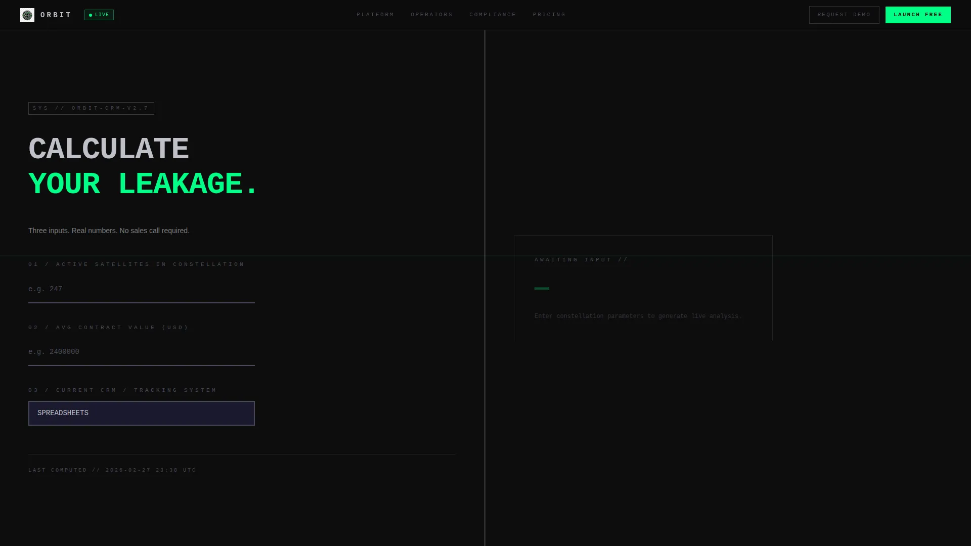
- A live split-screen calculator header with real-time output panels showing revenue leakage recovered, hours saved per week, and a pipeline accuracy score
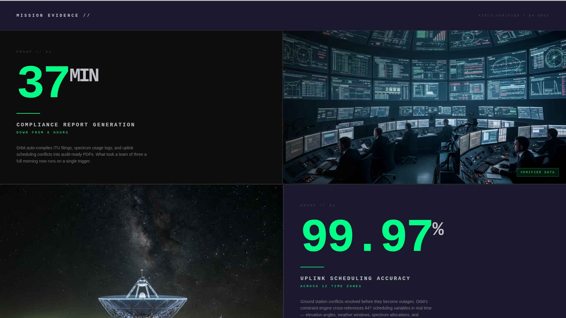
- Stats-first scroll blocks pairing oversized key statistics with alternating product screenshot panels in a left-right zigzag layout
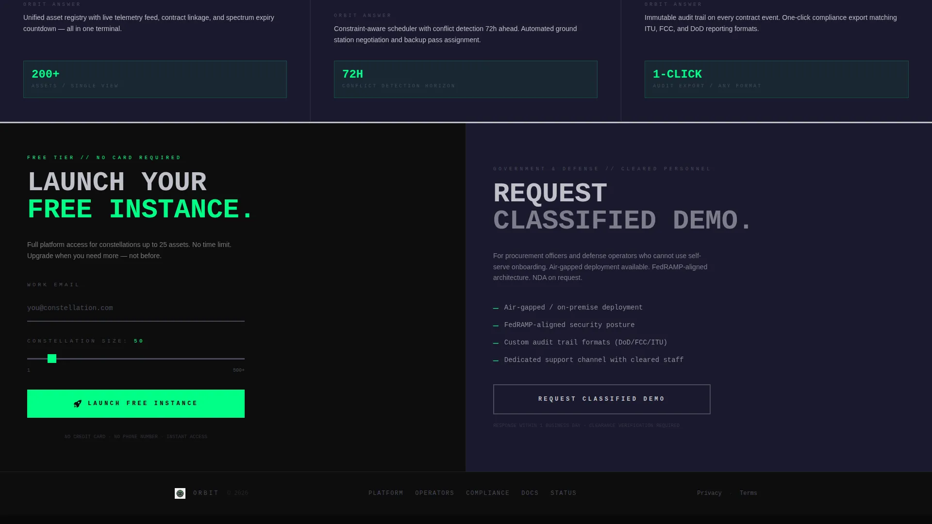
- A dual conversion path: a "Launch Free Instance" primary call to action and a "Request Classified Demo" secondary path for government visitors
Feature list
This template delivers a focused set of components designed specifically for the satellite vertical SaaS conversion flow.
Live Revenue-Leakage Calculator
The header is a fully interactive estimator split across two equal panels. The left side asks three direct questions: number of active satellites, average contract value, and current CRM tool (including a spreadsheet option in the dropdown). The right panel renders results instantly as the visitor types, animating signal green figures upward like a launch countdown.
Stats-First Scroll Architecture
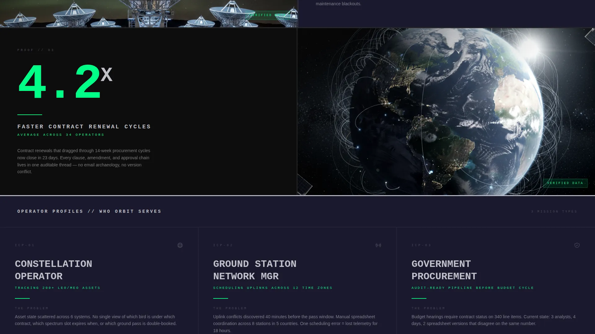
Every scroll stop opens with one oversized statistic before any explanatory copy appears. Examples built into the template include "37 minutes" to generate a compliance report, "99.97% uplink scheduling accuracy," and "4.2x faster contract renewal cycles." The stat earns attention; the supporting panel provides proof.
Alternating Split-Screen Layout
The 50/50 split persists throughout the entire page. Stat panels and product screenshot panels alternate orientation with each block, creating a zigzag reading rhythm that keeps visitors scanning rather than bouncing. No panel repeats the same side twice in a row.
Dual Conversion Path Design
The primary call to action, "Launch Free Instance," appears first inside the calculator results panel and again as a fixed bottom bar after the third scroll block. A secondary "Request Classified Demo" option in titanium outline style serves government and defense visitors who cannot use a self-serve flow.
Brutalist Divider System
Hard black rules with no rounded corners and no gradients separate each content block. The dividers function like bulkheads, giving each section a defined visual boundary and reinforcing the mission control aesthetic throughout the page.
Minimal Signup Form
The freemium signup collects only a work email address and a constellation size input via a single slider ranging from 1 to 500 or more assets. No credit card and no phone number are required, keeping the barrier to entry as low as possible.
Page sections overview
| Section | Purpose |
|---|---|
| Calculator Header | Capture attention with live, personalized ROI output |
| Compliance Stat Block | Lead with "37 minutes" report generation proof point |
| Scheduling Accuracy Block | Present 99.97% uplink accuracy with supporting screenshot |
| Renewal Cycle Block | Show 4.2x faster contract renewal with alternating panel |
| Fixed call to action Bar | Persistent "Launch Free Instance" bar after scroll block three |
| Demo Request Path | Secondary titanium-style call to action for government and defense visitors |
| Freemium Signup | Minimal email and constellation size slider form |
Design & branding system
The visual identity is built on a carbon fiber color system that feels engineered rather than designed. The palette references the surface texture of aerospace hardware: matte, dense, and purposeful.
- Five defined colors: chassis black (#0D0D0D), woven graphite (#1A1A2E), titanium mid-tone (#4A4A5A), raw aluminum highlight (#C0C0C8), and signal green (#00FF87) reserved exclusively for live data, active states, and primary calls to action
- Typography is oversized and monospaced wherever numbers appear; section headers are set in all-caps as if stamped onto sheet metal
- Backgrounds alternate between chassis black and woven graphite in hard, frameless blocks with no gradients or rounded corners anywhere on the page
Mobile & speed optimization
The template is structured to translate the split-screen desktop experience into a readable single-column flow on smaller screens without losing the data-dense impact of the original layout.
- The 50/50 split panels stack vertically on mobile so the calculator form and results panel remain fully usable on a phone screen
- Brutalist dividers and hard block backgrounds retain their visual weight at every viewport width, preserving the mission control aesthetic on smaller devices
- Monospaced number animations and signal green highlights remain the dominant visual cue across all screen sizes
How this template helps you convert
Orbit is designed around one insight: a satellite CRM buyer who sees their own numbers in real time is far more likely to act than one who reads a feature list. Every structural choice supports that conversion logic.
- The live calculator makes the value proposition personal before the visitor reads a single headline, turning a skeptical operator into someone who has already calculated their own revenue leakage recovered
- Stats-first scroll blocks build cumulative credibility with each section, so by the time the fixed call to action bar appears after the third block, the visitor has absorbed three independent proof points
- The two-path conversion design removes friction for both self-serve users and government buyers who need a structured demo, ensuring neither audience hits a dead end
Other information about this template
Orbit is categorized under Technology, specifically within the Satellite Vertical SaaS subcategory, and is designed for the Satellite CRM Platform niche. It is one of the most specialized templates in this category and is unlikely to need heavy customization for teams already operating in the constellation or ground station management space.
- The template style is a strict 50/50 split screen, meaning both panels carry equal visual weight on every scroll block
- The bold brutalist theme is intentional and opinionated; teams outside the aerospace or defense verticals may find the aesthetic requires adaptation for broader SaaS markets
- The freemium and trial conversion direction means the page is built to move visitors toward a no-credit-card signup first, with the demo path as a deliberate secondary option rather than the primary goal
Theme
Bold Brutalist
Creative direction
Stats-First Impact
Color system
Carbon Fiber
Style
Split Screen (50/50)
Direction
Freemium/Trial
Page Sections
Live Split-screen ROI Calculator
Stats-first Scroll Blocks
Alternating 50/50 Panel Layout
Dual Conversion Path Structure
Brutalist Divider and Block System
Minimal Freemium Signup Form
Related questions
Who is this template actually built for?
Can I use this template if my product is not in the satellite industry?
What conversion actions does this template support?
How does the calculator work in this template?
Is there a fixed call to action element included?



