Healthcare Software & SaaS Complete Professional Website Template
Pulse is a scroll-reveal landing page template built for a healthcare mobile app that brings clinical-grade triage to any smartphone. It features an interactive phone mockup header, a data-driven narrative structure, and a live comparison table. The design uses a Tech Glass visual system with deep blacks, frosted panels, and iridescent violet-to-teal gradients throughout.
by Rocket studio
Quick summary
Pulse is a single-page, scroll-reveal landing page template for a healthcare mobile app. It guides visitors through a cinematic, data-led narrative that moves from the clinical problem straight to proof. The header puts an interactive symptom-check demo front and center, and a live comparison table drives the primary conversion moment.
Who this template is for
This template is built for healthcare technology teams that need to communicate clinical credibility while driving sign-ups or demo requests. It fits equally well for product teams, growth marketers, and founders pitching to health system buyers.
- Healthcare mobile app teams targeting chronic care patients, emergency departments, or rural primary care practices
- Health-tech SaaS companies presenting clinical outcome data to hospital or health system decision-makers
- Digital health startups that need a polished, conversion-focused landing page to support sales or fundraising conversations
What problem this template solves
Most healthcare technology landing pages fail in the same two places: they bury the clinical proof, and they give skeptical buyers no reason to believe the numbers. Pulse is designed to fix both.
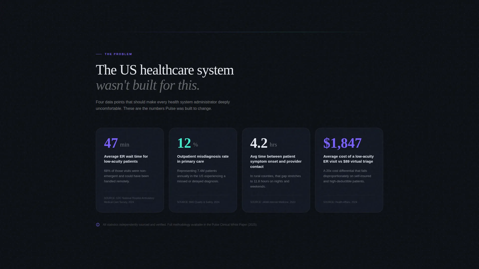
- Fragmented patient journeys and uncoordinated care are hard to illustrate without data. This template leads with uncomfortable, sourced statistics that frame the problem before presenting the solution.
- Visitors who are not ready to book a demo often leave with nothing. The dual conversion path captures both sales-ready leads and research-motivated prospects behind separate gates.
What you get with this template
You get a fully structured, scroll-reveal landing page built around a coherent clinical narrative. Every section is purposeful, progressive, and designed to earn the next scroll.
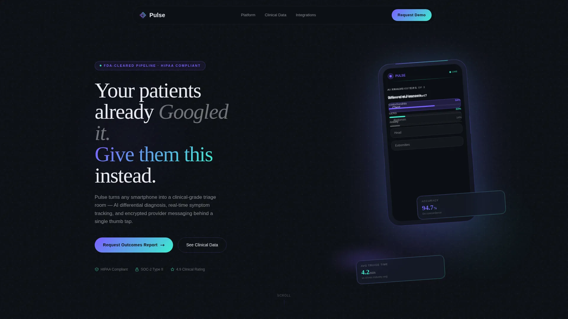
- An interactive phone mockup in the header that walks visitors through a live symptom-check flow without requiring any download
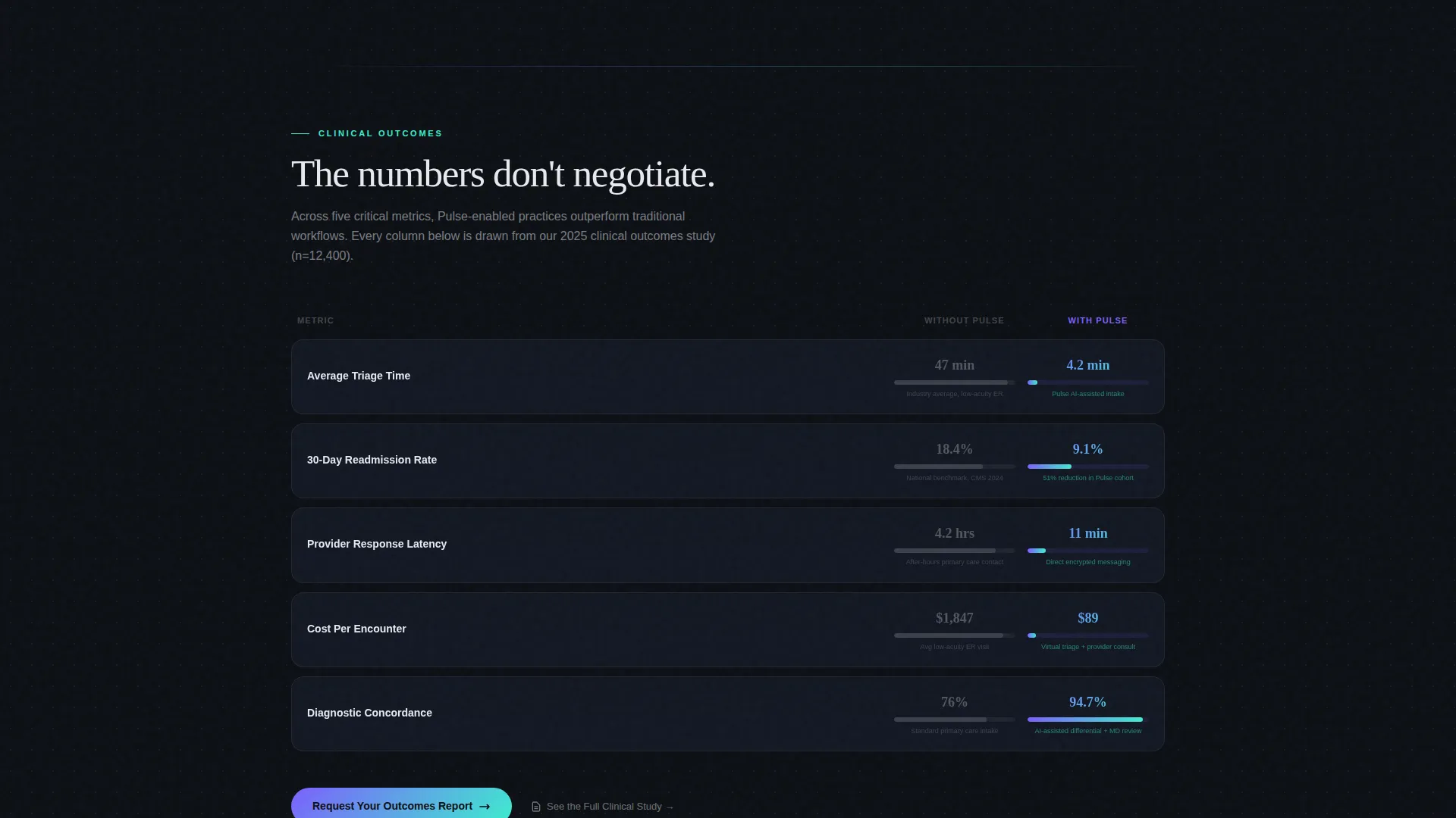
- A two-column animated comparison table that toggles between "Without Pulse" and "With Pulse" states across key clinical metrics
- Two distinct conversion forms: one collecting organization details for an outcomes report, and a second capturing emails behind a clinical study gate
Feature list
This template is built around a set of carefully considered components that work together across the full scroll experience.
Interactive Phone Mockup Header
A floating, three-quarter-angle phone mockup sits at the center of the header, rendered in frosted glass. Visitors can tap through a real symptom-check flow directly on the page. The five-second sequence animates through intake questions, a differential diagnosis card, and a provider match result without requiring any app download.
Scroll-Reveal Progressive Narrative
As the visitor scrolls, each content section fades into view in sequence. The layout follows an Industry Report creative direction: a sourced stat block appears first, followed by clinical outcome comparisons, then the conversion mechanics. Each section feels like turning a page in a well-designed white paper.
Animated Clinical Metrics Comparison Table
The primary conversion section features a two-column interactive table. Visitors toggle between the "Without Pulse" and "With Pulse" states. The muted gray column and glowing holographic violet column animate into view as the visitor scrolls, making the outcome gap immediately visible.
Dual Conversion Path Structure
The template includes two distinct calls to action. The primary form collects organization name, electronic health record system, and patient volume tier to deliver a custom outcomes report. The secondary path captures email addresses behind a clinical study gate, targeting research-motivated buyers who are not yet ready to speak with a sales team.
Data-Driven Stat Block Section
A dedicated section surfaces sourced statistics on emergency room utilization rates, average triage wait times, and misdiagnosis percentages. The data builds the clinical case before the template transitions into proof and product sections, following a problem-then-solution narrative arc.
Glass-Shatter Compliance Badge Animation
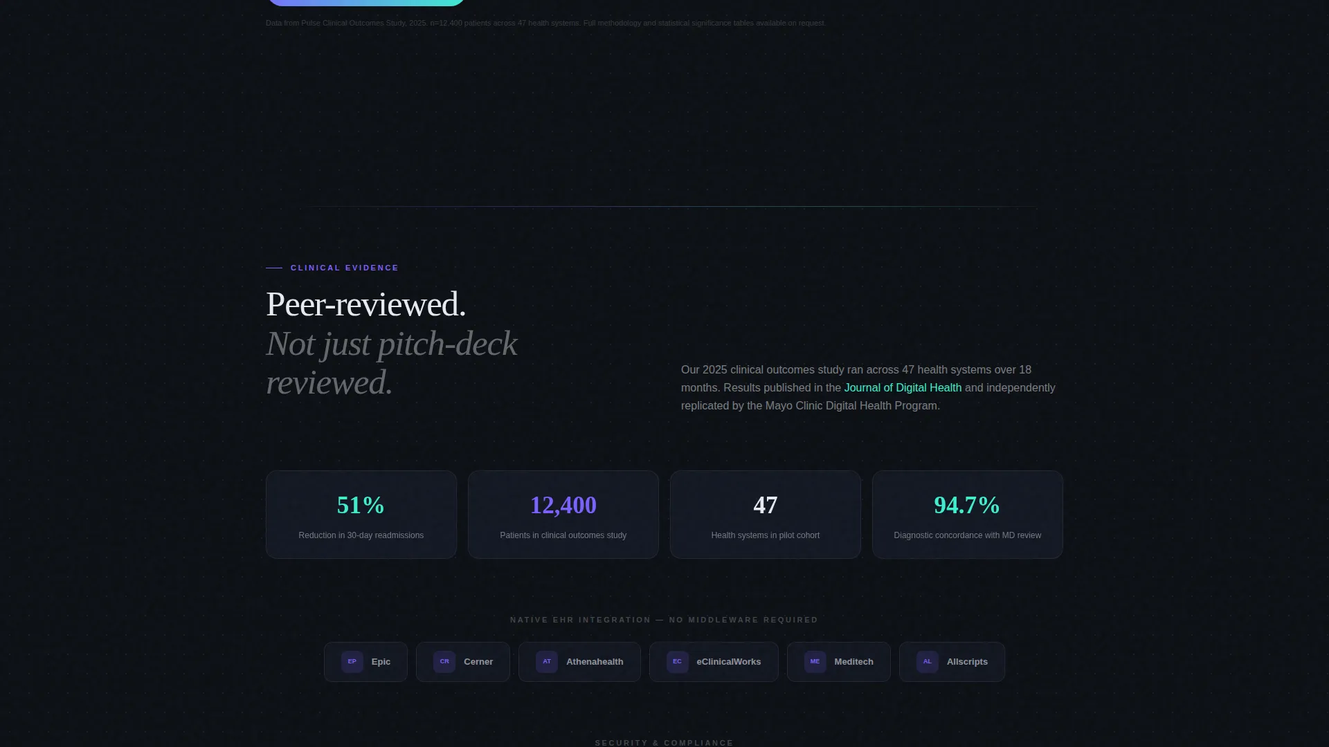
Compliance and integration partner credentials load with a glass-shatter animation. This section includes slots for health record integration partner logos and compliance badges that animate in subtly as the visitor reaches that point in the scroll.
Page sections overview
| Section | Purpose |
|---|---|
| Interactive Header | Showcase the app with a tappable phone mockup demo |
| Sourced Stat Block | Frame the clinical problem with uncomfortable data |
| Problem to Proof Shift | Transition narrative from challenge to clinical evidence |
| Outcome Comparisons | Present clinical results side by side with partner proof |
| Compliance Badge Row | Build credibility with integration logos and badges |
| Comparison Table | Let visitors toggle and visualize the impact of the app |
| Primary call to action Form | Capture sales-ready leads with an outcomes report offer |
| Secondary Study Gate | Capture research-led leads behind a clinical study email gate |
Design & branding system
The visual identity is built around a Tech Glass theme using an AI Iridescent color system. The palette is dark enough to read at any hour and luminous enough to feel genuinely forward-looking.
- Core palette: deep surgical black (#0B0E13) as the base, frosted glass panel white (#E8EAF0) for text panels, holographic violet (#7B5FFF) as the primary accent, and shifting teal (#3CEFCF) on hover states, data lines, and active interface elements
- A violet-to-teal iridescent gradient washes across card edges and section dividers, refracting like light through a prism and giving the page a medical-grade augmented reality aesthetic
- Soft iridescent light pools beneath the floating phone mockup in the header, and the glass-shatter badge animation extends the material metaphor across the compliance section
Mobile & speed optimization
The template is designed with a mobile-first audience in mind. The primary users of the Pulse app include patients on smartphones and clinicians working at odd hours on small screens, so the landing page must hold up in those conditions.
- The scroll-reveal animation system is built to function cleanly at mobile viewport widths, keeping the progressive narrative intact on smaller screens
- The floating phone mockup and interactive tap-through demo are optimized for touch interaction, reflecting the same thumb-tap simplicity that defines the app itself
How this template helps you convert
The conversion architecture in this template is intentional at every layer. It does not rely on a single call to action but instead creates two distinct capture moments timed to the visitor's readiness level.
- The primary conversion form appears below the animated comparison table, collecting organization name, electronic health record system selection, and patient volume tier. This captures buyers who have reviewed the outcome data and are ready for a personalized report.
- The secondary email gate sits below the primary form and offers access to the full clinical study. This captures research-motivated visitors who are not yet ready for a sales conversation but are deeply engaged with the clinical evidence.
Other information about this template
This template was designed specifically for the healthcare mobile app niche and reflects the real communication needs of health-tech go-to-market teams. A few additional details worth knowing before you build with it.
- The integration partner logo row includes pre-built slots referencing health record systems such as Epic, Cerner, and Athenahealth, making it straightforward to populate with your actual partner credentials
- The compliance badge section includes placement for HIPAA and SOC 2 credentials, with the glass-shatter animation adding a distinctive reveal moment for trust signals
- The template is structured as a single-page scroll experience, not a multi-page site, making it well-suited for campaign traffic, demo request flows, and product launch announcements
- The headline in the header reads "Your patients already Googled it. Give them this instead." and is included as a starting point you can adapt to your specific messaging
Theme
Tech Glass
Creative direction
Industry Report
Color system
AI Iridescent
Style
Scroll Reveal (Progressive)
Direction
Comparison/Versus
Page Sections
Interactive Phone Mockup Demo
Scroll-reveal Progressive Layout
Animated Comparison Table
Dual Conversion Path
Sourced Data Stat Block
Compliance and Integration Badge Section
Related questions
Can I edit the headline and copy inside this template?
Does the interactive phone mockup require custom coding to set up?
Can I use this template before my app has launched publicly?
How do the two conversion forms serve different visitors?
Is this template designed for business-to-business or direct-to-patient use?



