AI & Machine Learning Comparison Website Template
Orchestrate is a dashboard-style landing page template built for AI agent and automation platforms. It combines a live-metrics header, a dense spec comparison grid, and a sticky conversion bar into one cohesive single-page layout. The Midnight Blue color system and Data Command theme make every element feel deliberate, technical, and ready for an engineering audience evaluating serious infrastructure decisions.
by Rocket studio
Quick summary
Orchestrate is a single-page landing page template designed for AI agent and workflow automation platforms. It opens with a real-time stats dashboard, moves into a technical spec comparison grid, and closes with a dual conversion path. The layout speaks directly to engineering leads, operations managers, and CTOs who evaluate tools by reading the numbers, not the narrative.
Who this template is for
This template is built for technical and operational decision-makers who need a landing page that earns credibility through data rather than marketing copy. If your audience reads documentation before they read testimonials, this is the right starting point.
- Engineering leads evaluating whether to build or buy an internal orchestration layer
- Operations managers who have outgrown spreadsheet-based automations and need a scalable alternative
- CTOs and product leads presenting an AI agent platform to a technical buying committee
What problem this template solves
Most software landing pages try to persuade through story. Technical buyers do not respond to that. They scroll looking for the spec they care about, and if they cannot find it quickly, they leave. This template is designed to keep that visitor on the page.
- Every section is structured as a comparison row, so objections get answered as the visitor scrolls
- Expandable spec drawers let engineers drill into rate limits, webhook schemas, and retry policies without navigating away
- The sticky conversion bar activates at the right scroll depth, so the call to action appears only after the visitor has seen enough to act
What you get with this template
The template delivers a complete, conversion-focused landing page layout with no filler sections. Every block has a defined job, and the visual system reinforces the platform's technical credibility at a glance.
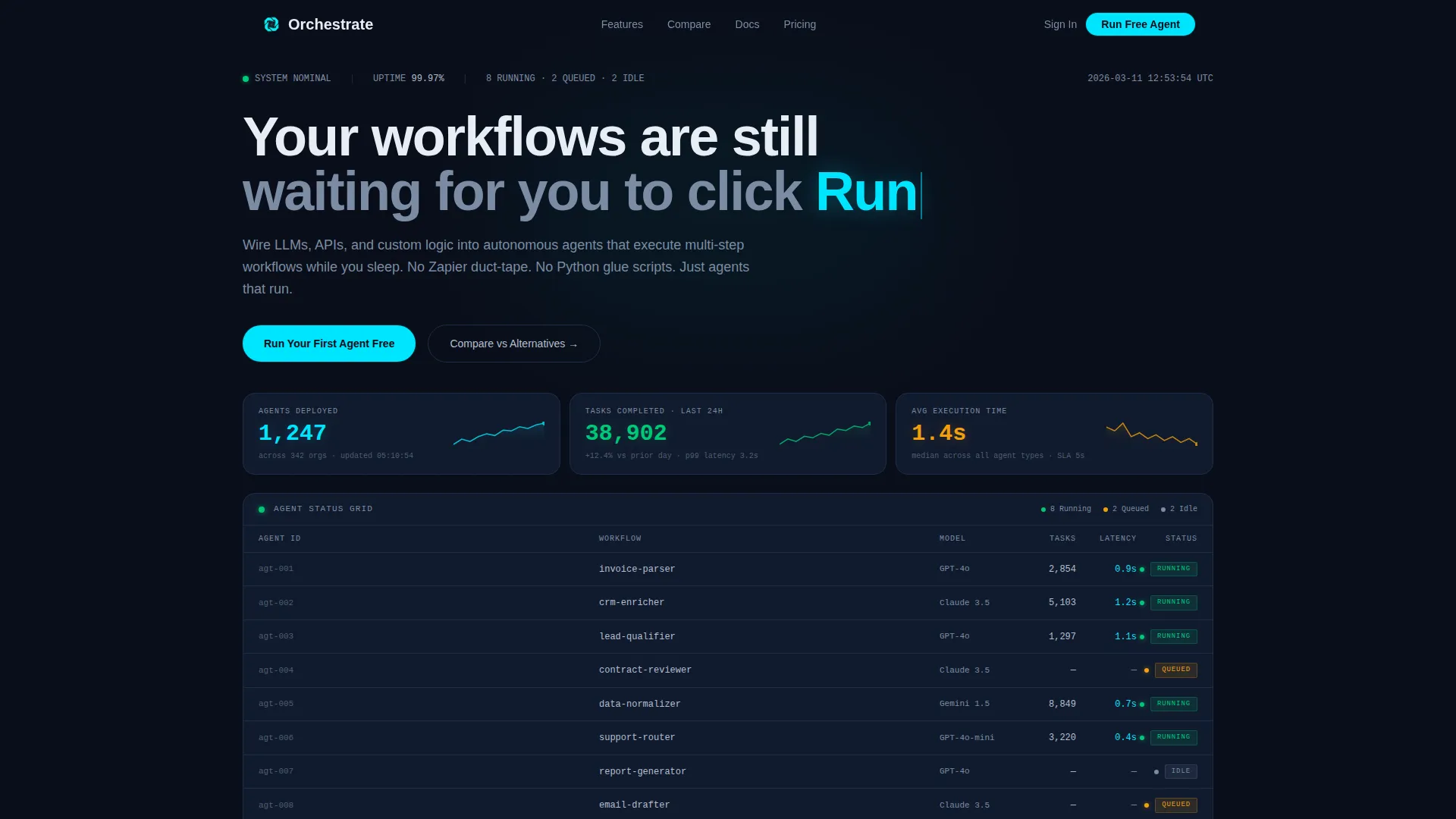
- A live-data metrics header featuring three horizontal metric bars with micro-sparklines and an agent-status grid with color-coded dot indicators
- A multi-row comparison grid that puts your platform side by side with alternative approaches across consistent evaluation columns
- A sticky bottom conversion bar with a primary call to action and a secondary email-gated PDF download path
Feature list
This template includes purpose-built layout components grounded in the Data Command visual theme. Each feature is designed to serve a specific part of the technical buyer's evaluation journey.
Live Stats Header Dashboard
The header opens with three horizontal metric bars displaying agents deployed, tasks completed in the last 24 hours, and average execution time. Each metric includes a micro-sparkline trailing to the right. A condensed agent-status grid sits below, using green, amber, and gray dot indicators to show running, queued, and idle states. Timestamps and formatted numbers give the data a telemetry-grade feel.
Multi-Column Comparison Grid
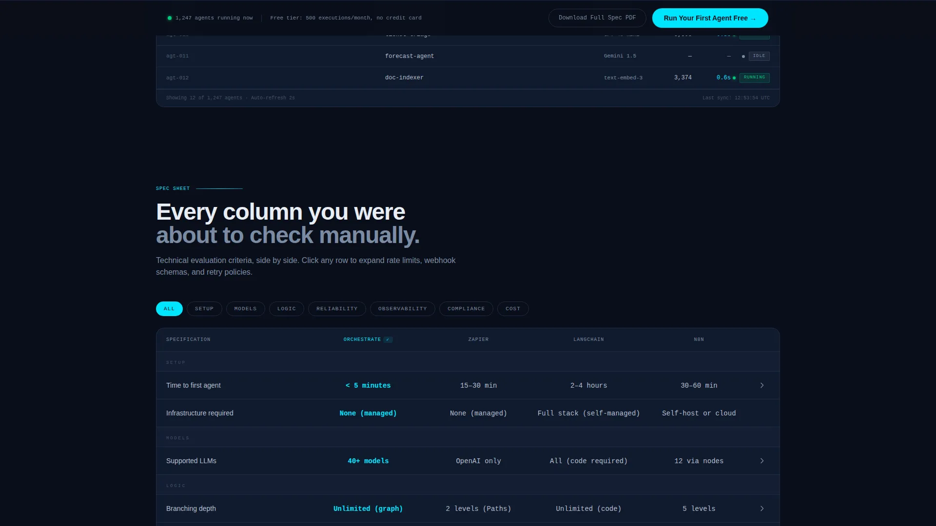
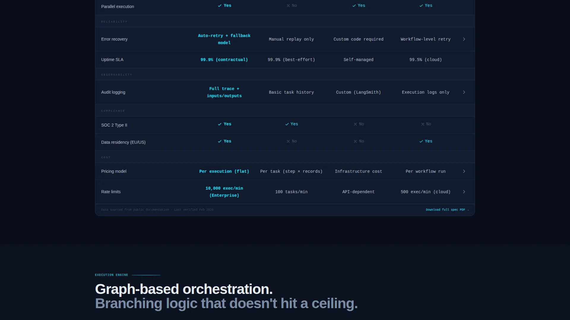
The core scroll experience is built around a structured comparison grid. Each row evaluates a consistent set of columns including setup time, supported models, branching logic depth, error recovery, audit logging, and compliance status. Your platform's column carries the active cyan checkmarks. The density of the grid rewards careful readers and answers objections before they are raised.
Expandable Spec Drawers
Engineers can expand individual comparison rows to reveal deeper technical detail. Rate limits, webhook schemas, and retry policies are all accessible without leaving the page. This removes the need for a separate documentation link during the initial evaluation.
Sticky Conversion Bar
A bottom bar anchors the primary call to action and activates after the visitor scrolls past the third comparison grid row. This placement ensures the prompt to act arrives after enough context has been absorbed. The bar remains visible as the visitor continues reading.
Email-Gated PDF Download Path
A secondary conversion path offers a full specification document in exchange for a single work email address. This serves the buyer who needs to circulate the comparison internally before a decision is made, capturing intent from leads who are not ready to start immediately.
Headline and Typographic Hierarchy
The headline sits above the metrics grid in medium-weight sans-serif type. Supporting labels, secondary text, and inactive borders use muted steel tones to keep the hierarchy clear. Active states and key figures use phosphor cyan sparingly, so the eye is always drawn to what matters most.
Page sections overview
| Section | Purpose |
|---|---|
| Live Metrics Header | Opens with real agent telemetry data and status grid |
| Platform Headline | Sets the core value proposition above the data |
| Comparison Grid Rows | Evaluates platform against alternative approaches column by column |
| Expandable Spec Drawers | Provides deep technical detail on demand within the page |
| Sticky Conversion Bar | Anchors the primary call to action at scroll depth |
| Email-Gated PDF Offer | Captures internal evaluators via a spec document download |
Design & branding system
The visual identity follows a Data Command theme using a Midnight Blue color system. The palette is built for discipline, not decoration. Every color has a defined role, and nothing glows unless it earns it.
- Void black (#0A0E1A) serves as the primary canvas, deep command-line navy (#111B2E) fills card surfaces and grid cells, phosphor cyan (#00E5FF) marks live-state accents and active metrics, and muted steel (#7B8CA3) handles secondary text and inactive borders
- Cyan appears sparingly on running-agent indicators, hovered grid rows, and the numbers that carry the most weight
- Typography uses medium-weight sans-serif for headlines and telemetry-style formatting with commas, decimal places, and timestamp footers for metric displays
Mobile & speed optimization
The template is structured with a lean, single-column layout that adapts naturally to smaller screens. The data-heavy sections are designed to remain scannable on mobile without losing their evaluative density.
- The comparison grid and metric bars are laid out to reflow cleanly on narrower viewports
- The sticky conversion bar is positioned to remain usable on mobile without obscuring key content
- Lightweight dot indicators and sparkline components keep the visual complexity manageable across device sizes
How this template helps you convert
This template is built around the insight that technical buyers convert when they feel their questions have already been answered. The layout earns the click by removing uncertainty rather than manufacturing urgency.
- The live metrics header establishes platform credibility in the first visible screen, grounding the visitor in real operational data before any marketing copy appears
- The comparison grid structure means every scroll answers a question the visitor was about to ask, reducing the need for back-and-forth research
- The dual conversion path captures both ready-to-start visitors via the sticky bar and internal-evaluation leads via the email-gated PDF, so no buyer intent is lost
Other information about this template
This template is designed to work as a standalone landing page for an AI agent or automation platform, but it can also serve as a high-intent evaluation page linked from paid campaigns or technical community channels.
- The layout suits platforms competing in the autonomous agent and workflow automation space, where buyers frequently compare multiple tools before committing
- The spec drawer pattern is particularly useful for platforms with deep technical documentation, since it surfaces key parameters without requiring a separate developer portal visit
- The template's visual system is consistent enough to support light brand customization, including swapping the cyan accent color for a brand-aligned alternative while keeping the Midnight Blue canvas intact
- Teams using tools like n8n, LangChain, or similar orchestration frameworks as reference points for competitive positioning will find the comparison grid structure directly applicable to those evaluations
Theme
Data Command
Creative direction
Spec Sheet
Color system
Midnight Blue
Style
Dashboard/Data Grid
Direction
Comparison/Versus
Page Sections
Live Stats Metrics Header
Multi-column Spec Comparison Grid
Expandable Technical Spec Drawers
Sticky Bottom Conversion Bar
Email-gated PDF Download
Related questions
Who is this landing page template designed for?
Can I customize the comparison grid columns?
Do I need design experience to use this template?
How does the email-gated PDF path work?
Can this template support a live data feed for the metrics header?



