Orchestrate — Developer Zapier Automation Landing Page Template
Automate is a developer-focused landing page template built for Zapier power users who treat automation as real engineering. It features a three-tab interactive hero, escalating comparison tables, copyable code blocks, glassmorphic testimonial cards, and a platform-toggle download call to action. The Tech Glass visual design makes every section feel like a live terminal session.
by Rocket studio
Quick summary
Automate is a single-page landing page template designed for developer blogs and resource hubs that cover Zapier as serious engineering infrastructure. It combines an interactive Feature Tab Switcher hero, three escalating comparison tables, social proof metrics, and a platform-aware download call to action, all wrapped in a dark, frosted-glass terminal aesthetic.
Who this template is for
This template speaks directly to engineers who have outgrown drag-and-drop tutorials. It is built for teams and individuals who want to convince a developer audience that automation tooling belongs in a real tech stack.
- Full-stack developers working in Python or JavaScript who want to ship internal tools faster
- Operations engineers managing SaaS sprawl with webhooks and multi-step workflows
- Solo founders who run Zapier as lightweight infrastructure rather than a hobby tool
What problem this template solves
Most automation content looks like it was written for non-technical marketers. Developers scroll past it immediately. This template solves the credibility gap by leading with syntax-highlighted code, side-by-side comparison data, and a tone that respects the reader's existing knowledge.
- Generic automation pages fail to show complexity scores, boilerplate reduction, or real time-saved metrics
- Competing layouts bury the technical proof behind hero images and vague benefit bullets
- Developers need to see the evidence before they download anything
What you get with this template
You get a fully structured single-page layout built around developer trust signals. Every section is designed to add evidence before asking for a commitment.
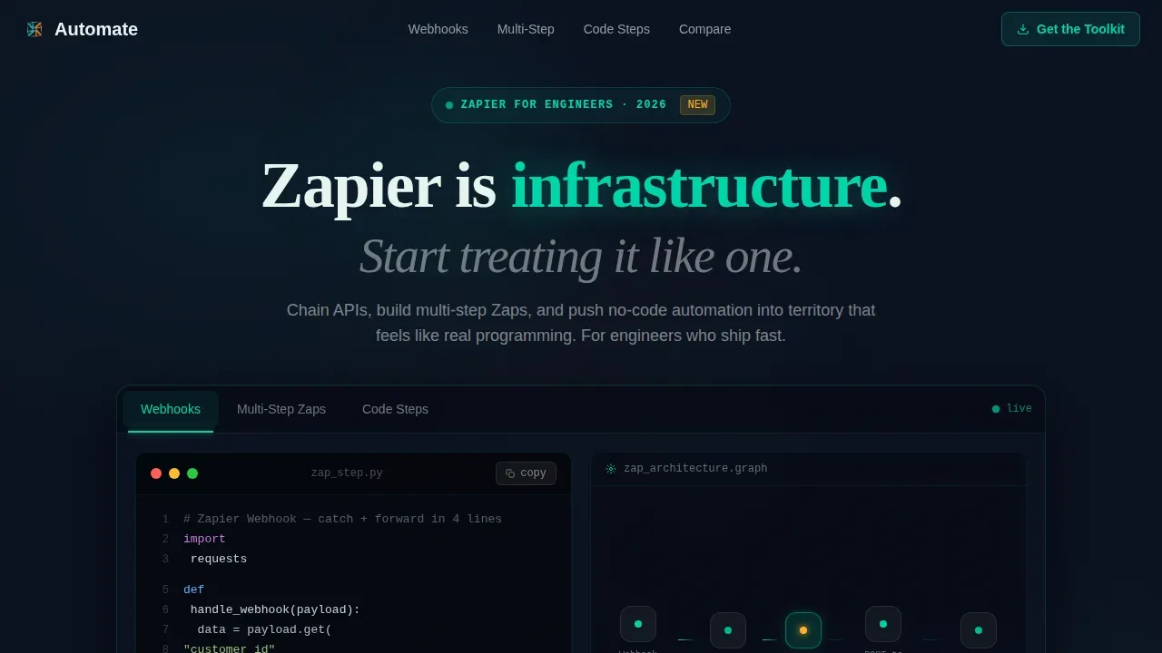
- A three-tab interactive hero with live syntax-highlighted code snippets, animated node graphs, and teal-glowing result outputs
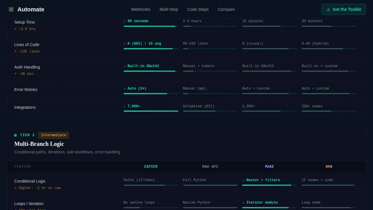
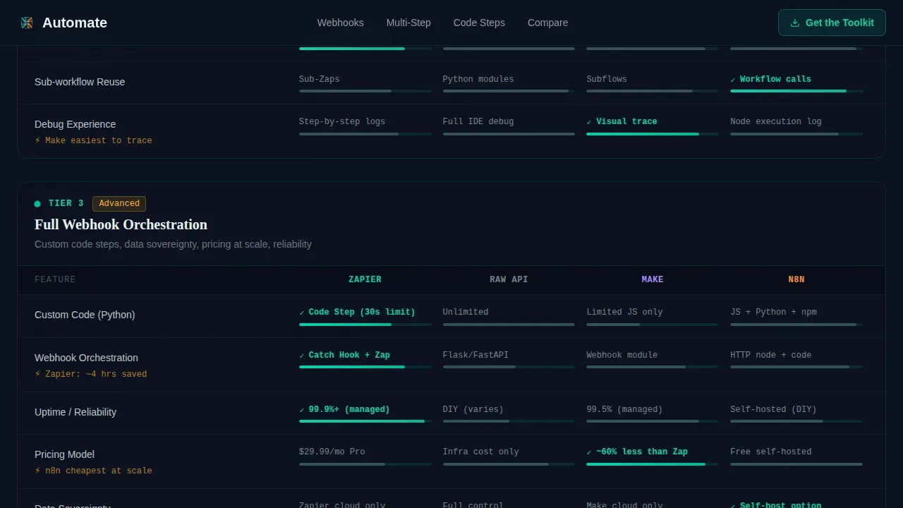
- Three escalating comparison table sections covering code steps versus raw API calls versus competing platforms, complete with time-saved metrics and complexity scores
- A metrics bento block, glassmorphic developer testimonial cards, a platform-toggle download call to action with an email field, and a linear single-row footer
Feature list
This section highlights the core interactive and structural capabilities built into the template.
Interactive Feature Tab Switcher
Three clickable tabs labeled "Webhooks," "Multi-Step Zaps," and "Code Steps" sit inside a frosted glass panel. Each tab swaps a syntax-highlighted code block on the left, an animated node-graph on the right, and a glowing teal result line at the bottom. The active tab indicator slides with spring easing, giving the header an IDE-like feel.
Escalating Comparison Tables
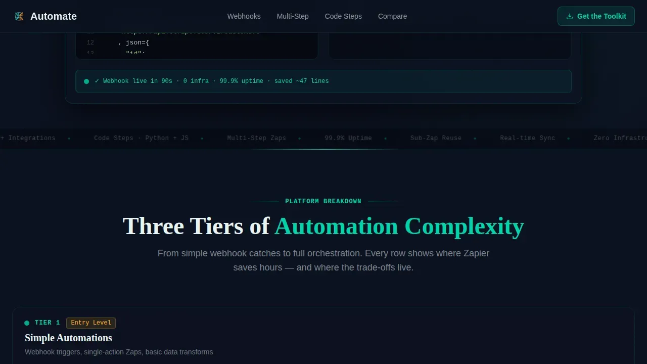
Three stacked comparison sections reveal capability tiers progressively. Each table compares automation approaches row by row, surfacing time-saved metrics and complexity scores. The scroll pacing builds conviction before the reader reaches the download call to action.
One-Click Copyable Code Blocks
Embedded code blocks throughout the page include a copy-to-clipboard button. Developers can grab snippets directly without selecting text manually. This small interaction signals that the content is meant to be used, not just read.
Glassmorphic Testimonial Cards
Developer quote cards float over the dark background using frosted glass panels at 12% opacity blur. They break the data-heavy rhythm of the comparison tables with human voices. Each card reinforces that real engineers rely on this workflow.
Platform-Toggle Download Call to Action
The primary call to action includes a toggle between macOS, Windows, and command-line interface options, paired with a single email field. This lets visitors self-select their environment before requesting the download link.
Metrics Bento Block
A dedicated social proof section displays key stats such as integration counts, uptime figures, and time-saved data in a bento-style grid layout. The block adds credibility without interrupting the page's narrative flow.
Page sections overview
| Section | Purpose |
|---|---|
| Hero Tab Switcher | Establishes capability with tabbed code demos and node graphs |
| Comparison Tables | Proves value through three escalating side-by-side breakdowns |
| Metrics Bento | Reinforces trust with social proof stats and integration counts |
| Testimonial Cards | Adds human credibility via glassmorphic developer quotes |
| Download Call to Action | Converts visitors with platform toggle and email capture |
| Linear Footer | Closes the page with a single-row navigation strip |
Design & branding system
The visual identity follows a Tech Glass theme using a Teal Catalyst color system. The overall feel is clinical, dark, and alive at the edges, like peering through a smoked glass server rack where one LED pulses green.
- Core palette: deep void black (#0B1120) background, reactive teal (#00D4AA) for interactive highlights and code annotations, frosted glass white (#E8F4F0) for card surfaces at 12% opacity blur, and signal amber (#FFB224) for notification badges and new-post indicators
- Typography stack: JetBrains Mono for all code blocks and terminal-style text, DM Sans for interface and body copy, Fraunces for display headings
- Animation layer: spring-easing tab indicator, teal pulse animations on section entrances, staggered scroll reveals, and high-motion interactivity throughout
Mobile & speed optimization
The template is built desktop-first to serve the developer audience, where wide code blocks and comparison tables need full horizontal space to stay readable. Interactive components use a client-component approach while static content is handled server-side.
- Desktop-priority layout ensures code snippets and comparison tables render without horizontal truncation
- Interactive elements such as the tab switcher, platform toggle, and copy-to-clipboard buttons are isolated as client components to keep static sections lightweight
- Scroll reveal animations and staggered transitions are designed to fire smoothly without blocking page rendering
How this template helps you convert
Every layout decision in this template is built to move a skeptical developer from curiosity to download. The page earns the click before it asks for it.
- The Feature Tab Switcher in the hero immediately demonstrates real technical depth, giving developers a reason to keep scrolling rather than bouncing.
- Three escalating comparison tables stack evidence progressively, so by the time a visitor reaches the call to action, the value case is already made through data, not claims.
- The platform-toggle download section removes friction by letting engineers select their environment upfront, making the final step feel like a natural next action.
Other information about this template
This template is part of the Automate collection, designed specifically for Zapier documentation and developer education content. It fits naturally within a Documentation and Support content strategy targeting engineers who already work with automation platforms.
- The template style is Comparison Table, making it well-suited for any resource hub that needs to differentiate automation approaches such as Zapier versus Make versus n8n
- The creative direction follows a Launch Energy narrative, structuring the page like a deployment countdown that builds urgency through escalating content tiers
- The header concept is a Feature Tab Switcher, a pattern borrowed from developer tooling product pages and interactive documentation sites
- The landing page direction targets App Download conversion, optimized for driving toolkit downloads via email capture with environment-aware platform selection
Theme
Tech Glass
Creative direction
Launch Energy
Color system
Teal Catalyst
Style
Comparison Table
Direction
App Download
Page Sections
Interactive Feature Tab Switcher
Escalating Comparison Tables
One-click Copyable Code Blocks
Glassmorphic Testimonial Cards
Platform-toggle Download Call to Action
Metrics Bento Social Proof Block
Related questions
Who is this landing page template designed for?
Can I edit the comparison tables to match my own data?
Does the tab switcher in the hero require custom development?
What makes this template different from a generic blog layout?
Is this template suitable for a single product or a broader documentation hub?



