Orchestrate - Headless BPM Landing Page Template
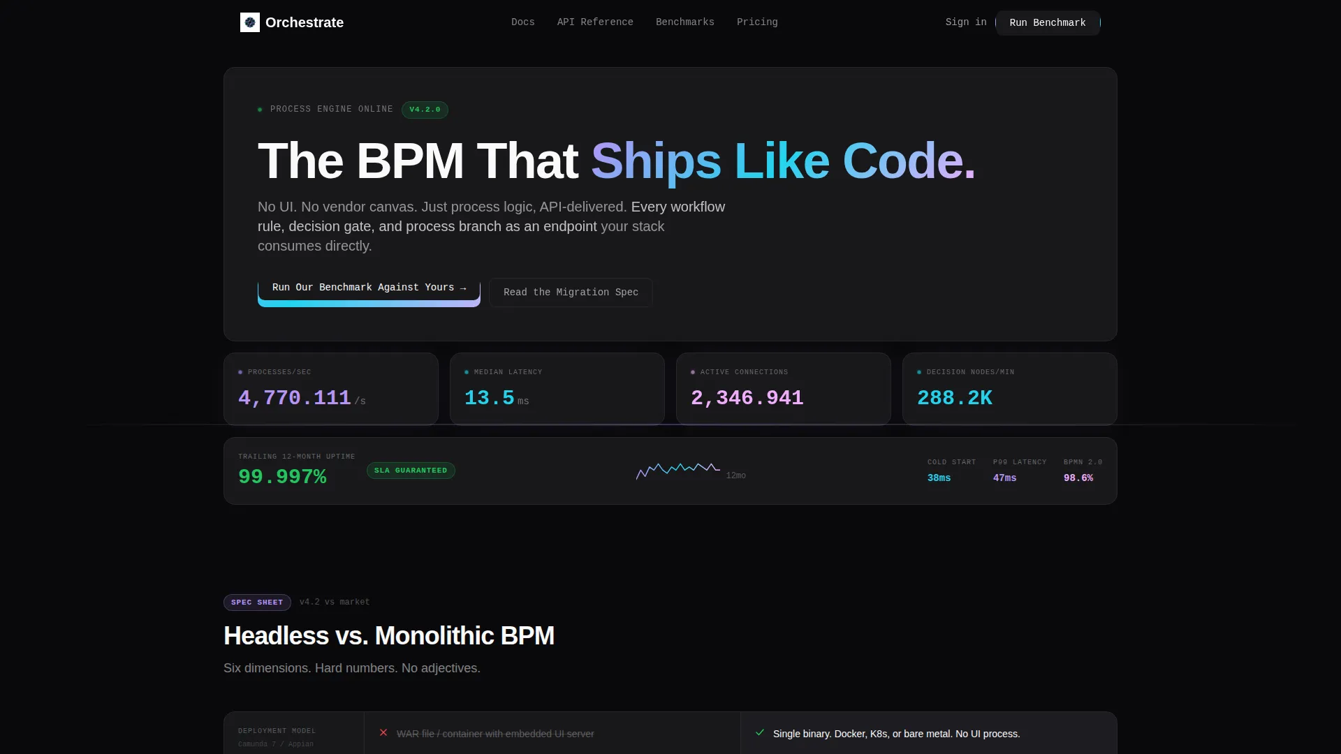
Orchestrate is a headless business process management (BPM) landing page template built on a bento grid layout. It targets platform engineers and integration architects who need API-first process orchestration without vendor user interface lock-in. The design uses a Data Command theme with an iridescent color palette, live metrics in the header, and a comparison-led conversion flow.
by Rocket studio
Quick summary
Orchestrate is a single-page bento grid landing page template for a headless BPM platform. It opens with a live stats wall, moves through a technical spec teardown, and closes with a benchmark-driven call to action. Every section is built to satisfy a deeply technical buyer who needs proof before they trust a vendor.
Who this template is for
This template is built for technical buyers at growth-stage and enterprise companies. It speaks their language directly and earns credibility through data, not marketing copy.
- Platform engineers at Series B+ software-as-a-service companies replacing embedded workflow tools
- Integration architects at enterprises frustrated by user interface rendering lock-in in existing BPM platforms
- DevOps leads who want process execution to live inside the same continuous integration and delivery pipeline as the rest of their stack
What problem this template solves
Most BPM marketing pages sell to business analysts, not engineers. They lead with drag-and-drop screenshots and feature bullet points that mean nothing to someone reading API documentation. Technical buyers leave quickly when the page does not speak their dialect.
- Traditional BPM landing pages hide latency numbers, scaling limits, and version control compatibility behind sales calls
- Engineers need to see proof of headless architecture before they commit to a migration conversation
- Comparison content is usually locked inside PDFs or buried after a demo request form
What you get with this template
You get a fully structured bento grid landing page designed around a spec-first narrative. The layout guides a skeptical technical buyer from raw performance metrics all the way to a benchmark conversion moment.
- A live stats wall header showing process throughput, median latency, active API connections, decision nodes per minute, and a trailing twelve-month uptime sparkline
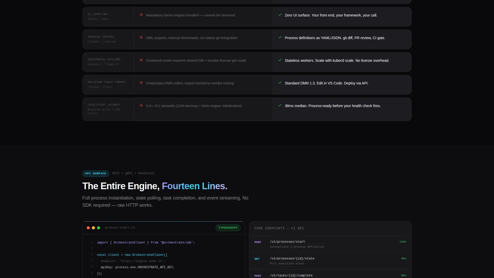
- A modular spec sheet section comparing headless orchestration against monolithic BPM across six dimensions, with hard numbers in every cell
- A persistent benchmark call-to-action cell fixed in the bottom-right quadrant after the first scroll, with a two-field form and automated report delivery
Feature list
This section describes the core template capabilities as designed in the source brief.
Live Metrics Header Wall
The header is a bento grid of real-time performance figures. Each cell displays a specific metric: processes executed per second, median latency held at 12ms, active API connections, decision nodes evaluated per minute, and a 99.997% uptime figure with a sparkline. There is no hero image. The numbers do the talking.
Spec Comparison Bento Modules
The first content row is a structured comparison module. It pits headless orchestration against monolithic BPM suites across six dimensions: deployment model, user interface coupling, version control compatibility, horizontal scaling, decision table format, and cold-start latency. Competitor constraints appear in muted gray on the left. Orchestrate specs appear in phosphor lilac on the right, always with hard numbers.
API Surface Breakdown Section
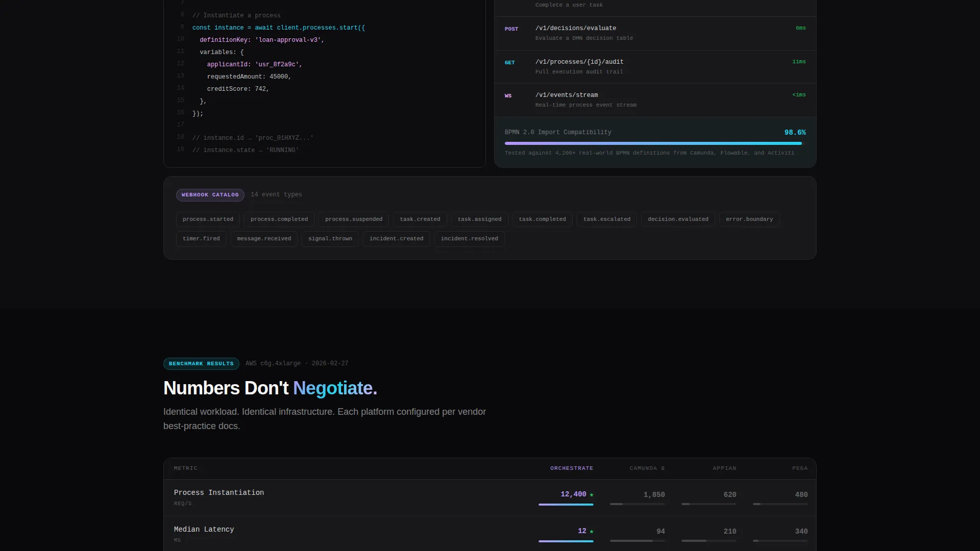
A dedicated bento cluster covers the full API surface. It includes REST and gRPC endpoint details, a webhook event catalog, a Business Process Model and Notation 2.0 (BPMN 2.0) import compatibility score of 98.6%, and a live code snippet cell showing a process instantiation call in fourteen lines of TypeScript.
Persistent Benchmark call to action Cell
The primary call to action is a bento cell fixed in the bottom-right quadrant after the first scroll. It invites visitors to run a benchmark comparison. Clicking opens a two-field form: a dropdown for the visitor's current BPM platform and a work email field. Submission triggers an automated benchmark report delivered to the inbox within sixty seconds.
Migration Spec Gate
A secondary conversion path appears as a "Read the Migration Spec" link. It gates a detailed technical migration guide behind the same email field used for the benchmark report. This path captures buyers who are further along in their evaluation and want migration-effort detail before committing.
Iridescent Bento Grid Layout
The bento grid uses void black backgrounds with signal white text. Iridescent gradient strokes trace cell borders on hover, shifting from phosphor lilac through refracted cyan to a soft magenta. Data visualizations use the full iridescent spectrum against black, making every chart and benchmark table read like a live diagnostic output.
Page sections overview
| Section | Purpose |
|---|---|
| Live Stats Header | Opens with real-time performance metrics in a bento grid formation |
| Headline Cell | Delivers the core positioning statement left-aligned in the largest cell |
| Spec Comparison Row | Benchmarks headless orchestration against monolithic BPM across six dimensions |
| API Surface Cluster | Details REST, gRPC, webhooks, BPMN 2.0 score, and a TypeScript code snippet |
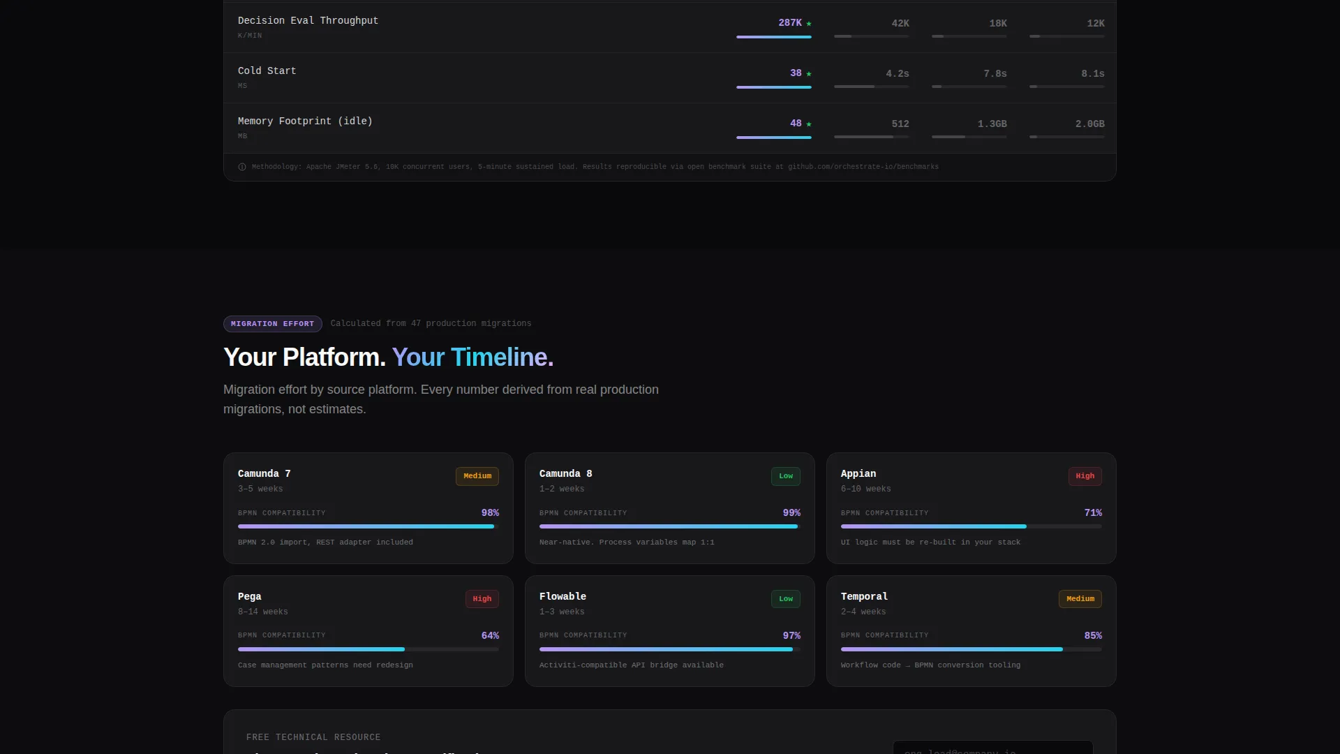
| Architecture and Benchmarks | Shows architecture diagrams, benchmark tables, and migration effort calculators |
| Persistent Benchmark call to action | Fixed bottom-right cell with two-field form and sixty-second report delivery |
| Migration Spec Link | Secondary email-gated path to a detailed technical migration guide |
Design & branding system
The visual identity follows a Data Command theme using an AI Iridescent color system. The palette feels like light diffracting through a prism inside a server room: cold obsidian surfaces interrupted by spectral flashes that shift as the viewer moves.
- Core palette: void black (#09090B) for backgrounds, signal white (#FAFAFA) for primary text, phosphor lilac (#B794F6) for Orchestrate specs and interactive highlights, refracted cyan (#22D3EE) for data accents
- Hover interaction: iridescent gradient strokes (#B794F6 to #22D3EE to #F0ABFC) trace bento cell borders when a visitor hovers, giving every cell a living, reactive edge
- Data visualizations use the full iridescent spectrum against black so charts and benchmark tables feel like active diagnostic readouts rather than static graphics
Mobile & speed optimization
The bento grid layout is designed to reflow cleanly across screen sizes. Technical buyers frequently review tools on both desktop and mobile during evaluation cycles.
- Bento cells stack responsively so metric walls and comparison modules remain legible on smaller screens
- Code snippet cells and benchmark tables are styled to scroll horizontally rather than truncate, preserving readability on narrow viewports
- The persistent call to action cell repositions to a fixed bottom bar on mobile so the benchmark form remains accessible throughout the scroll
How this template helps you convert
The conversion architecture is built around a "prove it first" principle. By the time a visitor reaches the call-to-action cell, they have already consumed the evidence that earns the click.
- The live stats header and spec comparison modules establish technical credibility before any marketing claim appears, so skeptical engineers stay on the page long enough to reach the conversion moment.
- The persistent benchmark call to action cell stays visible throughout the scroll, reducing the friction between "I'm convinced" and "I want the full comparison delivered to my team."
Other information about this template
This template is designed specifically for the headless enterprise software category inside the broader technology sector. It is a strong fit for any API-first process orchestration product competing against established BPM platforms.
- The template style is a bento grid, which suits data-dense technical content because it allows different information types to coexist without visual hierarchy conflicts
- The comparison-versus landing page direction means the layout is optimized for buyers who are already evaluating alternatives and need a structured side-by-side to make their case internally
- The header concept is stats and metrics, a deliberate choice that bypasses illustration and leads with operational proof
- Teams replacing tools like Camunda embedded forms, Appian, Pega, Flowable, or Temporal will find the comparison module structure directly relevant to their evaluation workflow
- The migration spec gate creates a second conversion moment for buyers who need detailed technical documentation before they can move forward with a platform change
Theme
Data Command
Creative direction
Spec Sheet
Color system
AI Iridescent
Style
Bento Grid
Direction
Comparison/Versus
Page Sections
Live Performance Metrics Header
Six-dimension Spec Comparison
API Surface Breakdown Cell
Persistent Benchmark Call to Action
Email-gated Migration Guide
Iridescent Bento Grid Interactions
Related questions
What type of product is this template designed for?
Can I update the comparison module to reflect different competitor platforms?
What happens when a visitor submits the benchmark form?
Does the template work for a product that is still in early access?
How does the secondary conversion path work?



