AI-Powered Enterprise Software Advanced Cost Calculator Website Template
Orchestrate is a dark-themed, dashboard-style landing page template built for AI-powered business process management platforms. It features a tab-switching header, an interactive Process Efficiency Estimator, live-metric KPI cards, and a lead-capture form flow. The design runs on an Electric Indigo color system that makes data feel alive and urgent.
by Rocket studio
Quick summary
Orchestrate is a single-page landing page template designed for enterprise process intelligence platforms. It opens with a three-tab feature switcher over a live dashboard mockup, then guides visitors through an interactive estimator, benchmark data grids, and animated KPI cards before presenting a high-trust lead capture form.
Who this template is for
This template speaks directly to enterprise software companies selling AI-powered business process management tools. It is built for teams who need to convert skeptical, senior buyers rather than casual browsers.
- Operations directors and transformation leads who evaluate tools based on measurable process outcomes
- Chief Information Officers who need to justify digital investment with clear return-on-investment evidence
- Enterprise software marketing teams launching or repositioning a process intelligence product
What problem this template solves
Senior enterprise buyers do not convert on generic hero sections and stock screenshots. They need to feel the platform before they commit to a conversation. This template solves the trust gap by leading with genuine interactive value instead of a sales pitch.
- Visitors leave without engaging because the page offers no tangible proof of capability
- Static testimonials and flat metrics fail to communicate the real-time intelligence of a process platform
- Long lead forms appear before visitors have any reason to trust the product
What you get with this template
You get a fully structured, dark-mode landing page that combines interactive tooling, animated data visualizations, and a layered lead generation flow. Every section is purpose-built to move a skeptical enterprise buyer forward.
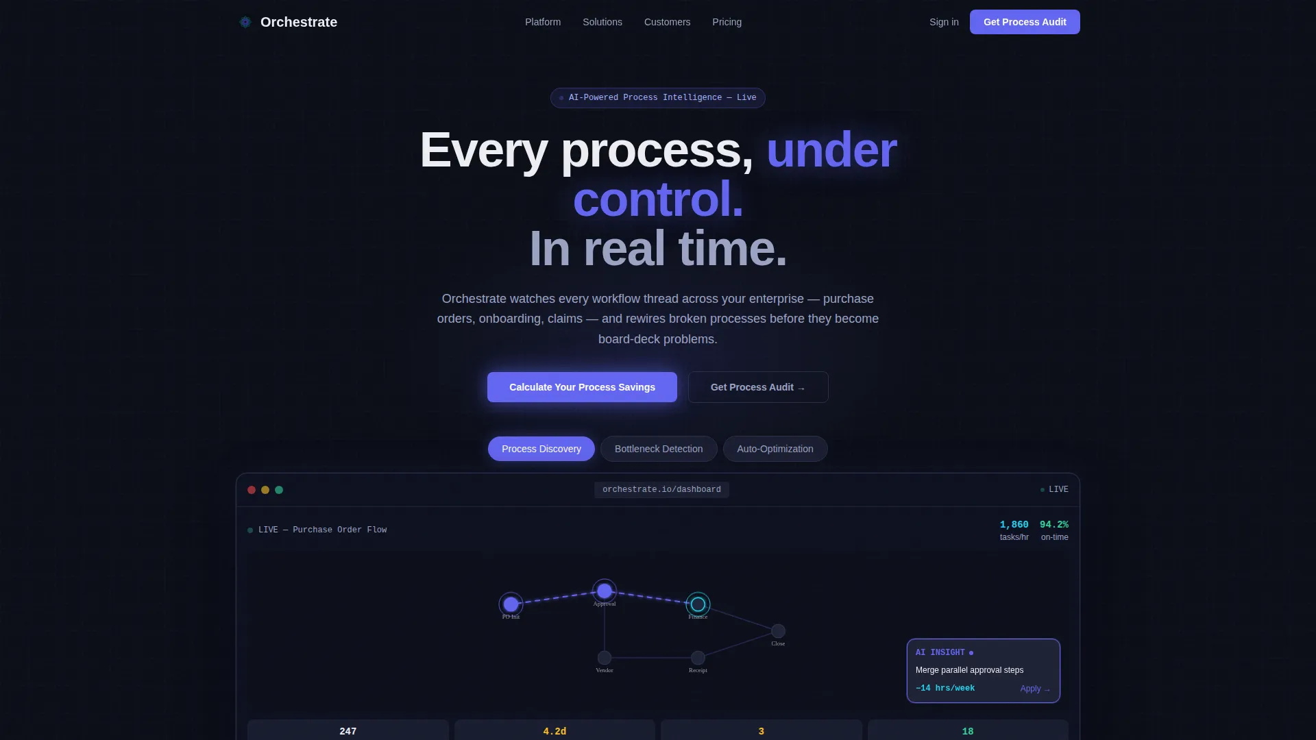
- A Feature Tab Switcher header with three swappable dashboard views and animated process map nodes
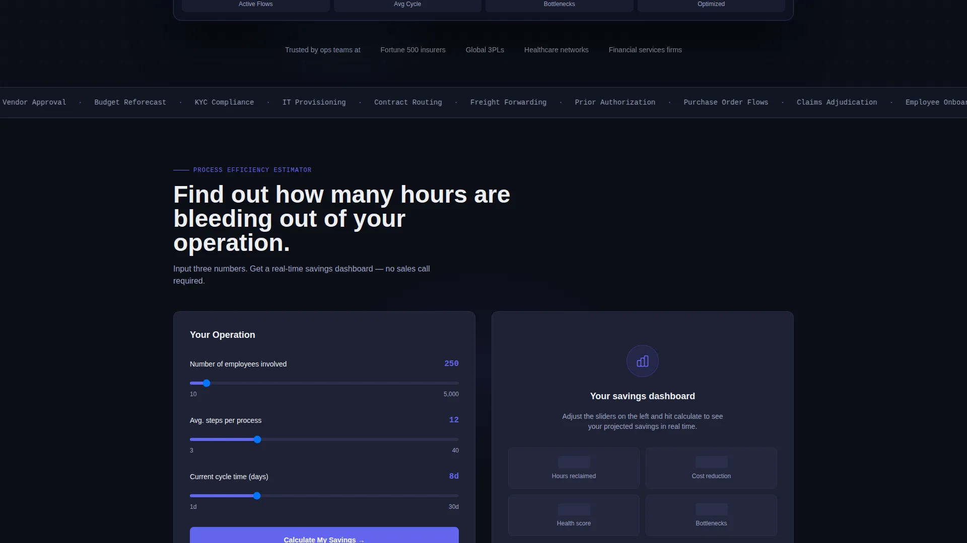
- An interactive Process Efficiency Estimator that renders a personalized savings dashboard before any form appears
- A dual lead capture path with a primary audit request form and a secondary gated PDF download option
Feature list
This template is built around six core interactive and visual components. Each one serves a specific role in the buyer journey.
Three-Tab Feature Switcher Header
Three clickable tabs sit above a live dashboard mockup. Each tab, labeled "Process Discovery," "Bottleneck Detection," and "Auto-Optimization," swaps the entire dashboard visual below with smooth, data-rich transitions. The default view shows a process map with indigo-pulsing animated nodes and a sliding AI recommendation card.
Interactive Process Efficiency Estimator
Before any form appears, visitors input their number of employees, average process steps, and current cycle time. The tool instantly renders a projected savings dashboard showing hours reclaimed, cost reduction, and a process health score animated in real time. This is the primary conversion driver on the page.
Animated Process Flow Breakdown
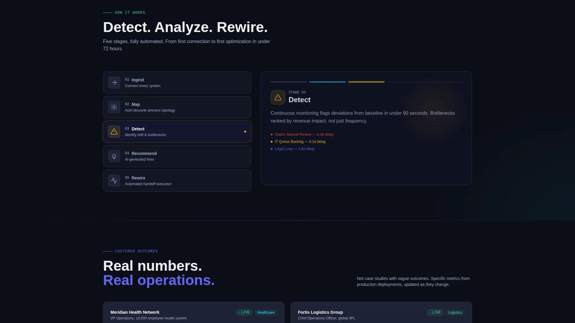
Below the estimator, an animated process-flow section visualizes how workflows move, stall, and resolve. It provides architectural proof that the platform understands enterprise process complexity without requiring a product demo to communicate it.
Industry Benchmark Data Grid
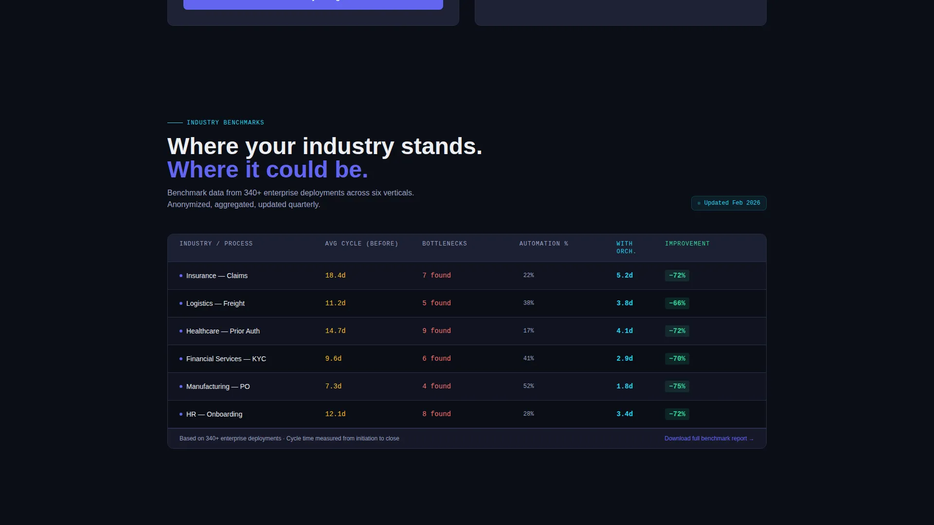
A dense data-grid section presents benchmark comparisons across industries. It gives buyers a reference point for their own process performance and positions the platform as a source of authoritative operational intelligence.
Live-Updating KPI Cards
Customer metrics appear as live-updating KPI cards rather than static testimonials. Counters tick, numbers climb, and cyan accent pulses mark active data moments, creating the feeling that the platform is running in the background right now.
Dual Lead Capture Flow
The primary call to action, "Get Your Process Audit," pins to the bottom of the estimator results with a subtle glow. It uses a three-field form: work email, company size dropdown, and a free-text field. A secondary path offers a gated PDF download for visitors who are not yet ready to speak with sales.
Page sections overview
| Section | Purpose |
|---|---|
| Tab Switcher Header | Showcase three core platform capabilities with swappable dashboard views |
| Process Map View | Animate live node activity and surface an AI recommendation card |
| Efficiency Estimator Tool | Let visitors calculate projected savings before any lead form appears |
| Estimator Results Dashboard | Display personalized hours saved, cost reduction, and process health score |
| Primary Lead Form | Capture work email, company size, and open-ended process pain point |
| Benchmark Data Grid | Compare process performance across industries with dense, scannable data |
| Animated Flow Breakdown | Visualize workflow architecture and platform decision logic |
| Live KPI Cards | Present customer outcomes as real-time updating metrics |
| Secondary PDF Download | Offer a gated ROI framework for visitors not ready to request an audit |
Design & branding system
The visual identity follows a Data Command theme. The palette is built to feel like mission-control monitors in a dim room: dark backgrounds, charged accent colors, and clean white type that floats above it all.
- Core colors: void-black (#0B0E17) canvas, cool slate (#1E2235) card surfaces, electric indigo (#6366F1) active elements, signal-white (#EDEEF2) typography, and cyan (#22D3EE) for live-data accent pulses
- Typography sits in signal-white against deep dark surfaces, keeping every metric and label readable at a glance
- Interactive states use electric indigo radiating from buttons and active nodes, with cyan pulses marking real-time data moments like counters ticking and processes completing
Mobile & speed optimization
The template is structured for responsive display so the command-center aesthetic translates cleanly from widescreen monitors to smaller viewports. Dense data grids and the tab switcher are designed to remain readable and functional across screen sizes.
- The estimator tool and results dashboard are laid out to reflow gracefully on tablet and mobile widths
- KPI cards and the data grid use a flexible grid structure that stacks rather than overflows on smaller screens
- Animated elements are scoped to key moments to keep the page feeling fast rather than heavy
How this template helps you convert
The conversion architecture is built on earned trust. The page gives value first, then asks for contact details only after a visitor has already seen their own numbers.
- The estimator delivers a personalized projected savings report before any form is shown, reducing resistance at the point of ask
- The primary "Get Your Process Audit" call to action appears pinned at the bottom of the estimator results, where intent is highest and the value exchange feels natural
- The secondary PDF download path captures emails from visitors in the research phase, keeping them in the funnel without forcing a sales conversation they are not ready for
Other information about this template
This template is categorized under Technology, specifically within the AI-powered enterprise software space. It is purpose-built for the AI-powered business process management niche and is optimized for lead generation conversion flows targeting senior operational and technology decision-makers.
- Template style: Dashboard and Data Grid, matched to the Data Command visual theme
- Creative direction: Calculator and Tool First, meaning the interactive estimator is the primary engagement layer before any call to action
- Header concept: Feature Tab Switcher, giving visitors immediate hands-on access to three distinct platform capabilities
- The page is suited for platforms handling enterprise workflows such as purchase orders, employee onboarding, and claims adjudication
- The intersection match score for this template against its niche, subcategory, and style combination is 13 out of a possible range, indicating a strong purpose-fit alignment
Theme
Data Command
Creative direction
Calculator/Tool First
Color system
Electric Indigo
Style
Dashboard/Data Grid
Direction
Lead Generation
Page Sections
Feature Tab Switcher Header
Interactive Process Efficiency Estimator
Live-updating KPI Cards
Industry Benchmark Data Grid
Dual Lead Capture Flow
Animated Process Flow Breakdown
Related questions
Who is this landing page template designed for?
How does the Process Efficiency Estimator work in the template?
What are the two lead capture paths included in this template?
Can I customize the tab labels and dashboard views in the header?
Does this template suit a dark-mode brand identity?



