API-First Enterprise Software Expert Professional Website Template
Orchestrate is an API-first robotic process automation (RPA) landing page template built for enterprise integration platforms. It features a live stats header, a browsable connector card grid, and a full-width comparison table. The glassmorphic design system and Launch Energy creative direction make complex infrastructure feel explorable, confident, and conversion-ready from the first scroll.
by Rocket studio
Quick summary
Orchestrate is a single-page landing page template for API-first enterprise automation platforms. It opens with animated metric counters, moves into a modular card grid of integration connectors, and closes the argument with a head-to-head comparison table. The design feels like a live operations dashboard, dark, precise, and built for technical buyers.
Who this template is for
This template is designed for teams building or selling API-driven automation infrastructure at the enterprise level. It speaks directly to the people who live inside these systems every day.
- Integration architects who manage fragile automation chains and need to show stakeholders a cleaner path forward
- DevOps leads who are tired of babysitting custom glue scripts and want a credible platform alternative
- CTOs who have discovered unmonitored bot sprawl across their operations stack and need to act fast
What problem this template solves
Most automation platforms look like product brochures. They describe features but fail to demonstrate capability. Technical buyers do not trust polished marketing copy, they trust data, specificity, and proof of scale.
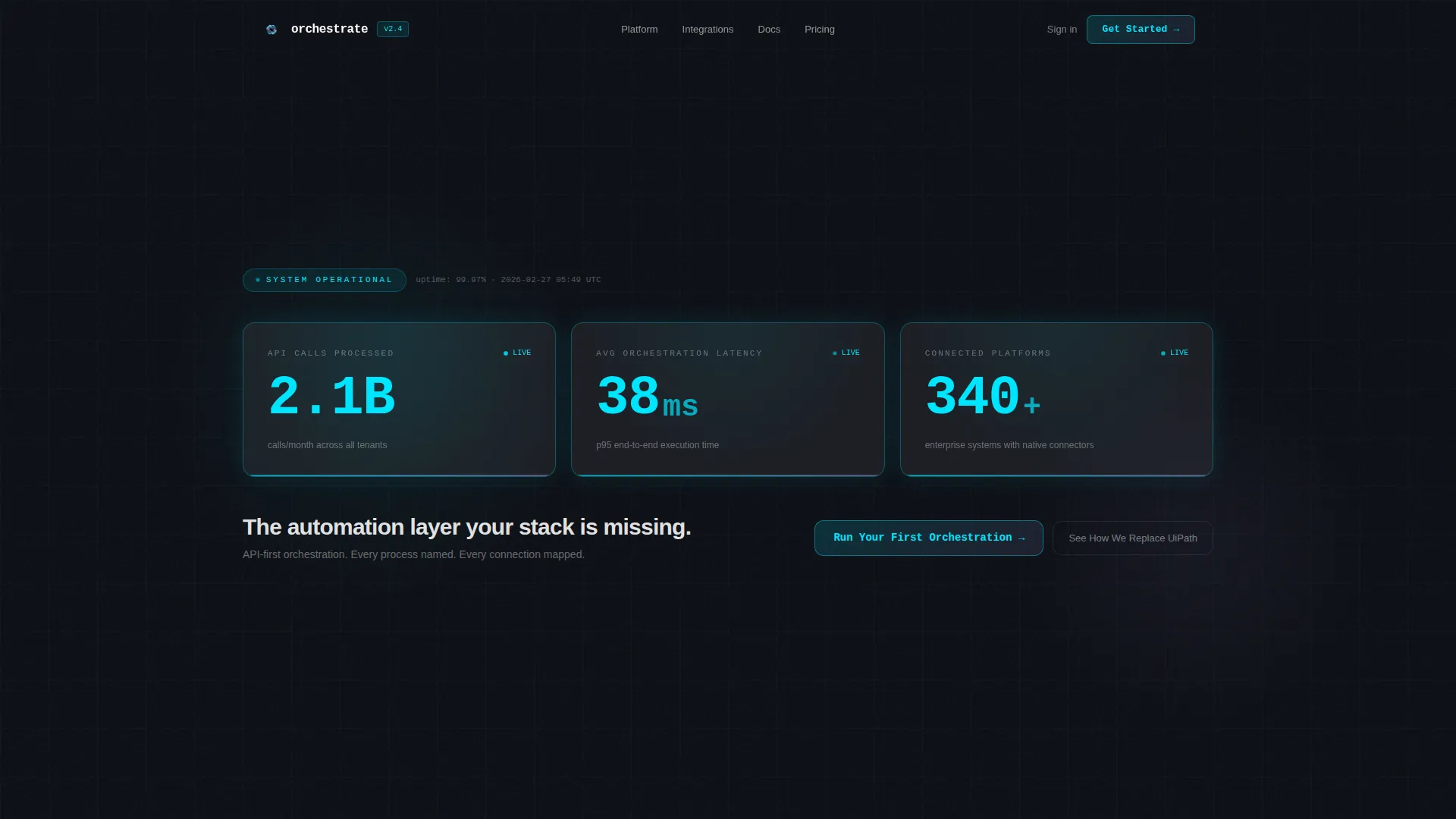
- The template replaces vague hero sections with live-feeling metric counters that establish credibility in seconds
- The connector card grid turns abstract API coverage into a browsable, tangible catalog that technical buyers can evaluate
- The comparison table handles objections before the prospect raises them, reducing the persuasion work your sales team has to do
What you get with this template
You get a complete, structured landing page layout that covers every stage of the technical buyer journey, from first impression through direct conversion. Every section is purposeful and prompt-backed.
- An animated stats header with three large counters (API calls processed, orchestration latency, and connected platforms)
- A modular card grid displaying connector pairs with execution counts and uptime badges, styled as a browsable directory
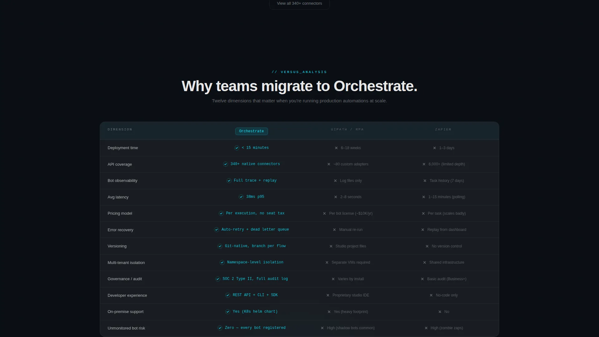
- A full-width versus table comparing your platform against legacy automation tools across twelve dimensions, with a sticky floating call-to-action pill and a single-field email capture form
Feature list
This template ships with a focused set of layout and interaction components built specifically for API-first platforms and technical conversion pages.
Animated Stats Header
Three monospaced display-scale counters tick upward on page load, settling on platform metrics like API calls processed, average latency in milliseconds, and total connected platforms. Each counter sits on its own frosted glass slab with a faint cyan pulse on completion, making the numbers feel live rather than static.
Connector Card Grid
The main content section renders as a browsable directory of integration cards. Each frosted module shows a connector pair such as Salesforce to NetSuite or Jira to ServiceNow, alongside an execution count and an uptime badge. Cards animate in with staggered spring physics and a subtle glass-clink micro-interaction on landing.
Full-Width Comparison Table
A twelve-dimension versus table splits the viewport between Orchestrate and legacy robotic process automation tools. Each row reveals your platform's advantage with a cyan checkmark against a muted competitor column, building cumulative persuasion as the reader scrolls down.
Sticky Floating Call-to-Action
The primary call-to-action button is pinned as a floating frosted pill that follows the user on scroll. It stays visible throughout the entire page, reducing the distance between decision and action at any scroll depth.
Single-Field Email Capture
A low-friction conversion form at the base of the comparison section asks only for a work email. The copy promise, a migration audit within 24 hours, qualifies intent through specificity rather than form length, keeping drop-off minimal.
Glassmorphic Design System
The entire template uses a layered glass aesthetic: deep void black as the base, frosted translucent panels with backdrop blur, electric cyan for live-state indicators, and soft lavender for hover states and category tags. Depth comes from transparency rather than heavy shadow.
Page sections overview
| Section | Purpose |
|---|---|
| Stats metrics header | Establishes platform credibility with animated live counters |
| Connector card grid | Displays integration pairs as a browsable directory catalog |
| Primary call to action block | Drives action above the comparison table with direct copy |
| Versus comparison table | Compares platform against legacy tools across twelve dimensions |
| Floating call to action pill | Keeps the primary action reachable at every scroll position |
| Email capture form | Converts comparison readers with a low-friction single field |
Design & branding system
The visual identity follows a Directory and Discovery theme expressed through a glassmorphic color system. Every layer of the design is intentional, from the base color to the micro-interaction palette.
- Base layer is deep void black (#0B0E14), with frosted translucent panels at rgba(255,255,255,0.06) and 12px backdrop blur creating depth through transparency
- Electric cyan (#00E5FF) drives all live-state indicators, primary accents, checkmarks, and counter pulse effects; soft lavender (#B4A0FF) handles hover states and category tag labels
- Monospaced typography at display scale anchors the stats header, reinforcing the terminal-and-infrastructure aesthetic throughout the page
Mobile & speed optimization
The card grid layout is modular by design, which means it adapts naturally to narrower viewports without requiring a complete layout rebuild. The template is structured for responsive reflow across screen sizes.
- Frosted glass panels and the card grid collapse to single-column stacks on smaller screens, keeping the directory feel intact without horizontal overflow
- The floating call-to-action pill and the sticky form remain accessible on mobile, so conversion paths stay open regardless of device
How this template helps you convert
The Comparison and Versus direction of this template is built around cumulative persuasion. Each section adds evidence before asking for action.
- The animated stats header creates immediate credibility with specific, data-grounded numbers before the reader has scrolled at all, earning enough trust to keep them moving down the page
- The connector card grid lets technical buyers self-qualify by browsing real integration pairs, turning passive reading into active discovery that builds purchase intent
- The versus table closes the argument systematically, and the combination of a sticky floating call-to-action and a low-friction email capture form turns that built-up evidence directly into a conversion moment
Other information about this template
This template is designed for a very specific intersection of technology category, enterprise software niche, and API-first robotic process automation use case. A few additional details worth knowing before you build with it.
- The template style is Card Grid (Modular), meaning individual connector cards can be added, removed, or reordered without restructuring the surrounding layout
- The header concept is a Stats and Metrics wall, it requires real platform data to feel credible, so placeholder numbers should be replaced with accurate figures before launch
- This template fits naturally into the API-first enterprise software subcategory and is well-suited for platforms that position against legacy robotic process automation tools like UiPath or Zapier
- The Launch Energy creative direction is intentional: scroll pacing, animation sequencing, and section transitions are designed to build momentum rather than present information neutrally


Theme
Directory & Discovery
Creative direction
Launch Energy
Color system
Glassmorphic
Style
Card Grid (Modular)
Direction
Comparison/Versus
Page Sections
Animated Stats Metrics Header
Modular Connector Card Grid
Twelve-dimension Comparison Table
Sticky Floating Call to Action Pill
Single-field Email Capture Form
Related questions
Who is this landing page template designed for?
Can I customize the connector cards in the grid?
Do I need real platform metrics for the stats header?
How does the comparison table work in this template?
Is the floating call-to-action button easy to adjust?



