API-First BPM Landing Page Template
Orchestrate is a Tech Glass landing page template built for API-first business process management (BPM) platforms. It combines a modular card grid layout with an interactive process diagram header, benchmark evidence cards, and a comparison-driven conversion flow. The design uses a Midnight Blue palette with electric cyan highlights to give technical buyers the confidence to act.
by Rocket studio
Quick summary
Orchestrate is a single-page, card-grid landing page template designed for API-first BPM platforms. It leads with an interactive process diagram, delivers evidence through modular benchmark and comparison cards, and converts through a "Run the Benchmark" sandbox call to action. Every section is built for a technical buyer who needs data before a decision.
Who this template is for
This template is built for teams selling infrastructure-grade workflow automation to a deeply technical audience. If your buyers read architecture diagrams before marketing copy, this layout speaks their language.
- Platform engineers and integration architects evaluating BPM tooling
- CTOs under pressure to reduce manual process handoffs before a hard deadline
- Product and growth teams at API-first enterprise software companies
What problem this template solves
Most BPM landing pages lead with marketing language when the real buyer wants proof. Engineers and architects need benchmark data, topology comparisons, and latency numbers before they will trust a platform. This template solves that gap directly.
- Generic feature lists fail to answer "how does this compare to what we already run?"
- Buried calls to action make it hard for technical decision-makers to take a low-friction first step
- Single-column layouts force linear reading when executives and engineers scan pages differently
What you get with this template
You get a fully structured, modular landing page that organizes evidence into self-contained cards. Each section lands one precise argument, from raw benchmark data to customer migration stories.
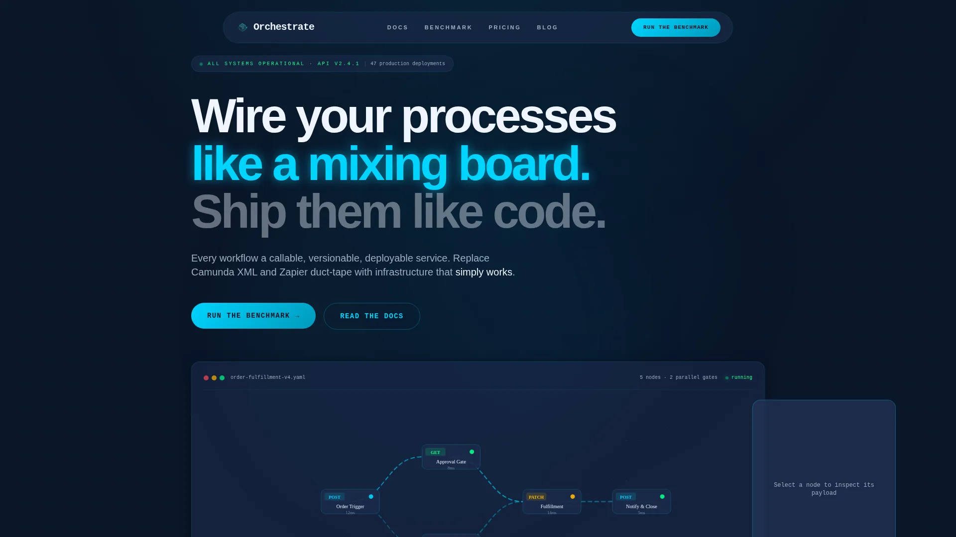
- An interactive header with a live, clickable process diagram showing real API endpoint nodes
- A card grid with benchmark, architecture comparison, quadrant positioning, latency chart, and case study modules
- A sticky bottom bar with a secondary call to action gated behind a single work-email field
Feature list
This template delivers purpose-built components for a technical, comparison-driven sales page. Every feature comes directly from the design brief.
Interactive Process Diagram Header
The header renders a live, explorable workflow diagram in the viewport. Nodes represent real API calls such as POST /orders, GET /approvals, and PATCH /fulfillment. Clicking any node slides out a syntax-highlighted request and response payload panel. A monospace tagline anchors the composition: "Your workflows are endpoints. Ship them like code."
Modular Evidence Card Grid
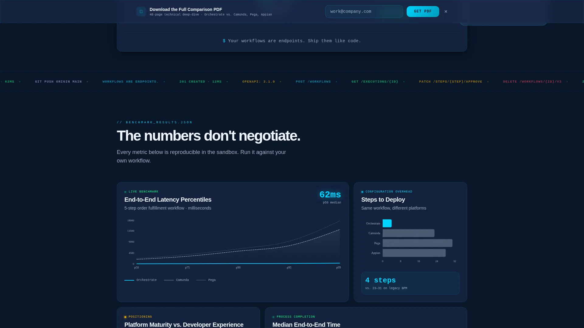
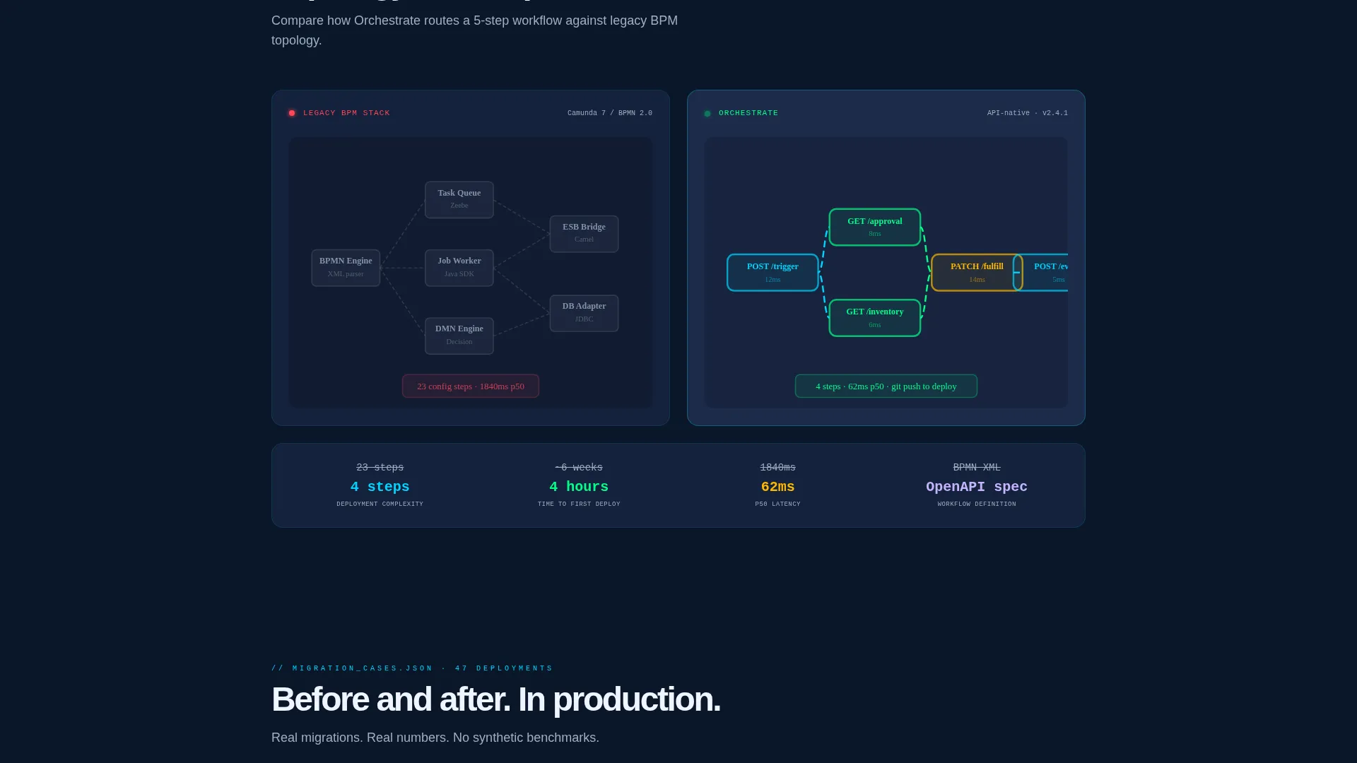
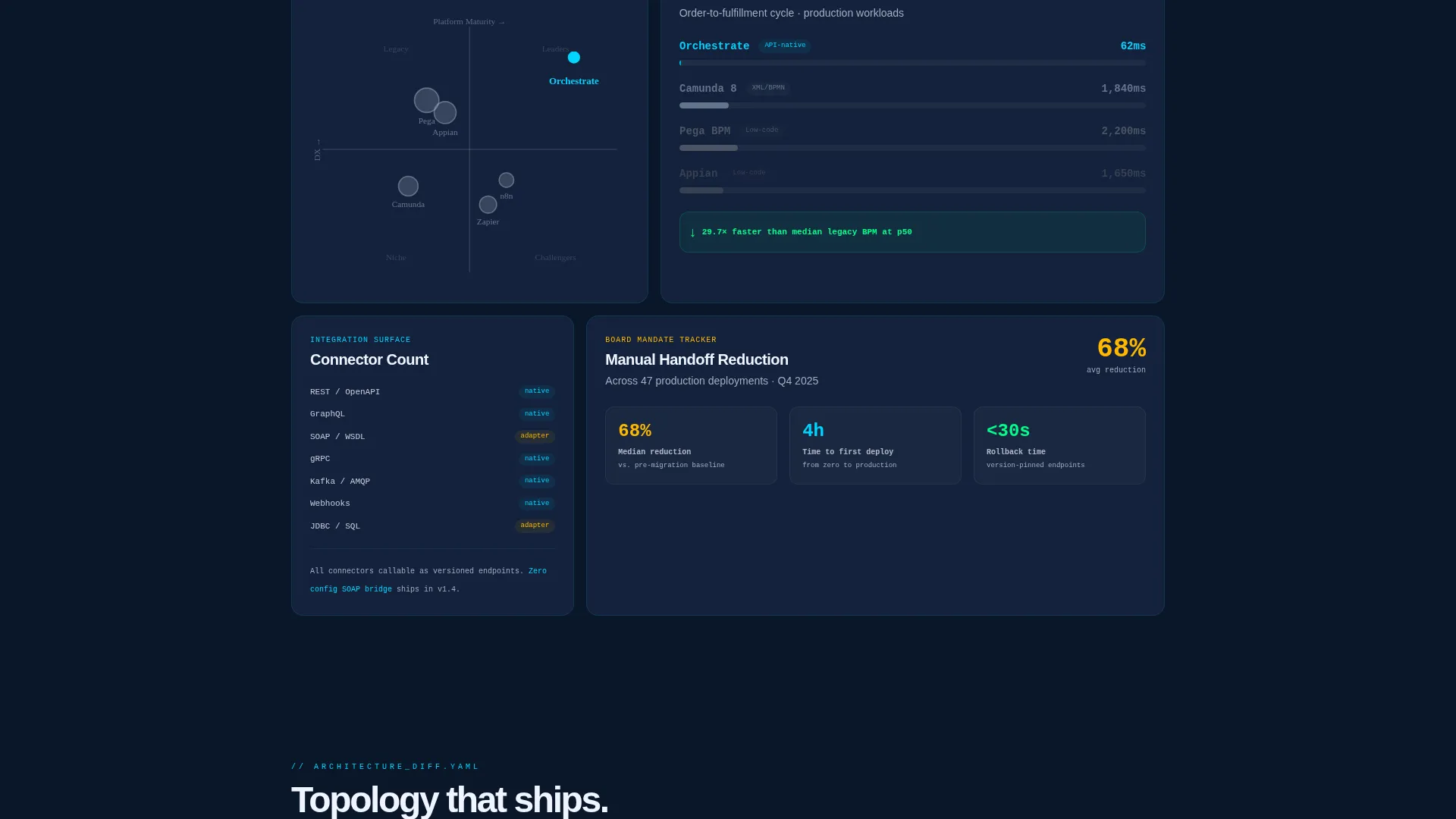
The page body is a responsive card grid where each card is a discrete evidence module. Cards include a benchmark card with median process completion times, an architecture comparison card with side-by-side topology diagrams, a quadrant positioning card, a latency percentile chart card, and customer migration case study cards with before and after metrics. The grid reflows so engineers can read linearly while executives can scan visually.
Benchmark-First Conversion Flow
The primary call to action is "Run the Benchmark," linking to a free sandbox where prospects model one real workflow. The sandbox scores latency, step count, and integration complexity. This approach shows the numbers before asking for any commitment.
Sticky Secondary Call to Action Bar
After the third card row, a sticky bottom bar appears with a "Download the Full Comparison PDF" prompt. It is gated behind a single work-email field, keeping friction low while capturing qualified leads.
Tech Glass Visual System
Cards use glass-morphism styling with frosted panel surfaces, subtle blur layers, and cyan edge highlights. The layout feels like infrastructure that is already running, reinforcing the platform's positioning before a single word is read.
Page sections overview
| Section | Purpose |
|---|---|
| Interactive Diagram Header | Introduces the platform through a live, clickable API workflow diagram |
| Monospace Tagline Block | Anchors the value proposition in a single developer-readable line |
| Benchmark Comparison Card | Shows median process completion times versus legacy BPM tools |
| Architecture Topology Card | Presents side-by-side infrastructure diagrams for visual comparison |
| Quadrant Positioning Card | Places the platform within a Gartner-style competitive landscape view |
| Latency Percentile Chart | Displays response-time data across key workflow percentiles |
| Case Study Cards | Delivers before and after migration metrics from real customer scenarios |
| Sticky call to action Bar | Surfaces the PDF download prompt after sufficient page scroll depth |
Design & branding system
The template uses a Midnight Blue color system that reads like a server room at 2 AM. Every color is functional, not decorative, and the palette reinforces technical credibility at a glance.
- Void-dark navy (#0A1628) as the primary canvas, frosted glass panel blue (#1B2A4A) for card surfaces, electric cyan (#00D4FF) on interactive highlights and live data indicators, and muted silver (#A0AEC0) for secondary text
- Cards float on glass-morphism blur layers with cyan edge refractions, giving the grid visual depth without distracting from the data
- Monospace typography anchors code-adjacent copy blocks, while the overall type system stays clean and scannable for mixed technical and executive audiences
Mobile & speed optimization
The card grid layout is built to reflow cleanly across screen sizes. Technical buyers often review vendor pages on multiple devices before making a decision, so the layout adapts without losing its evidence-first structure.
- The modular grid collapses to a single-column stack on smaller viewports, preserving card hierarchy and readability
- The sticky call to action bar repositions naturally on mobile so it remains visible without obstructing card content
How this template helps you convert
The conversion strategy earns the click by showing data first and asking for contact information second. This matches how technical buyers actually make decisions.
- The interactive header lets visitors engage with a working process diagram before they have read a single marketing claim, building immediate product credibility.
- The benchmark and comparison cards stack evidence progressively, so by the time a visitor reaches the primary "Run the Benchmark" call to action, they already have context to act.
- The sticky PDF download bar captures email addresses from buyers who are not ready to try the sandbox, giving the sales team a second conversion path without interrupting the reading flow.
Other information about this template
Orchestrate is designed specifically for the API-first BPM category, where buyers compare platforms rigorously before committing. The template's industry report creative direction is intentional: it mirrors the whitepapers and vendor evaluation reports that platform engineers and integration architects already trust.
- The template style is Card Grid (Modular), making it straightforward to add, remove, or reorder evidence cards as your messaging evolves
- The header concept is Interactive Preview, a component well-suited to platforms where showing a live workflow is more persuasive than describing one
- The landing page direction is Comparison/Versus, meaning every structural choice prioritizes helping buyers evaluate this platform against alternatives they are already considering
- The Tech Glass theme and Midnight Blue color system are consistent with tooling used by infrastructure and developer-tooling brands competing in the enterprise software space
Theme
Tech Glass
Creative direction
Industry Report
Color system
Midnight Blue
Style
Card Grid (Modular)
Direction
Comparison/Versus
Page Sections
Interactive API Workflow Diagram
Modular Evidence Card Grid
Benchmark-first Conversion Path
Sticky PDF Download Bar
Tech Glass Card Styling
Related questions
Who is the target audience for this landing page template?
Can I customize the benchmark and comparison cards with my own data?
How does the Run the Benchmark call to action work?
Does the sticky bar appear immediately on page load?
Is this template suitable for a mixed technical and executive audience?



