Software & SaaS Professional Website Template
Orchestrate is a split-screen event management landing page template built for high-stakes operators. It pairs a live attendee heatmap with a real-time budget dashboard inside frosted dark-glass panels, guiding visitors through a stats-first narrative that mirrors the full event lifecycle, from planning through post-event analysis, and drives them toward a demo with every scroll.
by Rocket studio
Quick summary
Orchestrate is a bold, data-forward landing page template for event management software. It uses a 50/50 split-screen layout, a dark Electric Indigo color system, and a stats-first storytelling approach to communicate command-level confidence. Every section leads with a hard metric before revealing the feature behind it, earning visitor trust before asking for a click.
Who this template is for
This template is designed for software products that serve professionals who run complex, high-pressure events. The visual language and content structure speak directly to operators who measure success in real-time numbers.
- Operations directors managing conferences of 10,000 seats or more
- Corporate event planners coordinating multi-city roadshows with dozens of vendors
- Festival producers who need instant alerts on stage capacity and catering wait times
What problem this template solves
Event logistics scatter across spreadsheets, group chats, and disconnected tools. Visitors arriving on a software landing page need to feel, immediately, that the product understands that chaos and replaces it with control.
- Fragmented data across vendor timelines, budgets, and venue capacities erodes confidence before an event starts
- Generic software landing pages fail to communicate real-time command capability to experienced operators
- Busy decision-makers skip pages that bury proof and lead with marketing language instead of results
What you get with this template
You get a fully structured single-page layout that guides a sophisticated visitor from first impression through to a product demo click. Every visual element and content block is designed around the event management workflow.
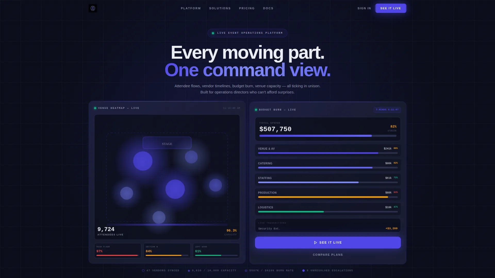
- A 50/50 split-screen header with two frosted dark-glass user interface panels showing a live attendee heatmap and an animated budget dashboard
- A stats-first scroll narrative that escalates from planning tools to live-event command to post-event analytics
- Strategically placed primary and secondary calls to action that resurface after every second stat reveal
Feature list
This template delivers a focused set of high-impact design and layout capabilities grounded directly in the source brief.
Split-Screen Dark Glass Header
Two frosted-glass user interface cards float side by side against a near-black background. The left panel shows a live-updating attendee heatmap with venue floor plan clusters pulsing in indigo gradients. The right panel displays a real-time budget dashboard with spend categories animating upward like a stock ticker. Light refracts subtly along each glass edge for depth.
Stats-First Scroll Transitions
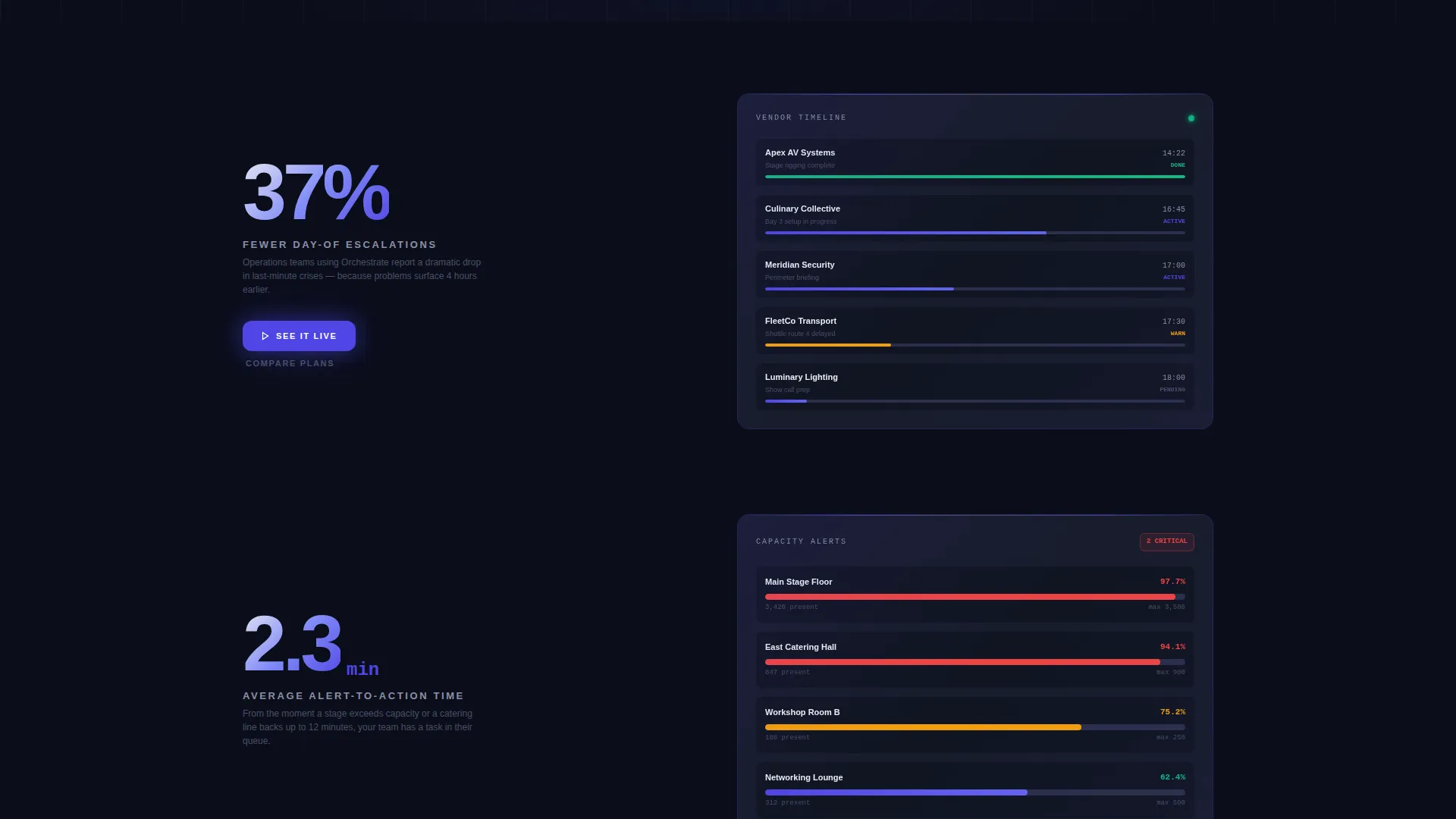
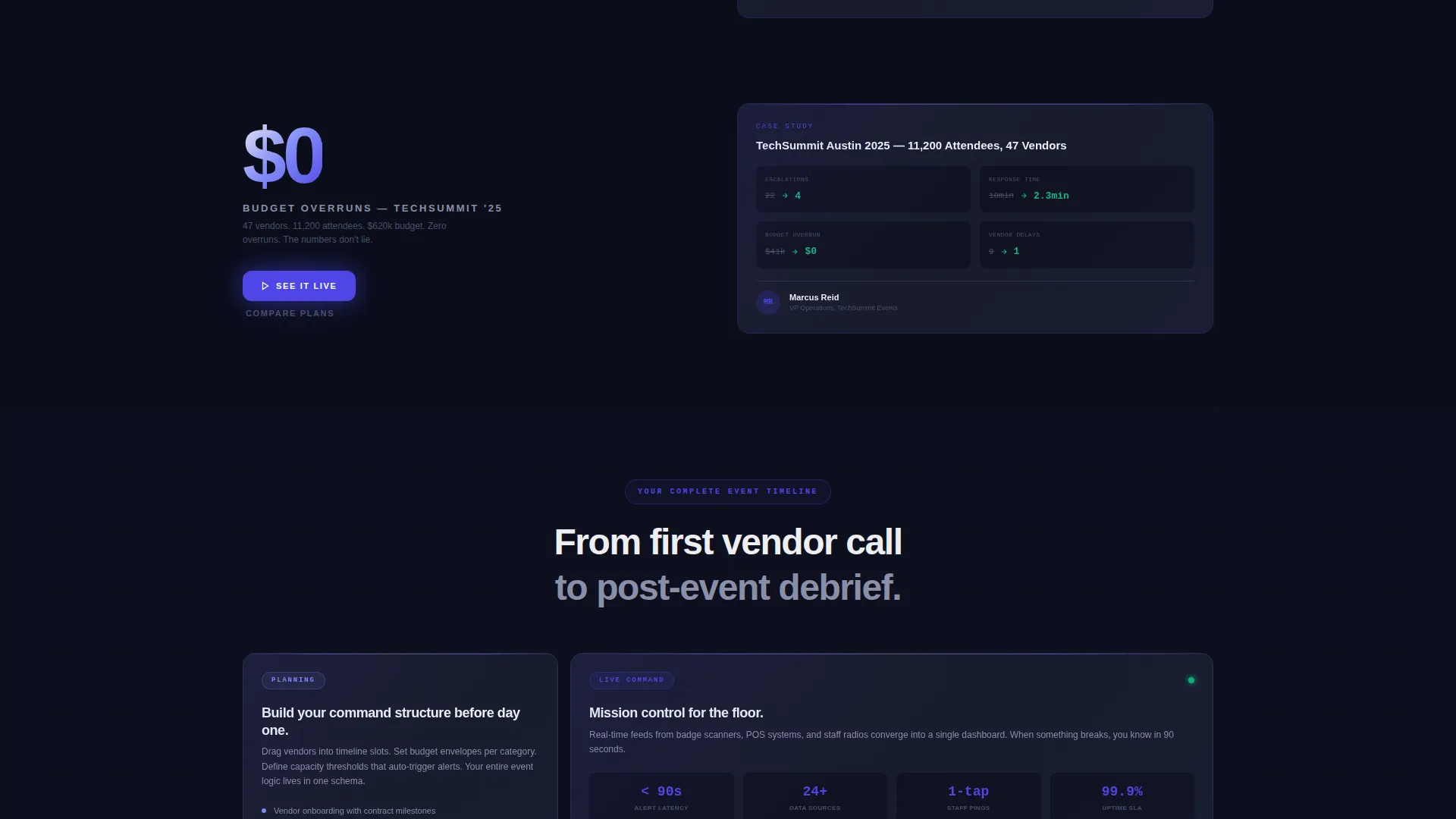
Every scroll transition leads with a single oversized statistic before the supporting explanation appears. For example, "37% fewer day-of escalations" arrives first, and then the split screen reveals the feature that produces that number alongside a mini case-study snapshot. This sequencing builds credibility with data before asking for attention.
Lifecycle-Mirroring Narrative Structure
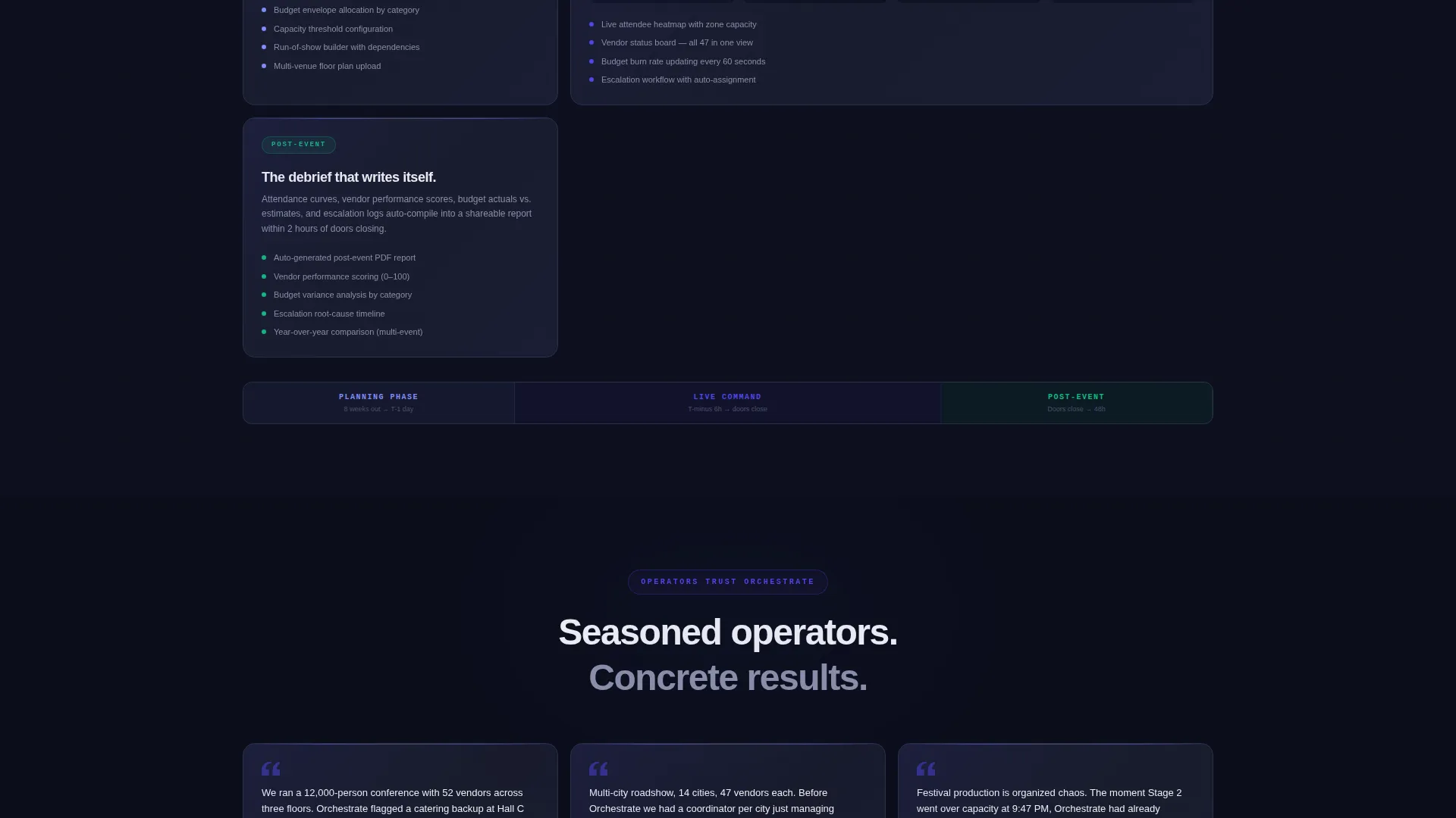
The page narrative moves in the same order as an actual event production: planning-phase tools, then live-event command, then post-event analytics. Visitors feel the product wrapping around their full workflow rather than encountering a generic feature list.
Glowing Indigo call to action System
The primary call to action, "See It Live," appears first inside the header's right panel as a glowing indigo button. It resurfaces after every second stat reveal. A secondary text link, "Compare Plans," sits beneath each primary call to action for visitors already past the consideration stage.
Data Command Visual Theme
The Electric Indigo color system uses deep void black (#0B0E1A) as the base, electric indigo (#4F46E5) across active data points and hover states, cool slate (#1E2235) for card surfaces, and phosphor white (#EDEEF2) for typography and metric readouts. The result feels like a darkened production booth lit by a dozen live monitors.
Page sections overview
| Section | Purpose |
|---|---|
| Dark Glass Header | Introduces the product through two live data user interface panels and the primary call to action |
| First Stat Reveal | Leads with an oversized metric to anchor visitor trust immediately |
| Planning Tools Split | Shows planning-phase features alongside a supporting case-study snapshot |
| Live Event Command | Demonstrates real-time operational capabilities during an active event |
| Second Stat Reveal | Resurfaces a key metric and the "See It Live" call to action to re-engage scrollers |
| Post-Event Analytics | Covers the reporting and analysis phase to complete the workflow narrative |
| Final call to action Block | Closes the page with the primary and secondary calls to action |
Design & branding system
The template uses a Data Command theme built entirely around synthetic, high-contrast visuals. No lifestyle photography or stock imagery is used anywhere on the page; the product data is the hero.
- Color palette: deep void black (#0B0E1A), electric indigo (#4F46E5), cool slate (#1E2235), and phosphor white (#EDEEF2)
- Typography renders in phosphor white to maximize legibility against dark panel backgrounds
- Indigo pulses on active data points and hover states to guide attention without distraction
Mobile & speed optimization
The template's layout and visual density are structured to translate cleanly from wide desktop displays to narrower mobile viewports. The split-screen panels are designed to stack gracefully on smaller screens without losing the data-forward character.
- The 50/50 split-screen columns reflow to a single-column vertical stack on mobile devices
- Frosted glass panel effects and indigo gradient clusters are styled to maintain visual integrity across screen sizes
How this template helps you convert
The page earns the click by proving competence with real metrics before making any request. The conversion path is deliberate and structured around how a seasoned operator evaluates software.
- The header's right panel places "See It Live" inside an active data environment, so the call to action feels like a natural next step rather than a sales push
- Oversized statistics repeated at scroll intervals keep reinforcing product credibility throughout the page, reducing friction at each subsequent call to action appearance
- The "Compare Plans" secondary link gives consideration-stage visitors a low-pressure path forward without disrupting the primary conversion flow
Other information about this template
Orchestrate is built for the event management software category and sits within the broader Software as a Service (SaaS) and Technology intersection. It is particularly well suited to products that serve large-scale event operations where real-time data visibility is a core value proposition.
- The template style is Split Screen (50/50), making it a strong fit for products that need to show two simultaneous data views
- The creative direction, Stats-First Impact, is designed to resonate with analytical buyers who respond to proof before pitch
- The header concept, Dark Glass Panels, positions the software as a professional-grade operations tool rather than a consumer product
- The page direction is Click-Through, optimized to move qualified visitors toward an interactive demo environment
Theme
Data Command
Creative direction
Stats-First Impact
Color system
Electric Indigo
Style
Split Screen (50/50)
Direction
Click-Through
Page Sections
Split-screen Dark Glass Header
Stats-first Scroll Narrative
Lifecycle-mirroring Page Structure
Glowing Indigo Call to Action System
Data Command Color System
Related questions
What kind of software product is this template designed for?
Can I update the statistics and metrics shown in the template?
Does this template use lifestyle photography or stock images?
How does the call-to-action system work in this template?
Is this template suitable for a single product or a multi-product platform?



