Serverless Enterprise Software Reviews Website Template
Orchestrate is a split-screen landing page template built for serverless business process management platforms. It pairs a live workflow canvas screenshot with bold, conversion-focused copy, a teal download button, benchmark charts, a live-counter section, and testimonials. The Dashboard Pro theme in Midnight Blue gives it the dense, purposeful feel of a mission control room going live.
by Rocket studio
Quick summary
Orchestrate is a single-page, split-screen landing page template designed for serverless workflow automation platforms. It uses a Dashboard Pro visual theme in Midnight Blue to deliver a product launch feel. Every section builds momentum toward one goal: getting operations teams, DevOps leads, and compliance officers to download the desktop app right now.
Who this template is for
This template is built for teams and founders who need to communicate technical depth without losing non-technical stakeholders. It speaks directly to the people who live inside broken workflows every day.
- Mid-market CTOs and operations leaders who need to justify switching from legacy tooling
- DevOps leads managing inherited spaghetti-workflow systems who want a cleaner deployment story
- Compliance officers who require visible audit trail logic and need to present that capability quickly to decision-makers
What problem this template solves
Most technical product landing pages either go too deep into infrastructure jargon or stay so shallow that buyers lose confidence. Orchestrate solves both problems at once. It leads with a live-looking product screenshot and a punchy headline, then layers in social proof and benchmark data before the visitor scrolls past the fold.
- Removes friction between a first impression and a download action by pinning the primary call to action in the header
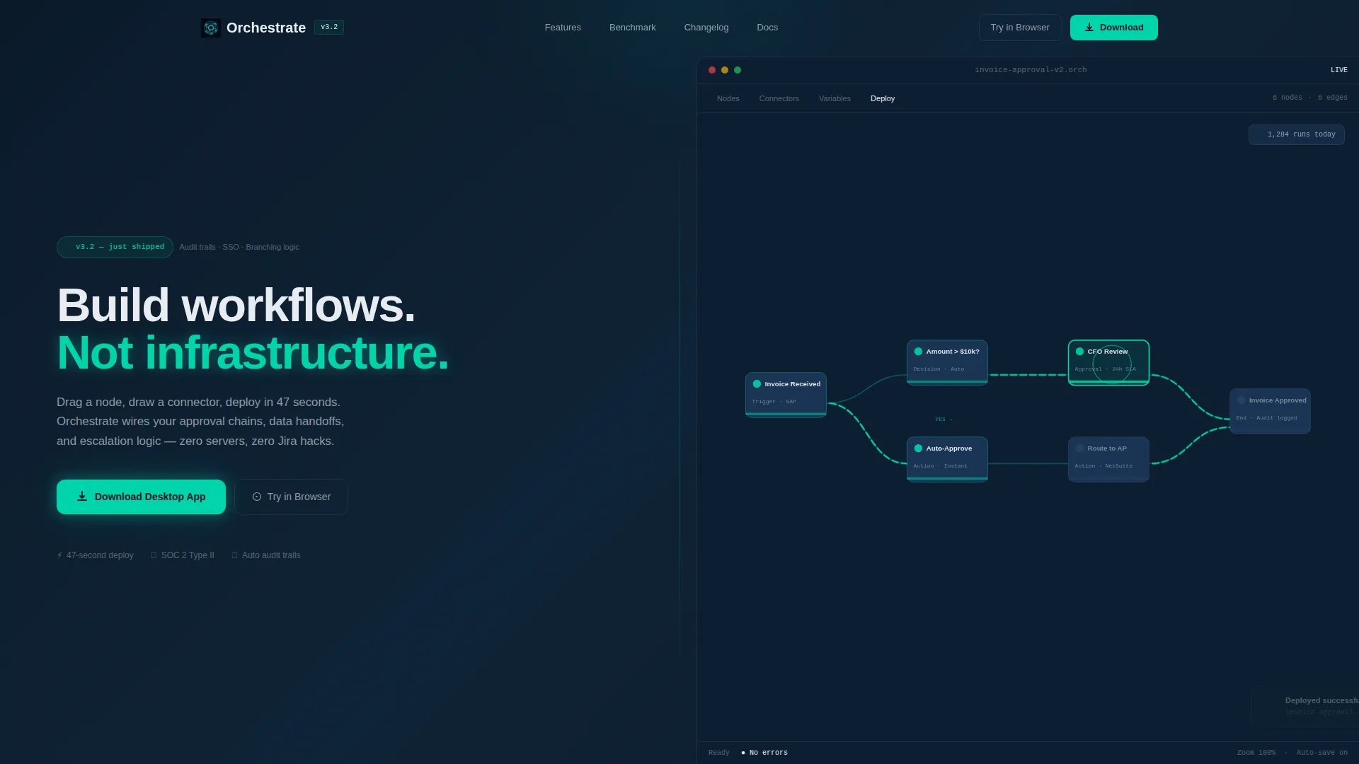
- Replaces vague feature lists with a real workflow canvas screenshot that shows labeled nodes and connector logic
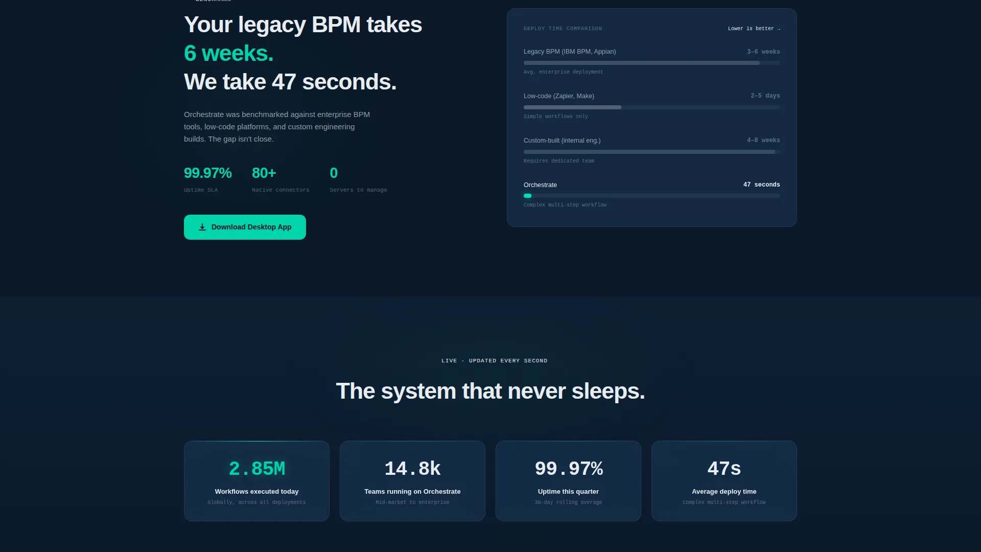
- Gives skeptical buyers concrete comparison data through a benchmark bar chart before asking them to commit
What you get with this template
You get a fully structured, single-page layout with every section pre-built and ready to customize. The template hands you a complete visual and copy framework, so you spend time replacing content rather than designing from scratch.
- A split-screen hero with a product screenshot on the right and headline copy on the left, including a version badge and a glowing teal download button
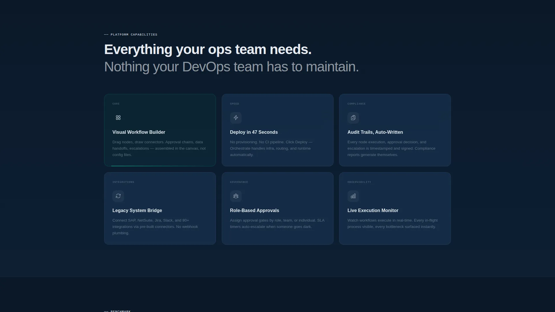
- A three-column animated feature grid, a benchmark comparison chart section, a live workflow counter section, and a dark-mode testimonial strip
- Three pinned download call-to-action placements: header, post-benchmark, and footer, plus a secondary "Try in Browser" path with no form fields required
Feature list
This template is built around a specific set of pre-designed sections and visual components pulled directly from the brief.
Split-Screen Hero with Product Screenshot
The hero divides the viewport 50/50. The right half holds a live workflow canvas mid-build, showing animated data pulses traveling along connector lines and a deploy-success toast notification. The left half carries a bold headline, a version badge, and the primary download button.
Animated Three-Column Feature Grid
The feature grid tiles animate in like a dashboard loading for the first time. Each column presents a key platform capability in a scannable card format, giving buyers a fast read of the product's core value.
Benchmark Comparison Bar Chart
A side-by-side bar chart renders legacy business process management deploy time against Orchestrate's deploy time. It uses real visual weight to make the speed advantage tangible rather than stated.
Live Workflow Counter Section
This section displays a running count of workflows executed globally. It creates urgency and social proof without requiring a single line of testimonial copy, letting the number do the convincing.
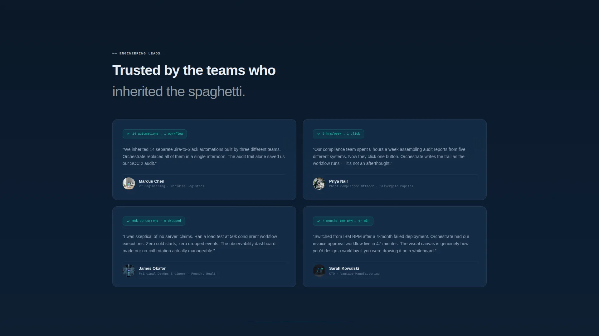
Dark-Mode Testimonial Strip
A full-width strip pulls named quotes from engineering leads at recognizable companies. The dark-mode treatment keeps it consistent with the Midnight Blue system while making the social proof feel heavyweight and credible.
Three-Placement Download call to action System
The primary call to action, "Download the Desktop App," appears in the header, after the benchmark section, and in the footer. A secondary "Try in Browser" option sits alongside each placement. One click triggers a platform-detected download for macOS, Windows, or Linux.
Page sections overview
| Section | Purpose |
|---|---|
| Split-Screen Hero | Establish product identity and drive the first download click |
| Version Badge Row | Signal active development and launch-day momentum |
| Feature Grid Tiles | Communicate core capabilities in a scannable three-column layout |
| Benchmark Chart Section | Prove speed advantage with a side-by-side visual comparison |
| Live Workflow Counter | Build urgency using a real-time global execution count |
| Testimonial Strip | Reinforce trust with named quotes from engineering professionals |
| Mid-Page call to action | Repeat the download action after benchmark evidence is presented |
| Footer call to action Block | Close the page with a final download prompt and browser-trial option |
Design & branding system
The visual identity is built on the Dashboard Pro theme using a Midnight Blue color system. Every color choice is deliberate, drawing from the metaphor of a submarine control panel: dark, information-dense, and purposeful.
- Deep terminal navy (#0B1929) forms the primary background, satellite-map blue (#1B3A5C) adds depth to surfaces and cards, status-bar teal (#00D4AA) highlights live-state accents and all call-to-action elements, and interface white (#E8ECF1) is used for typography and card surfaces
- The creative direction is Launch Energy, meaning the scroll experience is designed to feel like a product keynote unfolding in real time, with each section adding a new layer of proof and momentum
- Typography is set in bold interface white against terminal navy in the hero, maintaining high contrast and readability throughout the dark-mode layout
Mobile & speed optimization
The template is structured with a clean single-page layout that keeps the section hierarchy logical on smaller screens. The split-screen hero adapts naturally to stacked layouts, and the pinned call-to-action placements remain accessible at every scroll depth.
- The three-column feature grid stacks vertically on mobile without losing the tile-loading animation effect
- The benchmark chart and live counter sections are self-contained blocks, making them easy to reflow without breaking the visual logic of the page
How this template helps you convert
The page is engineered around a single conversion action: downloading the desktop app. Every structural decision points toward that moment.
- The primary call to action is pinned in the header so it is visible before the visitor reads a single word of body copy, removing the need to scroll to find the download button
- The benchmark chart and live counter appear mid-page as evidence layers, so by the time the visitor reaches the second call to action placement, they have already seen speed proof and social scale
- The footer closes with the download button and the line "No account required for your first three workflows," which directly removes the biggest hesitation a first-time visitor carries
Other information about this template
This template is positioned specifically for serverless business process management platforms targeting mid-market and enterprise operations buyers. It is a strong fit for product launches, version announcements, and app download campaigns where the goal is to move a technically literate audience from awareness to action in a single scroll.
- The "Try in Browser" secondary path gives visitors who are not ready to install a low-commitment entry point without adding form fields or friction
- The version badge component ("v3.2, just shipped") signals active development and is easy to update for each new release cycle
- The workflow canvas screenshot includes real field labels such as "Invoice Approved to Route to AP," making it read as a genuine in-product view rather than a generic placeholder mockup
- This template works within the Dashboard Pro theme family and pairs naturally with other dark-mode, data-dense interface templates in that design system
Theme
Dashboard Pro
Creative direction
Launch Energy
Color system
Midnight Blue
Style
Split Screen (50/50)
Direction
App Download
Page Sections
Split-screen Hero with Product Canvas
Animated Feature Grid
Benchmark Bar Chart Section
Live Global Workflow Counter
Dark-mode Testimonial Strip
Three-placement Call to Action System
Related questions
Does this template require a backend or server setup to use?
Can I swap in my own product screenshot for the hero section?
Is the download button pre-configured for platform detection?
Who is this landing page template designed for?
Can the live workflow counter display real data?



