Orchestrate - Powerful Whitelabel Landing Page Template
Orchestrate is a glassmorphic, card-grid landing page template built for agencies, consultancies, and vertical SaaS companies selling white-label business process management (BPM) software. The template uses an industry-report visual style, a logo-ticker header, and a sandbox app download flow to convert skeptical operations buyers into confident platform partners.
by Rocket studio
Quick summary
Orchestrate is a single-page, modular card-grid landing page template designed for white-label BPM platforms. It combines an industry-report creative direction with a glassmorphic color system to present workflow automation, approval chains, and KPI dashboards as a market-ready engine. The primary conversion goal is a sandbox app download, supported by a floating urgency bar and a simultaneous email capture field.
Who this template is for
This template is built for teams that need to sell embedded process automation under their own brand. It speaks directly to buyers who are under deadline pressure and need proof, not promises.
- Operations directors at mid-market consultancies who have committed to delivering a custom workflow tool for a client
- Product leads at vertical SaaS companies who need to add process automation without building a dedicated platform team
- Agency founders who want to grow recurring revenue beyond project retainers by offering a branded BPM product
What problem this template solves
Selling a white-label platform is harder than building one. Buyers arrive skeptical, need social proof fast, and often cannot picture the finished product under their own brand. This template removes those blockers.
- It replaces a generic sales deck with a self-scrolling, evidence-first experience that builds conviction card by card
- It shows the platform already deployed across dozens of fictional-but-believable partner brands, proving market adoption before a single word of feature copy appears
- It removes friction from the trial step by letting visitors download a fully skinnable sandbox environment directly from the page
What you get with this template
You get a complete, deployment-ready landing page layout with every section, component, and interaction pattern defined. Nothing is left to guess.
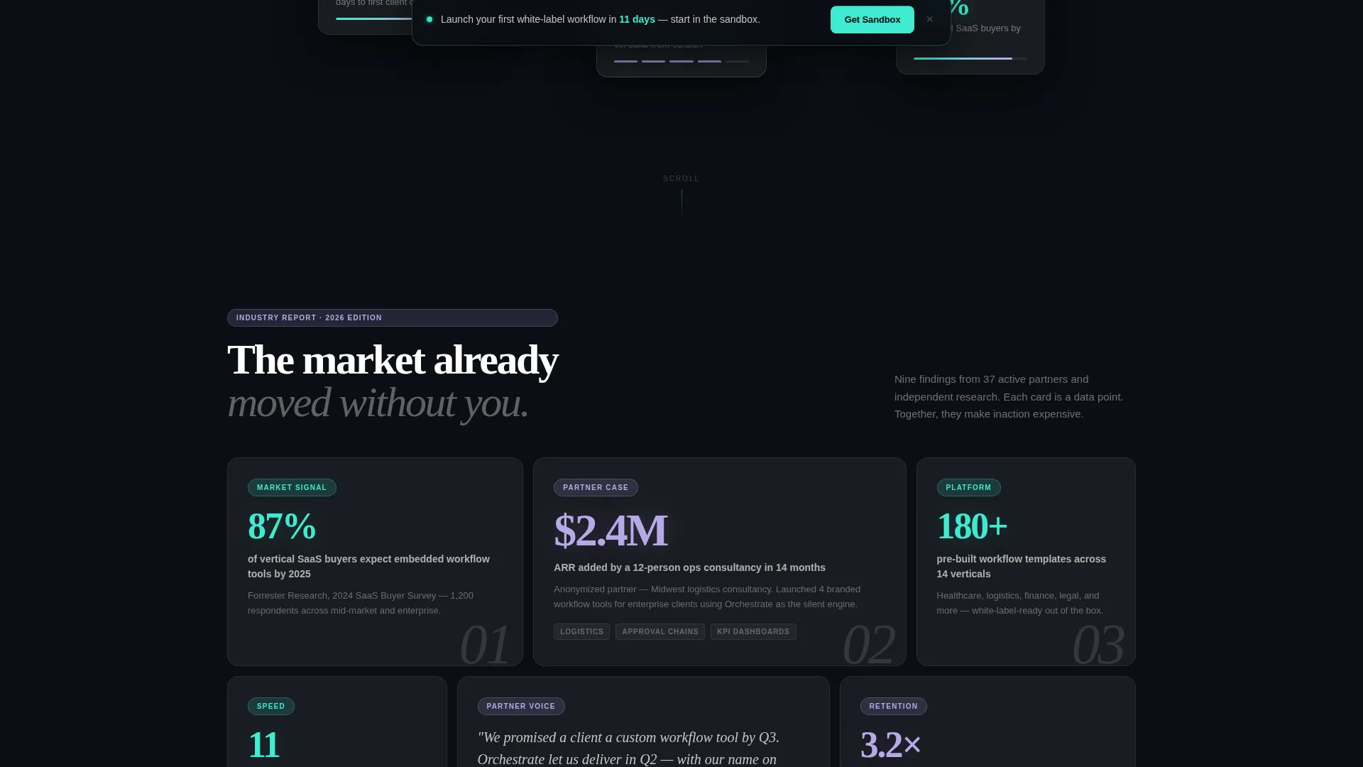
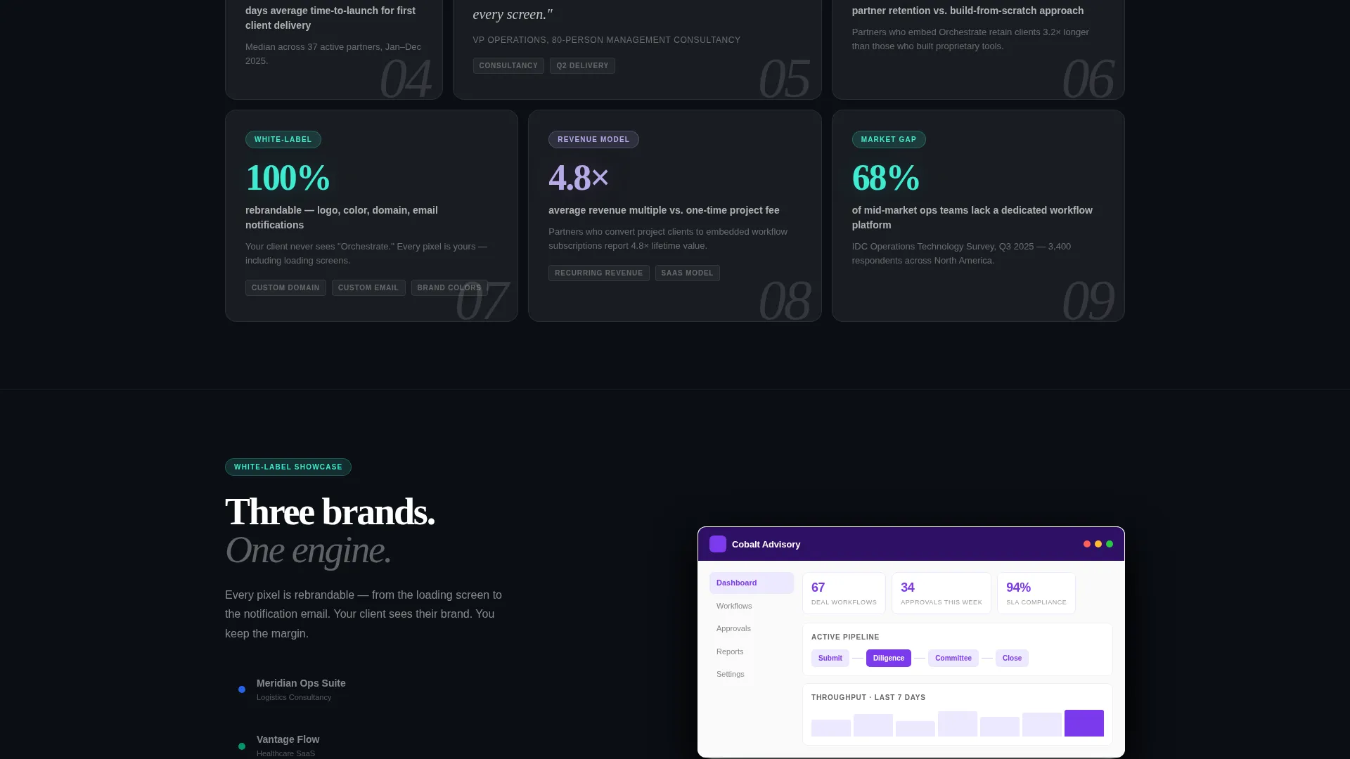
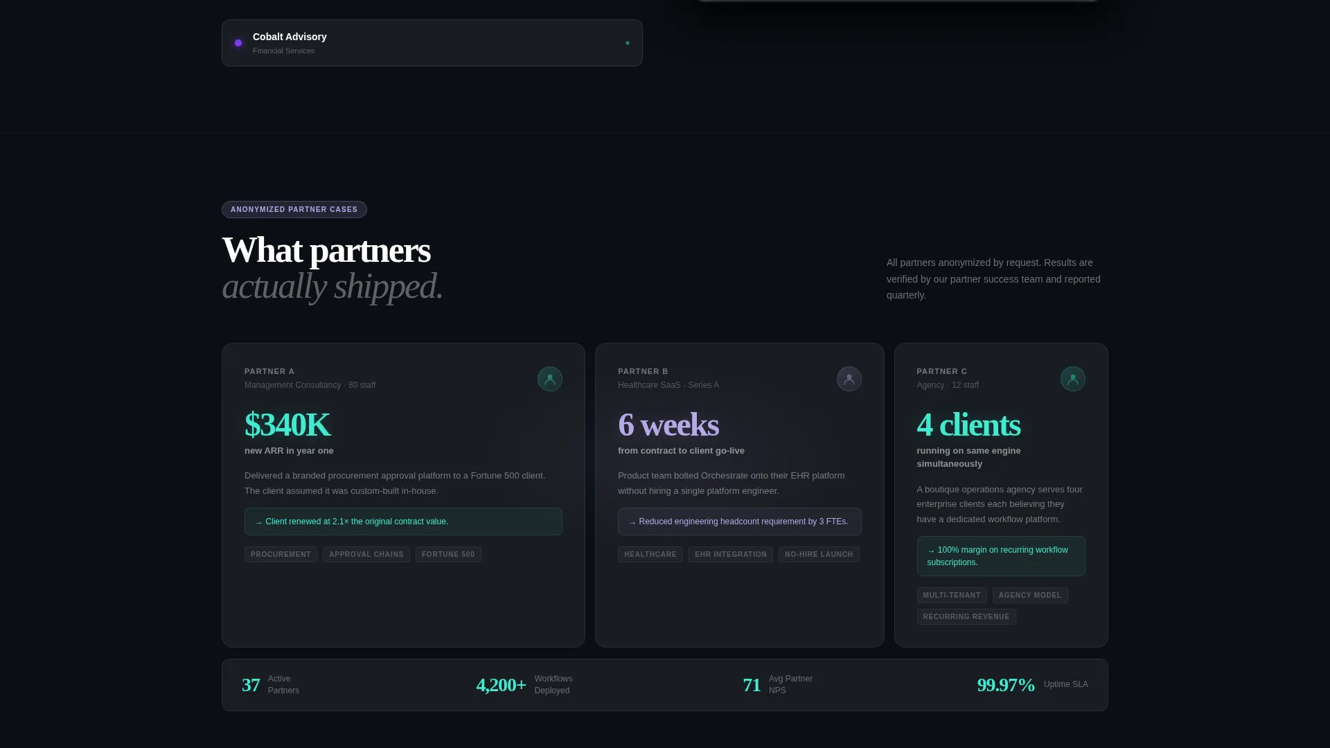
- A modular card grid with three card types: stat callouts, anonymized mini case studies, and feature snapshot cards showing the dashboard in three distinct brand skins
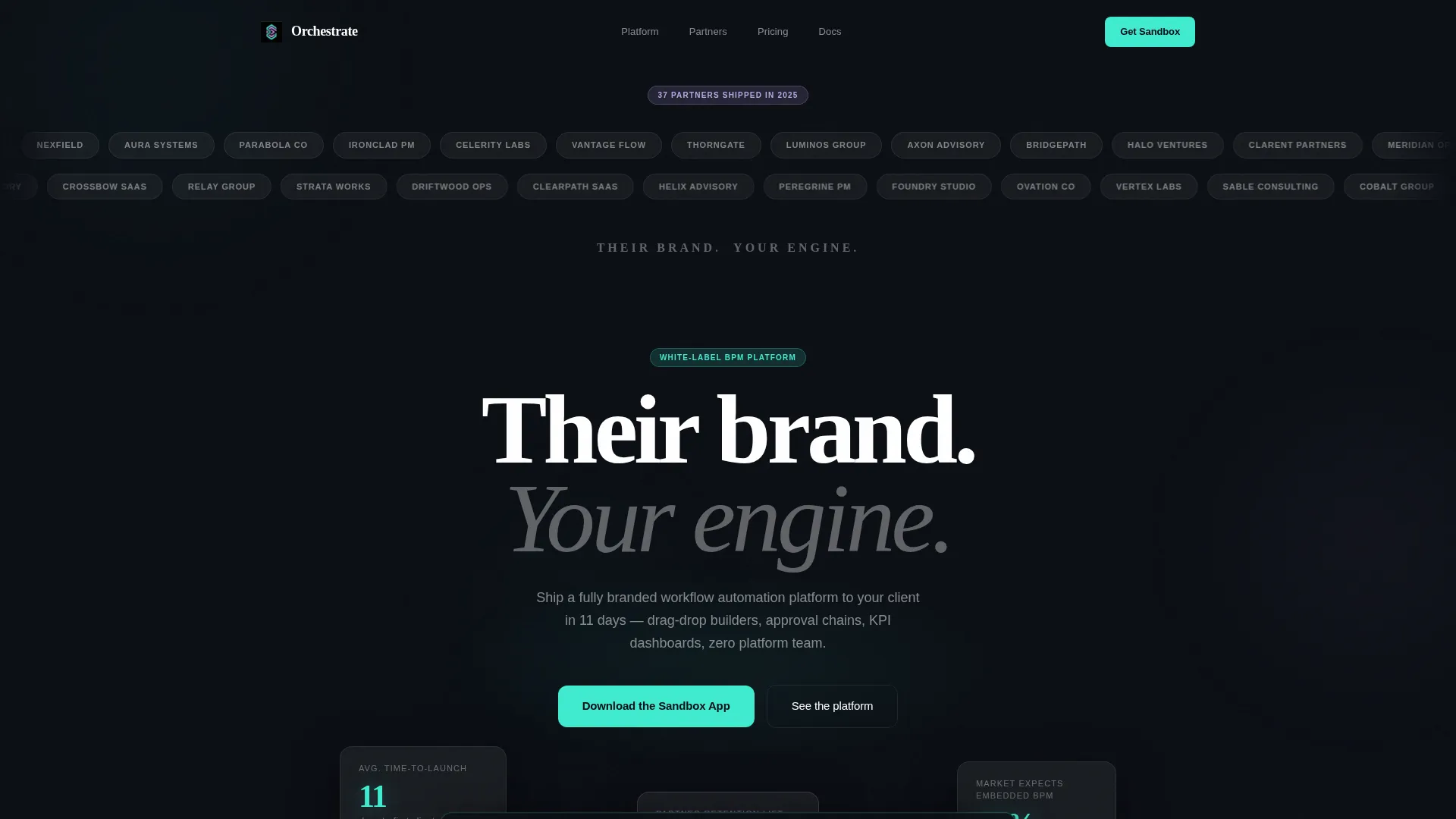
- A horizontal logo-ticker header with thirty-plus partner logo chips rendered in monochrome white on frosted glass, plus the headline "Their brand. Your engine."
- A primary download section with a platform toggle for iOS, Android, and Desktop, a single email capture field, and a floating bottom bar that appears after three card rows
Feature list
This template covers all the structural and visual components needed to launch a credible white-label BPM landing page.
Modular Card Grid Layout
The page is built on a modular grid where each card is a self-contained unit. Cards alternate between data-finding stat callouts, anonymized partner mini case studies, and feature snapshot previews. The layout lets visitors scan non-linearly, treating every card as its own entry point.
Logo Ticker Header
A slow-scrolling horizontal ticker displays thirty-plus fictional-but-realistic partner logos as monochrome white chips on frosted glass. Volume and variety are the proof mechanism. The single display headline beneath the ticker delivers the brand promise before any feature copy.
Industry Report Card System
Each stat card surfaces a single market finding in large display type, styled like a page from an analyst briefing. The format builds a cumulative case for action across the scroll journey without requiring visitors to read dense paragraphs.
Sandbox App Download Section
The primary conversion block includes a three-option platform toggle (iOS, Android, Desktop), a download call-to-action button, and a parallel email field labeled "Send me the link too." Both capture paths are available simultaneously to reduce drop-off.
Floating Urgency Bar
A sticky bottom bar appears after the visitor scrolls past three rows of cards. It reinforces the time-to-value message and links directly to the sandbox download, keeping the conversion path visible throughout the scroll experience.
Glassmorphic Design System
Every card sits on a semi-transparent, blurred surface with a 1-pixel border opacity. Active states and badge highlights use frosted lilac. Call-to-action elements and progress indicators use signal teal. Backgrounds are near-black with subtle radial gradients.
Page sections overview
| Section | Purpose |
|---|---|
| Logo Ticker Header | Establish partner scale and brand promise before feature copy |
| Hero Display Line | Deliver the core value proposition in a single sentence |
| Stat Callout Cards | Present market data findings as visual proof of urgency |
| Mini Case Study Cards | Show anonymized partner outcomes to build social proof |
| Feature Snapshot Cards | Preview the dashboard in three different brand skin variants |
| Sandbox Download Block | Drive app download with platform toggle and email capture |
| Floating Urgency Bar | Reinforce conversion after three card rows of scrolling |
Design & branding system
The visual identity follows a Directory and Discovery theme expressed through a glassmorphic color system. Every surface choice is deliberate: depth and translucency signal sophistication without visual noise.
- Core palette includes translucent panel white (rgba 255, 255, 255, 0.12), deep void black (#0B0E14), frosted lilac (#B8A9E8) for active-state glows and badge labels, and signal teal (#3FEBD0) for call-to-action buttons and progress indicators
- Cards use blurred semi-transparent backgrounds with 1-pixel border opacity, floating above near-black radial gradient backgrounds to create luminous depth
- Text is high-contrast white throughout; lilac appears sparingly for metadata labels and active states only, preserving hierarchy and legibility
Mobile & speed optimization
The card-grid layout is structured to work across screen sizes. The platform toggle in the download section adapts naturally to mobile interaction patterns.
- The modular grid reflows across breakpoints so card content remains legible and scannable on smaller screens
- The platform toggle (iOS, Android, Desktop) is designed as a single interactive element, keeping the download section compact and usable on mobile viewports
- The floating bottom bar is positioned to stay visible without obscuring card content on narrow screens
How this template helps you convert
Every structural decision in this template points toward a single outcome: getting the right visitor to download the sandbox app.
- The logo ticker builds credibility in the first three seconds, before a visitor reads a single feature claim, by displaying volume and variety of deployed partner brands
- The industry-report card grid uses cumulative market evidence to make inaction feel costly, so by the time a visitor reaches the download block they have already talked themselves into trying it
- The floating urgency bar keeps the call to action visible throughout the scroll journey, reducing the risk that a convinced visitor loses the conversion path before acting
Other information about this template
This template is categorized under Technology, specifically in the White-Label Enterprise Software and White-Label BPM subcategories. It is a strong fit for teams evaluating purpose-built landing page templates for business process management platforms.
- The template is designed for a single-page, section-led landing page flow rather than a multi-page site structure
- The card-grid style and industry-report creative direction make this template reusable for different verticals simply by swapping card content and brand skin previews
- The intersection match score for this template's niche alignment is 13, reflecting a precise fit between the white-label BPM use case and the Directory and Discovery theme with glassmorphic styling
Theme
Directory & Discovery
Creative direction
Industry Report
Color system
Glassmorphic
Style
Card Grid (Modular)
Direction
App Download
Page Sections
Modular Card Grid with Three Card Types
Slow-scrolling Logo Ticker Header
Industry Report Stat Cards
Sandbox App Download Block
Floating Urgency Conversion Bar
Glassmorphic Visual System
Related questions
Can I replace the fictional partner logos with real client logos?
Does the template include a working BPM dashboard or workflow builder?
What is the sandbox app download section designed to do?
Is this template suitable for a vertical SaaS product marketing page?
Can the card grid content be edited for different industries or verticals?



