Specialist Restaurant Software Comparison Website Template
Ticket is a bold brutalist restaurant workflow automation comparison landing page template built for multi-unit operators and executive chefs. It presents a raw, high-contrast feature matrix that stacks Ticket against competing tools and manual spreadsheets. The layout guides decision-makers through real operational data and pushes them toward a side-by-side evaluation of their current stack.
by Rocket studio
Quick summary
This template delivers a single-page, brutalist comparison experience for a restaurant workflow automation platform. It uses four dark glass hero panels, a locked comparison matrix, operator quote dividers, and two conversion paths. The design works hard to move operators from research to action without friction.
Who this template is for
Multi-unit restaurant operators and executive chefs need a way to show stakeholders exactly where current tools fall short. This template gives them the visual ammunition to make that case.
- Multi-unit operators running high-volume weekend services
- Executive chefs managing six-station lines across multiple locations
- Restaurant group general managers who reconcile multiple systems weekly
What problem this template solves
Operators spend hours every week working around disconnected kitchen systems. No single view shows ticket routing, prep list status, and inventory thresholds together. This template makes that gap impossible to ignore.
- Scattered workflow data forces manual reconciliation every shift
- Competing tools offer no honest side-by-side feature comparison
- Decision-makers need structured content to understand trade-offs fast
What you get with this template
The template is a complete single-page layout ready for a restaurant software platform. Every section is purpose-built to carry comparison data and drive conversion.
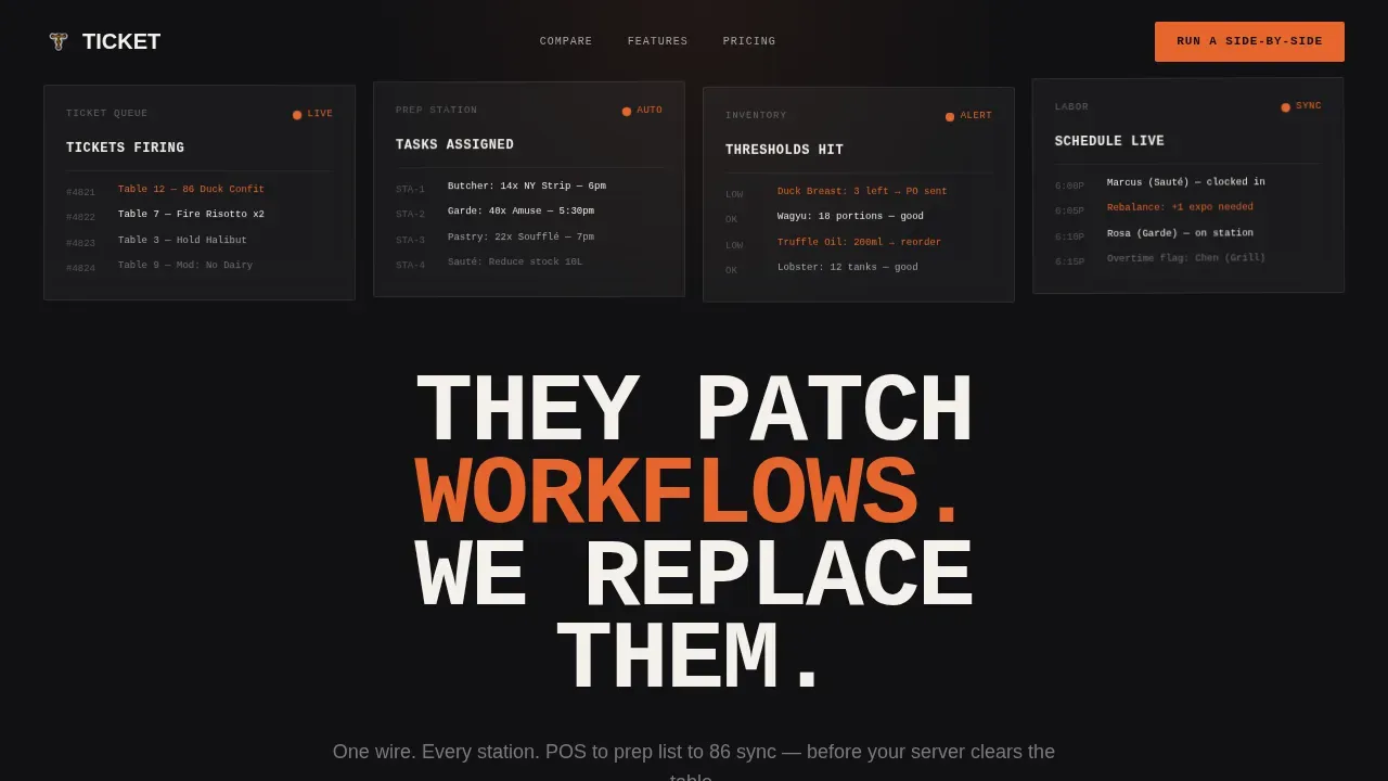
- A four-panel dark glass hero with parallax drift and monospaced headline treatment
- A full feature matrix comparing four workflow tools across eight operational categories
- Two conversion paths: a short side-by-side request form and a gated PDF download
Feature list
This template is designed so every section does real work toward conversion. Below is a description of the core capabilities built into the layout.
Four-Panel Dark Glass Hero
Four translucent, smoke-tinted panels float against a pure black field. Each panel shows a different workflow state: tickets queuing, prep tasks assigning, inventory thresholds triggering, and labor schedules rebalancing. A massive monospaced all-caps headline stamps across the panels.
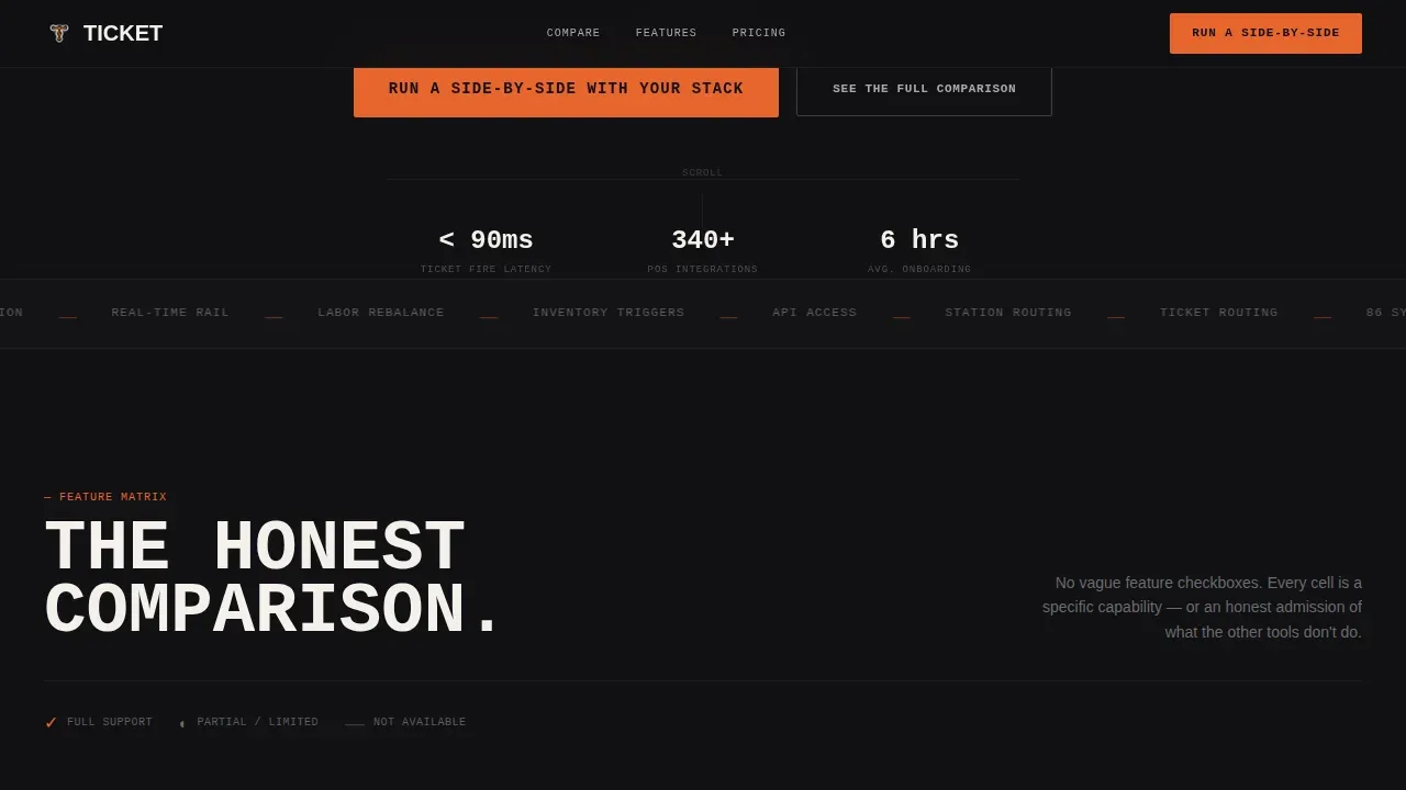
Persistent Comparison Matrix
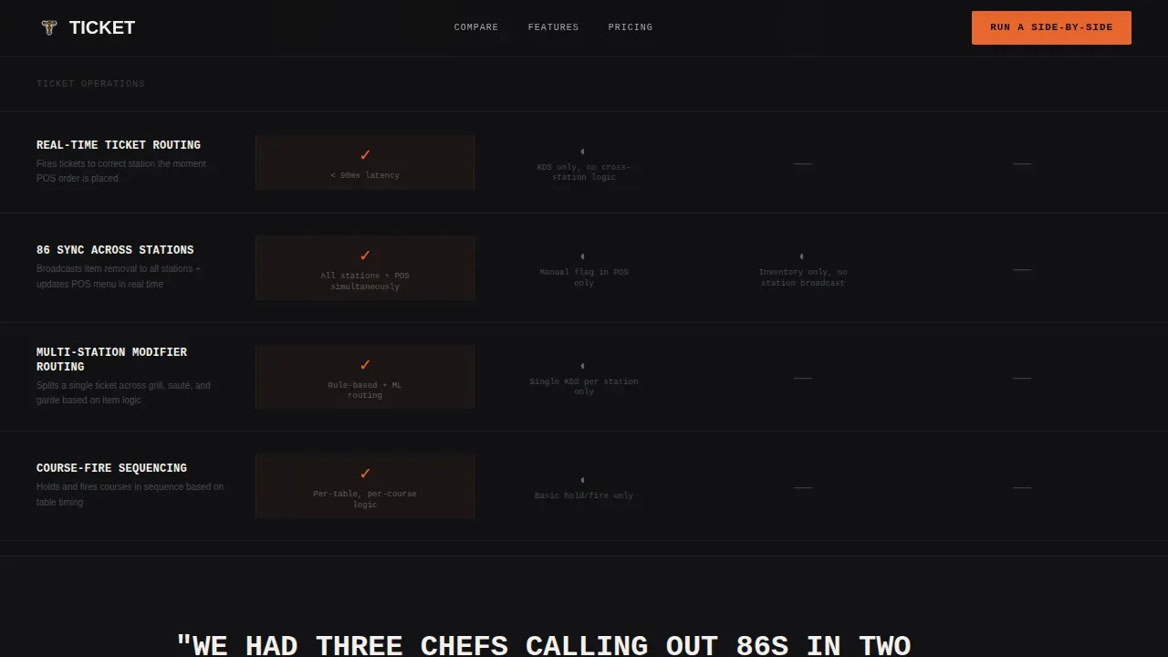
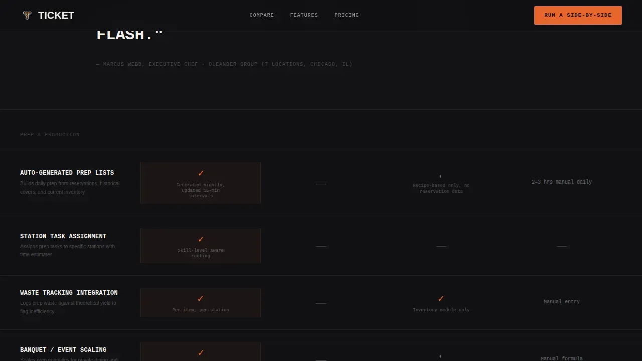
The feature matrix locks to the viewport as users scroll. It compares four tools across rows covering ticket routing, real-time sync, prep list generation, multi-location inventory, integration depth, API access, and onboarding time. Cells use direct indicators, never vague marketing language.
Operator Quote Dividers
Full-width brutalist dividers interrupt the table between sections. Each divider carries a single oversized operator quote. This grounds the data in real kitchen voices and helps users trust the comparison.
Dual Conversion Path Section
The primary call to action opens a short modal form asking for current point-of-sale system, number of locations, and biggest operational bottleneck. A secondary path gates a full comparison PDF behind an email address only, capturing researchers who need ammunition before a Monday GM meeting.
Sticky Conversion Bar
A floating bottom bar persists across the full page scroll. It keeps the primary call to action visible at all times without interrupting the table or content flow.
Page sections overview
| Section | Purpose |
|---|---|
| Dark Glass Hero | Introduce platform and set visual tone |
| Headline Stamp | Communicate core positioning immediately |
| Comparison Matrix | Display side-by-side feature data |
| Quote Dividers | Add operator credibility between table sections |
| Call to Action Form | Capture high-intent evaluation requests |
| PDF Download Gate | Capture researcher emails for follow-up |
| Footer Row | Close page with minimal linear navigation |
Design & branding system
The visual style embraces a raw, unpolished industrial aesthetic. High-contrast monochrome steel tones carry the layout, with one searing accent reserved strictly for action states. Bold, large monospace fonts dominate headlines, while a clean sans-serif handles body text.
- Forge black, brushed stainless, and ticket-paper white form the base palette
- Heat-lamp amber is used only for calls to action and live-state indicators
- JetBrains Mono handles all-caps headlines; DM Sans handles body copy
Mobile & speed optimization
The template is built desktop-first to match how general managers and operators do research. A mobile fallback ensures the layout and data remain readable on smaller screens.
- Comparison table reflows cleanly for mobile viewport widths
- Static server components handle content; client components handle animations
- Fast load behavior is prioritized to support high-conversion landing page goals
How this template helps you convert
The layout removes every distraction and channels attention directly toward the two conversion actions. No navigation bar competes for focus.
- The comparison matrix makes the decision feel obvious before a user reaches the call to action, reducing hesitation at the form
- The dual-path approach captures both high-intent operators ready to talk and researchers who need internal buy-in first
Other information about this template
This is the Ticket Bold Brutalist Restaurant Workflow Automation Comparison Landing Page Template. It is built on a no-code-compatible structure, so users can go from prompt to live page without traditional programming skills. AI-powered website and app builders allow users to create production-ready applications quickly, and this template fits that workflow. Subscription plans with free trials are common for platforms in this category, making it easy to test before committing. The high-contrast, text-driven layout follows principles found in hacker and developer templates, adapted here for explaining complex ticketing workflows. Custom brutalist builder tooling is ideal for achieving the raw, unpolished architectural feel this template delivers.
- Works with no-code and low-code deployment tools
- Supports AI-powered app builder workflows from natural language prompts
- Designed for restaurant software marketing teams who need a focused, high-converting page fast
Theme
Bold Brutalist
Creative direction
Feature Matrix
Color system
Monochrome Steel
Style
Comparison Table
Direction
Comparison/Versus
Page Sections
Dark Glass Hero Panels
Locked Viewport Comparison Matrix
Brutalist Operator Quote Dividers
Dual Conversion Path Layout
Persistent Sticky Call to Action Bar
Related questions
Who is this template designed for?
Can I adapt the comparison table rows to my own feature set?
Does this template include both conversion paths out of the box?
Is this template suitable for desktop-first research sessions?
Do I need coding skills to customize this template?



