Government Software Cost Calculator Website Template
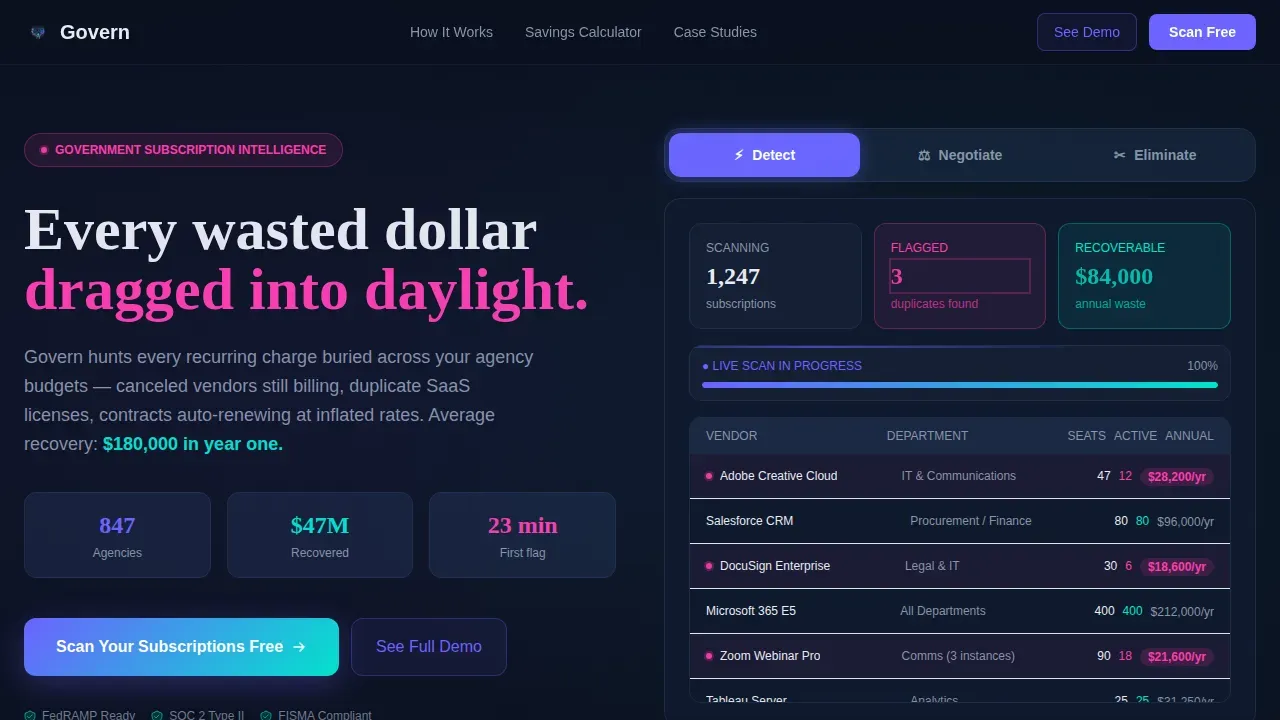
The Govern Smart Subscription Waste Detection Government Landing Page Template is a split-screen GovTech landing page built to convert state IT directors, procurement officers, and federal program managers. It combines a live-feel Feature Tab Switcher, animated before/after dashboard, savings calculator, and a freemium signup flow to make hidden subscription waste impossible to ignore.
by Rocket studio
Quick summary
Govern is a smart landing page template for a government subscription management platform. It surfaces hidden recurring charges, duplicate licenses, and zombie contracts across agency budgets. The page uses a 50/50 split-screen layout, dynamic motion animations, and a freemium trial flow to turn visitors into free-scan signups in a single session.
Who this template is for
This template is built for GovTech SaaS companies selling subscription intelligence tools to the public sector. It speaks directly to the people drowning in waste management operations across government budgets.
- State IT directors managing 400 or more software subscriptions across spreadsheets
- County procurement officers discovering duplicate platforms across multiple departments
- Federal program managers and budget analysts who need transparent audit trails
What problem this template solves
Government agencies lose enormous sums each year to untracked recurring charges. Canceled vendors keep billing. Contracts auto-renew at inflated rates. Workers across every department lack the tools to see the full picture. Tracking government waste manually is slow, error-prone, and politically costly.
- No single view exists showing all active subscriptions and their true cost
- Budget teams cannot evaluate duplicates without a consolidated data source
- Procurement leads need proof of savings before they can present a case to leadership
What you get with this template
This template gives you a complete, conversion-focused landing page designed specifically for government subscription management. Engaging visuals, including animations showing smart detection states, make the product feel real before a visitor ever signs up.
- A three-tab Feature Tab Switcher (Detect, Negotiate, Eliminate) with live-style dashboard panels
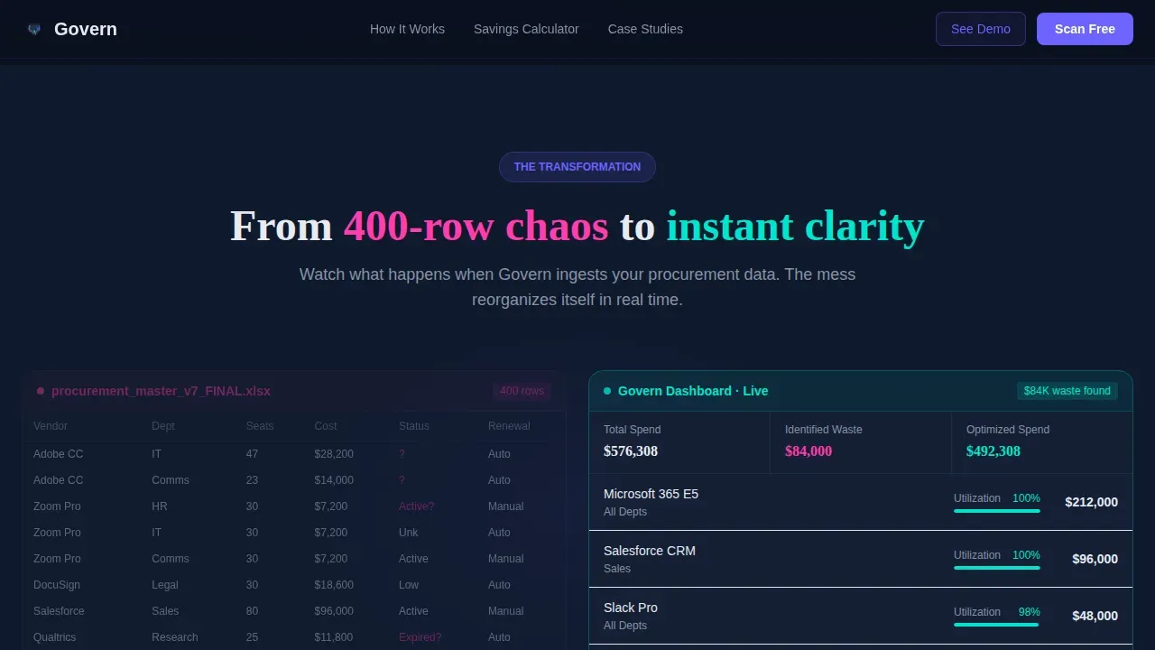
- An animated before/after section transforming a chaotic spreadsheet into a clean, consolidated view
- A savings calculator, social proof section, and a progressive freemium signup form
Feature list
The template includes six core feature areas drawn directly from the brief. Each one supports a specific moment in the visitor's decision journey.
Three-Tab Interactive Header
The header is a fully interactive Feature Tab Switcher. Each tab, Detect, Negotiate, and Eliminate, swaps the right-side panel with a different smart dashboard state. The Detect tab displays 1,247 subscriptions with duplicates flagged. Negotiate surfaces a 31% lower contract rate. Eliminate shows a cancellation queue with $84,000 in annual savings. Tab transitions use fluid motion so the header feels like a working product demo.
Animated Before/After Section
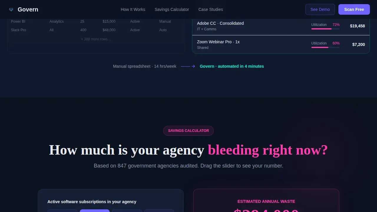
Section two splits a disorganized spreadsheet on the left against a clean consolidated dashboard on the right. An animated transition reorganizes the mess in real time. This moment makes the idea of subscription waste management concrete and visceral for any user who has lived inside a sprawling budget tracker.
Interactive Savings Calculator
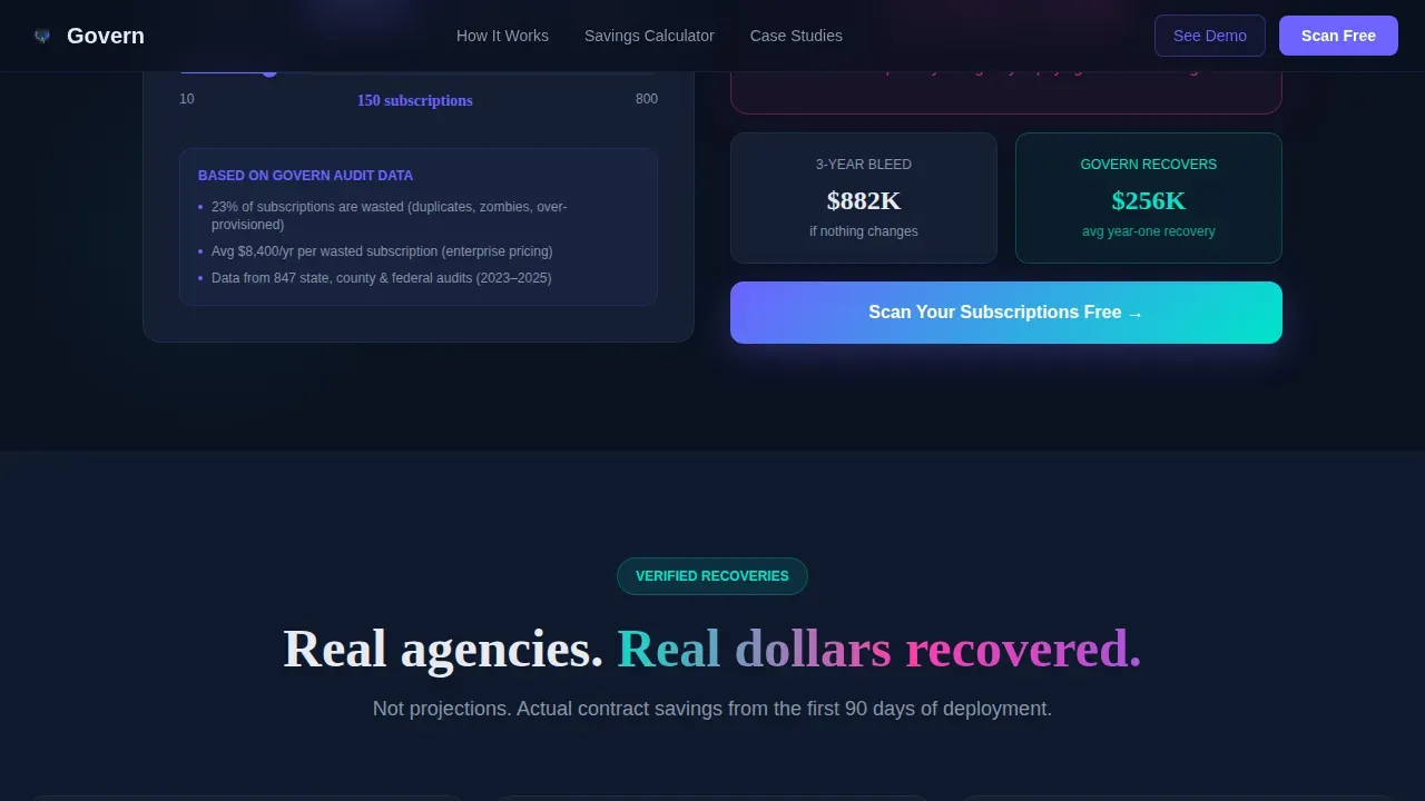
Section three lets visitors enter their agency's subscription count and watch projected waste appear as a live number. This is the highest-intent moment on the page. The visitor sees their own agency's potential loss, which makes the primary call to action immediately relevant. Data collection and analysis at this stage can provide real insights into recycling rates of wasted budget across the organization.
Progressive Freemium Signup Form
The primary call to action, "Scan Your Subscriptions Free," appears twice: directly after the tab switcher and again after the savings calculator. The form collects work email, agency name, and estimated subscription count across three progressive steps. Nothing requires internal approval to complete. A secondary path, "See the Full Demo," supports procurement leads who need to present findings to leadership before committing.
Social Proof Section
Section four displays three named government agencies with specific dollar amounts recovered. Real numbers from real agencies make the savings claims credible and transparent. This section builds the trust that smart procurement workers need before recommending a new platform to their department heads.
Dynamic Motion Animation System
The entire page runs on a Launch Energy scroll pattern. Motion accelerates as the visitor moves down. Numbers count up. Savings accumulate visually. Panels slide between states. The animation system is designed to make every recovered dollar feel like a small, satisfying win, a smart design strategy that connects the product's value to the visitor's emotional state.
Page sections overview
| Section | Purpose |
|---|---|
| Hero Tab Switcher | Demonstrates Detect, Negotiate, Eliminate capabilities interactively |
| Before/After Split | Visualizes the shift from spreadsheet chaos to clean dashboard |
| Savings Calculator | Lets visitors input subscription count and see projected waste |
| Social Proof | Displays named agencies and recovered dollar amounts |
| Primary Call to Action | Collects work email, agency name, and subscription count |
| Linear Single-Row Footer | Closes the page with minimal distraction |
Design & branding system
The visual identity uses an AI Iridescent color system layered over a dark institutional base. The palette describes light refracting through a government building's glass atrium: serious but unexpectedly alive. Typography pairs DM Sans for body and user interface text with Fraunces for display headlines.
- Navy (#0B1120) dominates backgrounds and data panels for institutional authority
- Violet-blue (#6C63FF) carries headlines and active states; teal (#00E5CC) pulses through savings confirmations
- Hot iridescent pink (#FF3CAC) fires only when the system catches waste, a deliberate dopamine signal
Mobile & speed optimization
The template is designed desktop-first to match how government IT directors and procurement workers operate. Most of these users are on workstations. The layout also responds cleanly across smaller screens so the page remains functional for any user on a mobile device.
- Interactive sections, the tab switcher, calculator, and animated dashboard, are built as client components for smooth in-browser performance
- Static sections use server-rendered components to keep the page responsive without sacrificing visual weight
- The 50/50 split-screen layout stacks gracefully on mobile so no section loses its core message
How this template helps you convert
The page is structured to build trust and urgency at every scroll point, then deliver the call to action exactly when a visitor's interest peaks.
- The tab switcher immediately proves capability with specific numbers: 1,247 subscriptions scanned, 31% rate reduction surfaced, $84,000 cancellation queue displayed. Visitors see proof before reading a single marketing claim.
- The savings calculator personalizes the pitch. When a visitor enters their own subscription count and sees projected waste, the "Scan Your Subscriptions Free" form becomes the obvious next step. The secondary "See the Full Demo" path retains procurement leads who need more time.
Other information about this template
This template sits inside a broader context of public-sector innovation around tracking government waste. Cities across the country are under pressure to become more efficient as solid waste management costs exceed $200 billion globally each year. Smart waste management systems, whether handling physical trash or digital subscription bloat, share the same core challenge: making invisible waste visible so workers and policymakers can act.
The template's design language connects to this moment. It is built for an era when the idea of a pioneering firm helping government agencies recover wasted resources resonates strongly. Public conversations around fiscal accountability, including discussions about the doge website and waste.gov, which was created by the Trump administration with the tagline "tracking government waste," reflect real demand for transparent spending tools. Note that waste.gov has previously displayed content unrelated to its stated purpose and remains behind a password wall after an article linked scrutiny to doge's actions and the oval office's broader reform agenda. The White House registered both waste.gov and DEI.gov, and this wider policy climate means people voted for accountability, making the market for smart government waste detection tools larger than ever.
This template supports GovTech companies that want to position themselves as a transparent, smart organization. It is editable, so your team or an editor can tailor every section to match your platform's specific data, agency names, and savings figures. Structured templates like this one can simplify complex waste management concepts for presentations and help workers across every department subscribe to a clearer picture of where budget is going. Teams can subscribe to updates and share a link to the page directly from their inbox, making it easy to circulate within a procurement department week after week.
- The template is created for Technology category buyers in the Government Software subcategory
- Visual content, including smart bin animations and efficient data systems displays, illustrates waste management processes effectively
- Sensors and IoT-powered systems that send data wirelessly support the kind of smart sustainability story this page is designed to tell
- Templates like this one can be used for various audiences, including government officials and corporate teams evaluating new platforms
- The subscription model this page promotes enables cities to optimize collection strategies and improve city sanitation and budget sustainability
Theme
Dynamic Motion
Creative direction
Launch Energy
Color system
AI Iridescent
Style
Split Screen (50/50)
Direction
Freemium/Trial
Page Sections
Interactive Three-tab Feature Header
Animated Before/after Dashboard
Live Savings Calculator
Progressive Freemium Signup Form
Named Agency Social Proof
Launch Energy Scroll Animation
Related questions
Can I customize the agency names and savings figures in the social proof section?
Does the savings calculator require a backend connection to work?
What conversion paths does this template support?
Is this template suitable for a federal government audience?
How does the tab switcher avoid looking like a static screenshot?



