Healthcare Software Specialist Professional Website Template
Orderly is a dark-themed, card grid landing page template built for healthcare order management platforms. It pairs an immersive dashboard hero with data-driven stat cards, a freemium trial form, and a gated report download. The design uses a Void and Violet color system to project focused intelligence, helping supply chain and procurement teams convert on first visit.
by Rocket studio
Quick summary
Orderly is a single-page, modular card grid template designed for healthcare order management software. It opens with a live-feeling dashboard preview, walks visitors through industry-level procurement pain statistics, and drives conversion through a no-credit-card free trial form. The dark Void and Violet palette signals focused, clinical intelligence from the first scroll.
Who this template is for
This template is built for healthcare software teams who need to reach procurement and supply chain decision-makers quickly and credibly. It speaks directly to the people who feel the daily weight of misrouted orders and delayed approvals.
- Materials managers and perioperative directors who need immediate clarity on order status
- Supply chain directors and finance leaders tracking off-contract spend and approval cycles
- Healthcare software founders or product marketers launching a procurement platform to hospital buyers
What problem this template solves
Healthcare supply chain teams deal with order errors, phantom backorders, and multi-day approval delays that can derail procedures and drain budgets. Standard marketing pages do not address this pain with the authority these buyers demand.
- Generic SaaS templates lack the clinical credibility needed to earn trust from hospital procurement teams
- Visitors leave before converting because no page speaks their language or reflects their actual daily chaos
- Lead capture often fails because there is no mid-funnel path for buyers who are not yet ready to trial
What you get with this template
This template delivers a complete, conversion-ready landing page structure for a healthcare order management platform. Every section is purpose-built to move a skeptical procurement professional from recognition to action.
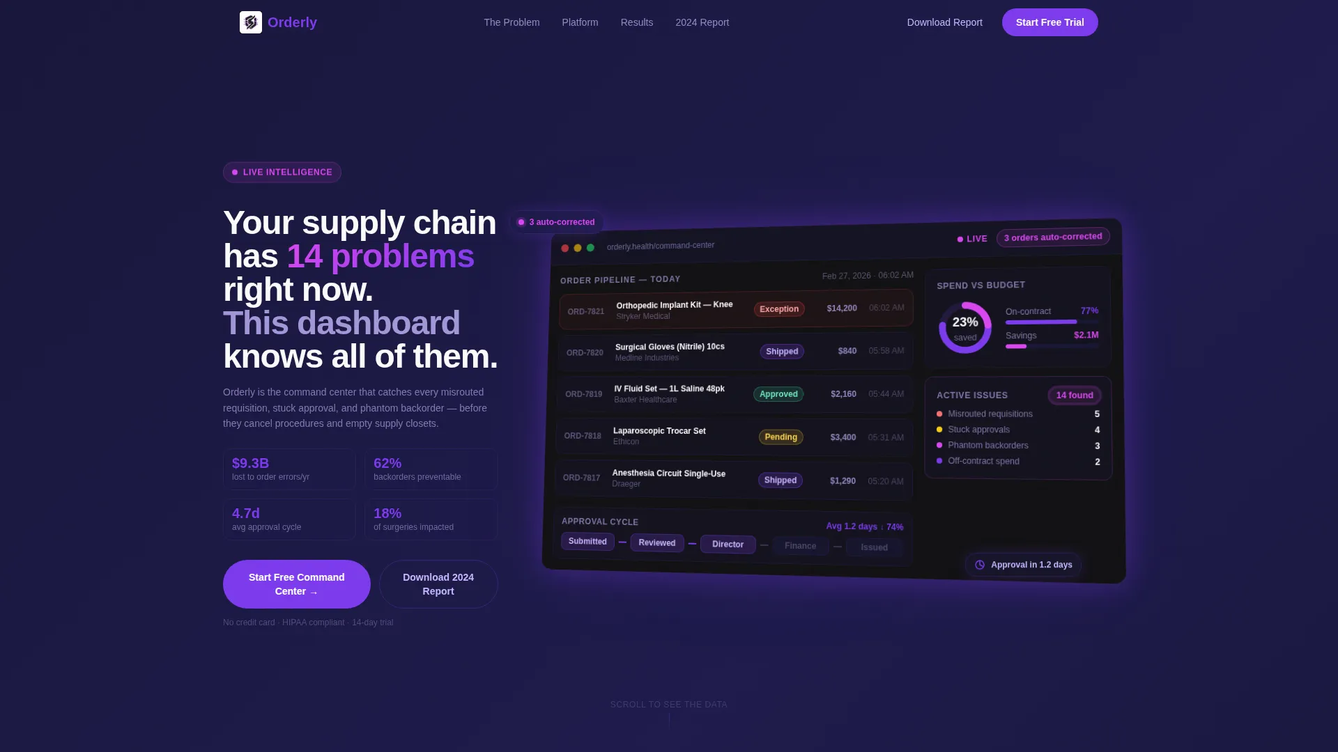
- A dimensional dashboard hero with a real-time order pipeline, spend-versus-budget donut chart, and auto-correction notification badge
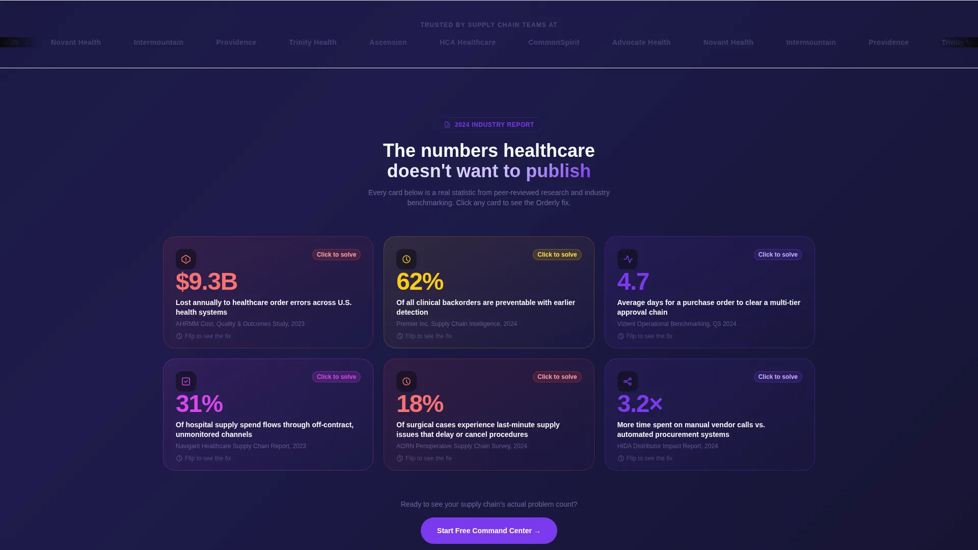
- A scrolling sequence of industry stat cards that flip or expand to reveal platform solutions, each with micro-animation
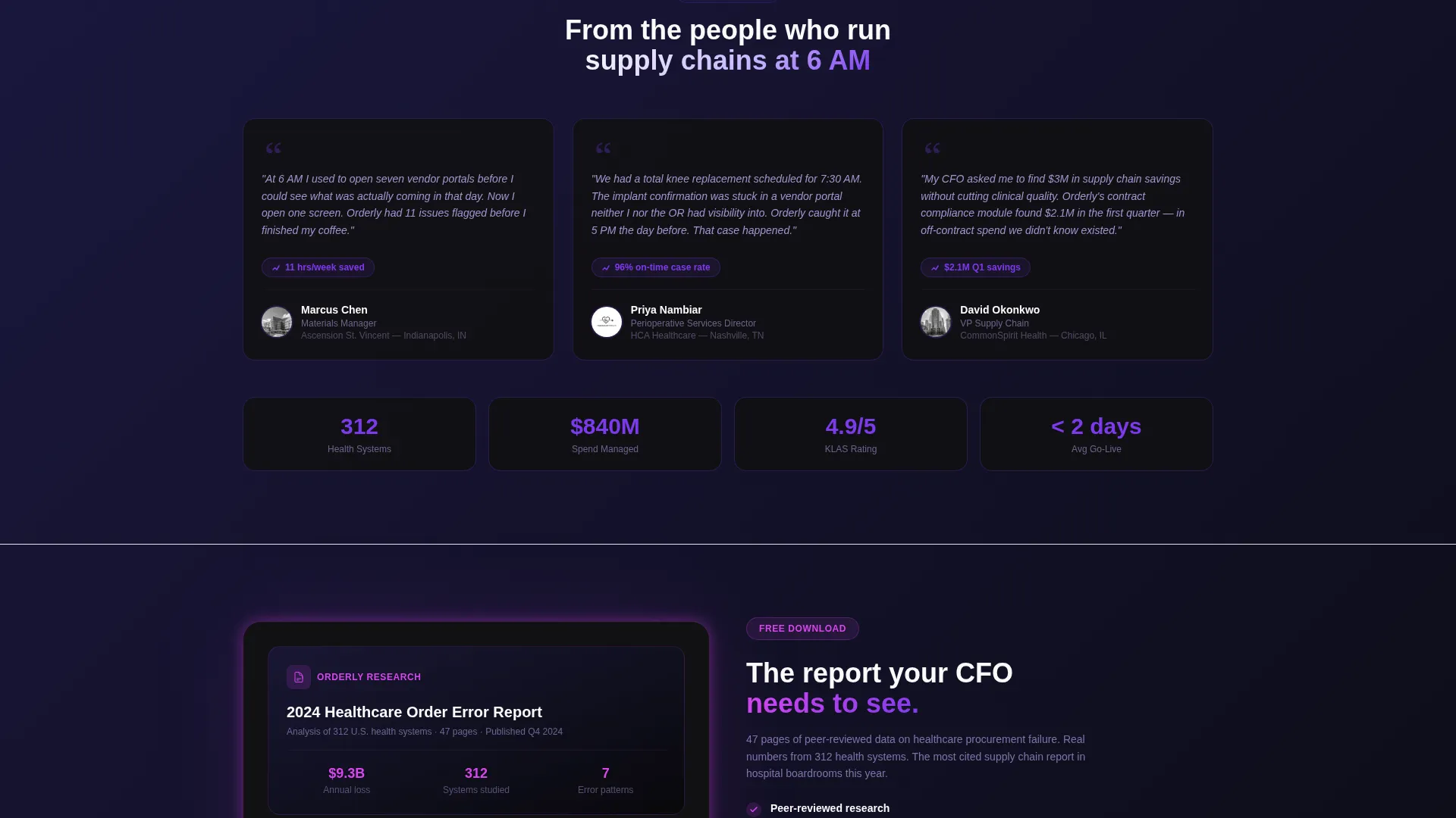
- A dual conversion path: a three-field free trial form and a gated PDF report download for mid-funnel leads
Feature list
This template is packed with purpose-driven components that reflect the complexity of the healthcare procurement audience.
Dimensional Dashboard Hero
The header fills two-thirds of the viewport with a pixel-perfect render of the order-tracking hub. It sits slightly rotated on a Z-axis for dimensional depth, making the product itself the visual centerpiece rather than any stock photograph.
Color-Coded Order Pipeline
Visible inside the hero dashboard, the order pipeline displays real-time status chips in four states: pending, approved, shipped, and exception. This immediately communicates platform capability to any visitor who manages order workflows daily.
Flipping Industry Stat Cards
Each modular stat card presents a single, sourced healthcare procurement statistic. On click, the card flips or expands to show how the platform solves that exact problem, complete with a micro-animation of the feature in action.
Dual Conversion Path
The primary call to action, "Start Your Free Command Center," appears inside the dashboard hero and repeats after every third card module. A secondary path offers a gated PDF download of the 2024 Order Error Report for visitors not yet ready to sign up.
Streamlined Trial Form
Clicking the primary call to action opens a focused three-field form: work email, hospital or health system name, and a role selector with five options. No credit card is required, reducing signup friction for risk-averse procurement buyers.
Recurring call to action Rhythm
The primary call-to-action button resurfaces after every third card module throughout the page. This pacing ensures conversion opportunities appear at natural decision points without feeling aggressive or disruptive.
Page sections overview
| Section | Purpose |
|---|---|
| Dashboard Hero | Showcase the order-tracking platform with dimensional depth and live-state user interface elements |
| Headline Block | Deliver the core value statement in bold white against a void black background |
| Stat Card Grid | Present industry procurement statistics that flip to reveal platform solutions |
| call to action Block One | First repeat of the free trial call to action after the opening card sequence |
| Stat Card Grid Two | Continue the industry report rhythm with additional pain-point and solution pairings |
| call to action Block Two | Second mid-page trial conversion prompt for engaged visitors |
| Gated Report Block | Offer the 2024 Order Error Report download as a mid-funnel lead capture path |
| Trial Signup Form | Three-field form for free command center registration with role selector |
| Footer Section | Close the page with supporting navigation and secondary links |
Design & branding system
The visual identity is built on a Void and Violet color system that channels dark, focused intelligence. Every color choice is deliberate, and every interactive state is mapped to a specific palette role.
- Core palette: absolute void black (#09090B) for backgrounds, deep space indigo (#1E1B4B) for depth layers, electric violet (#7C3AED) for buttons and hover states, and clinical white (#FAFAFA) for card surfaces
- Text lives in white and soft lavender (#C4B5FD), while hot orchid (#D946EF) accent pulses mark live data indicators and notification badges
- Cards float on the void background with violet-edged shadows, and every interactive element including toggles, buttons, and hover states fires in electric violet
Mobile & speed optimization
The card grid layout is designed to reflow cleanly across screen sizes. Mobile visitors get a vertical cascade that preserves the page's urgent, intelligence-briefing rhythm without losing any content.
- Modular card components stack into a single-column vertical cascade on smaller screens, giving mobile users the same data-shock-then-relief sequence
- The layout avoids heavy background images in favor of color-layered dark surfaces, keeping the visual weight manageable across devices
- The three-field trial form and gated report download remain fully accessible and usable at any viewport width
How this template helps you convert
Every structural decision in this template is aimed at reducing doubt and increasing action for a high-consideration healthcare software buyer.
- The dashboard hero leads with the product itself rather than abstract promises, giving procurement professionals immediate visual proof of platform capability before reading a single marketing claim.
- The industry report card rhythm builds cumulative authority by the time visitors reach the call to action, so the signup request feels earned rather than presumptuous.
- The dual conversion path catches both ready-to-trial visitors and research-phase buyers, ensuring no lead is lost to a single-option page.
Other information about this template
This template is well-suited for healthcare software products competing in the procurement and supply chain intelligence space. It is built on a Startup Velocity theme that pairs high-energy layout momentum with a restrained clinical palette.
- The creative direction follows an Industry Report format, making it credible for audiences who read analyst research and vendor assessments before making purchase decisions
- The template style is Card Grid (Modular), meaning individual stat and feature cards can be reordered, added, or removed to match the specific claims of any healthcare order management product
- The header concept is a Dashboard Preview, a proven approach for software landing pages where the product interface is the strongest differentiator
Theme
Startup Velocity
Creative direction
Industry Report
Color system
Void & Violet
Style
Card Grid (Modular)
Direction
Freemium/Trial
Page Sections
Dimensional Dashboard Hero
Color-coded Order Pipeline Display
Flipping Industry Stat Cards
Dual Conversion Path
Streamlined Three-field Signup Form
Recurring Call to Action Placement Rhythm
Related questions
Who is this template designed for?
Does the free trial path require a credit card?
Can I use this template without a gated PDF report ready?
What makes this different from a standard SaaS landing page template?
Can the stat card modules be reordered or customized?



