Orderly - Streamlined Kitchen Management Landing Page Template
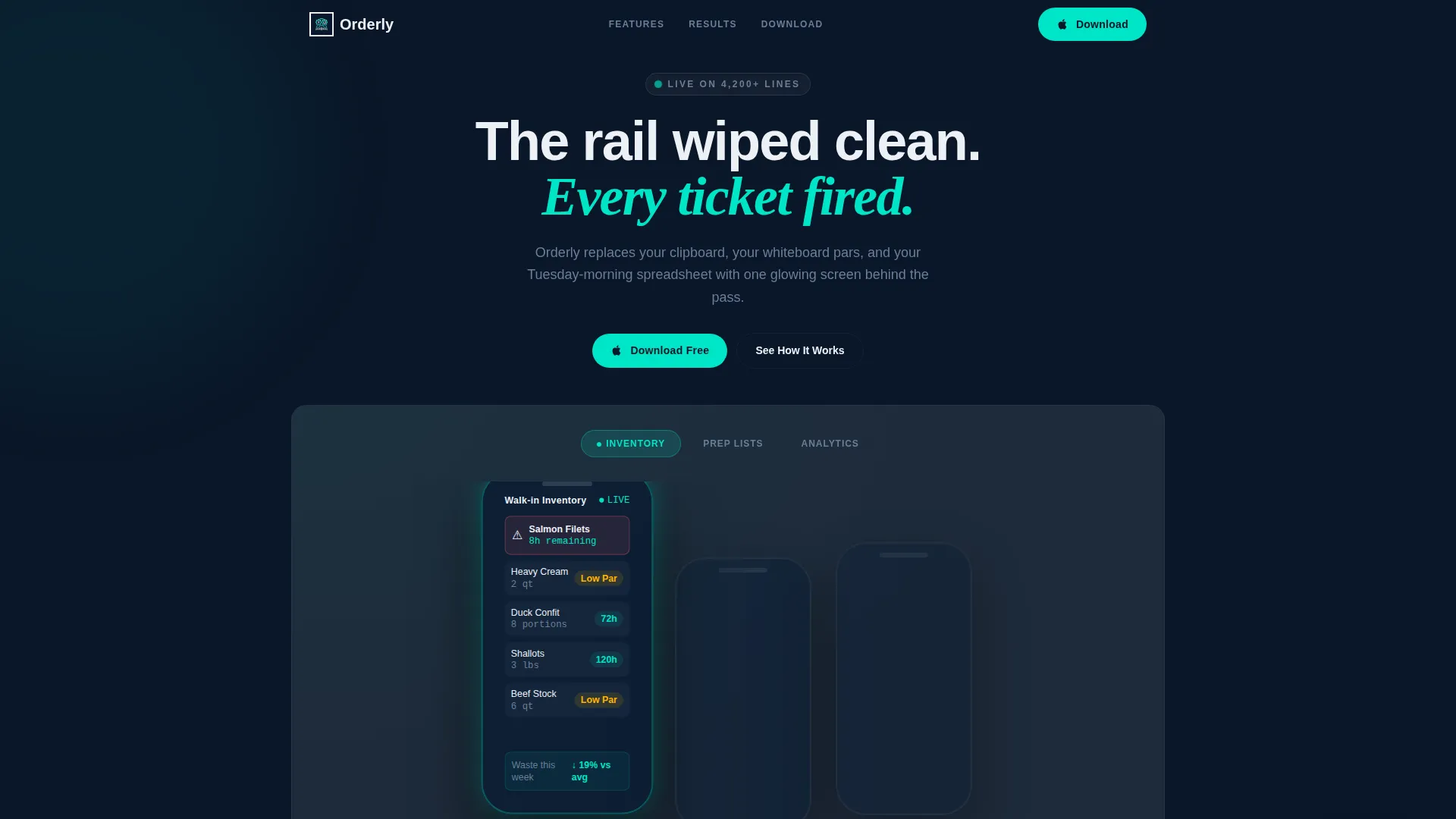
Orderly is a bento grid landing page template built for a food and beverage kitchen management mobile app. It features a Feature Tab Switcher header with three animated phone mockups, a Midnight Blue and electric teal color system, and dual app download calls to action. The template is designed to convert operators and chefs into app installs fast.
by Rocket studio
Quick summary
Orderly is a single-page bento grid landing page template for a kitchen management mobile app. It leads with a Feature Tab Switcher showing live-data phone mockups across three core modules. The Midnight Blue visual system and electric teal accents create an interface that feels precise and operational. Dual download calls to action and a sticky bar drive installs from first scroll.
Who this template is for
This template is built for teams launching a food and beverage mobile app that targets working kitchen professionals. It speaks the language of operators who measure success in cost percentages and fired tickets, not marketing buzzwords.
- Sous chefs and kitchen managers who need a landing page that speaks directly to prep-list and inventory pain
- Bar managers and multi-unit operators evaluating mobile tools to control costs and track spillage
- Product teams and founders in the food and beverage software space who want a high-density, conversion-focused single-page layout
What problem this template solves
Kitchen operators face a daily flood of disconnected information: expiring walk-in items, handwritten par counts, and cost-of-goods reports assembled too late to act on. A generic app landing page cannot earn their trust because it does not speak their reality.
- The template replaces vague app marketing with specific operational proof, showing real metrics like a 28.4% food cost split and a walk-in item expiring in 11 hours
- It removes the need to build a complex animated header from scratch, providing a ready-made Feature Tab Switcher with three interactive phone mockups
- It solves the conversion drop-off problem by front-loading real product data before the sticky download bar ever appears
What you get with this template
You get a fully structured bento grid landing page with every major section pre-built and ready to customize. The layout is dense with proof and light on filler, so visitors spend time evaluating the product rather than reading marketing copy.
- A Feature Tab Switcher header with three animated phone mockups covering Inventory, Prep Lists, and Analytics modules
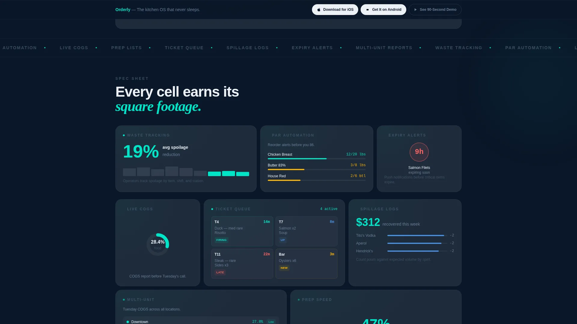
- A bento cell grid where each cell isolates a single capability with a metric, a micro-animation placeholder, and a one-line explanation
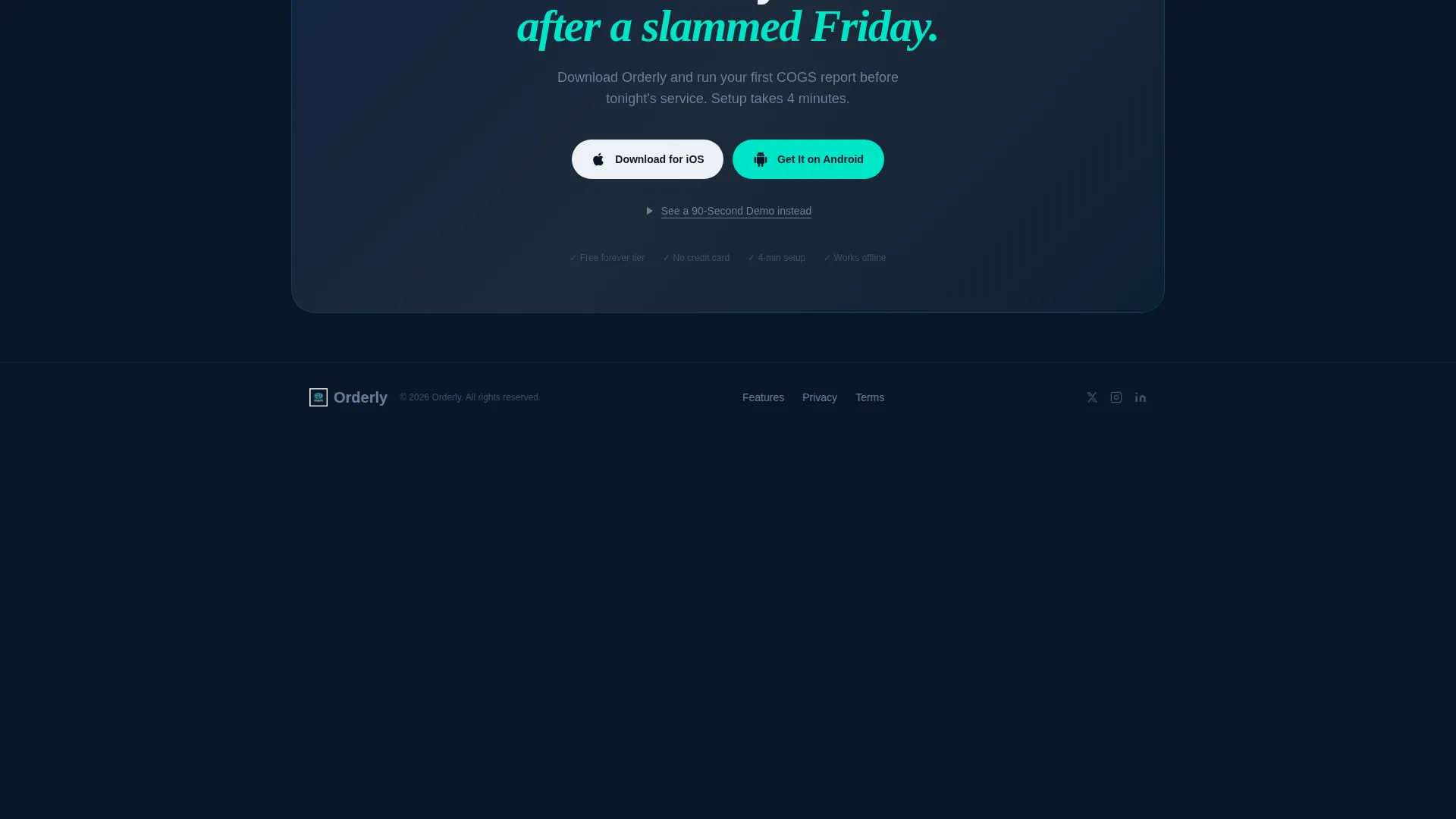
- A sticky download bar with dual platform calls to action and a soft video modal path for visitors not yet ready to install
Feature list
This template ships with six built-in design and interaction components drawn directly from the creative brief.
Animated Feature Tab Switcher
Three phone mockups sit inside a dark bento cell at the top of the page. Tapping any tab animates the phone screen to display module-specific data: a walk-in expiry countdown, a drag-to-complete prep list, or a COGS donut chart. The active tab glows electric teal while inactive tabs dim to graphite.
Bento Grid Layout
The page uses a spec-sheet-style bento grid below the header. Each cell earns its space by isolating one feature with a supporting metric. The grid lets the eye land anywhere and extract value without a forced reading sequence.
Sticky Download Bar
A slim sticky bar appears after the first scroll. It holds two platform-native download calls to action for iOS and Android, keeping the conversion action visible throughout the entire page experience.
Inline Video Modal Path
A third, softer call to action reads "See a 90-Second Demo" and opens an inline video modal. This gives undecided visitors a lower-commitment path before committing to an install.
Midnight Blue Color System
The template uses a four-color palette: deep terminal navy for the primary background, brushed graphite for card surfaces, electric teal for live-data accents and interactive states, and chalk white for typography. Every color choice reinforces a precise, data-forward brand feeling.
Metric-Driven Cell Copy
Each bento cell pairs a feature name with a concrete operational result. Examples built into the template include waste tracking with a 19% average spoilage reduction and par automation with reorder alerts framed around preventing stockouts.
Page sections overview
| Section | Purpose |
|---|---|
| Tab Switcher Header | Showcases three core app modules with animated phone mockups |
| Bento Feature Grid | Isolates individual capabilities with metrics and micro-animations |
| Sticky Download Bar | Pins iOS and Android calls to action after first scroll |
| Demo Video Modal | Provides a low-commitment preview path via inline video |
Design & branding system
The visual identity follows a Startup Velocity theme built entirely around the Midnight Blue color system. Every design decision reinforces the feeling of a chef's phone glowing on a stainless-steel counter at midnight: precise, awake, and running numbers.
- Core palette: deep terminal navy (#0A1628) background, brushed graphite (#1E2A3A) card surfaces, electric teal (#00E5C7) for accents and interactive states, chalk white (#EDF0F5) for all body and heading typography
- Teal is used like an order-fire indicator across the grid, sparking on active tabs, live-data labels, and hover states to create visual rhythm without lifestyle photography
- No photography is used anywhere; the product interface data on the phone mockups serves as the only hero visual
Mobile & speed optimization
The template is designed with a mobile-first operator audience in mind. The people this app targets check their numbers on a phone, often in a walk-in cooler or behind a pass at midnight.
- The bento grid is structured to reflow cleanly for smaller viewports, keeping each capability cell readable without horizontal scrolling
- The sticky download bar is designed to remain slim and unobtrusive on mobile screens, so it never blocks the content beneath it
- Phone mockup assets and micro-animation placeholders are scoped to lightweight interaction states rather than heavy video backgrounds, keeping the page feeling fast
How this template helps you convert
The template is built around a deliberate conversion sequence. Every layout decision is designed to reduce hesitation and move operators toward an install.
- The Feature Tab Switcher puts real operational data in front of the visitor within the first viewport, so they see the product solving a Tuesday-morning problem before any call to action appears.
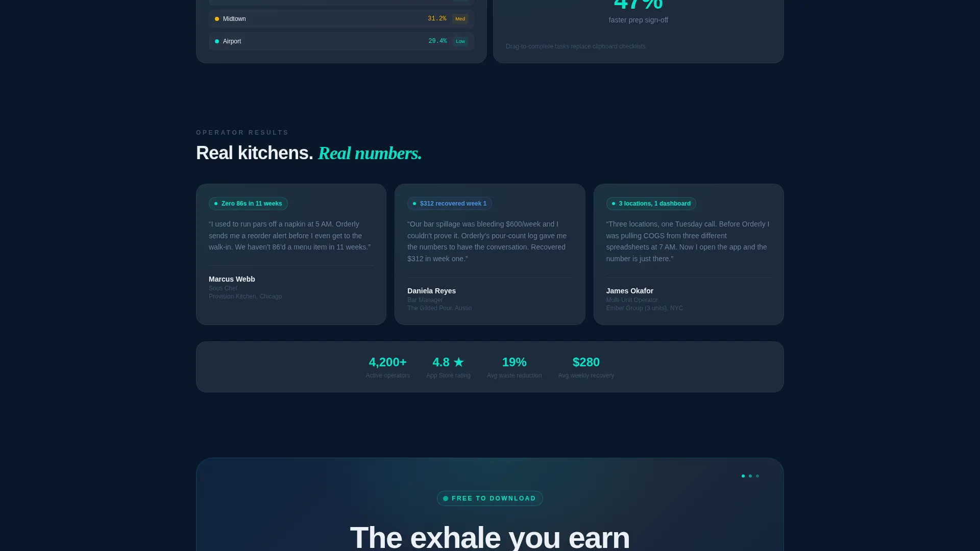
- The bento grid builds cumulative proof as the visitor scrolls, with each metric-backed cell adding to a picture of a capable, tested tool rather than a generic app.
- The sticky bar and video modal work together to capture both ready-to-install visitors and those who need one more confirmation, covering two distinct decision stages in a single layout.
Other information about this template
This section covers additional context about the template's production scope, intended platform pairing, and practical customization notes.
- The template is categorized under Technology, with a specific focus on Food and Beverage Software and SaaS, making it a strong fit for app product pages in the restaurant and hospitality sector
- The bento grid structure follows a Spec Sheet creative direction, meaning cells are modular and can be reordered or replaced without disrupting the overall visual hierarchy
- The header concept is a Feature Tab Switcher, which is a recognized conversion pattern for mobile app landing pages that need to demonstrate multiple modules without multiple pages
- Metric placeholder copy in the template, such as "reduced spoilage 19% avg." and the 28.4% COGS figure, is included as demo content and should be replaced with verified data from the actual product before launch
Theme
Startup Velocity
Creative direction
Spec Sheet
Color system
Midnight Blue
Style
Bento Grid
Direction
App Download
Page Sections
Animated Feature Tab Switcher Header
Metric-backed Bento Grid
Sticky App Download Bar
Inline Demo Video Modal
Midnight Blue Visual System
Modular Spec Sheet Cell Structure
Related questions
Can I change the metrics and module names in the tab switcher?
Does this template support both iOS and Android download links?
Is the video modal connected to a video hosting service?
Who is this landing page template best suited for?
Can the bento grid cells be reordered or removed?



