Defense Contractor & Military Complete Professional Website Template
Ordnance is a dashboard and data grid landing page template built for missile and munitions defense contractors. It uses side-by-side comparison tables, single-stat callout cards, and a structured dual-call to action flow to help procurement officers and program managers evaluate capability data with confidence. The Warm Stone color system and isometric technical header set a tone of measured authority.
by Rocket studio
Quick summary
Ordnance is a precision-built landing page template for defense contractors in the missile and munitions space. It leads with an isometric technical header illustration, then walks visitors through layered comparison grids and stat callout cards. The design earns trust before it asks for anything, placing the primary call to action only after the visitor has absorbed substantial capability evidence.
Who this template is for
This template is designed for organizations that sell, evaluate, or procure guided munitions and related defense systems. The intended audience operates in high-accountability environments where data credibility matters more than visual flair.
- Defense contractors presenting munition families to government procurement officers
- Program managers preparing capability submissions ahead of a downselect decision
- Allied military representatives assessing interoperability with NATO munition standards
What problem this template solves
Most commercial landing pages persuade through narrative. Defense procurement audiences do not respond to that approach. They need auditable, structured data they can compare, screenshot, and bring into a review meeting.
- Generic contractor pages lack the structured comparison format that procurement officers actually use
- Narrative-heavy layouts force technical readers to search for the specific parameters they need
- Weak or absent qualification gates collect low-quality leads from non-government contacts
What you get with this template
The template delivers a fully structured, single-page layout built around data density and quiet authority. Every section has a defined role, and nothing is included without purpose.
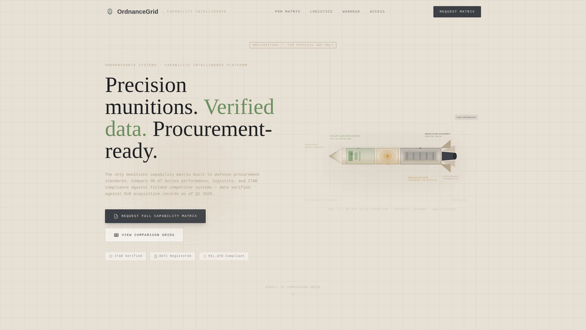
- An isometric cutaway header illustration with labeled subsystems and a graph-paper grid underlay
- Multiple side-by-side data comparison grids with per-row status icons covering dozens of parameters
- Two distinct conversion paths: a full capability matrix request form and a lower-commitment unclassified spec sheet PDF gate
Feature list
This template ships with a focused set of purpose-built components drawn directly from the design brief. Each one serves the procurement-audience use case.
Isometric Technical Header
The header features a multi-stage missile rendered in precise technical illustration style. The outer casing is partially transparent, revealing the guidance module, propulsion section, and payload in exploded layers. Subsystems are labeled with monospaced type and thin leader lines over a subtle graph-paper grid. The illustration communicates engineering complexity without motion or embellishment.
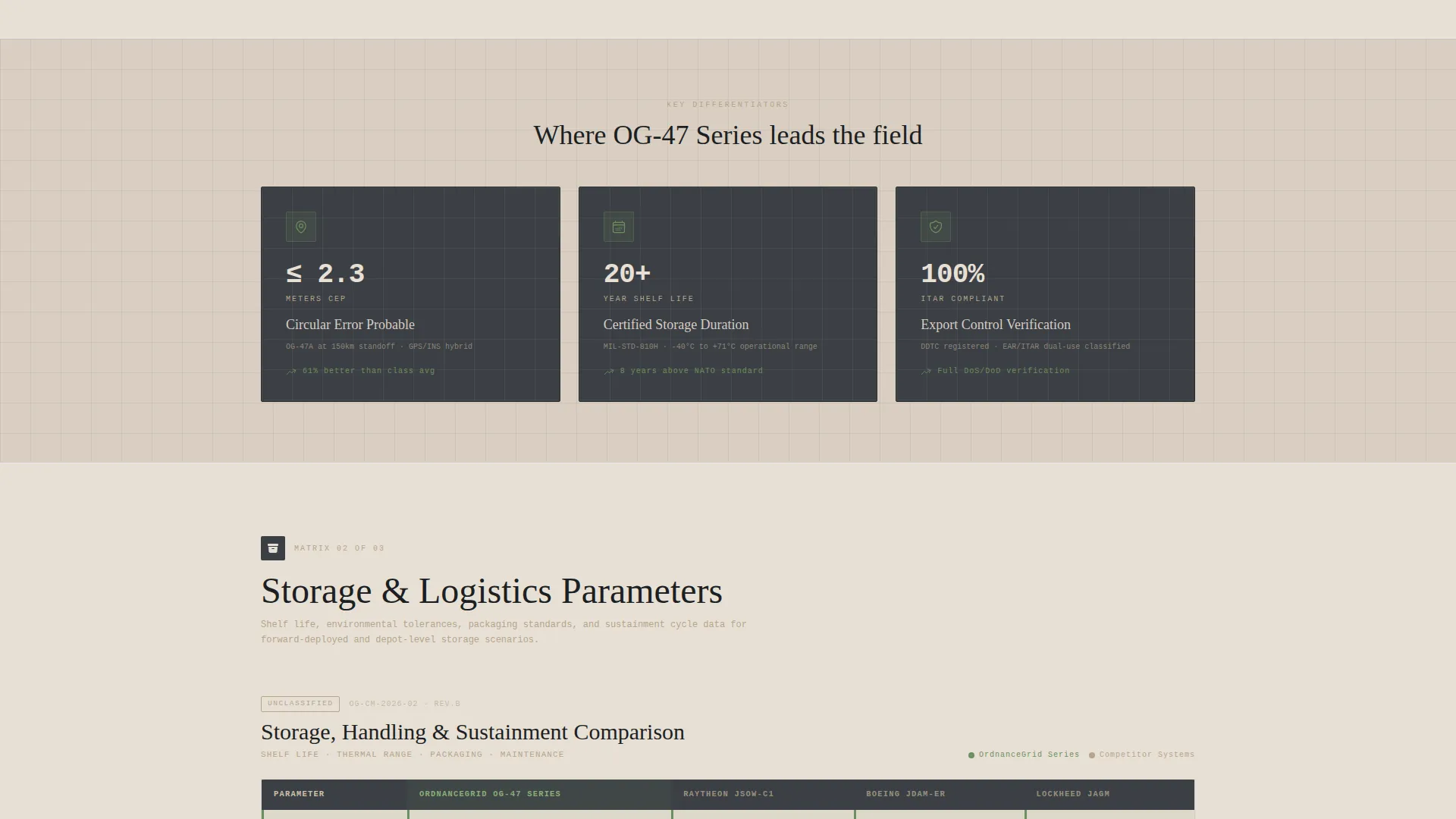
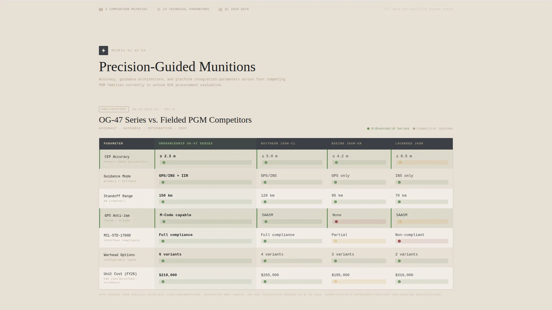
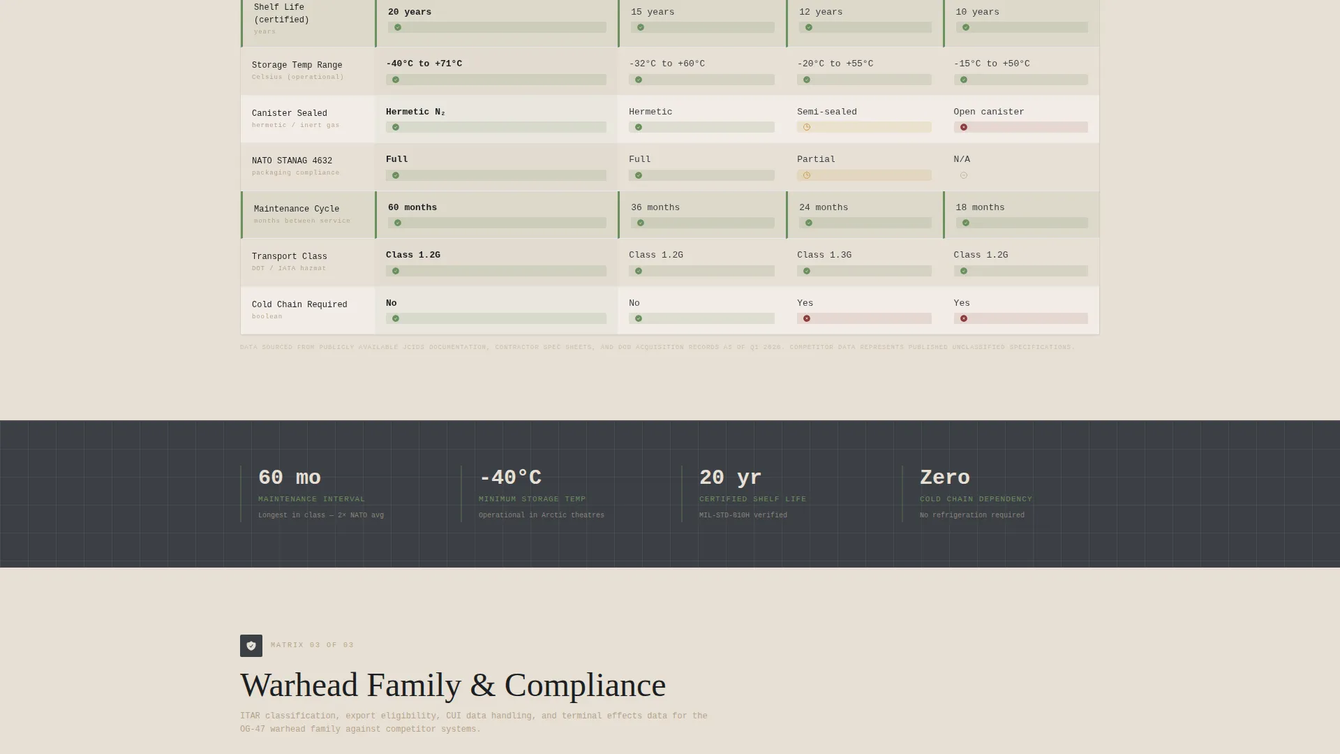
Multi-Column Comparison Data Grids
Three side-by-side data grids compare the contractor's munition family against two anonymized competitor columns. Parameters include circular error probable accuracy, shelf life, storage temperature range, ITAR (International Traffic in Arms Regulations) compliance status, and unit cost at volume. Each row carries a small status icon: a checkmark, a dash, or a caution triangle.
Single-Stat Callout Cards
Between each dense comparison grid, isolated callout cards highlight the contractor's strongest individual differentiators. An example from the brief: "14,200-hour mean time between failure." These cards give the reader a visual rest point and anchor key figures in memory.
Dual Conversion Path calls to action
The primary call to action, "Request Full Capability Matrix," appears after the third comparison grid. It collects organizational affiliation, program name or RFP number, and required classification level (Unclassified, CUI, or Secret). A secondary path, "Download Unclassified Spec Sheet," requires only government email verification, lowering the barrier for early-stage evaluators.
Warm Stone Color System
The palette uses limestone white, sandstone mid-tone, and gunmetal charcoal as the three structural colors. Verification green is reserved exclusively for compliance checkmark states and pass indicators. No color is used decoratively; every hue carries a specific functional meaning.
Checklist and Audit Scroll Cadence
The page is structured so that scrolling reveals evidence progressively. Comparison grids alternate with callout cards in a deliberate rhythm. The layout does not rely on persuasive language. It relies on the completeness and specificity of the data itself.
Page sections overview
| Section | Purpose |
|---|---|
| Isometric Header | Establish technical authority with labeled missile cutaway illustration |
| First Comparison Grid | Present parameter-level munition data against two competitor columns |
| Callout Card Block | Isolate a key differentiator stat for visual emphasis and retention |
| Second Comparison Grid | Continue parameter comparison with additional specification rows |
| Second Callout Card | Highlight another top-line performance or compliance figure |
| Third Comparison Grid | Complete the data evidence set before the primary conversion point |
| Capability Matrix Form | Collect qualified lead data including classification level requirement |
| Spec Sheet Gate | Offer a lower-commitment PDF download for government email holders |
Design & branding system
The visual identity follows a Corporate Precision theme. Every design decision reinforces the impression of a classified briefing room built for long-duration, high-stakes reading.
- Color palette: limestone white (#E8E0D5), sandstone mid-tone (#B5A48B), gunmetal charcoal (#3B3F45), and verification green (#6B8F5E) used only for pass states
- Typography uses monospaced type for labels and leader lines inside the header illustration, reinforcing a measurement and accountability aesthetic
- No decorative motion, gradients, or commercial visual language anywhere in the layout
Mobile & speed optimization
The template is structured to remain readable and functional across device sizes. Data-dense layouts require deliberate handling on smaller screens.
- Comparison grids are built for horizontal scroll on mobile so column relationships remain intact
- Callout cards restack vertically on smaller viewports without breaking the visual rhythm
- The header illustration scales proportionally so label legibility is preserved at reduced sizes
How this template helps you convert
The conversion strategy is built on earned trust. The page does not ask for information before it has demonstrated value.
- Progressive data exposure builds credibility across three comparison grids before the primary call to action appears, so the visitor already understands the depth of what is being offered.
- The dual-path call to action structure matches two distinct buyer readiness levels: qualified procurement contacts submit the full matrix request form, while early-stage evaluators use the lighter spec sheet gate requiring only government email verification.
Other information about this template
This template sits at the intersection of the Aerospace and Defense category, the Defense Contractor and Military subcategory, and the Missile and Munitions niche. It is one of the higher-specificity templates available for this vertical.
- The template style is Dashboard and Data Grid, matched to the Comparison and Versus landing page direction
- The Checklist and Audit creative direction means the layout is optimized for readers who evaluate evidence rather than respond to persuasion
- The Intersection Match Score for this template is 13, indicating strong alignment across category, subcategory, and niche signals
- This template can support contractor presentations for programs involving guided munitions, propulsion systems, and multi-stage missile families
Theme
Corporate Precision
Creative direction
Checklist & Audit
Color system
Warm Stone
Style
Dashboard/Data Grid
Direction
Comparison/Versus
Page Sections
Isometric Missile Cutaway Header
Three-column Comparison Data Grids
Single-stat Callout Cards
Dual Conversion Path Ctas
Verification Green Compliance Indicators
Checklist and Audit Scroll Structure
Related questions
Who is the intended audience for this template?
Can I customize the comparison grid parameters?
What does the dual conversion path mean in practice?
Is the header illustration included with the template?
What classification levels does the request form support?


