Nonprofit Team Landing Page Template
Orgcommand is a hub-and-spoke nonprofit team landing page built around a Data Command visual theme. It puts an interactive team explorer front and center, letting visitors filter by department, region, or program area and explore a live force-directed graph. Every section flows toward a clear app download call to action, making organizational depth feel immediate and trustworthy.
by Rocket studio
Quick summary
Orgcommand is a single-page nonprofit team directory built as a hub-and-spoke layout with persistent anchor navigation. It opens with a scrolling logo bar of partner and funder badges, then leads visitors into an interactive team explorer before walking them spoke by spoke through Leadership, Field Teams, Board, and Volunteers. The page closes with a focused app download call to action.
Who this template is for
This template is designed for nonprofit organizations that need to communicate team scale, geographic reach, and operational depth to high-stakes visitors. It works especially well for organizations with staff across multiple regions or countries.
- Executive directors who want to benchmark their organization against peers and present their team credibly
- Foundation program officers vetting grantee capacity before making significant funding decisions
- Volunteer coordinators who need a clear view of roles and reporting lines before they begin
What problem this template solves
Many nonprofit team pages fail at the exact moment that matters most. A funder or partner arrives looking for evidence of organizational capacity and finds a static grid of headshots with no context, no structure, and no depth.
- Visitors cannot quickly understand who leads what, where teams operate, or how large the organization really is
- There is no interactive layer to help a researcher or program officer explore the org chart at their own pace
- Generic pages offer no clear next step, leaving high-intent visitors with no way to stay connected
What you get with this template
This template delivers a complete, ready-to-customize nonprofit team landing page built around a Data Command design theme. Every section is pre-structured, so you fill in your people and publish.
- A scrolling logo bar header that immediately signals institutional legitimacy to first-time visitors
- A force-directed interactive team explorer with department, region, and program-area filters
- Hub-and-spoke anchor navigation covering Leadership, Field Teams, Board, and Volunteers sections
- A sticky app download call-to-action bar plus a full-width closing section with App Store, Google Play, and email fallback
Feature list
This template ships with purpose-built components designed for nonprofit team communication.
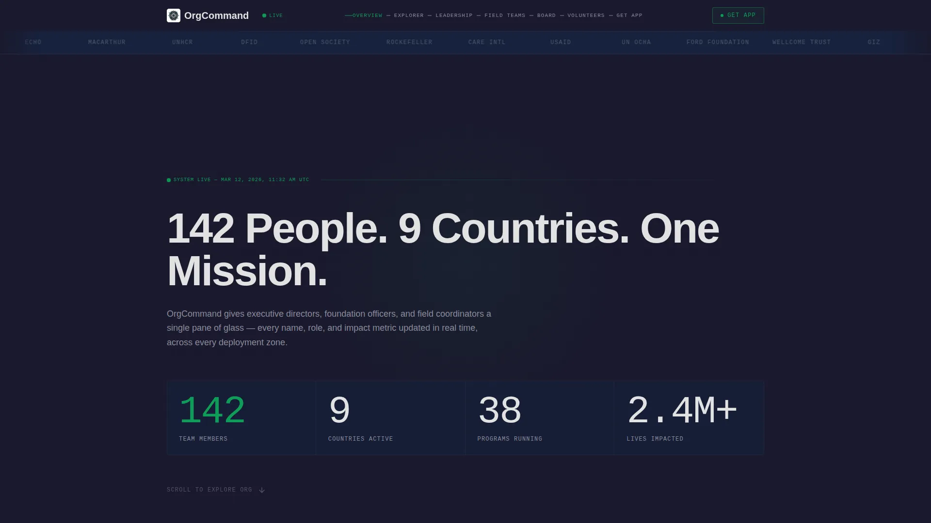
Scrolling Partner Logo Bar
A horizontal strip of partner logos, funder seals, and accreditation badges scrolls at a deliberate pace against the carbon-black header. It establishes institutional credibility within the first two seconds of arrival, before a visitor reads a single word of body copy.
Animated Headline Counter
A single sans-serif headline assembles letter by letter: "142 People. 9 Countries. One Mission." No hero image competes with this statement. The numbers themselves serve as the visual anchor for the entire page.
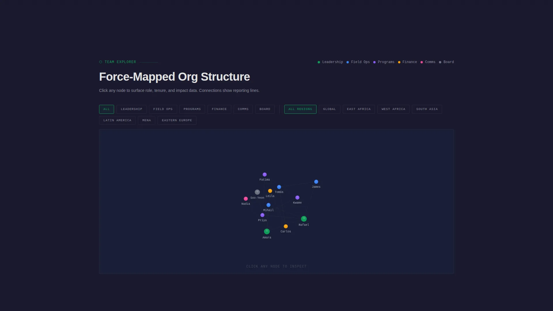
Interactive Force-Directed Team Explorer
Visitors can filter the org chart by department, region, or program area. The force-directed graph redraws connections in real time. Clicking any node opens a compact card showing role, tenure, and a single sentence of impact data.
Hub-and-Spoke Anchor Navigation
A persistent navigation rail keeps all four spokes visible as the visitor scrolls. Each spoke, Leadership, Field Teams, Board, and Volunteers, is a self-contained section that reveals deeper organizational detail the further down the visitor reads.
Sticky App Download Call to Action
After the team explorer interaction, a sticky bottom bar appears with the "Get the Team Directory App" prompt. It persists through the rest of the scroll and reappears as a full-width closing section with App Store and Google Play buttons alongside a phone mockup.
Email Fallback Download Link
A single-field email input sits alongside the app download buttons. Desktop visitors can enter their email to receive a direct download link, reducing friction to a single keystroke and capturing intent without requiring an immediate app install.
Page sections overview
| Section | Purpose |
|---|---|
| Partner Logo Bar | Establishes credibility with funder and partner badges |
| Animated Stat Headline | Anchors page identity with key org numbers |
| Team Explorer Tool | Interactive force-graph for filtering and exploring the org chart |
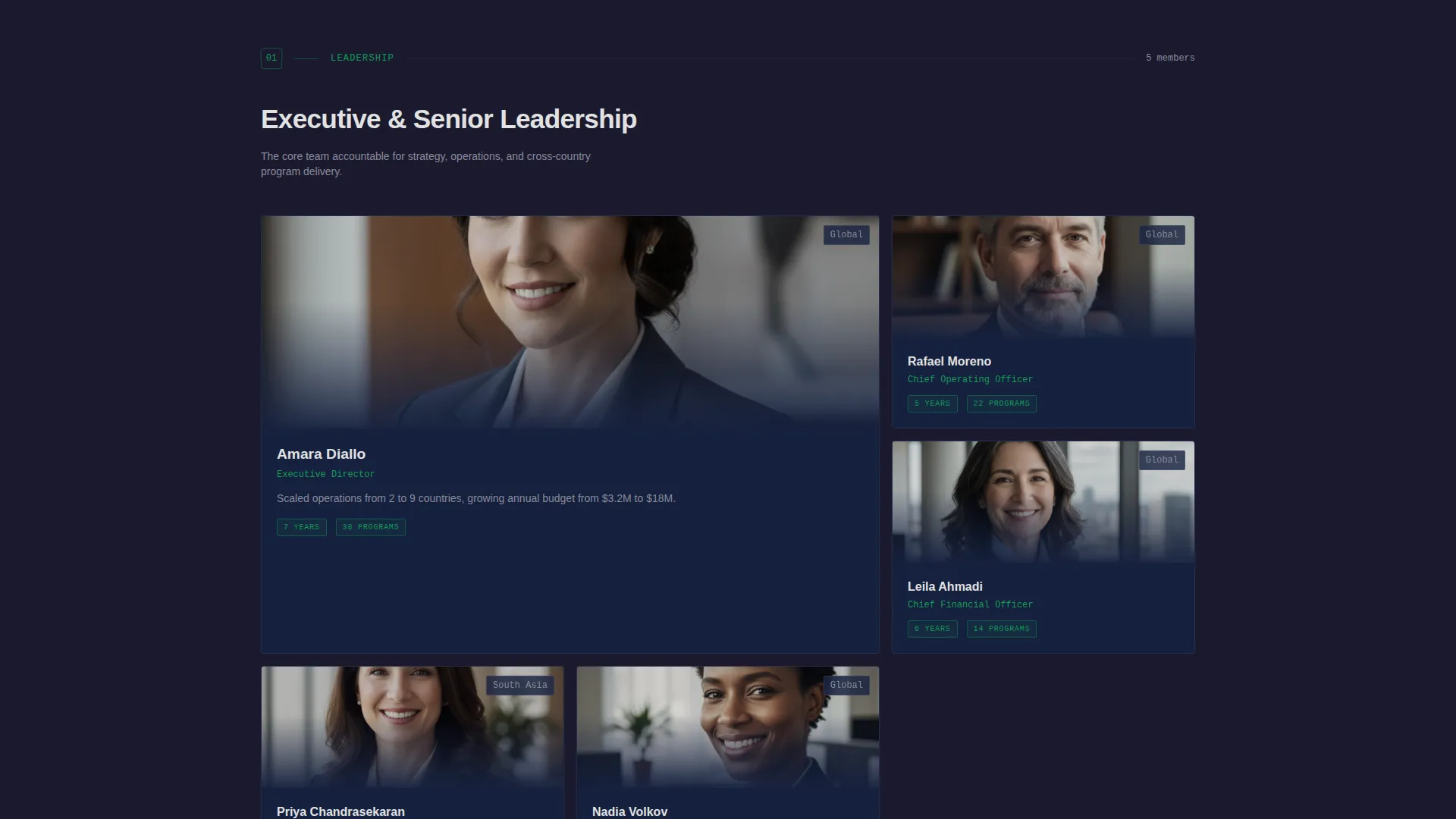
| Leadership Spoke | Profiles senior leadership with role and tenure detail |
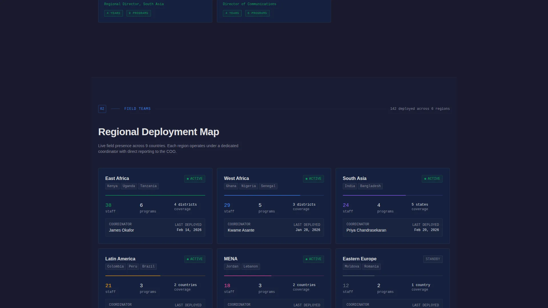
| Field Teams Spoke | Shows regional and program-area staff with geographic context |
| Board Spoke | Presents governance structure and board member profiles |
| Volunteers Spoke | Maps volunteer contributors and their areas of work |
| App Download Bar | Sticky call-to-action bar that appears after tool interaction |
| Closing Download Section | Full-width section with app store buttons, mockup, and email input |
Design & branding system
The visual identity follows a Data Command theme built on a Carbon Fiber color system. Every design decision reinforces the feeling of a live operations console, with dark matte surfaces that push data forward rather than compete with it.
- Core palette: deep carbon black (#1A1A2E) and gunmetal chassis (#16213E) for backgrounds; tactical silver (#E2E2E2) for typography and divider lines; signal green (#0F9D58) pulsing on interactive elements and live-status indicators
- Typography uses crisp mono-spaced type to reinforce the data-first visual language throughout the page
- Interactive elements and status indicators glow in signal green, creating clear visual hierarchy between passive content and actionable components
Mobile & speed optimization
The template is structured so that the interactive team explorer and anchor navigation remain usable on smaller screens. The hub-and-spoke layout collapses cleanly, keeping section order and call-to-action placement intact across devices.
- The persistent anchor nav rail adapts to mobile viewports so spoke sections remain directly accessible without excessive scrolling
- The app download call to action, including both store buttons and the email input field, stacks cleanly on narrow screens for easy tap interaction
How this template helps you convert
Every structural decision in this template is designed to move a skeptical, research-oriented visitor toward a single confident action: downloading the team directory app.
- The interactive team explorer creates hands-on engagement early, so by the time the app download prompt appears, the visitor has already experienced the core value of the product in the browser
- The sticky call-to-action bar after the tool interaction catches visitors at peak engagement without interrupting the browse experience, while the full-width closing section gives a second, unhurried opportunity to convert
- The single-field email fallback removes the last remaining friction point for desktop visitors who are not ready to go directly to an app store
Other information about this template
This template is categorized under Technology and is specifically designed for the nonprofit organization team page niche. It is built as a hub-and-spoke anchor navigation landing page, making it well suited for organizations that want to present complex team structures in a single, scannable page format.
- The template style is Hub and Spoke with Anchor Navigation, meaning each major spoke section is independently accessible from the persistent nav rail at any point during the scroll
- The creative direction is Calculator and Tool First, prioritizing the interactive team explorer above bios and headshot grids so that high-intent visitors engage with data before they read narrative copy
- The header concept is a Logo Bar, chosen specifically to front-load institutional trust signals for the funder and program-officer audience most likely to evaluate organizational credibility
- The landing-page direction targets App Download as the primary conversion goal, with the phone mockup reinforcing continuity between the in-browser experience and the downloadable product
Theme
Data Command
Creative direction
Calculator/Tool First
Color system
Carbon Fiber
Style
Hub & Spoke (Anchor Nav)
Direction
App Download
Page Sections
Scrolling Partner Logo Bar
Animated Stat Headline
Interactive Force-directed Team Explorer
Hub-and-spoke Anchor Navigation
Sticky App Download Call to Action
Email Fallback Download Link
Related questions
Can I update the team data shown in the interactive explorer?
Does this template work for a smaller nonprofit with a modest team size?
Can I replace the app download call to action with a different conversion goal?
How long does it take to customize and publish this template?
Is the interactive team explorer usable on mobile devices?



