Outreach - Powerful Seniorcare Landing Page Template
Outreach is a senior care marketing automation landing page template built for regional operators and marketing directors. It presents a unified dashboard view of every lead source, campaign, and community in one organized screen. The modular card grid layout, monochrome steel palette, and freemium signup flow make it ready to deploy for senior living admissions teams.
by Rocket studio
Quick summary
Outreach is a single-page template designed for senior living marketing platforms. It opens with a realistic dashboard preview, moves through a structured feature matrix of marketing and lead management capabilities, and closes with a freemium signup form. The design is calm, chrome-toned, and built for admissions directors who need clarity, not clutter.
Who this template is for
This template is built for the people who manage occupancy numbers across multiple senior living communities. It speaks directly to operators who balance move-in quotas, ad budgets, and referral pipelines every week.
- Regional operators managing eight to forty senior living communities
- Marketing directors juggling move-in quotas with shrinking ad spend
- Ownership groups who want occupancy numbers without chasing five people for answers
What problem this template solves
Senior care marketing teams often work across disconnected tools. Lead data sits in one place, campaign spend in another, and referral activity somewhere else entirely. This template frames the platform as the answer to that fragmentation.
- Admissions directors cannot tell at a glance which leads are warm and which campaigns are wasting budget
- Regional operators lack a single view that connects Google Business profiles, referral tracking, and family inquiry follow-ups
- Ownership groups have no reliable way to check occupancy trends on demand without manual reporting calls
What you get with this template
This is a fully structured, modular card grid landing page ready to present a senior care marketing automation platform. Every section is purpose-built and visually coherent out of the box.
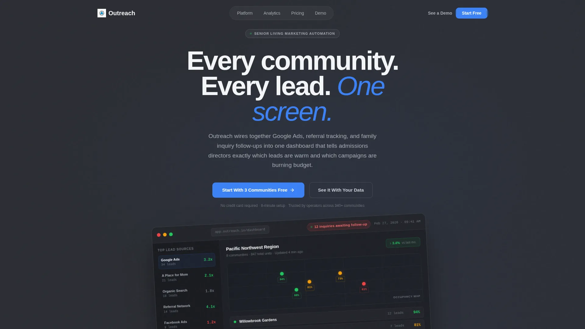
- A header section with a tilted dashboard screenshot, headline, and primary call-to-action
- A scrollable feature matrix using rows of capability-category cards with icons, labels, and interface screenshots
- A freemium signup form collecting work email, community count, and role, plus a secondary demo booking path
Feature list
This template ships with purpose-built sections that guide a visitor from first impression to signup. Each component is grounded in the platform brief and designed to earn the conversion.
Dashboard Preview Header
The header opens with a pixel-accurate platform screenshot at a shallow 3-degree tilt on a charcoal background. The image shows a regional map with community pins color-coded by occupancy rate, a lead source sidebar, and a live notification badge. A single headline sits above it: "Every community. Every lead. One screen."
Modular Feature Card Grid
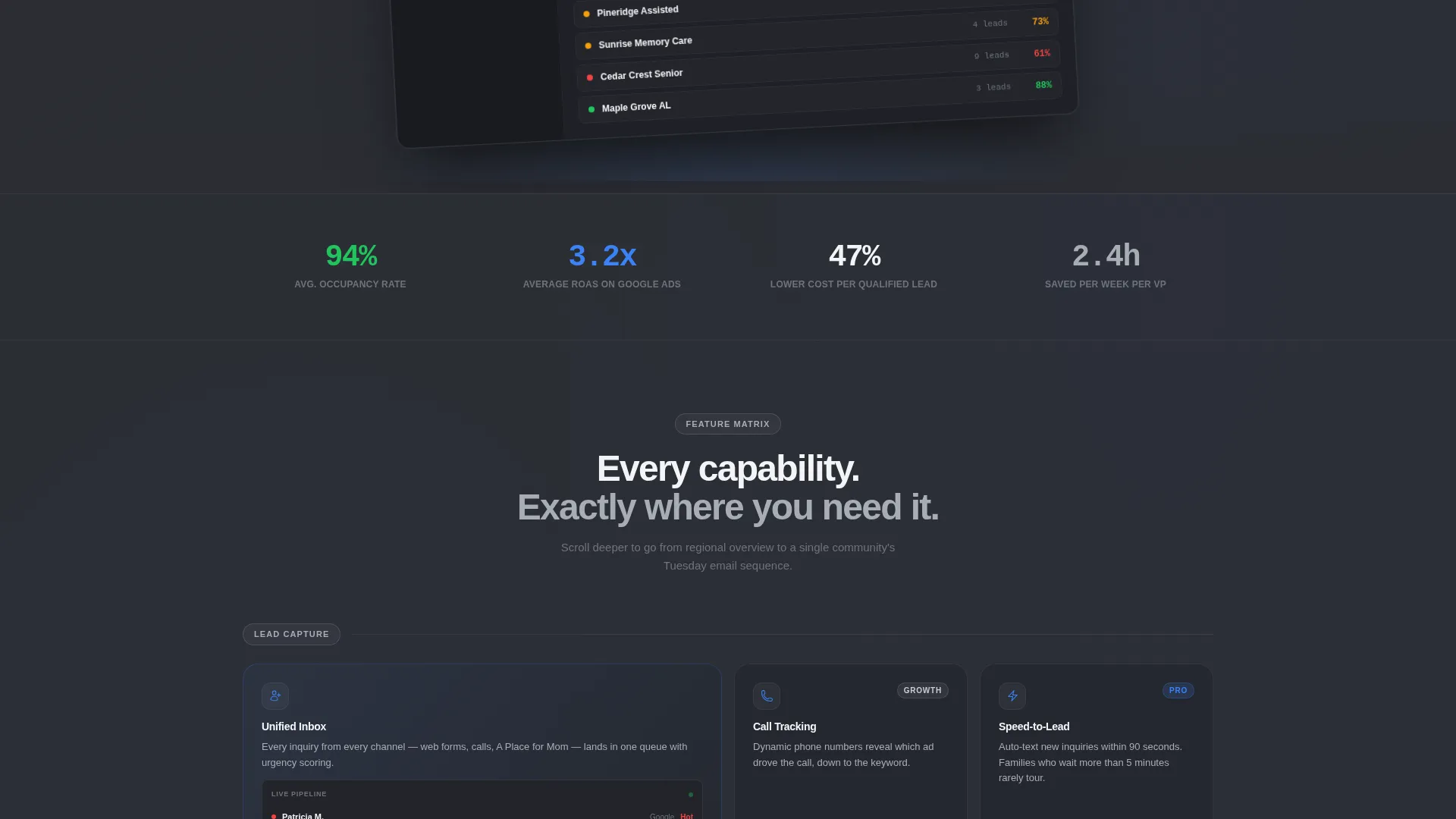
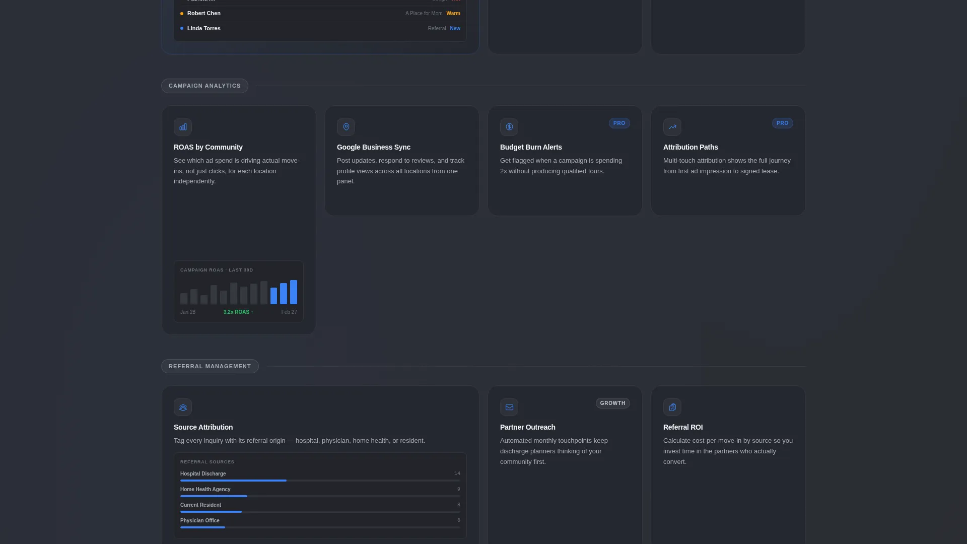
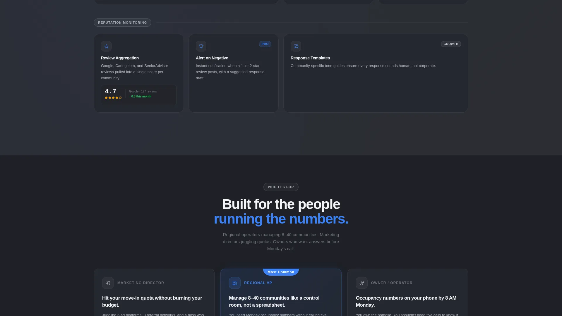
The feature matrix organizes platform capabilities into rows by category: Lead Capture, Campaign Analytics, Referral Management, and Reputation Monitoring. Each card holds an icon, a three-word label, and one explanatory sentence. Real interface screenshots inside each card let visitors feel familiar with the product before they sign up.
Tiered Plan Badges
Select feature cards carry "Pro" or "Growth" comparison badges. These quietly surface the upgrade path as visitors browse without interrupting the discovery flow or adding a dedicated pricing section.
Freemium Signup Form
The primary conversion form asks for work email first, then number of communities managed via a dropdown (1 to 5, 6 to 20, 21 to 50, 50 and above), then role via a second dropdown. The form is placed directly beneath the dashboard header for immediate action.
Demo Booking Path
A secondary call-to-action reads "See It With Your Data" and links to a guided demo booking flow with a calendar embed. This serves visitors who want a personalized walkthrough before committing to a free trial.
Persistent Mobile Call-to-Action Bar
On mobile, the primary call-to-action "Start With 3 Communities Free" appears as a persistent bottom bar. Visitors always have a clear next step regardless of how far they have scrolled.
Page sections overview
| Section | Purpose |
|---|---|
| Dashboard Preview Header | Anchors trust with a realistic platform screenshot and primary headline |
| Primary call to action Block | Places the freemium signup form immediately below the header |
| Lead Capture Row | Introduces lead collection features via scannable icon cards |
| Campaign Analytics Row | Shows campaign performance and budget monitoring capabilities |
| Referral Management Row | Covers referral source tracking and pipeline visibility features |
| Reputation Monitoring Row | Highlights Google Business profile and review management features |
| Demo Booking Section | Offers a secondary path to a guided, personalized demo |
| Persistent Mobile Bar | Keeps the freemium call to action accessible on mobile throughout the scroll |
Design & branding system
The visual identity follows a Directory and Discovery theme using a Monochrome Steel color system. Every design decision serves legibility and calm authority, not decoration.
- Foundational charcoal (#2B2D33) for primary surfaces, brushed aluminum (#A8ADB5) for secondary text and dividers, and cold white (#F4F5F7) for card backgrounds
- Signal blue (#3B82F6) reserved exclusively for interactive elements and live data points, keeping the palette surgical and purposeful
- The aesthetic resembles a control room: organized, nothing blinking red, every surface reflecting just enough contrast to read clearly at a glance
Mobile & speed optimization
The template is structured to function cleanly on mobile without requiring redesign. The modular card grid adapts naturally to narrower screens, and the persistent bottom bar keeps the primary action always within reach.
- Card rows reflow vertically on small screens so the feature discovery experience stays intact
- The persistent bottom call to action bar replaces the scroll-back experience on mobile, reducing friction at the moment of decision
- Real interface screenshots are sized and placed to remain legible on both desktop and mobile viewports
How this template helps you convert
Every section of this template is sequenced to build confidence and reduce hesitation before asking for a commitment.
- The dashboard header shows realistic, detailed platform data so visitors can picture themselves using the product within the first few seconds of the page.
- The card grid gives visitors a structured, low-pressure way to evaluate specific features at their own pace, with plan badges gently introducing upgrade context.
- The dual conversion path, a quick freemium form and a demo booking option, matches two distinct buyer mindsets: those ready to start and those who need one more look.
Other information about this template
This template is built within the Technology category, specifically targeting the Senior Care Software and SaaS subcategory. It is designed for the senior care marketing automation niche and carries an Intersection Match Score of 13, reflecting strong alignment between the template style and the niche use case.
- The template style is Card Grid (Modular), paired with a Feature Matrix creative direction for structured, scannable discovery
- The header concept is Dashboard Preview, and the landing page direction is Freemium and Trial conversion
- The theme is Directory and Discovery, reinforcing the control-room metaphor where every data point has a designated place
Theme
Directory & Discovery
Creative direction
Feature Matrix
Color system
Monochrome Steel
Style
Card Grid (Modular)
Direction
Freemium/Trial
Page Sections
Dashboard Preview Header with Live Data
Modular Feature Card Grid
In-card Interface Screenshots
Tiered Plan Comparison Badges
Two-path Conversion System
Persistent Mobile Call to Action Bar
Related questions
Who is this template designed for?
What conversion paths does this template include?
Can I use this template if I manage fewer than eight communities?
What do the Pro and Growth badges on the feature cards do?
Does the template include real data in the dashboard screenshot?



