Opera Management Software Comparison Landing Page
Overture is a single-page comparison landing page template built for opera management software. It opens with an interactive production cost calculator, then walks visitors through a visually escalating set of comparison tables that contrast fragmented tool stacks against a unified dashboard. The Dashboard Pro theme and Teal Catalyst color system give every section the focused intensity of a darkened tech booth.
by Rocket studio
Quick summary
Overture is a comparison-style landing page template designed for opera management software. It leads with a live production cost calculator, builds tension through escalating side-by-side tables, and closes every section with a clear call to action. The Teal Catalyst color system and Dashboard Pro theme make the layout feel precise, purposeful, and impossible to skim past.
Who this template is for
This template is built for opera management software teams who need to convert informed buyers quickly. The target visitor already knows their current tools are failing them. They need proof, not persuasion.
- General managers running multiple concurrent productions who need one coordinated view
- Stage managers currently tracking blocking changes across color-coded spreadsheets
- Artistic directors who need instant budget visibility before committing to a second cast
What problem this template solves
Opera production teams operate across too many disconnected tools. Scheduling lives in one place, budgets in another, and artist correspondence somewhere else entirely. That fragmentation creates costly errors and exhausting coordination overhead.
- No single view connects casting calls, rehearsal schedules, orchestra assignments, and surtitle cues
- Comparison shopping is hard when your current tool stack feels familiar but its true cost is invisible
- Visitors leave competitor pages unconvinced because no one shows them the real operational gap
What you get with this template
You get a complete, section-led landing page ready to represent an opera management platform. Every component is purpose-built for the comparison conversion path, from the opening calculator to the final call-to-action anchor.
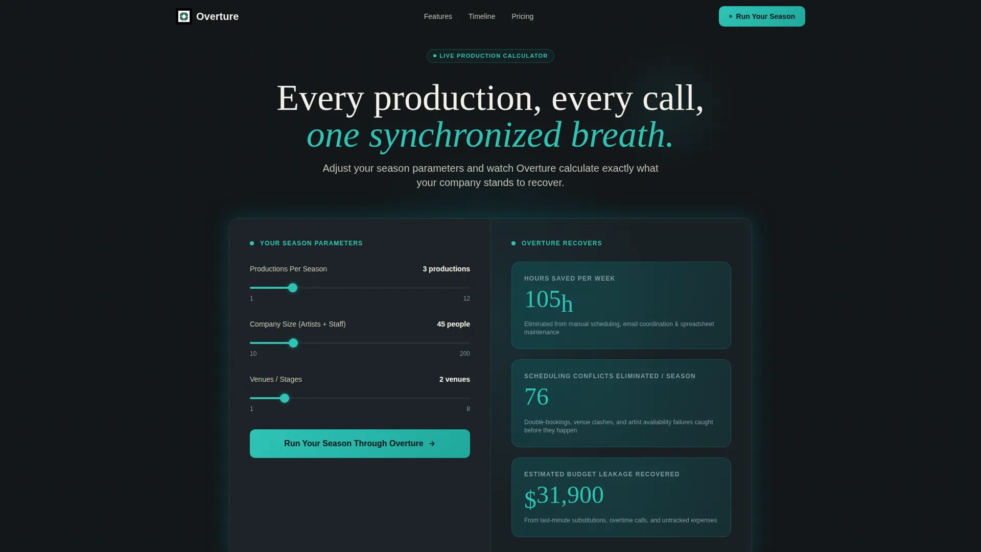
- An interactive production cost calculator in the header that renders hours saved, scheduling conflicts eliminated, and budget leakage recovered in real time
- A sequence of animated comparison tables contrasting spreadsheet-based tool stacks against a unified opera dashboard
- A live production timeline animation, a gated secondary download path, and a sticky call-to-action bar that persists after the first table
Feature list
The Overture template includes the following built-in components and design capabilities.
Interactive Production Cost Calculator
The header section is a fully functional estimator. Visitors input their number of productions per season, company size, and venue count. The dashboard instantly animates to show hours saved per week, projected scheduling conflicts eliminated, and estimated budget leakage recovered. Numbers roll like a digital call board, proving value before any body copy is read.
Escalating Comparison Table Sequence
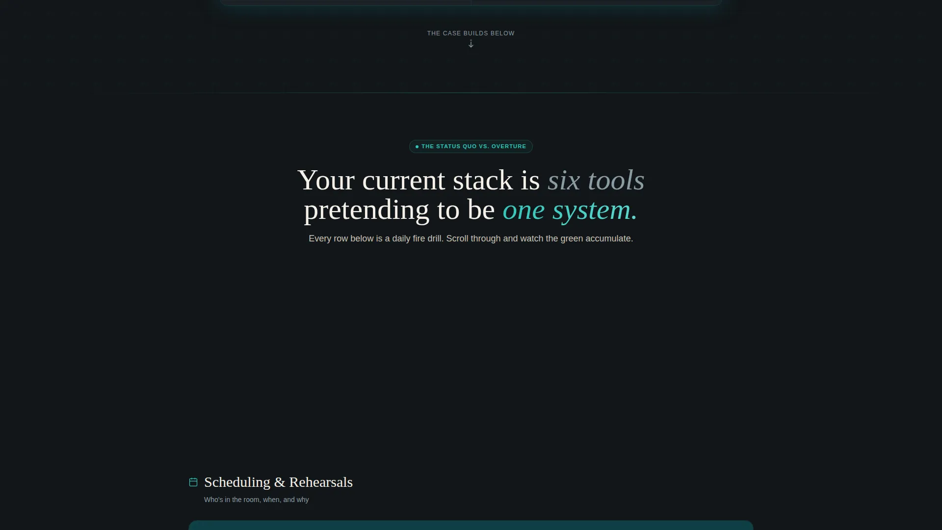
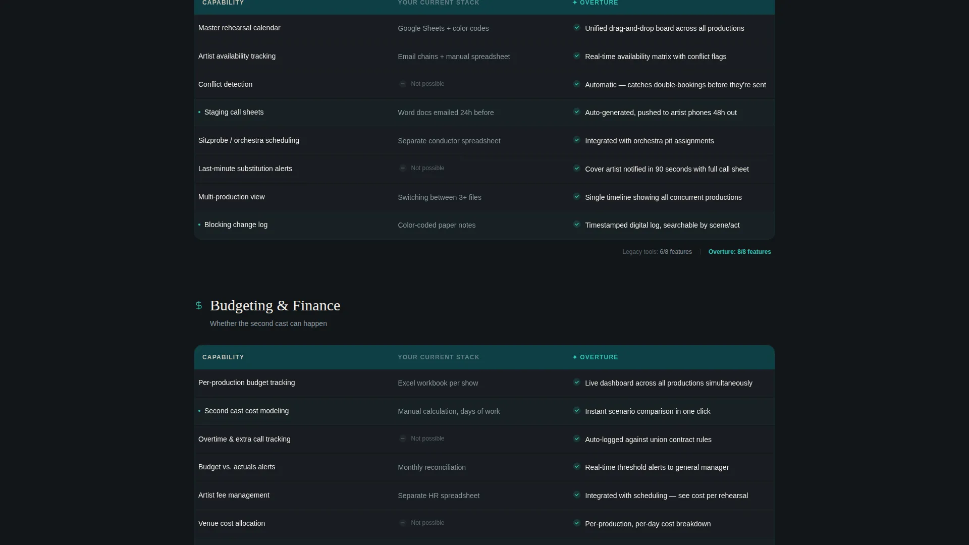
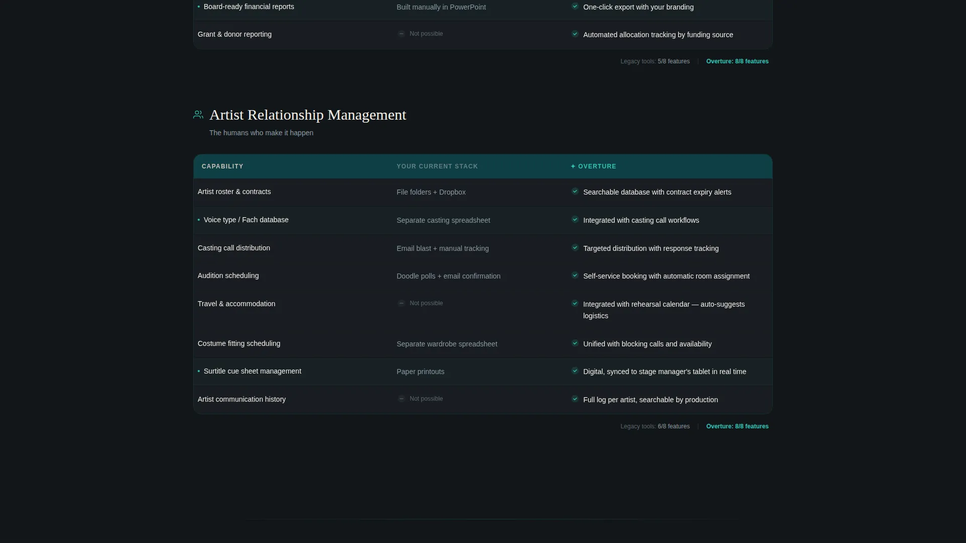
Multiple side-by-side comparison tables build progressively through the page. Each table covers a different operational domain: scheduling, budgeting, and artist relationship management. Rows light up in catalyst green as they scroll into view. Every row ends with a checkmark in catalyst green or a gray dash, so the visual weight of the page accumulates decisively in favor of the product.
Live Production Timeline Animation
A mid-page Gantt-style waterfall animation auto-plays between the static comparison tables. Rehearsals, fittings, sitzprobes, and staging calls snap into position in sequence. It injects kinetic proof at the exact moment visitor attention needs re-energizing.
Gated PDF Download Path
A secondary conversion path offers a downloadable comparison document gated behind a single email field. This captures prospects who are not yet ready to commit to a demo or trial, keeping them in the funnel without friction.
Sticky Call-to-Action Bar
After the first comparison table, a persistent sticky bar carries the primary call to action across every subsequent section. Visitors never have to scroll back to find the next step. The bar uses the catalyst green accent to stay visible without disrupting the reading flow.
Testimonial Block with Specific Metrics
A dedicated testimonial section features a quote from a real company manager citing a specific number, whether hours, dollars, or canceled fire drills. Specificity here does more persuasive work than any feature bullet, because it makes the outcome feel real and reachable.
Page sections overview
| Section | Purpose |
|---|---|
| Calculator Header | Estimate production savings interactively |
| Chaos Framing Section | Contrast current tool stack visually |
| Scheduling Comparison Table | Show scheduling coordination gap |
| Budgeting Comparison Table | Highlight budget visibility advantage |
| Artist Management Table | Compare relationship tracking capabilities |
| Timeline Animation Block | Animate production workflow in motion |
| Testimonial Block | Anchor claims with a specific metric |
| Secondary Download Gate | Capture emails from undecided visitors |
| Final call to action Section | Close the page with a decisive action prompt |
Design & branding system
The Teal Catalyst color system is built around functional contrast. Every color serves a specific role, and nothing competes for attention without earning it.
- Deep auditorium teal (#0D5C63) anchors the navigation and section backgrounds; bright catalyst green (#2EC4B6) drives calls to action, toggle states, and table checkmarks
- Carbon score-black (#121619) handles body text and table headers for crisp legibility; parchment ivory (#F5F0E8) fills negative space with warmth, referencing aged libretto paper
- The overall palette evokes a modern lighting console glowing in a darkened tech booth, where every lit element demands attention because nothing else competes
Mobile & speed optimization
The template is structured for clean rendering across screen sizes. The Dashboard Pro theme keeps layout logic tight so the comparison tables and calculator remain readable without horizontal scrolling.
- The comparison tables reflow gracefully on smaller screens, preserving the checkmark-versus-dash visual weight that drives conversion
- The sticky call-to-action bar is positioned to remain usable on mobile without obscuring table content
- The calculator input fields and animated outputs are designed for touch interaction, keeping the estimator functional on any device
How this template helps you convert
The entire page is engineered around a single persuasion arc: show the chaos, prove the solution, make clicking feel inevitable.
- The calculator leads with proof before copy, so visitors quantify their own problem using their own numbers before they read a single feature claim
- The escalating comparison tables accumulate visual evidence across scheduling, budgeting, and artist management, so by the final section the green-to-gray ratio overwhelms hesitation
- Three call-to-action placements, at the calculator output, in the sticky bar, and at the page anchor, mean the decision moment meets the visitor wherever they stop scrolling
Other information about this template
This template is part of a broader collection designed around specific vertical SaaS use cases. A few additional details worth noting before you choose it.
- The template style is Comparison Table, which suits any software product where the visitor's current workflow is the real competitor
- The creative direction is Launch Energy, meaning the scroll pacing builds like a countdown, with tension rising section by section toward a confident close
- The header concept is a Calculator or Estimator, a proven high-engagement pattern for software tools where quantified ROI matters to the buyer
- This template is categorized under Technology and the Opera Vertical SaaS subcategory, but the layout structure transfers well to any niche where production complexity is the core pain point
Theme
Dashboard Pro
Creative direction
Launch Energy
Color system
Teal Catalyst
Style
Comparison Table
Direction
Comparison/Versus
Page Sections
Interactive Production Cost Calculator
Escalating Comparison Table Sequence
Live Production Timeline Animation
Sticky Call-to-action Bar
Gated PDF Download Path
Testimonial Block with Specific Metrics
Related questions
What type of software is this template designed to promote?
What makes the calculator section different from a standard hero banner?
Is there a secondary option for visitors who are not ready to sign up?
How does the page guide visitors toward the primary call to action?
Can someone without design experience customize this template?



