Fertility Vertical SaaS Professional Website Template
Ovulate is a clinical-grade fertility management landing page template built for reproductive endocrinologists, OB-GYN nurses, and cycle-tracking patients. It transforms basal body temperature readings, LH surge data, and cervical mucus observations into predictive cycle maps. The hub-and-spoke layout with anchor navigation guides every visitor from curiosity to a live sandbox demo click, combining clinical authority with an intuitive interface.
by Rocket studio
Quick summary
The Ovulate template is a single-page, hub-and-spoke landing page built for a clinical fertility management software platform. It presents three frosted-glass dashboard cards in the hero, then guides visitors through five interactive anchor-nav spokes covering cycle tracking, dual-view toggling, protocol management, and analytics. Every section ends with the primary "Explore the Demo" call to action, moving qualified visitors straight into a live product sandbox.
Who this template is for
This template serves two closely related groups united by a need for clinical-grade data clarity. Reproductive endocrinologists and OB-GYN nurses need a page that immediately communicates protocol-management depth and confidence intervals they can trust in an IVF or timed-intercourse context. Fertility patients need the same data presented in language that removes guesswork from their menstrual cycle journey.
- Reproductive endocrinologists and OB-GYN nurses charting IVF stimulation protocols and timed intercourse windows
- Women tracking their menstrual cycle who need reliable, signal-clear interpretation of basal body temperature, LH results, and cervical mucus patterns
- FemTech SaaS teams who need a high-converting landing page that communicates clinical authority and product depth simultaneously
What problem this template solves
Traditional ovulation tracking apps present raw numbers without context. Patients stare at ambiguous Ovulation Predictor Kit lines and cannot tell whether today is a peak day or a false positive. Clinicians juggle spreadsheets and disconnected charts that make performance data hard to share or act on. This template solves both problems in one layout.
- Fragmented data: the template demonstrates a unified view of basal body temperature, LH surge, and cervical mucus in a single dashboard interface, eliminating the need for multiple disconnected tools
- Unclear predictions: interactive confidence intervals and color-coded fertility windows communicate certainty levels plainly, so both clinicians and patients can make informed decisions without a data analyst
- Low visitor trust: the spoke-by-spoke interactive structure lets visitors touch the product six times before committing, building trust through direct experience rather than promotional claims
What you get with this template
You receive a fully structured, single-page hub-and-spoke landing page template ready for a fertility management software product. The layout is built around anchor navigation so visitors can jump directly to the spoke that matters most to them, whether that is cycle tracking, protocol management, or outcomes analytics. Every design decision, from the void-black background to the violet active states, reflects the Dashboard Pro visual identity described in the brief.
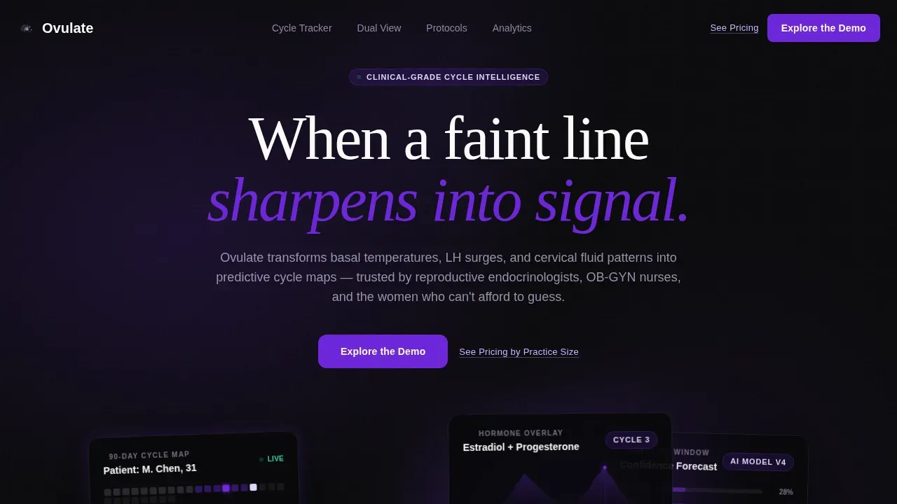
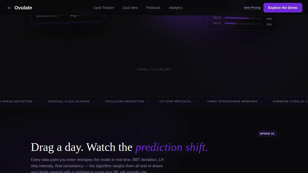
- Hero section with three angled frosted-glass dashboard cards showing a 90-day cycle timeline, a hormone overlay chart with estradiol and progesterone curves, and a predictive fertility window with confidence percentages
- Five anchor-nav spokes covering the cycle tracker, dual clinician-and-patient view toggle, IVF protocol management accordion, and a bento-grid analytics section with social proof stats
- Click-through optimized structure with "Explore the Demo" as the fixed primary call to action and "See Pricing by Practice Size" as a secondary text link for comparison shoppers
Feature list
This template ships with a focused set of purpose-built components that serve both the clinical and patient-facing sides of the platform.
Interactive 90-Day Cycle Timeline Spoke
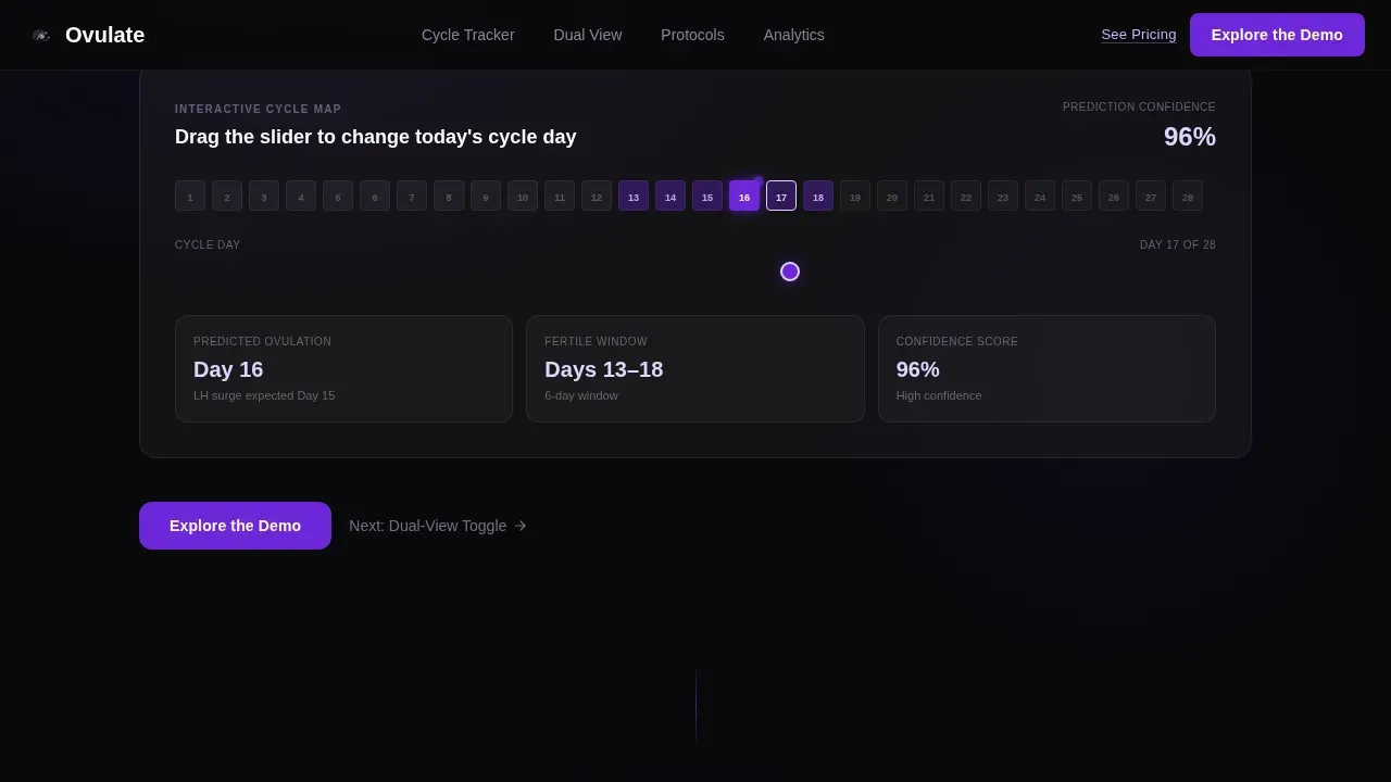
The cycle tracker spoke presents a draggable 90-day timeline where visitors can pull a cycle day marker and watch ovulation peak confidence scores recalculate in real time. This interaction demonstrates dynamic predictive modeling directly in the browser, turning the landing page itself into a product proof point. The timeline marks the four cycle phases: Menstrual, Follicular, Ovulation, and Luteal, using color-coded fertility window styling that highlights high-fertility days clearly without alarming language.
Dual Clinician and Patient View Toggle
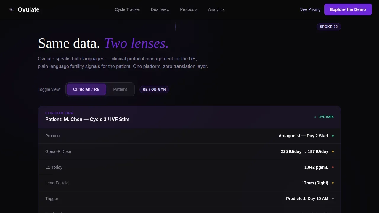
A single data set, two lenses. The toggle spoke lets visitors switch between a Clinician view showing an IVF stimulation protocol layout and a Patient view showing the same cycle as a personal fertility window. This component is central to the template's value proposition: demonstrating that power and simplicity coexist in one interface. Clinicians see key performance indicators tied to protocol stages; patients see a plain-language "Today" widget giving immediate cycle status guidance such as "Peak Day - Test Now."
Accordion Protocol Management Spoke
The IVF protocol management spoke uses an accordion component to reveal stimulation steps one at a time, each annotated with hormone overlay data. Complexity escalates as visitors expand each step, but the calm glass-panel interface keeps the experience readable. This spoke directly addresses the clinical sales process, showing reproductive endocrinologists exactly how the platform handles multi-step protocol documentation without overwhelming the screen.
Bento Grid Analytics and Social Proof Section
The analytics spoke presents clinical outcome data in a staggered bento grid: prediction accuracy at 94.7%, 12,400-plus cycles tracked, and a reproductive endocrinologist testimonial. Bar charts and line chart elements visualize performance trends across patient cohorts. This section functions as board-level visibility for the platform's outcomes, giving procurement decision-makers the high-level performance data they need to justify adoption.
Fixed Anchor Navigation with Repeated calls to action
The anchor navigation bar stays fixed at the top of the page throughout scrolling. It includes a persistent "Explore the Demo" button so the primary call to action is always one click away. Each spoke section also closes with its own repeated call to action, meaning the page creates six distinct touchpoints with the product before asking the visitor to commit to the sandbox demo click-through.
Dark Glass Panel Hero with Cursor-Reactive Parallax
The hero section displays three frosted-glass user interface cards angled slightly against a pure void-black field. Each card shows a different live dashboard view: the 90-day cycle timeline, the hormone overlay chart, and the predictive fertility window. Cursor-reactive parallax animation makes the cards respond to mouse movement, creating an immersive effect that mirrors the ultrasound-monitor aesthetic of the Void and Violet color system. No stock photography appears anywhere in the hero.
Page sections overview
| Section | Purpose |
|---|---|
| Hero Dashboard Cards | Establish clinical visual identity and deliver primary call to action |
| Cycle Tracker Spoke | Demonstrate interactive 90-day timeline with drag prediction |
| Dual-View Toggle Spoke | Show clinician and patient perspectives on same data |
| Protocol Management Spoke | Reveal accordion IVF stimulation steps with hormone annotations |
| Analytics Trust Spoke | Display outcomes bento grid with social proof stats |
| Footer Single Row | Provide minimal navigation and secondary conversion link |
Design & branding system
The template uses the Dashboard Pro theme built on the Void and Violet color system. The aesthetic is deliberately clinical: void black forms the base, violet pulses through active states and live data lines, lavender softens secondary text and chart fills, and glass-white panels float above the background like translucent specimen slides. Typography pairs DM Sans for body text and user interface copy with Fraunces for hero display moments, creating a contrast between precision and warmth.
- Color palette: absolute void black (#09090B) for background, deep uterine violet (#6D28D9) for primary actions and data lines, soft follicle lavender (#DDD6FE) for secondary fills and chart backgrounds, clinical glass white (#FAFAFA) for card surfaces
- Typography: DM Sans handles all body and interface copy for legibility; Fraunces appears in hero headlines for a display-serif moment that signals depth and care
- No stock photography anywhere: the visual language relies entirely on the product interface itself, rendered as luminous glass-panel user interface cards against the dark background
Mobile & speed optimization
The template is built desktop-first to match the clinical dashboard context of its target audience. Reproductive endocrinologists and OB-GYN nurses typically work on large monitors during clinical sessions. However, mobile optimization of the landing page remains important given the high volume of health-related searches that patients conduct on phones. The template includes a responsive mobile fallback that preserves readability across device sizes.
- Desktop-first layout prioritizes the dashboard card parallax hero and wide bento grid analytics section on large screens
- Responsive mobile fallback restructures the three-card hero into a vertically stacked sequence and collapses the bento grid to a single-column card list
- Static sections use server-rendered components to keep initial load fast; interactive spokes load as client components to isolate interactivity without blocking the critical render path
How this template helps you convert
The entire page architecture is engineered around a single conversion goal: getting the visitor to click "Explore the Demo." Every design and copy decision serves that outcome.
- The hero makes the first impression purely through product user interface, building trust in the interface before any text claim is made. Three angled glass dashboard cards showing real cycle data immediately communicate platform sophistication to both clinical and patient visitors.
- Each of the five interactive spokes hands control to the visitor, letting them drag a cycle day, toggle a view, or expand an accordion step. This progressive interaction model builds investment and demonstrates product value without a sales team intervention, shortening the effective sales process.
- The fixed anchor navigation keeps the "Explore the Demo" call to action visible at every scroll depth, so the decision to click is never more than one gesture away. The secondary "See Pricing by Practice Size" link captures comparison shoppers without diluting the primary conversion path.
Other information about this template
The Ovulate template is designed to support a SaaS sales process where qualified leads arrive from multiple channels and need different levels of detail before committing. The page structure accommodates both clinical buyers doing strategic planning and individual patients looking for immediate cycle clarity.
- The template supports a click-through lead generation model: no form fields appear on the landing page. All data capture happens inside the demo sandbox, which keeps conversion rates on the page high by removing friction before the click.
- For teams measuring campaign performance across advertising platforms, the clean single-page structure makes it straightforward to track traffic sources and attribute conversions back to specific channels. Whether traffic arrives from a ppc dashboard campaign, organic search, or multi channel campaigns, the page delivers a consistent experience.
- The analytics spoke is designed to show board-level visibility metrics: prediction accuracy, total cycles tracked, and a clinical testimonial. These conversion metrics translate directly into financial performance narratives for procurement teams evaluating the platform.
- Teams tracking key metrics such as conversion rates, click through rates, engagement metrics, and audience growth will find the page structure naturally supports cohort analysis of visitor segments from different advertising platforms, including google ads, linkedin ads, and microsoft ads.
- The template can complement a broader marketing analytics stack. Practices that already use google analytics to monitor website traffic and website performance, or that pull campaign performance data from google ads dashboard sources, can use this landing page as a clean entry point that keeps traffic quality high.
- The dual-view spoke supports user behavior and customer behavior analysis: clinicians and patients interact with different sections, and the toggle component makes that segmentation visible in session recordings. Teams using google search console or crm data to understand audience engagement will have a clear on-page signal to analyze.
- Conversion metrics such as average order value, revenue attribution, and monthly recurring revenue benchmarks are relevant to SaaS teams evaluating whether this landing page format supports their revenue contribution goals. The page is optimized for conversion performance at the click-through stage, handing qualified leads to the demo environment where sales team follow-up begins.
- The template supports data driven decisions about page iteration. Because every spoke section ends with the same call to action, teams can run A/B tests on individual spokes without restructuring the full page. This creates clear optimization opportunities tied to specific sections rather than the page as a whole.
- Customer lifetime value and lifetime value calculations benefit from a demo-first funnel: prospects who explore the sandbox before signing up tend to have higher retention rates. The page is built to attract leads whose customer lifetime engagement starts with deep product familiarity.
- Performance data from historical data sources can be used to calibrate the social proof numbers in the analytics bento grid. The template includes placeholder stat blocks for prediction accuracy, patient volume, and a testimonial, all of which should be updated with current, verified figures before launch.
- Leading indicators such as scroll depth, spoke interaction rate, and demo click rate function as key dimensions for evaluating page health. These signals help teams spot trends in visitor behavior before they appear in downstream sales metrics like win rates or total sales.
- The template also accommodates secondary analytics needs: teams can layer in data extraction workflows to pull performance trends from google analytics, integrate automated data extraction from their ad spend platforms, and pipe results into reporting tools. Pre built connectors for these workflows sit outside the template itself but the page structure makes attribution clean.
- For practices using Power BI to visualize performance, the landing page's clean URL structure and single conversion event make it easy to build a Power BI report tracking campaign performance, lead generation volume, and conversion rates over time. Power BI users can connect traffic sources, website performance data, and CRM data into a unified view of how the Ovulate landing page contributes to the broader sales pipeline. Power BI dashboards built on this data can show performance trends across time, highlight actionable insights from cohort analysis, and give the sales team reliable view of which marketing channels drive the most qualified leads. Power BI's ability to handle historical data from multiple data sources means teams can analyze audience engagement, track average order patterns, and evaluate informed decisions about ad spend allocation. For organizations that require board level visibility, a Power BI dashboard connected to this page's conversion data provides strategic decision making support at every level of the organization.
Theme
Dashboard Pro
Creative direction
Interactive Explorer
Color system
Void & Violet
Style
Hub & Spoke (Anchor Nav)
Direction
Click-Through
Page Sections
Interactive 90-day Cycle Timeline
Dual Clinician and Patient View Toggle
Accordion IVF Protocol Management
Bento Grid Analytics with Social Proof
Fixed Anchor Navigation with Persistent Call to Action
Dark Glass Panel Hero with Parallax
Related questions
Who is this landing page template built for?
Does the template include form fields for lead capture?
What interactive elements are included in the template?
Can the social proof statistics be customized?
Is there a secondary conversion path for visitors not ready to try the demo?



