Equestrian Vertical SaaS Booking Website Template
Paddock is a hub-and-spoke landing page template built for equestrian stable management software. It combines a Feature Tab Switcher header, animated comparison grids, and a Slate and Sky color system to show yard managers exactly how one platform replaces lesson diaries, arena schedules, and horse rotation logs with a single live dashboard.
by Rocket studio
Quick summary
Paddock is a single-page, anchor-nav template designed to market equestrian booking and stable management software. It opens with an interactive tab switcher showing live dashboard mockups, then guides visitors through feature-by-feature comparison grids that make manual yard admin look exhausting by comparison. Every section ends with a clear call to action.
Who this template is for
This template is built for founders and marketing teams promoting software that helps equestrian businesses run more smoothly. It speaks directly to the people buying that software too.
- Yard managers running large liveries with multiple horses and instructors
- Riding school owners who handle lesson bookings alongside daily yard duties
- Livery operators tracking individual client accounts, horse care schedules, and outstanding charges
What problem this template solves
Running a busy yard on a paper diary or a patchwork of spreadsheets creates real operational drag. Double-bookings, missed farrier appointments, and phone-tag confirmations eat hours that should go toward the horses. This template gives a software product a landing page that makes those pain points impossible to ignore.
- Visitors arrive and immediately see their own Monday-morning chaos reflected back at them
- Animated "You versus. Us" comparison tables make manual workflows look slow next to every feature
- A low-friction trial path reduces hesitation before the visitor clicks away
What you get with this template
You get a fully structured, single-page layout with an anchor navigation system that lets visitors jump directly to the section relevant to their role. Every spoke section is self-contained and ends with a conversion prompt.
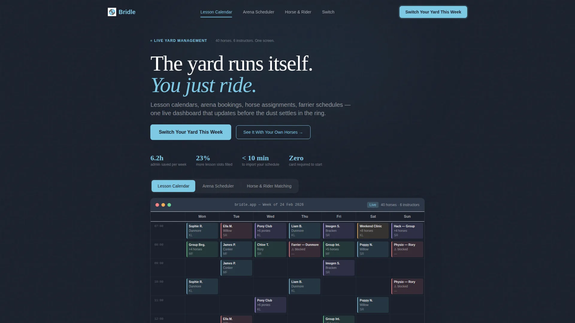
- A Feature Tab Switcher header with three interactive dashboard views: Lesson Calendar, Arena Scheduler, and Horse and Rider Matching
- Animated comparison grids per section, each targeting one operational problem with real-looking data
- Two distinct conversion paths: a primary call to action and a secondary "See It With Your Own Horses" intake form
Feature list
This section covers the core built-in components and design behaviors included in the Paddock template.
Interactive Feature Tab Switcher Header
Three labeled tabs sit above a live-user interface dashboard mockup. Clicking each tab slides a new dashboard screenshot into view with a smooth lateral animation. The default view shows a colour-coded weekly calendar dense with lesson blocks, horse names, instructor initials, and time slots, so a yard manager recognises a real-world schedule immediately.
Animated Comparison Grids
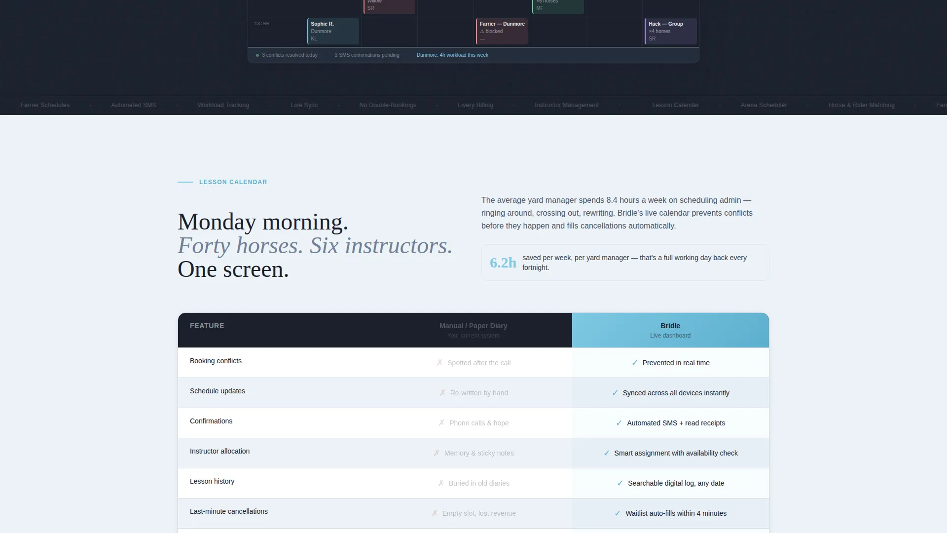
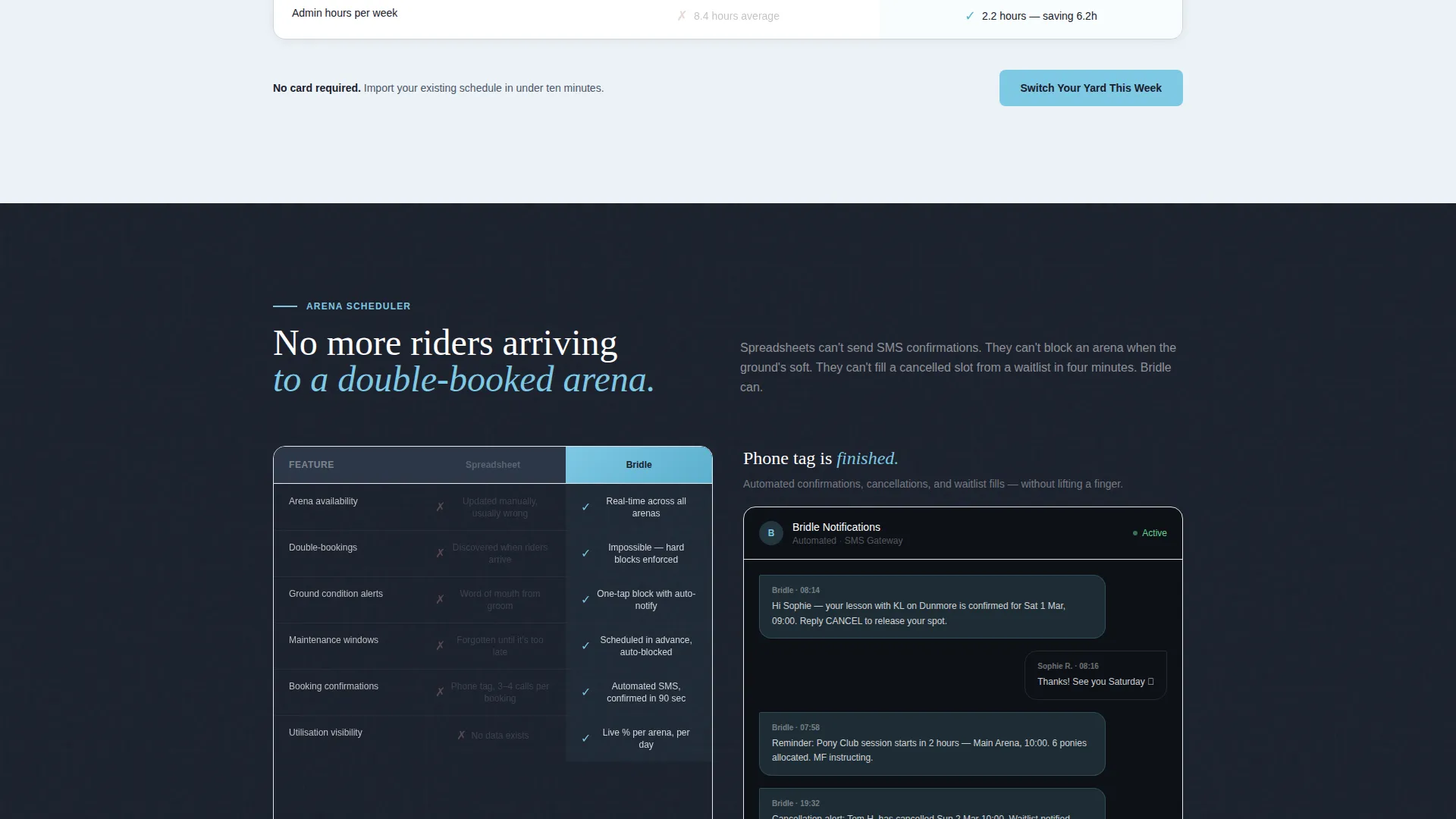
Each anchor section contains a "You versus. Us" feature grid. Rows build on scroll, checkmarks animate in, and the competitor column fades to grey while the product column pulses in sky blue. Specific metrics like "Average yard saves 6.2 admin hours per week" appear inline to give the comparison real weight.
Hub and Spoke Anchor Navigation
A persistent anchor nav bar lets visitors jump between spoke sections without scrolling the full page. The primary call to action, "Switch Your Yard This Week," is pinned inside the nav so it stays visible at every scroll position.
Dual Conversion Path Layout
The template supports two conversion routes side by side. The primary path drives straight to a free trial with a no-card-required promise and a single-sentence reassurance about schedule import time. The secondary path opens a short intake form collecting yard name, horse count, instructor count, and current booking method via a dropdown.
Escalating Stakes Copy Structure
Section copy follows a deliberate three-stage escalation: convenience benefits first, then revenue impact, then horse welfare outcomes. Each stage is backed by a specific claim from the brief, moving the visitor from mild interest to genuine urgency across the page.
Dynamic Motion Visual System
The page uses scroll-triggered animations throughout. Tables build row by row, action elements pulse in the accent color, and the tab switcher uses a lateral slide transition. Motion is purposeful and tied to the content reveal, not decorative.
Page sections overview
| Section | Purpose |
|---|---|
| Tab Switcher Header | Introduce the dashboard with three interactive product views |
| Lesson Calendar Spoke | Show how live lesson scheduling replaces paper diaries |
| Arena Scheduler Spoke | Demonstrate conflict-free arena booking with real-time sync |
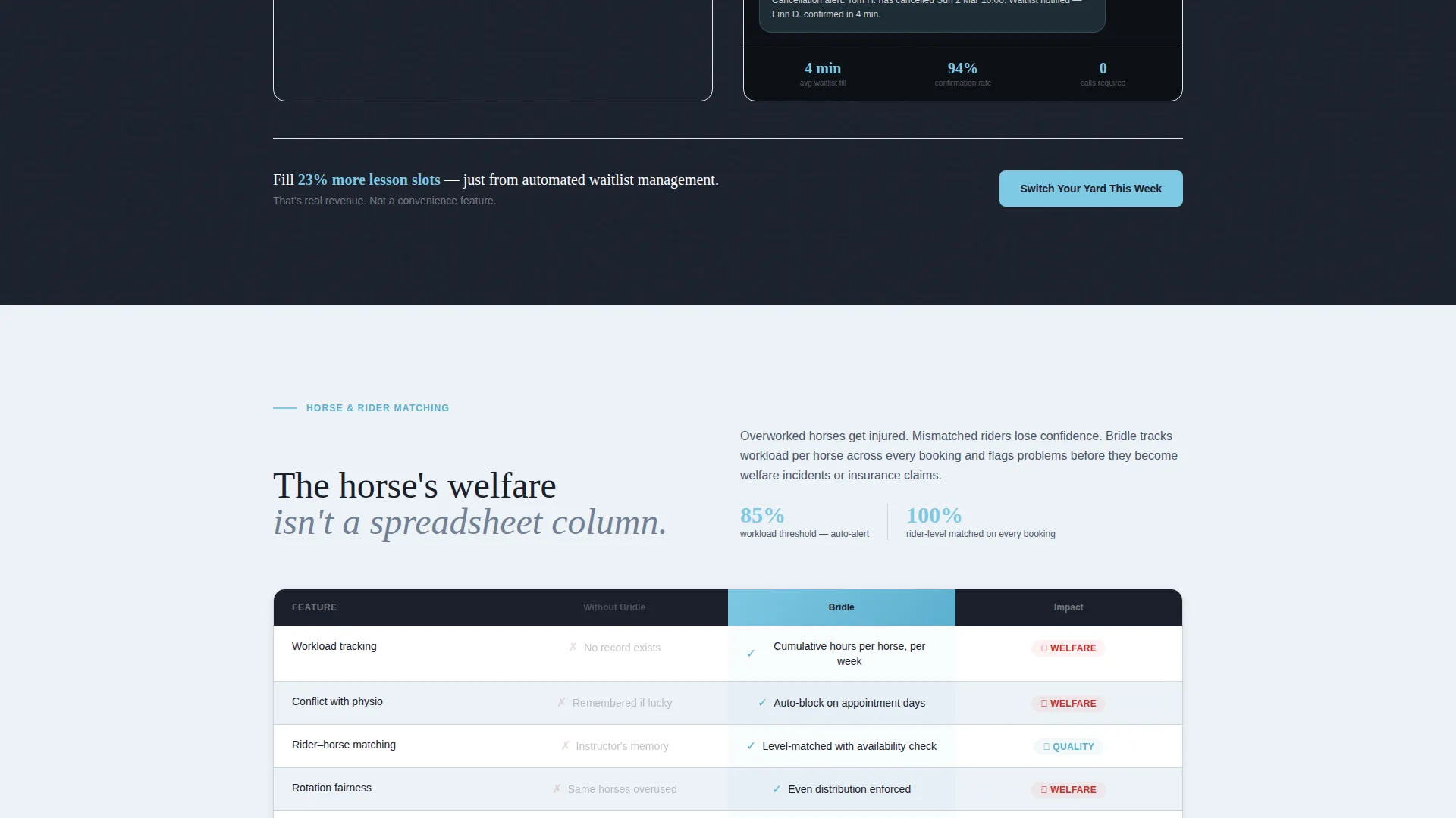
| Horse and Rider Matching | Highlight automated horse assignment and rotation tracking |
| Farrier and Care Schedules | Address welfare scheduling and missed-appointment prevention |
| Admin Hours Comparison | Anchor the 6.2 hours saved claim with a full comparison grid |
| Revenue Impact Section | Present the 23 percent more lesson slots filled argument |
| Trial Conversion Footer | Close with dual call to action and the no-card-required intake form |
Design & branding system
The Slate and Sky color system is built around an early-morning outdoor atmosphere. Color is used directionally, not decoratively, so every accent draws the eye exactly where action is needed.
- Weathered slate (#4A5568) backgrounds and stable-door charcoal (#1A202C) typography create a grounded, professional base
- Open-paddock sky (#7EC8E3) appears only on buttons, active tab states, animated checkmarks, and pulsing product columns so the accent never loses its urgency
- Pale morning frost (#EDF2F7) card surfaces and section breaks keep comparison grids easy to scan without visual clutter
Mobile & speed optimization
The Dynamic Motion theme is designed to work across screen sizes without sacrificing the scroll-triggered animation sequences that power the comparison grids.
- The anchor nav collapses cleanly on smaller screens so the "Switch Your Yard This Week" call to action remains reachable at all times
- Tab switcher transitions and row-build animations are tied to scroll events, keeping the experience coherent on both touch and pointer devices
How this template helps you convert
Every structural decision in Paddock points toward getting the visitor to start a free trial or submit the intake form before leaving the page.
- The tab switcher header puts recognisable, specific dashboard content in front of the visitor within seconds of arrival, replacing any doubt about what the product actually does with a visual proof of concept they can interact with.
- Comparison grids in each spoke section make the visitor's current workflow feel slow and costly, then immediately offer a frictionless exit: a no-card-required trial and a ten-minute schedule import promise that removes the last practical objection.
Other information about this template
Paddock is a marketing landing page template, not a functional software application. It is designed for teams building a go-to-market presence for an equestrian vertical software product.
- The template is built as a single-page hub-and-spoke layout with anchor navigation between spoke sections
- Dashboard screenshots inside the tab switcher are mockup placeholders intended to be replaced with real product visuals before launch
- The intake form fields, yard name, horse count, instructor count, and booking method dropdown, are structural placeholders ready for connection to a form handler of your choice
- The creative direction follows a Spec Sheet approach: every section is structured around a specific operational problem and answers it with a side-by-side comparison rather than general feature lists
- Copy examples in the template use real-sounding data points to model the tone, including the 6.2 admin hours and 23 percent lesson slot figures cited in the brief
Theme
Dynamic Motion
Creative direction
Spec Sheet
Color system
Slate & Sky
Style
Hub & Spoke (Anchor Nav)
Direction
Comparison/Versus
Page Sections
Feature Tab Switcher Header
Animated Comparison Grids
Persistent Anchor Navigation
Dual Conversion Path Layout
Escalating Stakes Copy Structure
Dynamic Motion Visual System
Related questions
Does this template include working software or a real booking system?
Can I customise the comparison grid data for my own product claims?
How does the dual conversion path work in practice?
Is the tab switcher animation built into the template?
Who writes the copy for the comparison grids?



