Smart Barn Management CRM Landing Page Template
Paddock is a dark-mode, comparison-driven landing page template built for equestrian barn management software. It guides barn managers and trainers from an industry-problem framing through a feature comparison table and case study strip to a personalized demo signup. The design uses electric chartreuse, hot magenta, and interface slate on a deep black base for a high-contrast, dashboard-grade visual experience.
by Rocket studio
Quick summary
Paddock is a single-page, scroll-driven landing page template designed for equestrian customer relationship management (CRM) and barn management software. It opens with a product screenshot hero, moves through sourced industry-pain data, delivers a side-by-side comparison table, and closes with a full-width call-to-action (call to action) strip. Every section earns trust before asking for a demo signup.
Who this template is for
This template is built for founders, product teams, and marketers selling barn management software or farm management software to equestrian professionals. If your product helps barn operators move from paper to digital, this page is your sales argument made visual.
- Barn management software companies targeting barn managers running 20 to 60 horses across daily lesson schedules and boarding services
- Equestrian SaaS teams whose buyers are independent trainers hauling between multiple farm locations or show-barn owners losing revenue to unbilled services
- Digital product studios building a landing page for a niche farm business software client who needs industry-specific proof points alongside a clear conversion path
What problem this template solves
Barn managers and trainers have historically run six-figure operations using paper binders, whiteboards, sticky notes, and spreadsheets. The business cost is real: missed farrier invoices, double-booked arenas, and lost schooling-ride revenue stack up every single day. A general-purpose website or a generic CRM landing page fails to communicate why equestrian-specific software is worth switching to.
This template solves the persuasion gap directly. It frames the cost of the current situation before ever introducing a product, so the demo request feels like the correct next step rather than a sales pressure point.
- Removes the credibility gap by leading with sourced industry data on unbilled services, paper-based scheduling, and revenue loss that farm operators recognize immediately
- Replaces vague feature lists with a structured comparison table that maps specific barn tasks row by row against generic CRM tools, spreadsheets, and paper-based methods
- Converts interest into action through a personalized demo signup flow where visitors select their facility type and herd size before leaving an email, reducing friction and improving lead quality
What you get with this template
The template provides a complete, section-by-section landing page layout. Every section is scoped to move a barn manager or trainer from skeptical viewer to engaged demo requester. The page is built desktop-first with responsive design, and the interface is dark-mode throughout.
- A full-width hero with a perspective-tilted product screenshot, a benefit-driven heavy headline, and a floating call to action placed immediately after the screenshot so the visitor does not have to scroll ahead to act
- A sourced industry-data section with hard statistics on revenue lost to unbilled services, percentage of barn businesses still using paper or generic software, and median weekly time spent on scheduling tasks alone
- A side-by-side comparison table covering horse profiles, lesson scheduling, billing automation, show entry tracking, vet and farrier logging, and client communication, with visual cell states for native features, workarounds, and impossible tasks
- A case study strip presenting three facility types (lesson barn, show barn, and breeding farm) with before-and-after operational metrics
- Three strategically placed call to action instances with a personalized demo signup form that collects facility type and herd size before requesting an email address
Feature list
This template is provided as a structured set of design-ready sections and interactive components. The following features are built into the layout as described in the template brief.
Perspective-Tilted Product Screenshot Hero
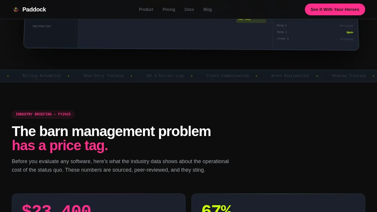
The header section displays a pixel-sharp dashboard screenshot placed on a subtle perspective tilt against a pure black background. The screenshot shows a weekly lesson calendar color-coded by instructor, a horse profile card with vet and farrier dates, an unpaid invoice counter glowing magenta at 14, and a real-time arena availability bar pulsing chartreuse. A single heavy sans-serif headline sits above it. No lifestyle photography, no horses as decoration. The product interface is the entire visual argument.
Sourced Industry Pain Data Section
Below the hero, a data section presents hard industry statistics in an editorial, industry-report tone. Each stat is visually separated, numerically specific, and attributed to a source. Stat counters animate on scroll using staggered reveals so each data point lands with weight. This section sets up the comparison table by proving the problem is expensive before the product is introduced. Real-time data presentation like this allows barn operators to recognize the cost of current farm management practices at a glance.
Side-by-Side Comparison Table
The comparison table is the structural centerpiece of the page. It maps Paddock against generic CRM tools, spreadsheets, and paper across six barn-specific capability rows: horse profiles, lesson scheduling, billing automation, show entry tracking, vet and farrier logging, and client communication. Cells glow chartreuse for native features, display dim gray for workarounds, and show magenta marks for tasks that are simply not possible in legacy methods. Table rows include hover-glow states so the viewer can move through the comparison at their own pace. This layout makes it immediately clear that farm management software built for equestrian operations handles requests that general tools were never designed for.
Case Study Facility Strip
A horizontal strip below the comparison table presents three real facility types: a lesson barn, a show barn, and a breeding farm. Each panel shows before-and-after operational metrics specific to that farm category. The strip uses the same dark-mode card style as the rest of the page, with chartreuse highlighting improved metrics and magenta drawing attention to the cost figures that occurred before the software was adopted. Studies like these ground abstract product claims in recognizable operational scenarios.
Three-Instance call to action Architecture
The call-to-action, "See It With Your Horses," appears three times across the page. It floats after the hero screenshot, anchors below the comparison table, and fills a full-width closing strip at the bottom. Each click opens a personalized demo signup sequence where the visitor selects their facility type and herd size before providing an email. No credit card field. No commitment language. The form is short by design, kept to the minimum details needed to qualify the lead and route the demo correctly.
Acid Digital Color and Motion System
The visual identity uses an Acid Digital color system: electric chartreuse (#CCFF00) for data highlights and active states, deep stable black (#0D0D0D) as the base, interface slate (#1A1F2B) for card panels, and hot magenta (#FF2D8A) reserved for calls to action and alert states. Animation is high throughout: the hero uses a perspective tilt, chartreuse indicators pulse, stat counters increment on scroll, and table row hover states glow. The call to action uses a magnetic effect. Typography is DM Sans for heavy headlines and JetBrains Mono for data and statistics display.
Page sections overview
| Section | Purpose |
|---|---|
| Hero Screenshot | Anchors the product interface as the visual centerpiece with a benefit-driven headline and floating call to action |
| Industry Pain Data | Posts sourced statistics on barn revenue loss, paper usage rates, and weekly scheduling time costs |
| Comparison Table | Maps farm tasks row by row across Paddock, generic CRMs, spreadsheets, and paper with color-coded cells |
| Case Study Strip | Shows before-and-after operational metrics for three barn facility types |
| Closing call to action Strip | Full-width section delivering the final "See It With Your Horses" action prompt |
| Footer | Horizontal flow footer pattern providing general navigation and business links |
Design & branding system
The design follows a Dynamic Motion theme built on an Acid Digital color system. The overall feel is a dark-mode dashboard viewed under arena lights at a night show: high-contrast, unapologetically digital, and built to make spreadsheet-era barn managers realize they are viewing a different class of tool. The interface layers information forward so data floats on black rather than sitting flat on a neutral page.
- Colors: electric chartreuse (#CCFF00) for data states and active indicators, deep black (#0D0D0D) as the anchor base, interface slate (#1A1F2B) for cards and panels, hot magenta (#FF2D8A) for calls to action and alert states
- Typography: DM Sans in heavy weights for all headlines; JetBrains Mono for statistical data, counters, and dashboard-style readouts throughout the page
- Motion: perspective tilt on the hero screenshot, pulsing chartreuse arena indicators, staggered stat reveals on scroll, table row hover glows, and a magnetic call to action effect on the closing strip
Mobile & speed optimization
The template is built desktop-first to match the primary use case: a barn manager seated at an office desk reviewing operations at the start or end of the day. However, the layout is responsive and adapts for mobile viewing, which matters for trainers reviewing details between sessions on barn Wi-Fi. A mobile-first design approach ensures that buttons and forms remain easy to interact with on smaller screens so no lead is lost because the page is hard to use on a phone.
- Responsive column layouts collapse the comparison table and case study strip cleanly for smaller viewports, keeping the data legible without horizontal scrolling
- Server Components handle static sections of the page to keep initial load fast; client-side components manage the animation layers so interactive states do not block the core content from loading
- call to action buttons and demo signup forms are sized and spaced for touch interaction so a person viewing the page on a phone between barn tasks can act without frustration
How this template helps you convert
This landing page template is structured as a persuasion sequence, not a feature brochure. Every section is ordered to move the visitor one step closer to booking a demo. The page earns the click by proving the problem is expensive before it ever shows a product name.
- The hero section posts a product screenshot rather than a concept illustration, so the visitor can immediately understand the interface and begin forming a mental picture of their own barn data displayed on that screen, which builds concrete interest faster than abstract copy
- The industry data section and comparison table work together to make the cost of the status quo undeniable: a barn manager viewing real numbers on unbilled services and scheduling time will recognize the problem from their own day-to-day experience, making the demo feel like relief rather than a sales meeting
- The three-instance call to action placement with a personalized form means the visitor is never more than one scroll away from acting, and the form collects only the minimum details needed so the barrier to submitting remains low at every stage of the scroll
Other information about this template
This section covers additional context about the Paddock template that may be useful when evaluating fit or planning a build.
- The template is sold as a design-ready layout, not a live software product. It provides the page structure, visual system, and component set; the actual CRM software and its data are provided separately by the product team using the template.
- Barn management software tools referenced in the equestrian industry include platforms like BarnManager, which focuses on digital records, scheduling, and invoicing specifically for horse barns, and Stable Secretary, which provides customizable record-keeping and billing for equine businesses. These are referred to here for general market context only and are third-party products not included in or affiliated with this template.
- Automated billing and payments is one of the key capabilities a smart barn management CRM should showcase. The comparison table rows in this template are built to highlight exactly that kind of farm software feature, including invoicing for boarding and other services.
- Digital record keeping replaces paper binders with centralized profiles for horses or livestock, including health records and vaccination schedules. Showcasing this transition on a landing page is one of the most effective ways to communicate the value of a barn management platform to a manager who has been stuck on paper for years.
- The template is version-ready and can be adapted for different farm business contexts beyond equestrian barns, such as livestock operations, small breeding yards, or agricultural services businesses, as long as the comparison table rows and data section copy are updated to match the correct industry details.
- Operational scheduling is a core landing page theme here. It manages staff tasks, arena bookings, and vet appointments in a single view, providing automatic notifications for owners. This is one of the most compelling features to post prominently on any barn management CRM page.
- The demo signup form is structured to collect facility type, herd size, and email. No credit card field is included. The form is intentionally limited to prevent drop-off and ensure the visitor does not feel committed before they have seen the product.
- This template is suitable for use in markets including the United States and Australia, where equestrian farm businesses operate across a wide range of sizes from small backyard yards to large multi-facility show operations. Markets like Australia have a strong equestrian business community where farm management software adoption is growing, and landing pages built for this audience should reflect local operational language and services.
- The page architecture minimizes navigation to keep viewers focused on the conversion goal. There is no top navigation menu linking away from the page. This is a deliberate design decision to prevent the visitor from leaving before reaching the call to action.
- Template purchases grant the buyer a license to use and adapt the layout for a single end-project. Licensing details, permitted use cases, and any restrictions on resale are governed by the platform's standard terms. Buyers should review those terms ahead of building to ensure their intended use falls within what is permitted under the applicable law or platform policy.
- The footer follows a horizontal flow pattern and is located at the bottom of the page. It is designed to house general business links, office or location details, and social or contact information without drawing the eye away from the primary call to action strip above it.
- Any person evaluating this template for a barn business website should note that the comparison table is editable. Rows can be updated, and the farm-specific capability labels can be replaced to match whatever services or tasks are most relevant to the target barn operation.


Theme
Dynamic Motion
Creative direction
Industry Report
Color system
Acid Digital
Style
Comparison Table
Direction
Click-Through
Page Sections
Perspective-tilted Product Screenshot Hero
Sourced Industry Pain Data Section
Side-by-side Comparison Table
Before-and-after Case Study Strip
Three-instance Call to Action with Personalized Demo Form
Acid Digital Color and Motion System
Related questions
Who is this landing page template built for?
Does the template include the actual CRM software?
Can the comparison table rows be updated to fit different farm services?
Is the demo signup form included in the template?
Can this template be adapted for barn businesses outside the United States?


