Church & Religious Software Expert Professional Website Template
Flock is a bold brutalist dashboard landing page template built for church and religious membership management platforms. It presents a glowing data-rich header, a nine-tile feature matrix, and a clear app download call to action. The design uses void black, consecration violet, and holographic teal to make every membership metric feel urgent, alive, and unmissable.
by Rocket studio
Quick summary
Flock is a single-page dashboard template designed for church membership and volunteer management platforms. It opens with a full-bleed dark header showing live-style attendance data, scrolls through a nine-card feature matrix, and closes with a confident app download call to action. The bold brutalist visual style makes complex data feel grounded and trustworthy.
Who this template is for
This template was built with a specific type of church operator in mind. If you manage people across services, sites, or ministry teams, Flock speaks your language directly.
- Executive pastors overseeing multiple campuses who need a single view of attendance and membership data
- Volunteer coordinators managing weekly schedules, check-ins, and team communication across dozens of people
- Small-group leaders and administrators tracking attendance, giving, and engagement without juggling spreadsheets
What problem this template solves
Church administration still runs on clipboards, group texts, and bulletin-back notes for far too many teams. Flock presents a platform that replaces that friction with one unified membership database, and the template communicates that transformation at a glance.
- Scattered sign-up sheets and Sunday-morning headcounts become a single living record of every member
- Disconnected volunteer schedules and communication threads are replaced with one coordinated hub
- Multi-campus data that used to live in separate files can now sync and surface inside one dashboard view
What you get with this template
You get a complete, production-ready landing page built around a dashboard-first visual narrative. Every section earns the app download by showing the product at work before asking for anything.
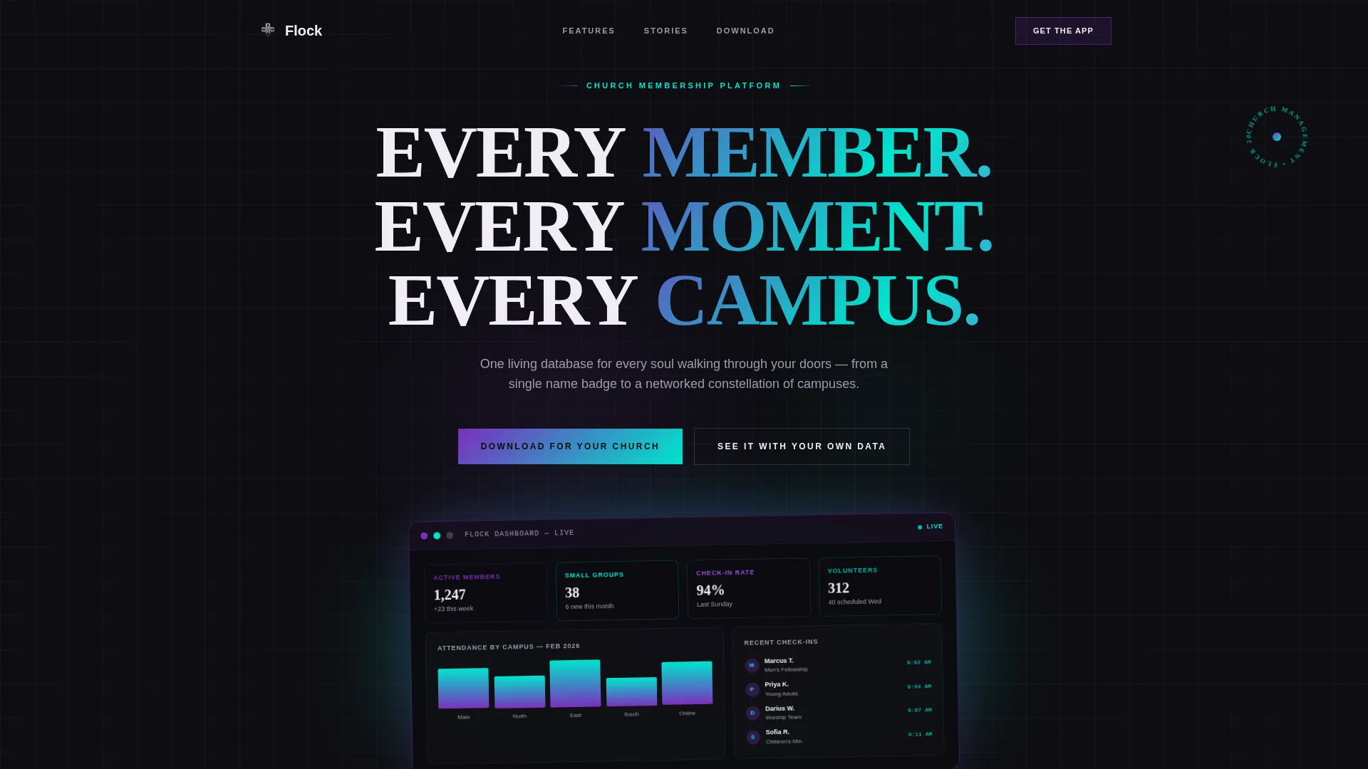
- A dark full-bleed header featuring a glowing dashboard mockup with real-looking attendance metrics and campus bar charts
- A scrolling nine-tile feature matrix organized in three rows, with hover-triggered iridescent border animations and demo GIFs inside each card
- Two call-to-action touchpoints: a primary app download block with paired store badges and a secondary inline form capturing church name, weekly attendance range, and primary role
Feature list
This template packs a focused set of visual and functional capabilities drawn directly from the brief. Each one is designed to persuade a church decision-maker before they reach the download button.
Glowing Dashboard Header Mockup
The header displays a floating dashboard user interface centered on a void black canvas. Visible data points include 1,247 active members, 38 small groups, a 94 percent check-in rate, and a three-campus attendance bar chart. The iridescent card borders pulse with violet-to-teal gradients, making the data feel active rather than static.
Nine-Tile Feature Matrix Grid
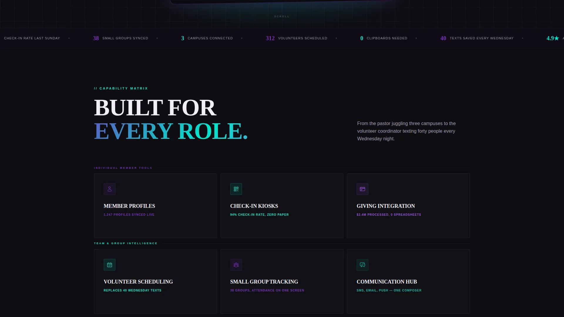
A rigid brutalist grid presents nine capability cards across three rows. Each tile contains an icon, a feature name, and a metric or micro-interaction. The grid moves from individual member tools in row one to organization-wide intelligence in row three, giving visitors a sense of scale as they scroll.
Hover-State Card Animations
Every feature tile responds to hover with an iridescent border animation and an expanded demo GIF. This interaction keeps visitors engaged longer and lets the product demonstrate itself without requiring a separate product tour page.
Dual Call-to-Action Architecture
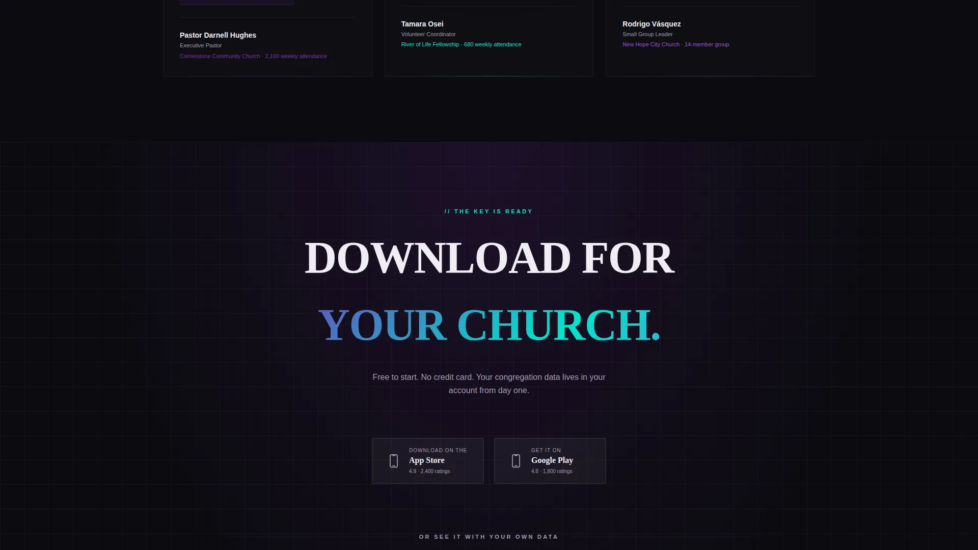
The primary call to action drives app downloads with App Store and Google Play badges styled in the iridescent border treatment. The secondary inline call to action opens a lightweight qualification form, capturing church name, weekly attendance, and role before handing the lead forward.
Iridescent Color Gradient System
Violet and teal shift across gradients on hover states, card borders, and badge treatments throughout the page. The absolute black background ensures every colored element glows with maximum contrast, reinforcing the stained-glass-on-concrete visual identity.
Bold Brutalist Typography Treatment
Headlines appear in communion white uppercase with a brutalist typographic voice. The headline "EVERY MEMBER. EVERY MOMENT. EVERY CAMPUS." sets the product's ambition immediately and anchors the page's tone from the first scroll position.
Page sections overview
| Section | Purpose |
|---|---|
| Dark Header Canvas | Introduces the platform with a glowing dashboard mockup and bold uppercase headline |
| Member Tools Row | Showcases Member Profiles, Check-In Kiosks, and Giving Integration as individual-level features |
| Team Tools Row | Presents Volunteer Scheduling, Small Group Tracking, and Communication Hub for coordinators |
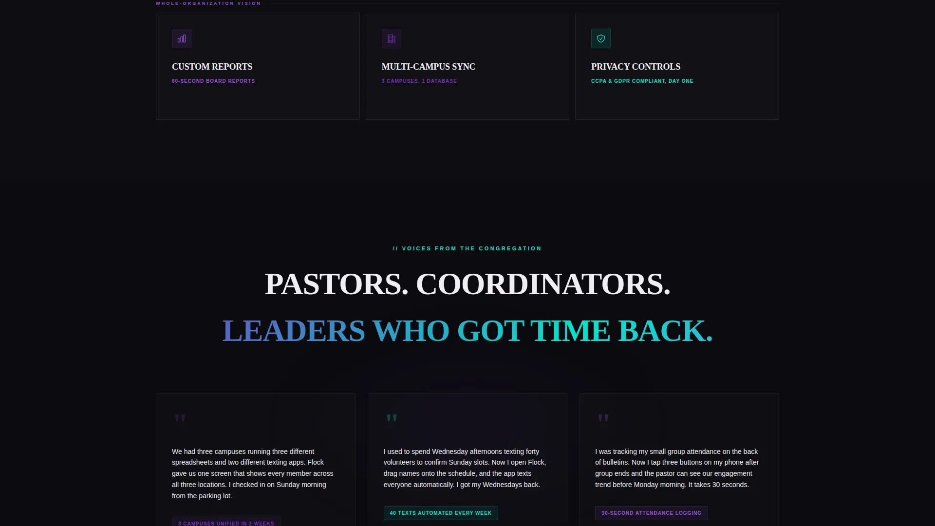
| Organization Tools Row | Covers Custom Reports, Multi-Campus Sync, and Privacy Controls for executive-level users |
| App Download Block | Drives the primary conversion with App Store and Google Play badges in iridescent styling |
| Inline Qualification Form | Captures church name, attendance range, and role via a secondary "See It With Your Own Data" call to action |
Design & branding system
The visual identity is built on a Bold Brutalist theme with an AI Iridescent color system. The result feels like stained glass projected onto poured concrete: sacred color locked inside unforgiving geometry.
- Core palette: void black (#0B0B0F) as the absolute background, consecration violet (#7B2FBE) and holographic teal (#00E5CC) for gradients and borders, communion white (#F0EDF5) for headlines and data labels
- Typography is uppercase and heavy for hero headlines, with clean legible weights used for feature names, metrics, and form labels
- Hover states trigger gradient shifts from violet to teal across card borders and badge outlines, creating a living iridescent feel without breaking the dark base
Mobile & speed optimization
The template is designed with a responsive layout in mind so the feature matrix, dashboard mockup, and download block remain clear and functional at smaller screen sizes.
- The nine-tile grid collapses cleanly to a single-column card stack on mobile without losing the brutalist tile structure
- The glowing header mockup scales to fit narrower viewports while keeping the key metrics legible
- Interactive elements including hover states and demo GIFs are structured to work within a lightweight page architecture
How this template helps you convert
Flock is built around a conversion logic that earns trust before it asks for action. The feature matrix does the persuading so the download button feels like a natural conclusion.
- The dashboard header opens with real-looking data, immediately signaling that the platform is operational and data-rich, which builds credibility in the first few seconds of a visit
- Each of the nine feature tiles adds a layer of proof as visitors scroll, moving from individual member tools to campus-wide intelligence so the product feels both personal and scalable
- The dual call-to-action structure lets ready visitors download immediately while giving hesitant visitors a low-commitment way to engage through the qualification form, reducing drop-off at both ends of the decision spectrum
Other information about this template
Flock was designed to sit at the intersection of church administration software and modern product marketing. It draws on visual language familiar to SaaS dashboards while grounding every element in the specific context of religious community management.
- The template style is Dashboard and Data Grid, making it well suited for platforms in the church and religious software category that need to show data density and feature breadth on a single page
- The creative direction follows a Feature Matrix layout, a proven structure for software products where feature credibility drives the conversion decision
- The header concept is Dark Full-Bleed with Glow, a treatment that positions the product as premium and data-forward without relying on lifestyle photography
Theme
Bold Brutalist
Creative direction
Feature Matrix
Color system
AI Iridescent
Style
Dashboard/Data Grid
Direction
App Download
Page Sections
Glowing Dashboard Header Mockup
Nine-tile Feature Matrix Grid
Hover-state Card Animations
Dual Call-to-action Architecture
AI Iridescent Color Gradient System
Bold Brutalist Typography Treatment
Related questions
Who is this landing page template designed for?
Can I customize the dashboard data shown in the header?
What are the nine features shown in the feature matrix?
Does the template include hover animations and demo GIFs?
Is this template suited for a multi-campus church platform?



