Park - Powerful Whitelabel Landing Page Template
Park is a Bold Brutalist white-label parking platform landing page built for operators ready to own their brand, data, and revenue. It leads with a metrics wall, dominates with a head-to-head comparison table, and closes with a sticky primary call to action. Deploy-ready in weeks, not years, zero per-transaction fees, full license plate recognition support, and dynamic pricing baked in.
by Rocket studio
Quick summary
Park is a single-page white-label parking platform landing page designed for operators who want to stop paying fees to third-party apps and start owning the full stack. It opens with a brutalist metrics wall, flows through a structured comparison table, and ends with a focused lead-capture form. The visual identity is industrial, cold, and deliberately arresting.
Who this template is for
This template is built for operators and decision-makers in the parking industry who need to present a white-label platform credibly and convert qualified buyers fast.
- Parking garage chains evaluating alternatives to per-transaction third-party apps
- Airport authorities and municipal governments seeking a fully branded experience
- Platform vendors pitching white-label parking software to enterprise operators
What problem this template solves
Most parking operators struggle to communicate the real cost of using generic aggregator apps. They lack a focused page that turns technical differentiators into a clear, side-by-side case for switching.
- No way to show feature depth versus competitors without a structured comparison
- No landing page that captures leads while making the cost of the status quo visible
- No branded presentation that makes real-time bay tracking and dynamic pricing feel tangible
What you get with this template
You get a fully structured single-page layout that moves a qualified visitor from awareness to action without detours. Every section earns the next scroll.
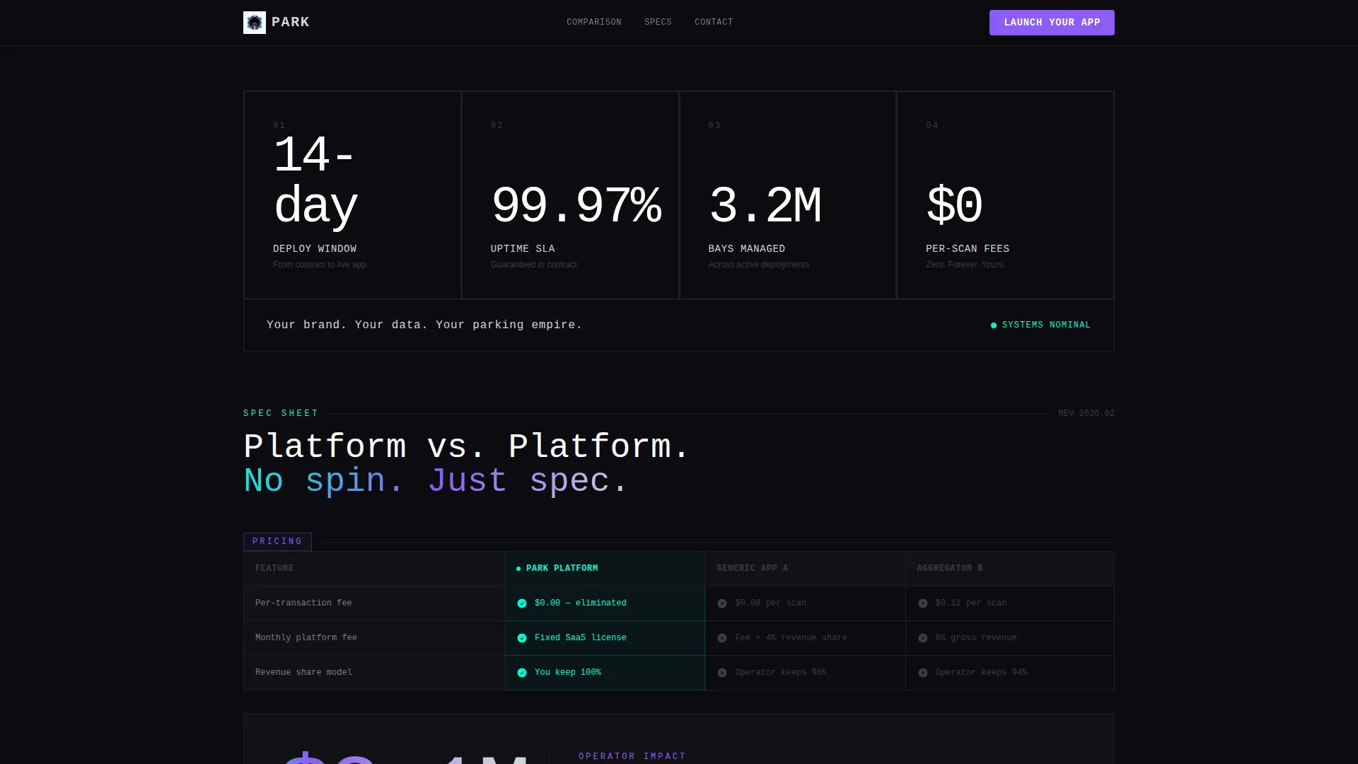
- A brutalist stats wall header with four oversized operator metrics on void black
- A multi-row comparison table pitting the platform against two anonymized competitors
- A sticky bottom bar with a primary call to action and a gated PDF spec sheet form
Feature list
This template is built around a tight set of conversion-focused components. Each one pulls directly from the source brief and serves a specific role in the page flow.
Brutalist Metrics Wall Header
Four oversized monospaced stats sit in individual concrete-style blocks on void black. The figures shown are "14-day deploy," "99.97% uptime," "3.2M bays managed," and "Zero per-scan fees." Each block carries a thin iridescent border that pulses once on load. No hero image competes for attention. The numbers are the visual.
Head-to-Head Comparison Table
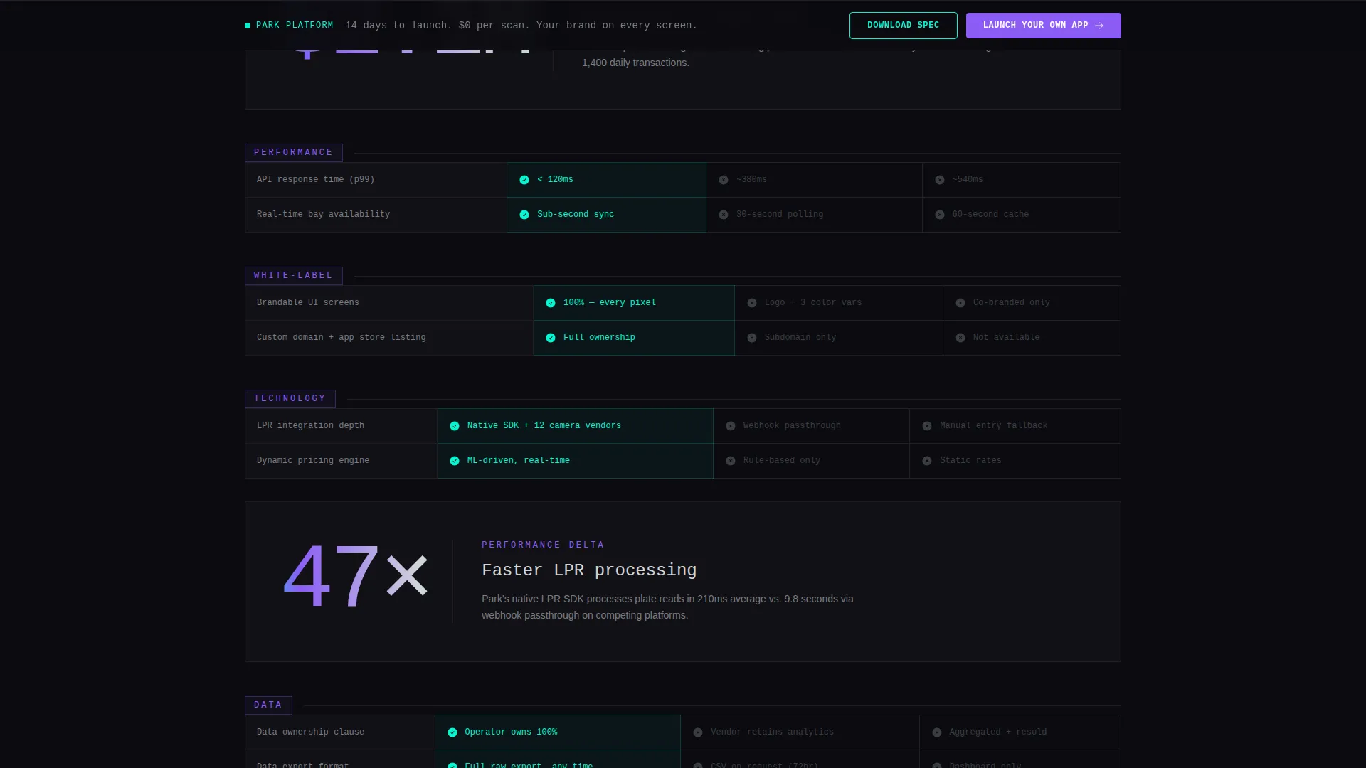
The core of the page is a structured comparison table that scores the white-label platform against two anonymized rivals across rows including per-transaction fees, API response time, brandable user interface screens, license plate recognition (LPR) integration depth, revenue share model, and data ownership clause. Winning cells highlight in iridescent cyan. Losing cells stay muted gray. The table makes the competitive case without a single word of editorializing.
Callout Blocks Between Table Sections
Single-stat callout blocks interrupt the table at regular intervals. Each block pulls one real operator metric large, breaking the scroll rhythm so visitors alternate between structured evidence and high-impact proof. The pattern keeps attention engaged across a long-form comparison page.
Sticky Primary Call to Action Bar
A bottom bar pinned to the viewport appears after the first table section scrolls into view. The primary button reads "Launch Your Own App" and is styled in holographic violet. It remains visible throughout the rest of the scroll, reducing the distance to conversion at every point on the page.
Gated PDF Spec Sheet Capture
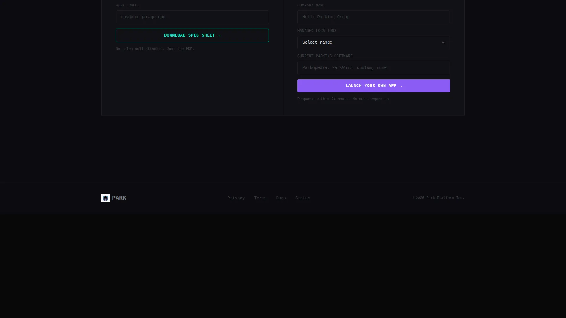
A secondary conversion path lets visitors request the full spec sheet PDF. Access is gated behind a single email field. The form also collects company name, number of managed locations via a dropdown (1 to 10, 11 to 50, or 50 and above), and current parking software. This qualifies leads while delivering a perceived-value asset.
Iridescent Cyan Win-State Highlights
Interactive states and winning-column cells use iridescent cyan exclusively. This creates an immediate visual hierarchy inside the comparison table. Visitors read the winning column faster because the color contrast does the editorial work. The palette pulls from the AI Iridescent color system defined in the design brief.
Page sections overview
| Section | Purpose |
|---|---|
| Stats Metrics Wall | Opens with four brutalist operator metrics to establish credibility immediately |
| Chrome Tagline Bar | Delivers the brand positioning line beneath the metrics grid |
| Comparison Table Block | Scores the platform against two competitors across six specific rows |
| Callout Stat Interrupts | Breaks table scroll with single-metric impact blocks to sustain attention |
| Sticky call to action Bar | Pins the primary action button to the viewport after the first table section |
| PDF Spec Sheet Form | Captures qualified leads via email gate and a short operator profile form |
Design & branding system
The visual identity follows a Bold Brutalist theme using the AI Iridescent color system. The palette feels industrial and deliberately cold until interactive states make it come alive with unexpected color.
- Core colors: void black (#0B0B0F), liquid chrome (#D2D5DA), holographic violet (#8B5CF6), and iridescent cyan (#06F5D0)
- Iridescent cyan is reserved exclusively for interactive states and winning-column highlights in the comparison table
- Typography uses oversized monospaced figures for the header stats, with chrome-white body text on void black backgrounds
Mobile & speed optimization
The page layout is built to read cleanly on smaller screens without sacrificing the brutalist character that makes it distinctive on desktop.
- The comparison table is structured to remain readable on mobile viewports, with horizontal scroll or stacked rows where needed
- The sticky call to action bar maintains its pinned position across all screen sizes so the primary action is always reachable
- Single-column callout blocks reflow naturally without layout shifts on narrower displays
How this template helps you convert
The page is engineered to move a skeptical operator from scroll to submission. Every design and copy decision builds toward the same two outcomes: a demo request or a qualified lead form fill.
- The metrics wall opens with hard numbers that establish authority before any feature claim is made, reducing the visitor's skepticism before the comparison table even loads.
- The comparison table rows are chosen for maximum embarrassment value: per-transaction fees, data ownership, and revenue share are the rows operators feel most acutely, so the page turns their existing vendor into the problem before the call to action appears.
- The sticky bar and gated PDF create two conversion paths at different intent levels, capturing both the ready-to-act operator and the still-evaluating buyer in one scroll.
Other information about this template
This template is designed specifically for the white-label parking app niche, where the sales cycle is long and the buyer is skeptical. The page structure reflects that reality.
- The comparison table format is borrowed from enterprise software sales decks, translated into a high-impact landing page layout
- The gated PDF path mirrors a common B2B demand-generation tactic, giving hesitant buyers a low-commitment next step
- The anonymized competitor labels ("Generic App A" and "Aggregator B") let operators deploy the page without legal risk from named comparisons
- The dropdown field for number of managed locations segments leads at the point of capture, enabling sales follow-up prioritization
- The template is built as a single-page layout and does not include multi-page navigation or a blog structure

Theme
Bold Brutalist
Creative direction
Spec Sheet
Color system
AI Iridescent
Style
Comparison Table
Direction
Comparison/Versus
Page Sections
Brutalist Stats Wall Header
Head-to-head Comparison Table
Single-stat Callout Blocks
Sticky Primary Call to Action Bar
Gated PDF Spec Sheet Form
Iridescent Cyan Win-state Highlights
Related questions
Can I replace the anonymized competitor labels with real brand names?
Is the comparison table editable?
How does the sticky call to action bar behave on scroll?
What information does the lead capture form collect?
Can I adjust the color palette to match my own brand?



